


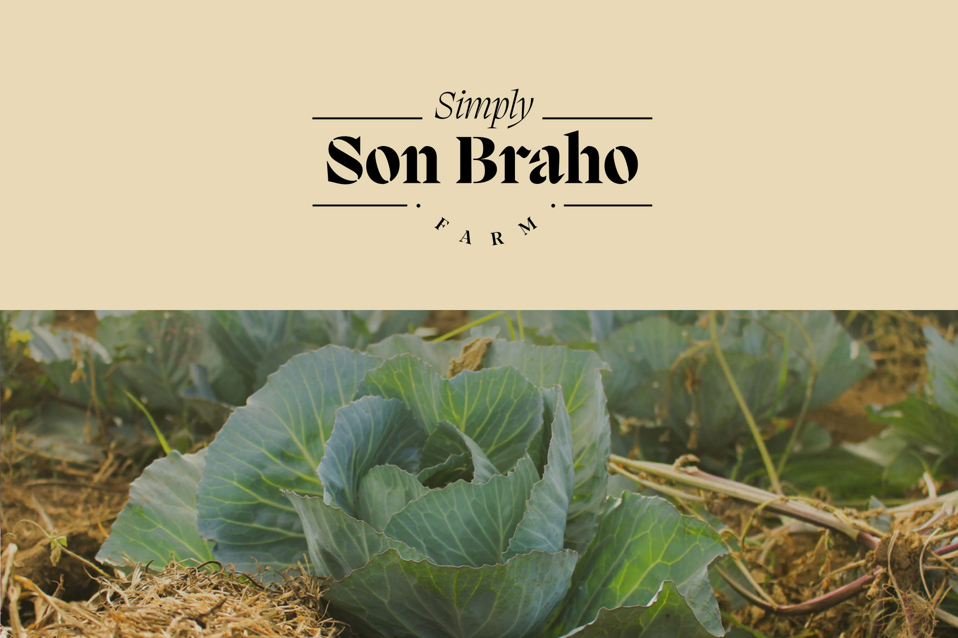
Farm and company of seasonal, natural and organic food products prepared with raw material grown in Son Brahó.
The development of the identity is based on this idea of organic transformation. A natural growth inspired by the countryside, nature, plants, organic shapes and abstract combinations. Go further than a simple vegetable represents. “Transforming the essence of the ingredient into a culinary art, a way of living, a way of educating, a movement.”
Abstract representation of vegetables as the main protagonists.
Transformation essence: Conceptual symbol of growth, evolution until reaching further. Transformation of the product into a healthy meal and transformation of the way of life with personal and social growth.
Organic essence: Inspiration in irregular shapes that present an abstract, undefined, natural and organic essence. Rustic colours, typical of the countryside and nature. Handmade details, warmth and proximity, also with a country style.
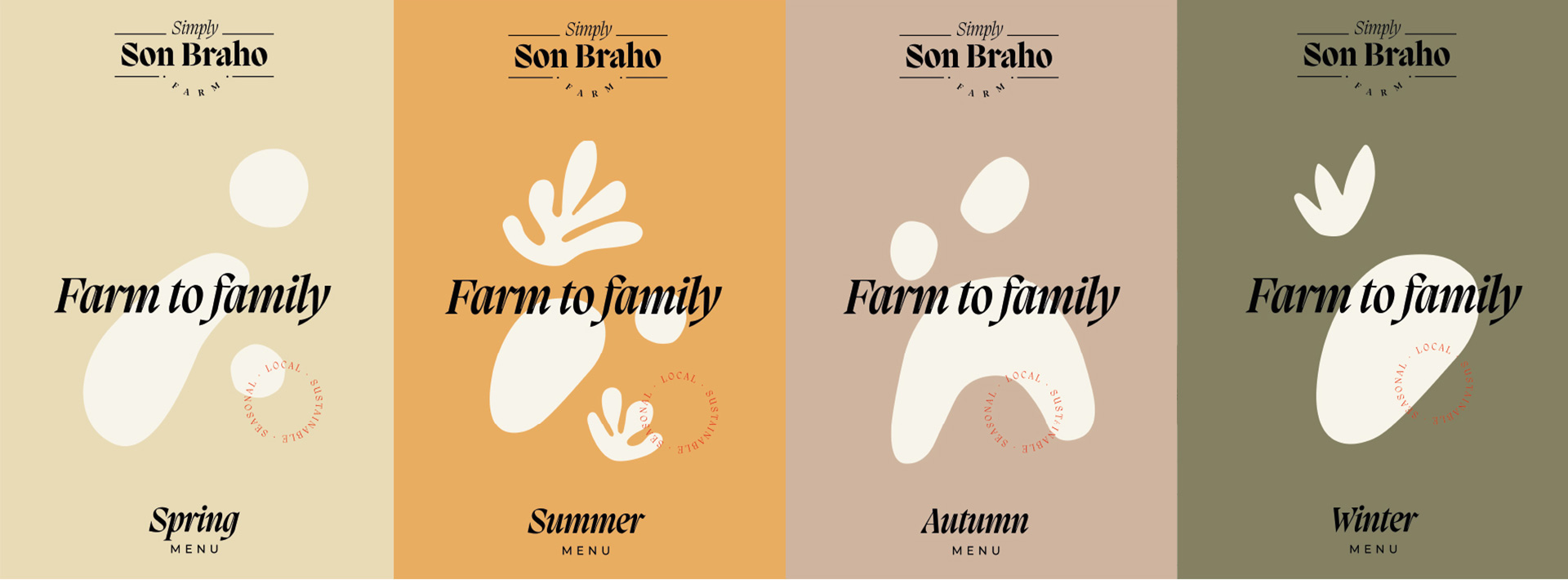
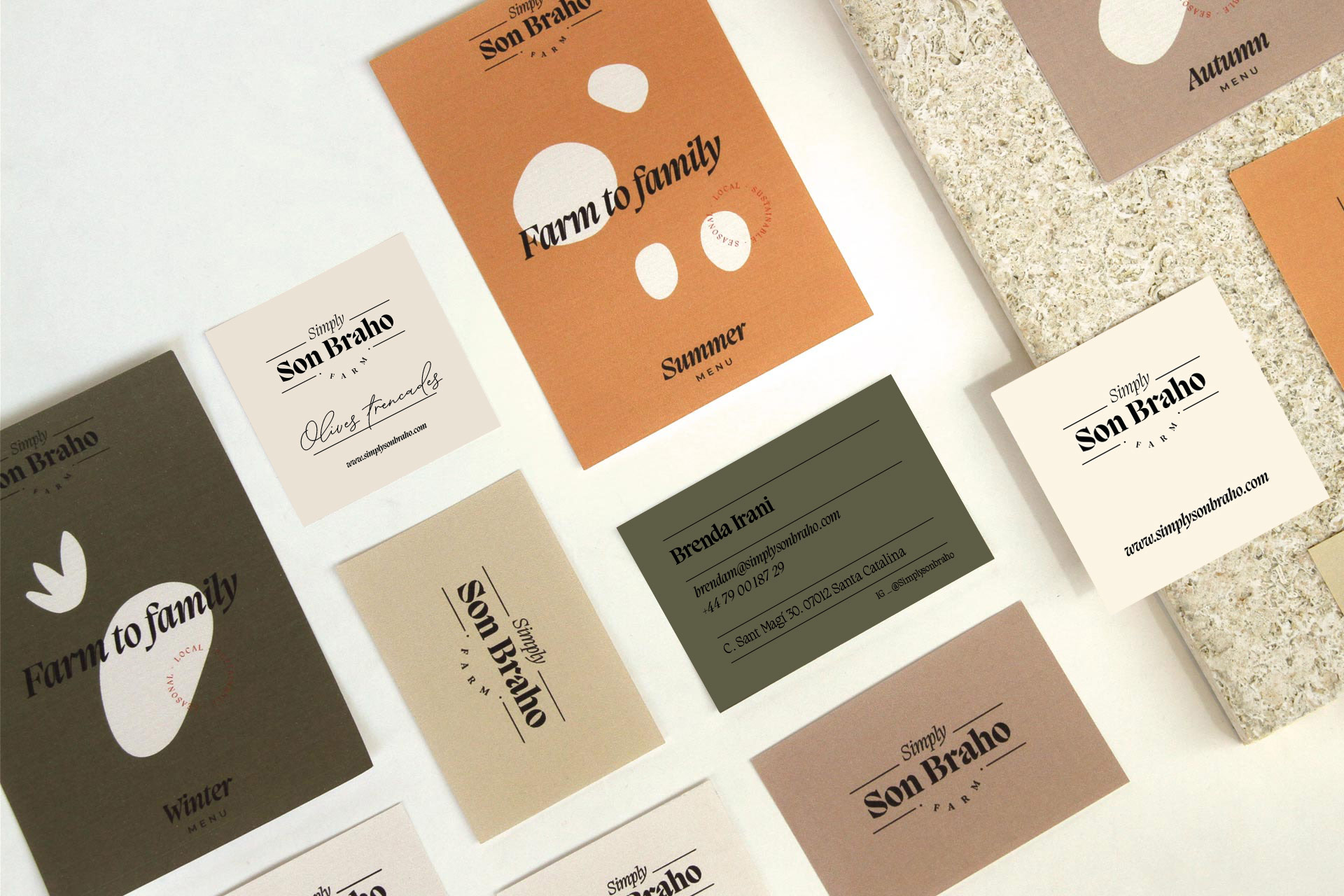
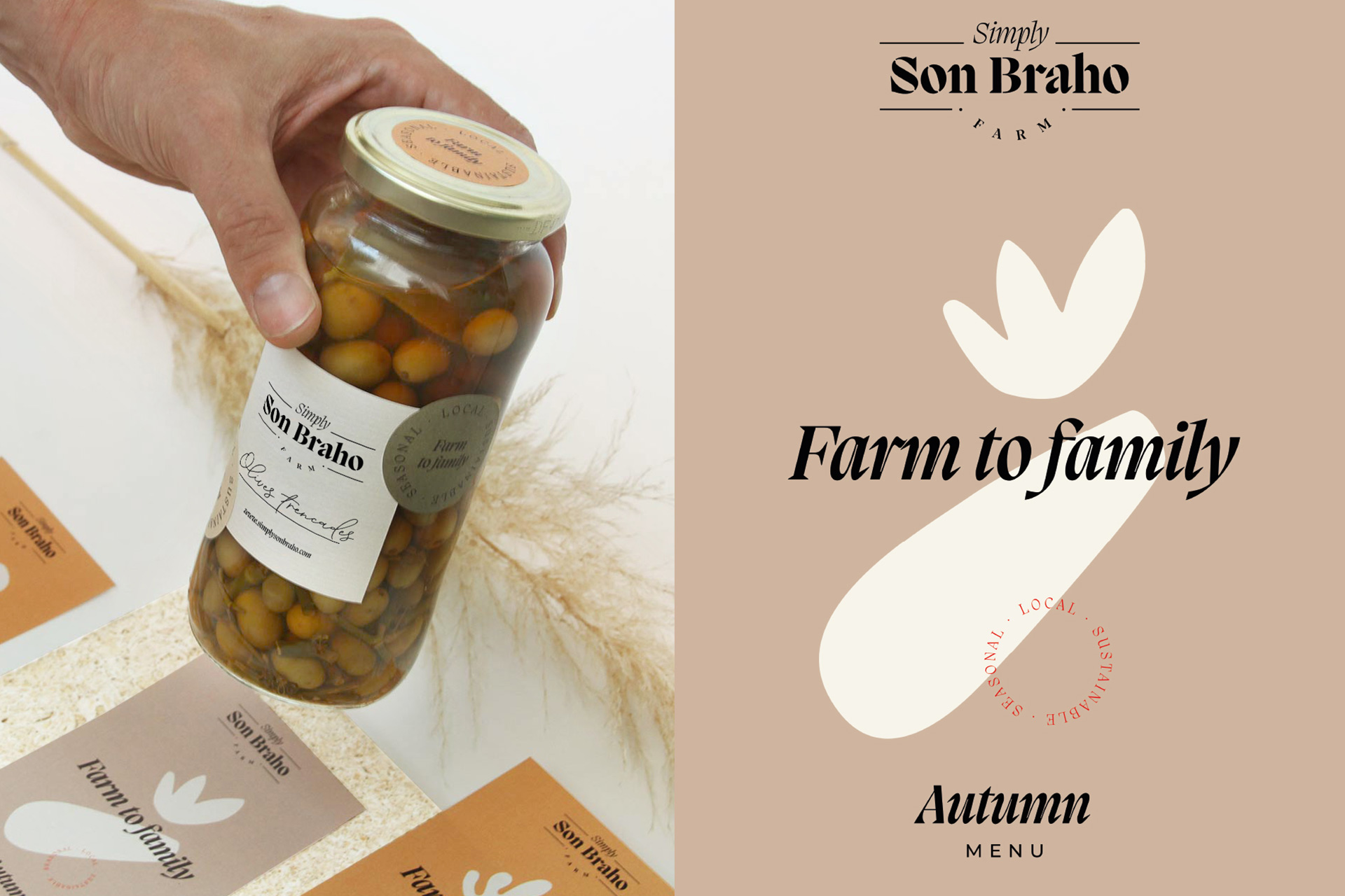
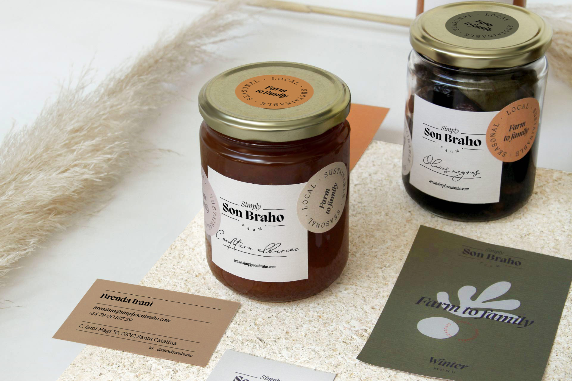
Variation of the brand for circular supports as a more organic and dynamic shape. The idea is to create a logo that can be easily combined on different media to create a flexible Simply Son Braho identity.
The shapes of the vegetables have been extracted through children’s illustrations that represents some indefinitely ingredients and also is the starting point in the family role to learn new ways of life and educate new generations.
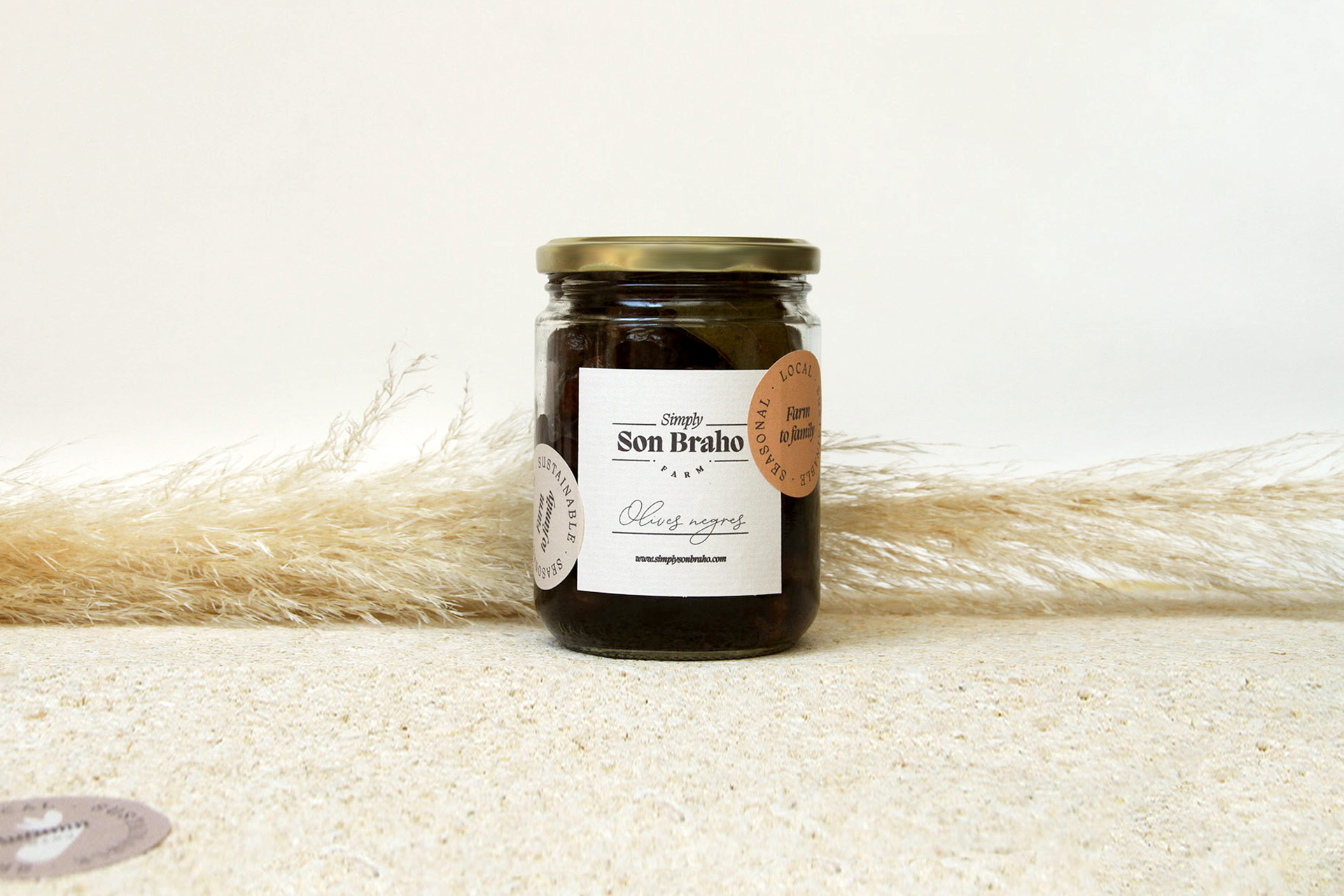
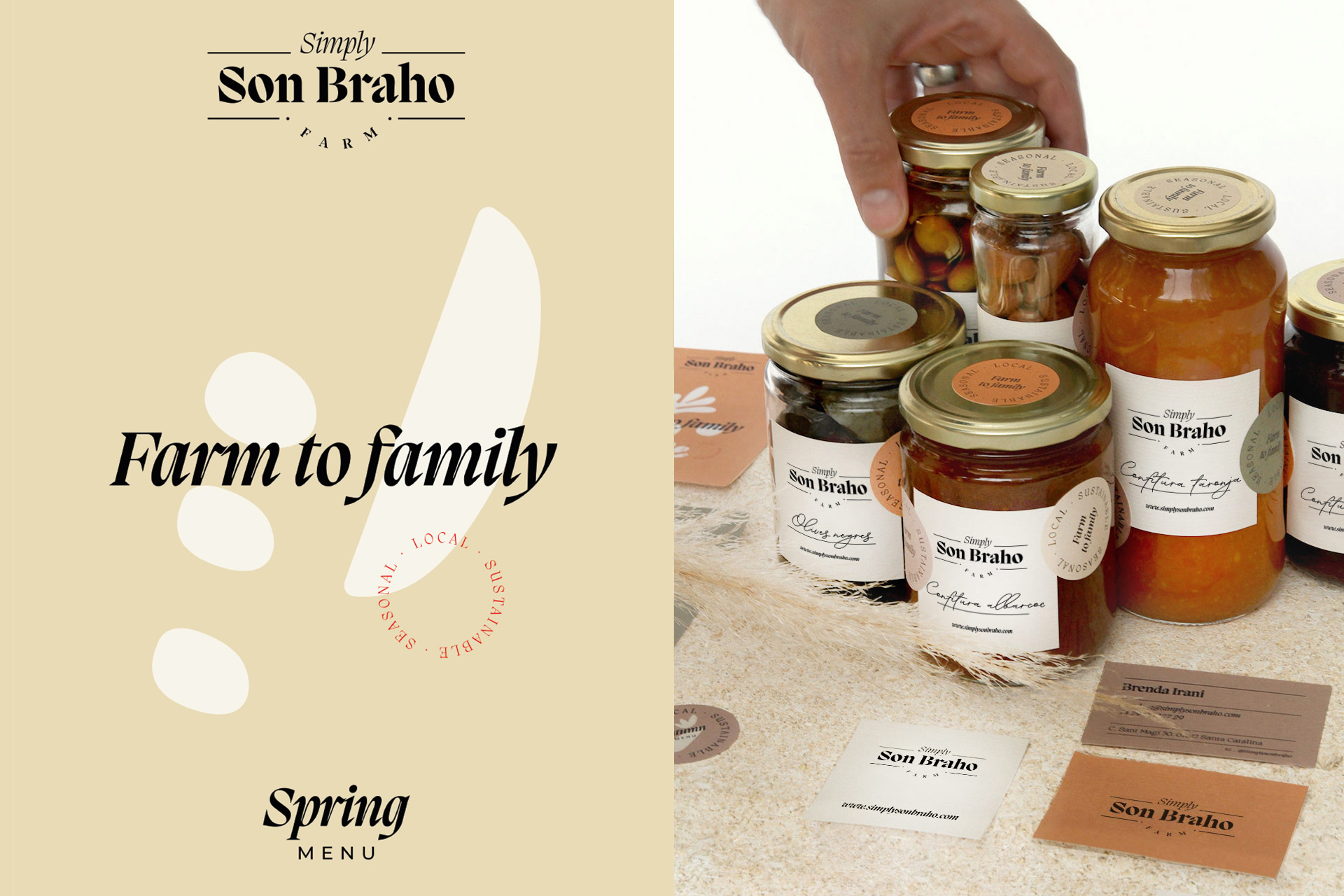
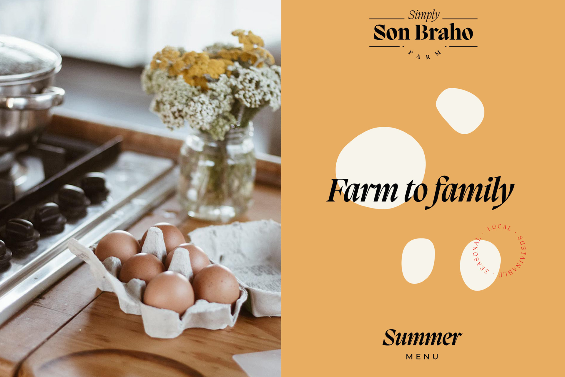
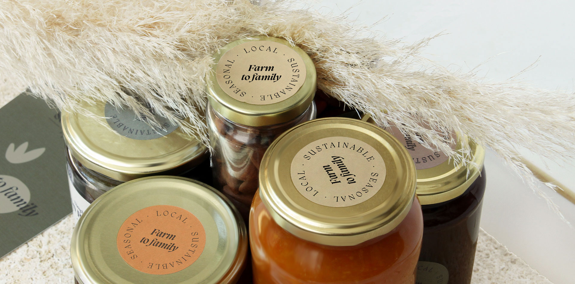
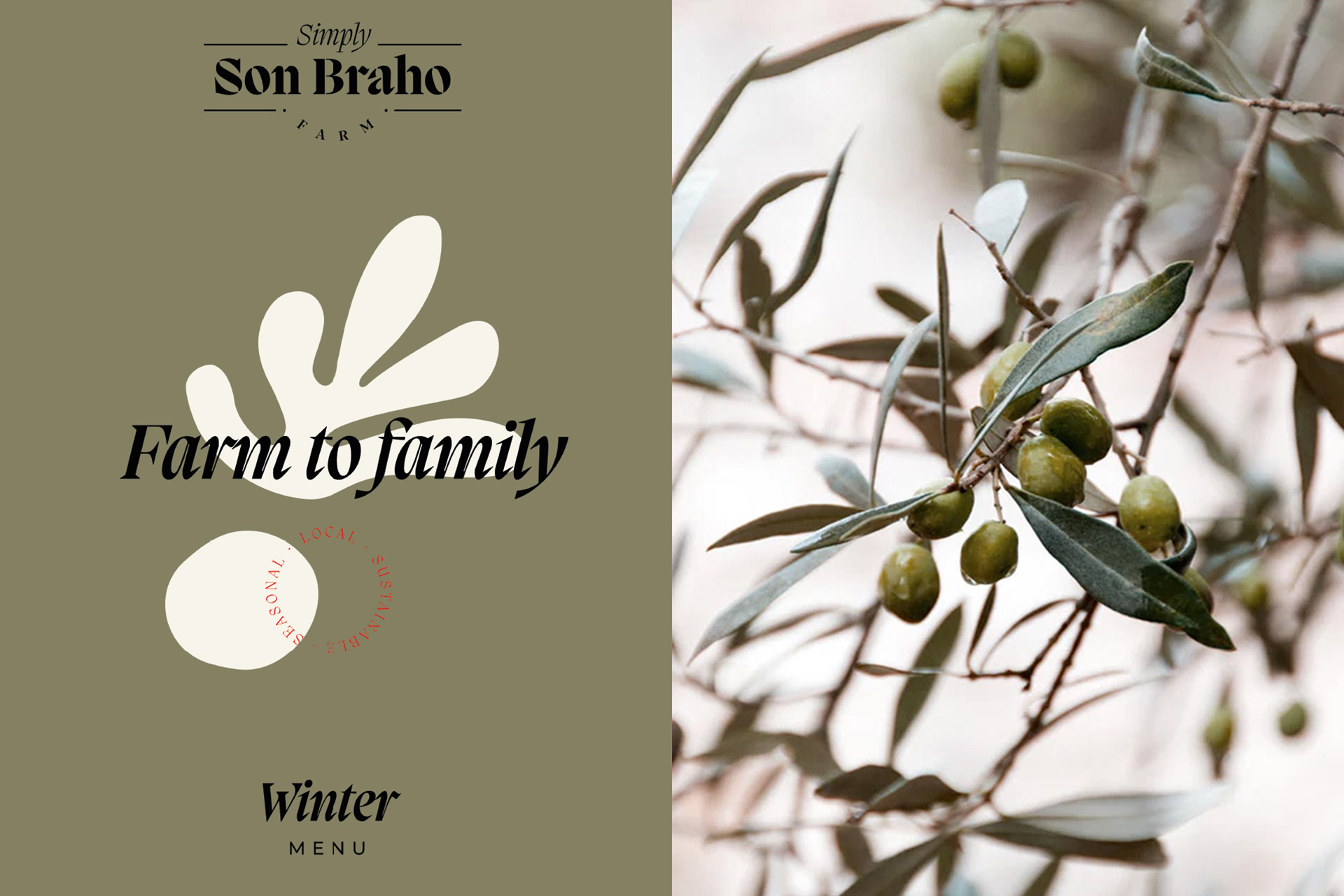
Packaging and Seasonal flexibility
A flexible system has been designed to be able to cover different products with a two- element structure: A generic fixed adhesive and another flexible and variable depending on the product or menu.
CREDIT
- Agency/Creative: Barceló Estudio
- Article Title: The Natural, Sustainable and Flexible Simply Son Brahó Brand and Packaging Identity
- Organisation/Entity: Agency
- Project Type: Packaging
- Project Status: Published
- Agency/Creative Country: Spain
- Agency/Creative City: Palma
- Market Region: Europe
- Project Deliverables: Brand Design, Brand Guidelines, Brand Identity, Identity System, Label Design, Logo Design, Packaging Design, Packaging Guidelines, Photography
- Format: Jar
- Substrate: Glass Jar
- Industry: Food/Beverage
- Keywords: organic food, natural, mallorca, rustic, Local, Seasonal, Sustainable, Healthy, Vegetables, Farm.
-
Credits:
Creative Director: Xisco Barceló
Art Director: Estel Alcaraz


