


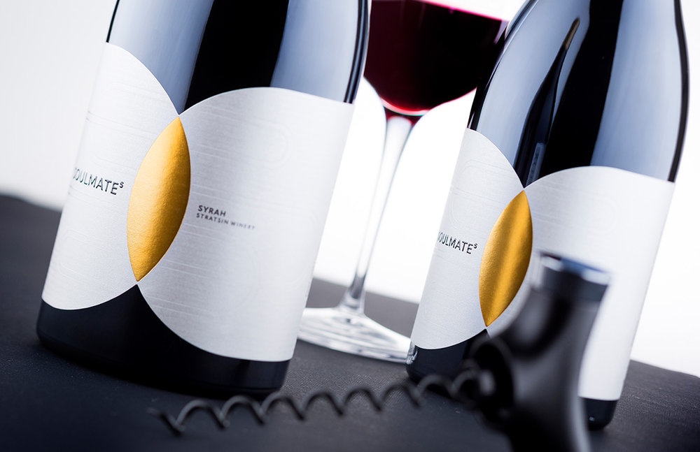
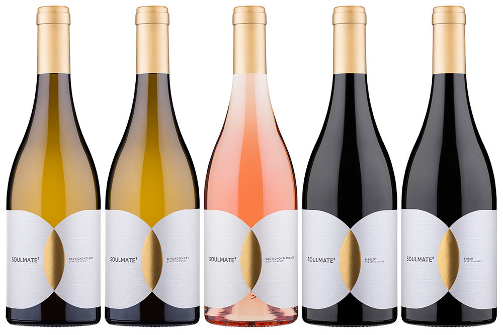
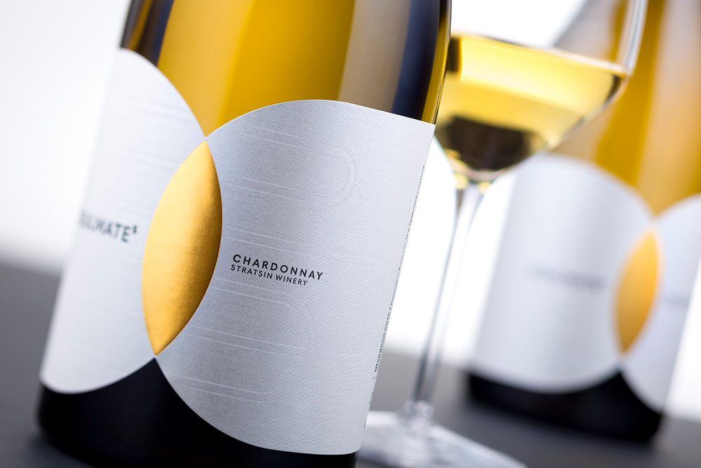
” SOULMATEs is very new project created for young Stratsin Winery. I started it in 2016 and it was printed in early 2017.I began from ground zero – white sheet, pencil and a good doze of motivation. I had some pretty good impressions about the team – owners & winemakers – and in fact they were the reason to create a brand called SOULMATEs. It is an idea that came to me as a reflection of what I saw from their relations. It is a company of four people who made me think they share same ideas and live and work as best friends respecting each other and looking at the same direction on their way thru wine world. That is why I decided to call the brand SOULMATEs as it perfectly describes what I saw and felt. I have already created very modern and clean logo for the winery so I decided to continue the same way and design unique contemporary label that stands out among the other. I used very simple yet meaningful idea – two overlapping circles intersecting in a leaf-shaped space. One circle is for the owners and what they are as individuals, the other is for the winemakers. The intersection between them illustrates everything that they have in common as being SOULMATEs.It was a real breakthrough to me because I have true feeling that this brand will be very strong and memorable and it was my duty to create relevant label. I started with the size and form – I wanted big nearly wrapping from side to side label. I wanted to pick excellent elegant paper with own presence and individuality. Arconvert’s Constellation Jade Raster was the perfect choice for this design.”
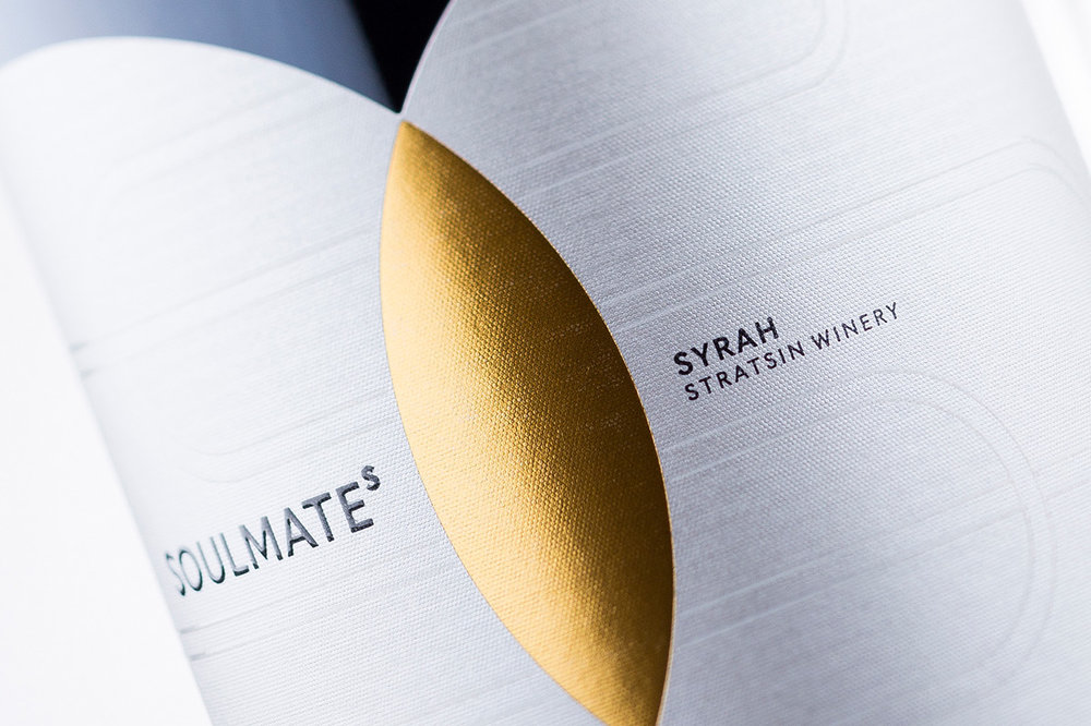
” I like this paper very much and I often use it but this time I decided to customize it a little bit and make it look like it was created exactly for this label. I worked on the background with two transparent varnishes – one was UV varnish and I printed a pattern of horizontal lines, the other was partial raised varnish to print an outlined version of the Stratsin Winery logo almost on the whole area of the label background. They created elegant texture that somehow looked stronger when you rotate or tilt the bottle – perfect solution to leave in audience good impression for super custom paper. While trying to keep everything simple, contemporary and unique, I decided to use only one typeface in my design – the amazing Quasimoda by Lettersoup with its balanced geometry and modern look was excellent addition to my work.At the center of the label I printed the intersection area with rich gold hot foil. This is the most special place in the whole design – the heart of the label. I did not want to think of any other special effects on the gold leaf as I wanted it to shine with the beauty of its perfect shape.Another key element in my packaging is something I should have started my story with – the bottle. It is very important to pick the best one for such special project. I did not think days about it – my eyes were set on one of my old glass friends – Agape by Saverglass. Looking very solid yet elegant with its clean lines and really big vertical section, this bottle proved again that it is one of the best on the market. It was in perfect harmony with my idea & design.At the end – I tell the whole story the way it was just to show you how easy it is to transform a strong brand name into unique contemporary wine label design. It is always a real pleasure when you have good ideas – they are endless source for creativity and solid foundation for amazing new wine labels.”
CREDIT
- Agency/Creative: the Labelmaker
- Article Title: the Labelmaker – SOULMATEs
- Project Type: Packaging
- Format: Bottle
- Substrate: Glass, Pulp Paper


