


The Project: Profundo is a small family-owned winery in José Ignacio – Uruguay, South America run by Malin and Trevor Durnford.
I was really surprised to learn that they sold their business and moved from Sweden to Urugay – what an amazing and intriguing start of this new project! They decided to name their new venture ‘profundo’ which means ‘deep’ in Spanish. For Malin and Trevor the word carries the meaning of deep change and deep transformation as they have started something brand new to them and were both family and team.
My job was to reflect this short story and create a logo and wine label design for the winery.
The Challenge: I have always been surprised by the challenges that every new project hides for me – new requests, new personalities, new ideas, new approach. Profundo was something like no other for me as I was deeply understanding how unique this story was and at the same time I felt great responsibility because a family from the other end of the world had decided to trust me and my skills, being surrounded by hundreds of wineries and surely by many other serious designers. Well, call it what you want, but for me this is a real challenge!
The Logo
I had plenty of ideas because we had wonderful discussion with the Trevor & Malin. Like many times in my career I started with a blank sheet and did some sketches, wrote some important keywords that describe the project and give me the right feeling and mood about it. So after a week and a half of “fermenting” I finally came up with few ideas which were reflecting the Profundo theme in different angles.
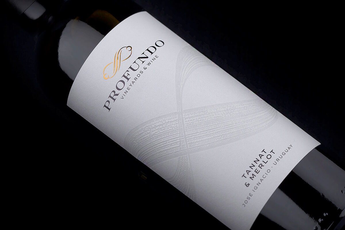
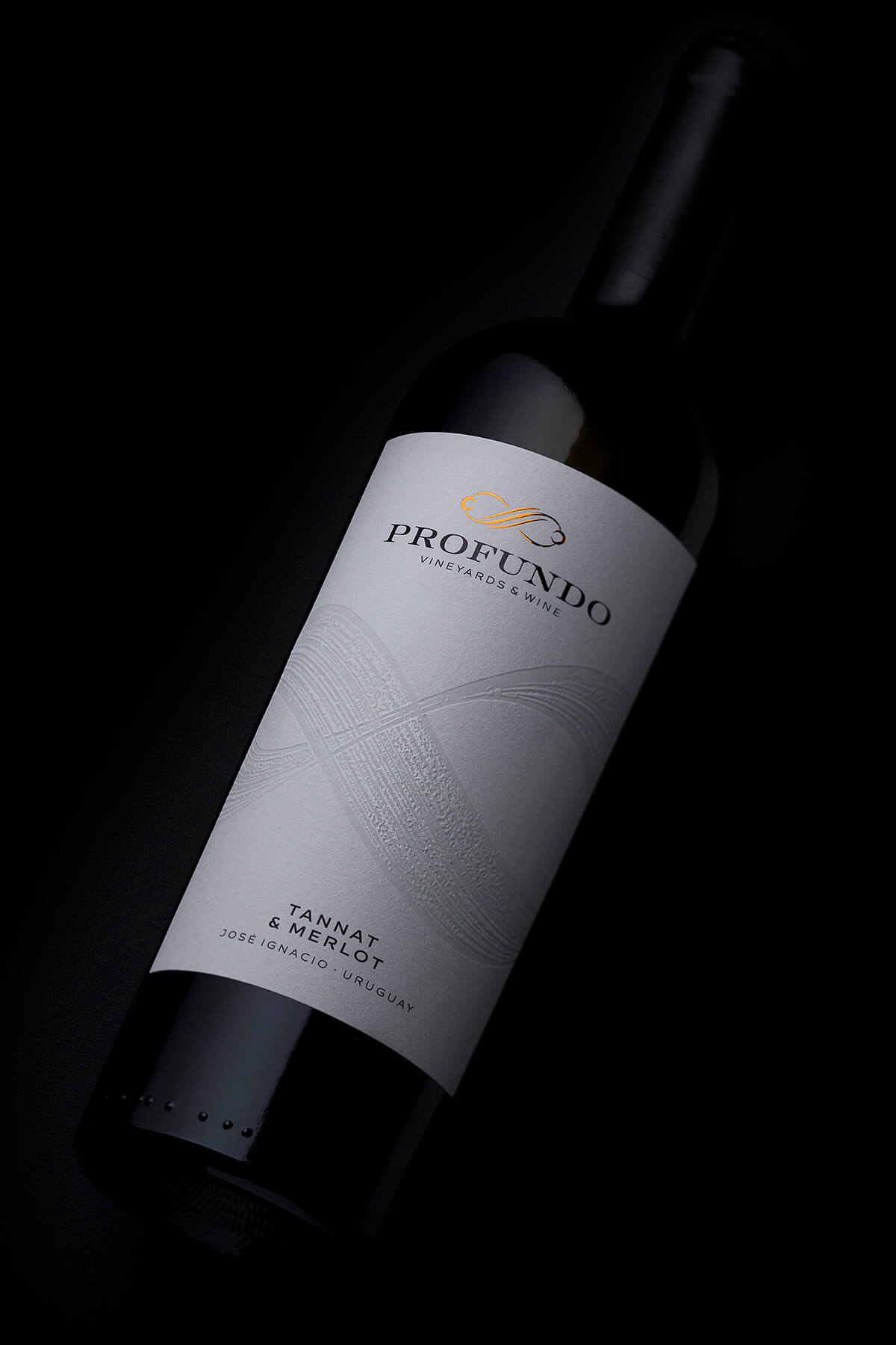
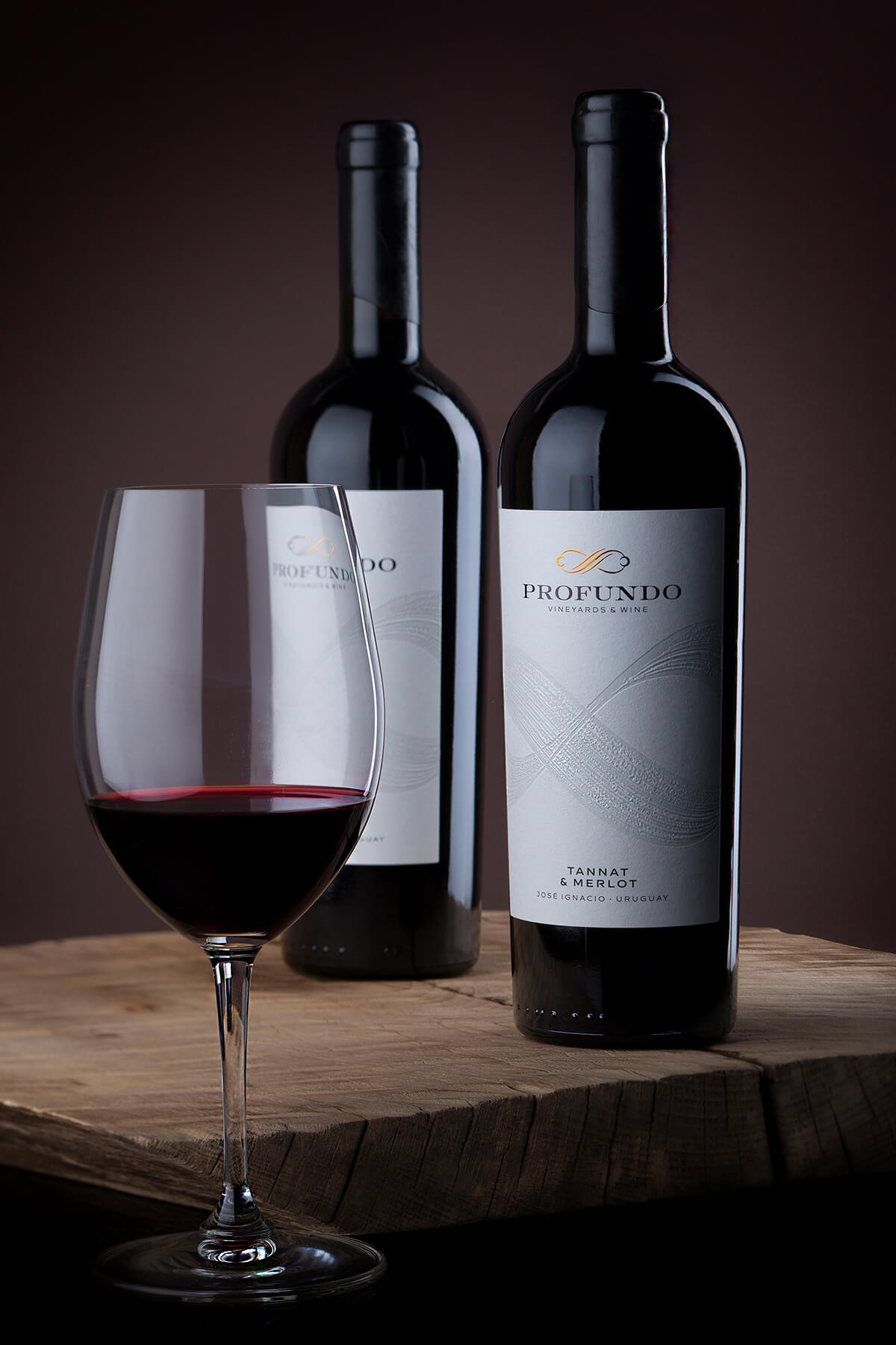
While creating my proposals I was thinking of something meaningful meditating on words like deep, depth, change, roots but then, after a couple of days I realised that actually they (Malin and Trevor) were the change, they were the team and family behind this ne venture and they were in constant constant interaction which was the real engine of Profundo. This is how their logo was born. I will probably its detailed story in another case study but in short it features two figures seen from above, crossing hands in infinity sign. This is how I saw Malin & Trevor and their personal Profundo.
The Execution: Bottle – We picked a classic tapered bordolaise bottle with very elegant masculine presence. Sealing – Tin capsules branded with Profundo new logo. Paper – Like I mentioned this above – this project was like no other, even when we speak about paper. We decided to use the amazing Moonlight Paper by Manter because of its amazing ability to offer semi transparent look of all de-bossed areas. Print – Printing has always been my secret weapon especially after I teamed up with my friends from Daga Printing House. We used very large, strong and visible de-bossing at the centre of the label featuring the infinity symbol hand-drawn on my Ipad Pro in Procreate app. At the top of it, I placed the newly-designed Profundo logo using very elegant and precise doming effect in gold and copper colors. At the bottom of the label I placed the variety and the wine region of the winery.
The Result: For me the main character in this new label is the Moonlight paper. Its ability to change its transparency when debossed is simply amazing – I really love such types of effects that look very natural and are at the same time very classy and intriguing. I designed a large white label with great combination of embellishments that are balanced in harmony. When you grab the bottle you could find lots of intricate details each with its own meaning and life in this brand new piece of art.
CREDIT
- Agency/Creative: the Labelmaker
- Article Title: The Labelmaker Creates Wine Label and Winery Logo Design for Profundo
- Organisation/Entity: Agency, Published Commercial Design
- Project Type: Packaging
- Agency/Creative Country: United States
- Market Region: South America
- Project Deliverables: Brand Creation, Brand World, Branding, Packaging Design, Photography
- Format: Bottle
- Substrate: Glass Bottle


