


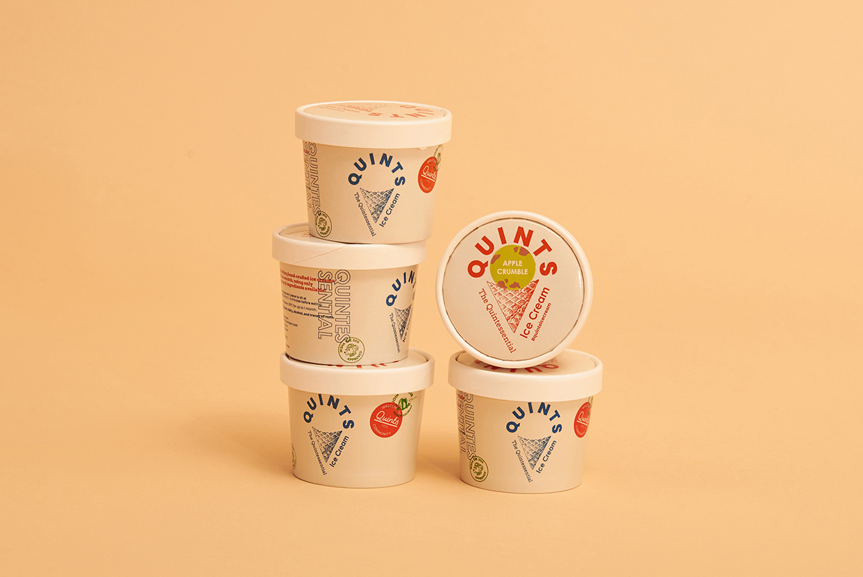
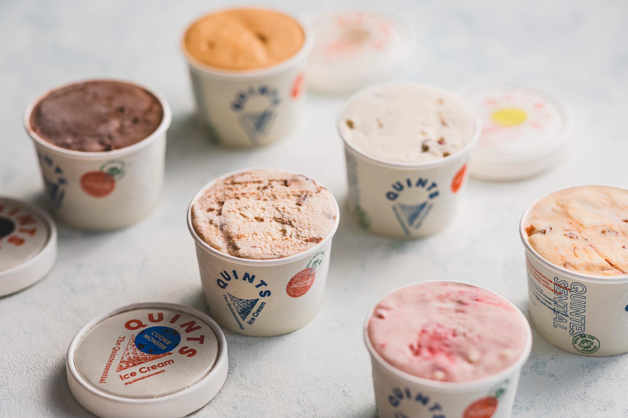
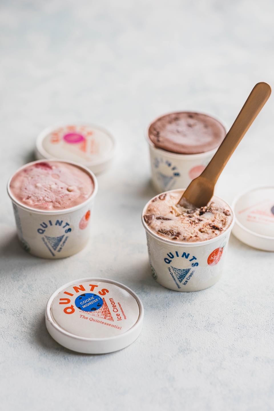
Imagining an ice cream brand that’s creative and collaborative, the brand founder’s vision is to create a space where chefs and ice cream lovers can explore new flavours together. So the brand overall visual borrows the narrative of Boy and Girl Scouts to signify exploration and curiosity. Badges and pins are used to signify fun and friendly vibes. There’s negative space on top of the cone illustration, to leave a place where imaginations can fill in.
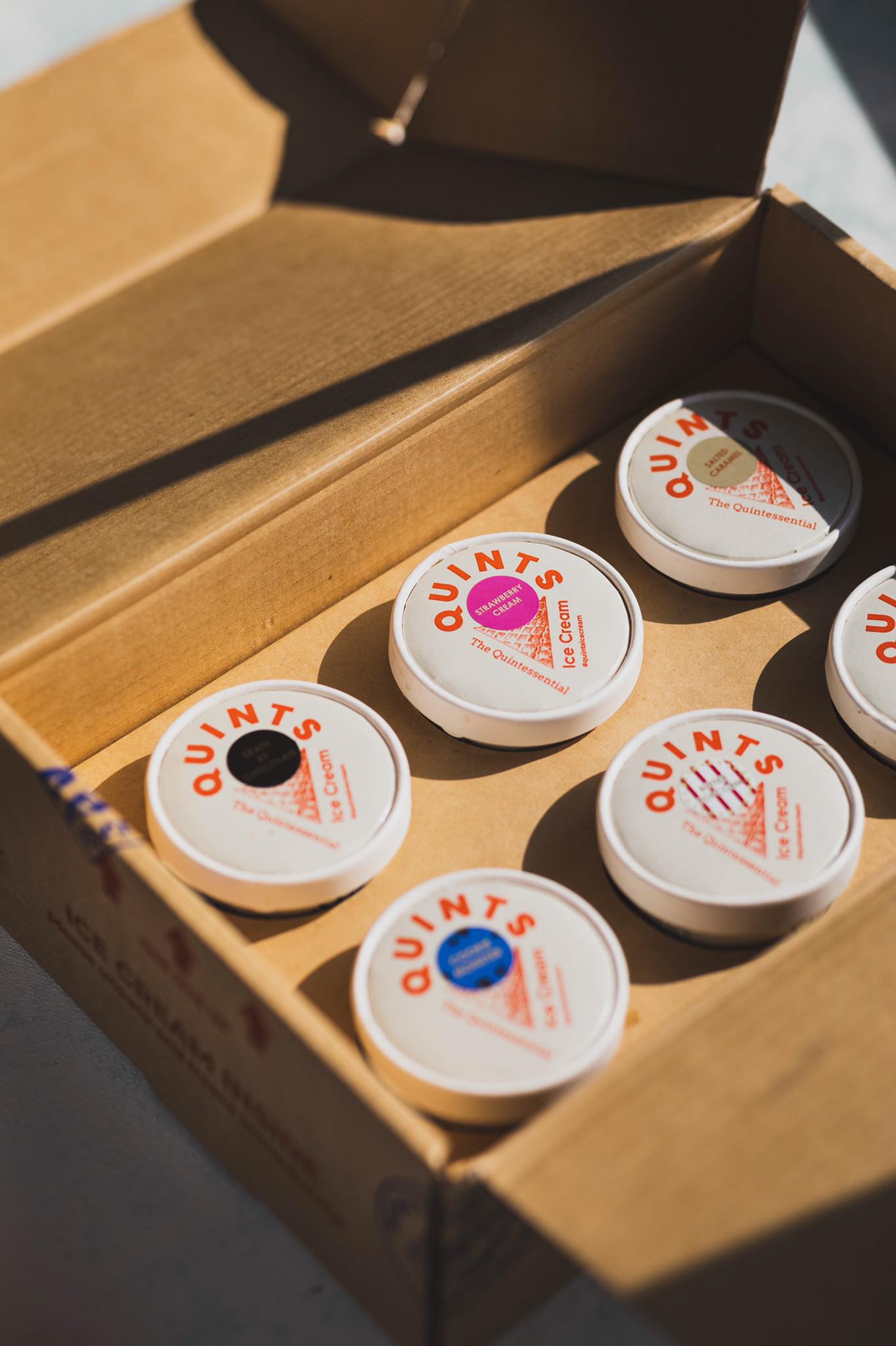
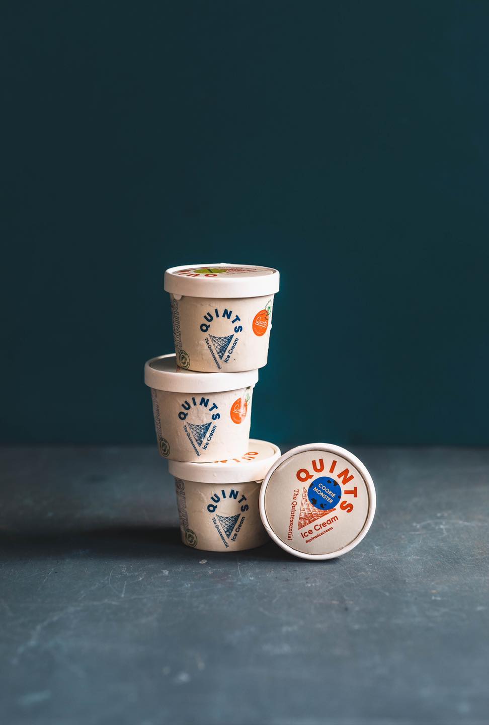
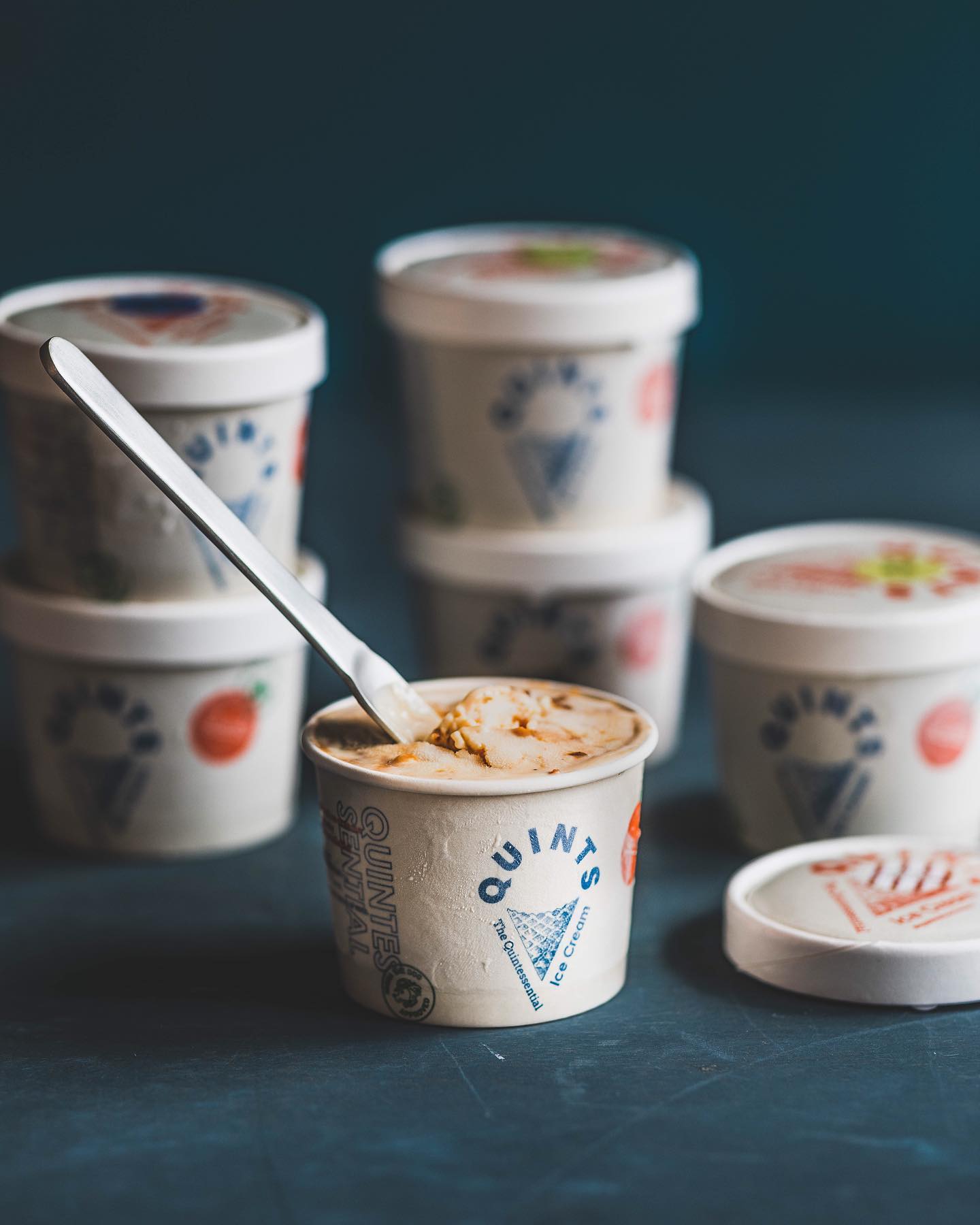
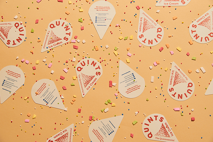
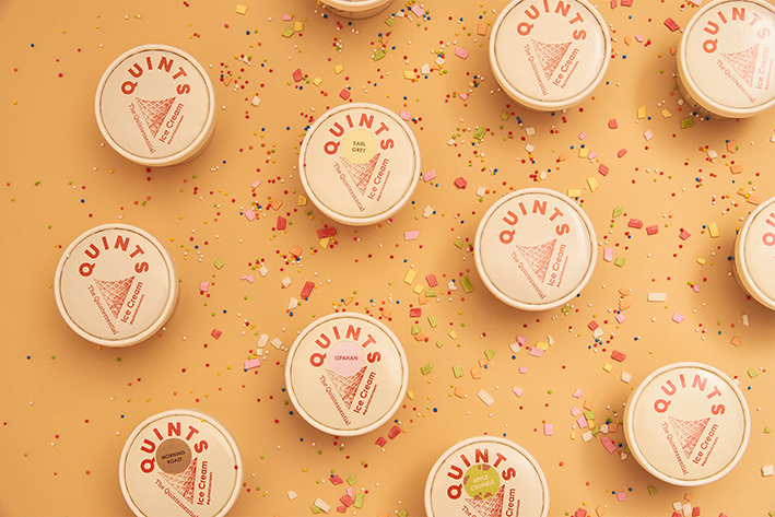
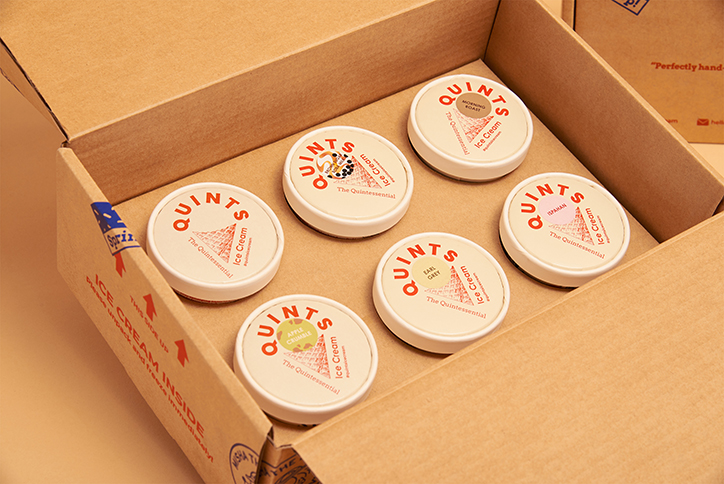
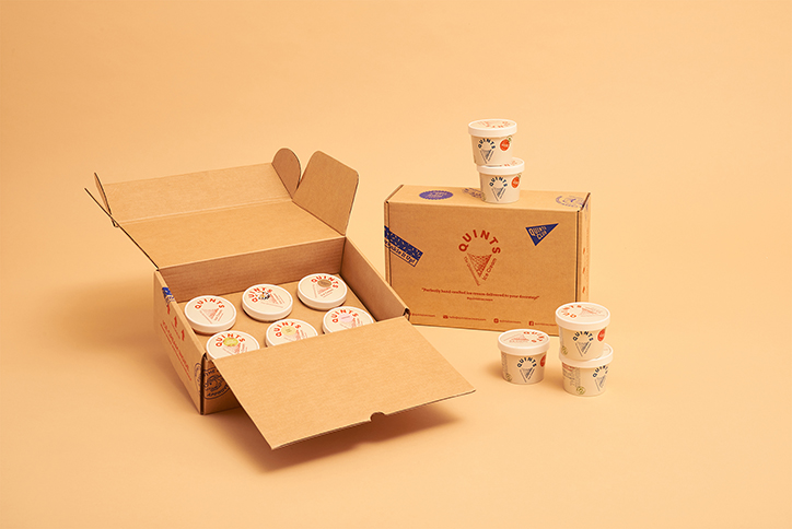
Our design deliverables consisted of the brand logo, ice cream cup and, delivery box.
Within 3 months of launch, Quints has become one of the most loved premium ice cream brands in Bangkok.
When our client, a dessert chef and bakery instructor, approached us with an idea of her ice cream venture, she said she wanted to create an ice cream brand in which customers can participate in the brand’s journey of creating the flavors.
After combining her passion for researching and developing innovative flavours with the happy and youthful vibes that ice cream brings to everyone, It is clear to us that the words “discovery”, “youthful”, “experimental” and “fun” have become our important design keywords for this project.
Thus, the Boy/Girl Scout aesthetic is chosen for this brand because of its adventurous, curious, experimental and collaborative characteristics. Moreover, its iconic and nostalgic use of elements such as colorful badges and icons and banners are highly relatable by the crowd.
The logo is designed using combinations of typography and hand illustration in the familiar shape of the ice cream cone to directly link to the product but leave negative space in the area of the ice cream scoop so that the audience can fill in the blank with his/her own imaginative flavours.
The result is a brand identity that stands out, warm, bright and filled with youth. Just like back in the days when we can have fun with experiments and enjoy new discoveries in our lives
CREDIT
- Agency/Creative: The Head and The Heart Studio
- Article Title: The Head and The Heart Studio Create Identity and Packaging Design for Premium Ice Cream Brands Quints
- Organisation/Entity: Agency
- Project Type: Identity
- Project Status: Published
- Agency/Creative Country: Thailand
- Agency/Creative City: Bangkok
- Market Region: Asia
- Project Deliverables: Brand Creation, Brand Design, Brand Identity, Logo Design, Packaging Design
- Industry: Food/Beverage
- Keywords: Brand Identity, Packaging Design
-
Credits:
Creative Director: Manasrawee Wongpradu
Designer: Rin Jirajakkavan


