


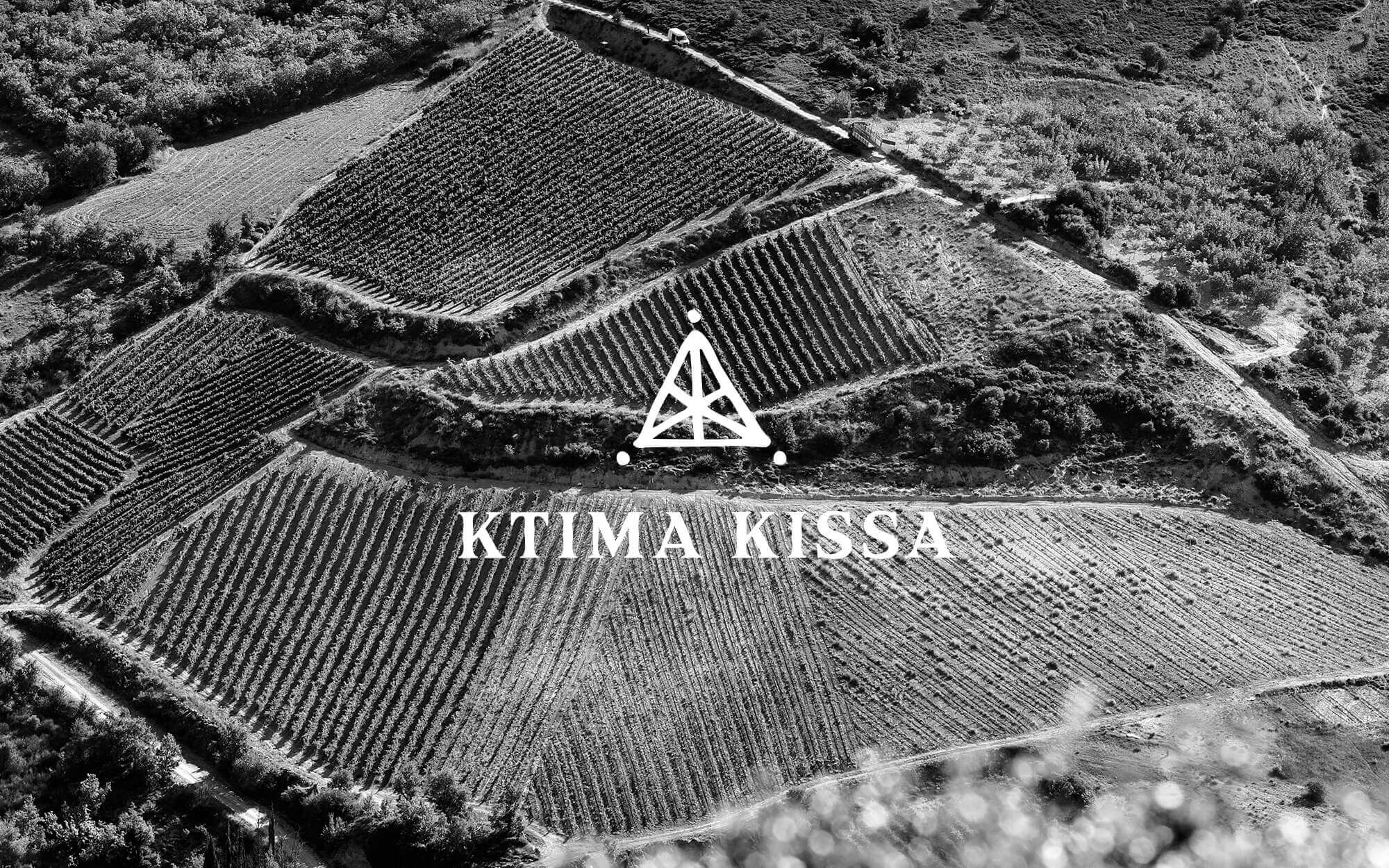
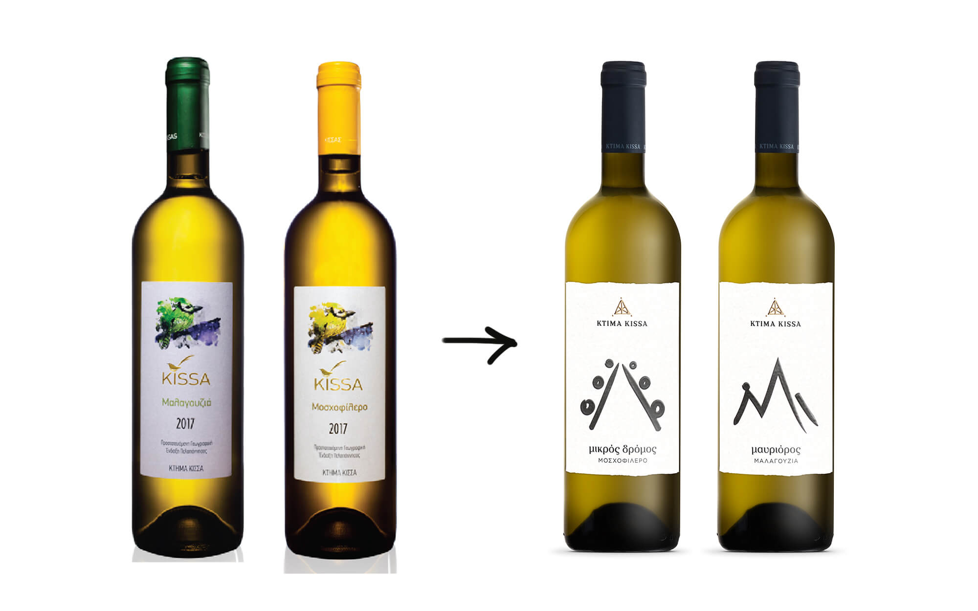
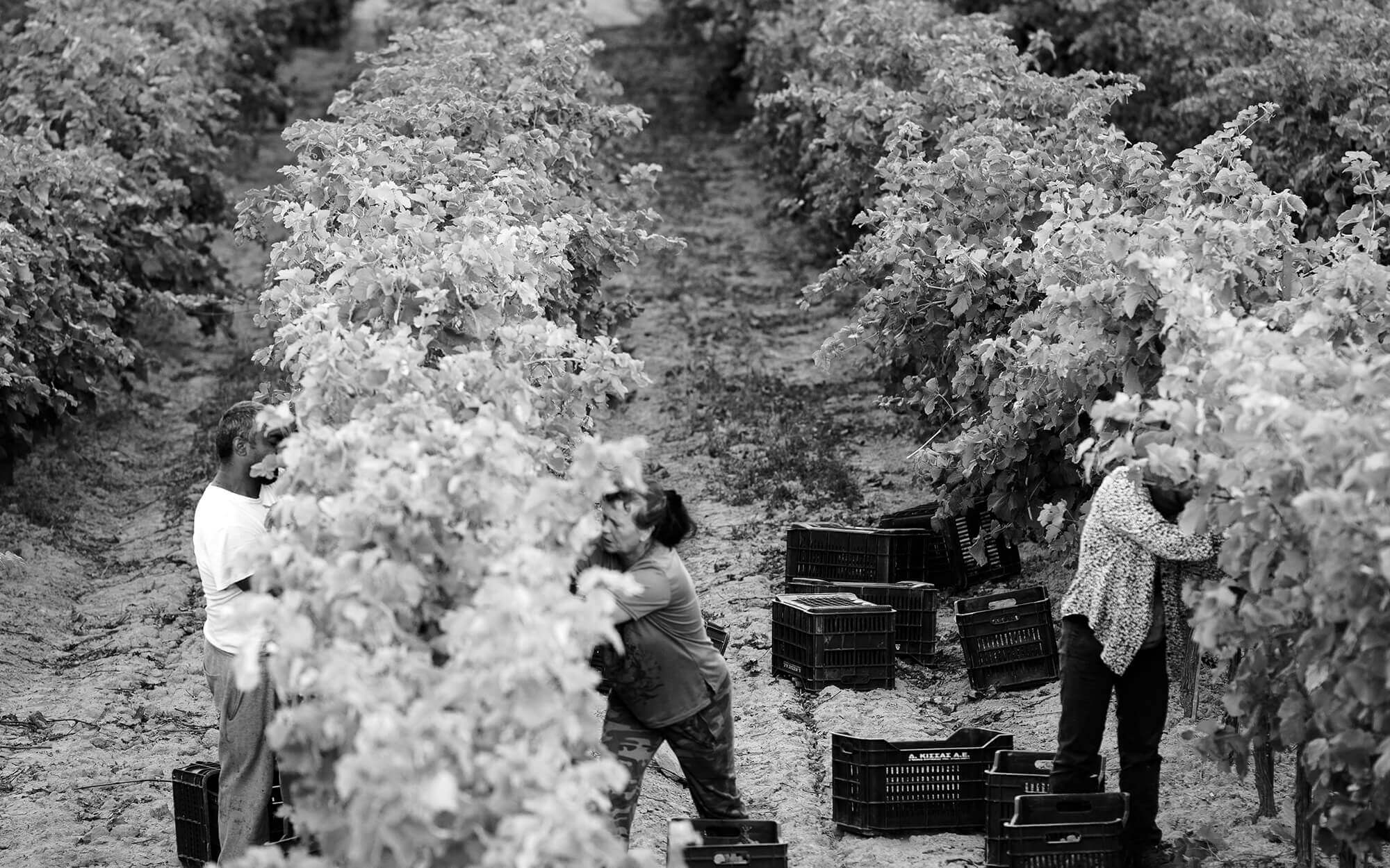
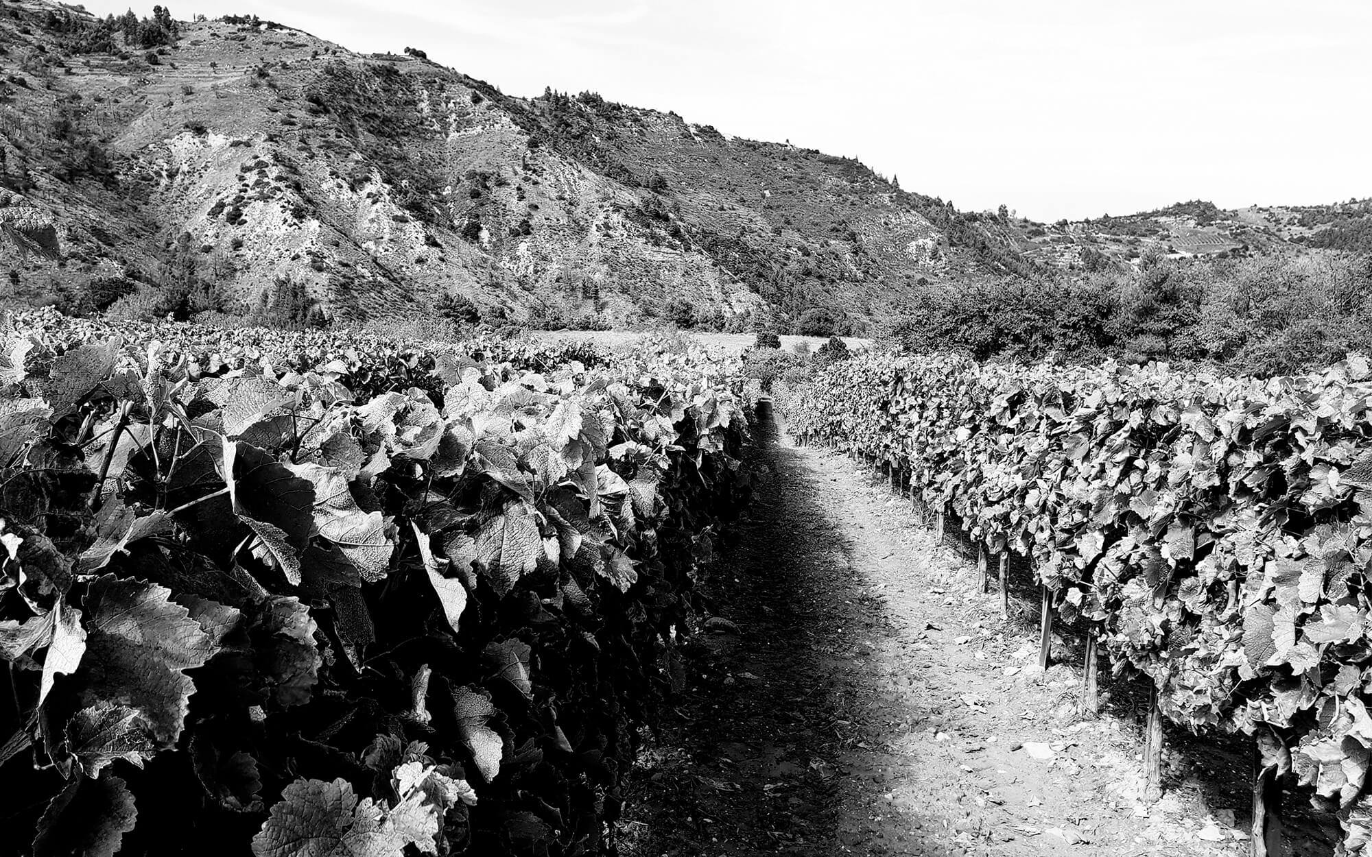
BRIEF: The amazing growth of Greek wine opened up new opportunities – but also intensified competition. This has led many producers to approach their identity and branding with a renewed interest and excitement. Kissas, a winemaking family based in Corinth is one of them. They are the carriers of a deeply rooted tradition that started with small steps back in 1949, and today is in its third generation. Their story and creations are inexorably linked to the history-rich mountains of Corinth in Peloponnese, where many ancient legends can be traced down. Their vineyards are perched at an altitude of up to 900 meters and benefit from the unique local mountain terroir and the gentle, mild breeze that blows from the Corinthian Gulf. Ideal local conditions combined with the family’s knowledge and passion, bring to life wines bristling with character and individuality, each with a special story to share. The rebranding initiative that we were entrusted with had some solid bases to build upon. What was needed from our part was to bring it all together in a way that worked.
TARGET GROUP: Wine-lovers in Greece and export markets, with a certain level of prior exposure to what’s available and an eye for wines that come along with a story.
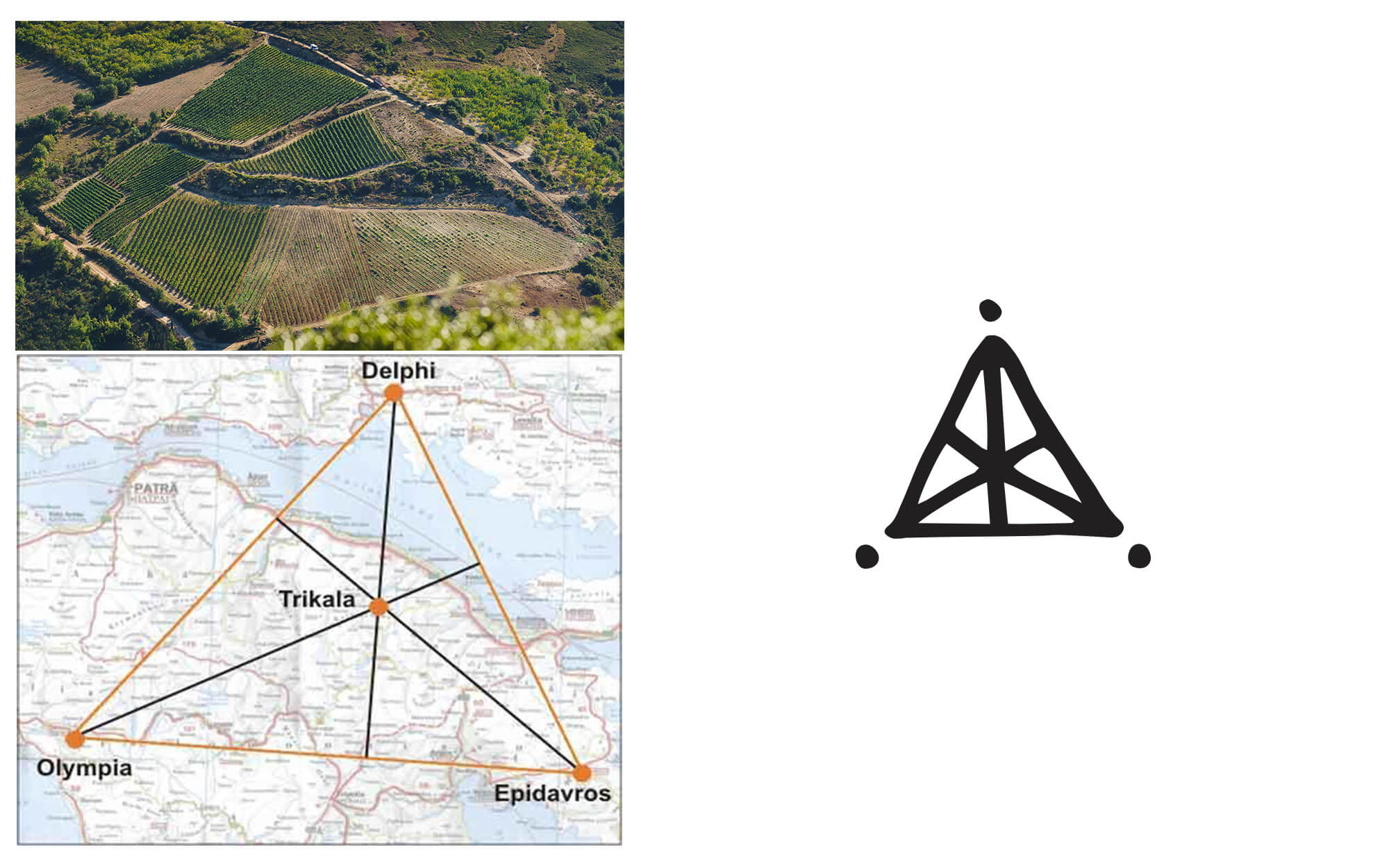
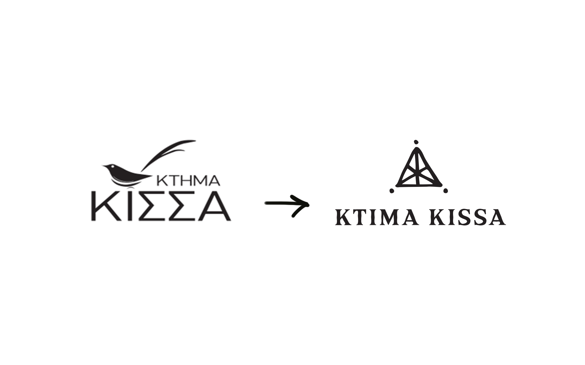
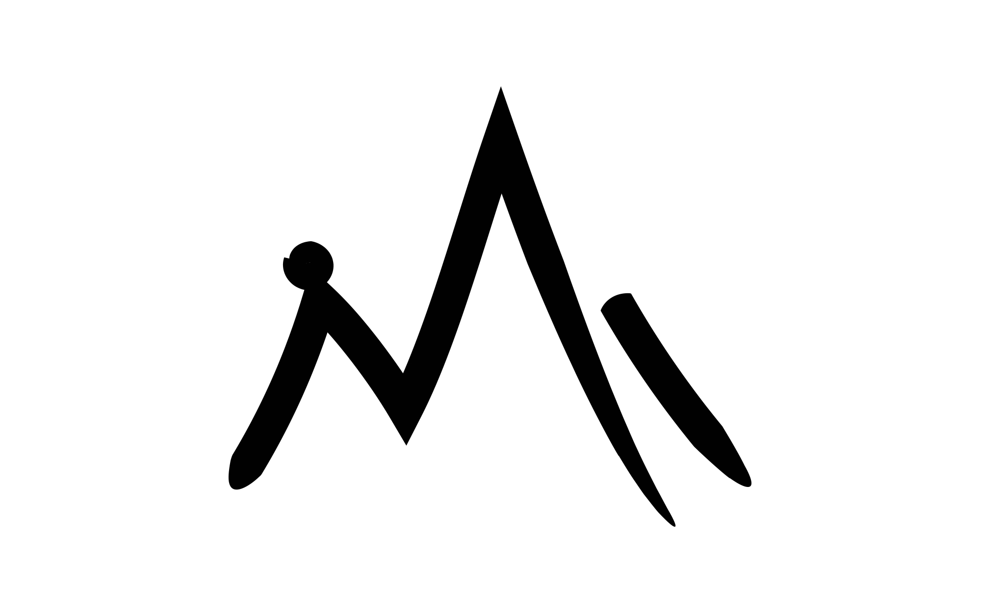
CONCEPT: The legendary load of the place has led the way in terms of inspiration. Delphi, Olympia and Epidaurus, three of the most sacred locations of Ancient Greece, if connected on the map create the shape of an equilateral triangle. At the center of this triangle stands the local village of Trikala – a name that loosely stands for ‘three virtues’. The energy emanating from these connections was too strong to be ignored. We envisaged an identity heavy with symbolism and full of primal power, but without any tired references to ancient Greece.
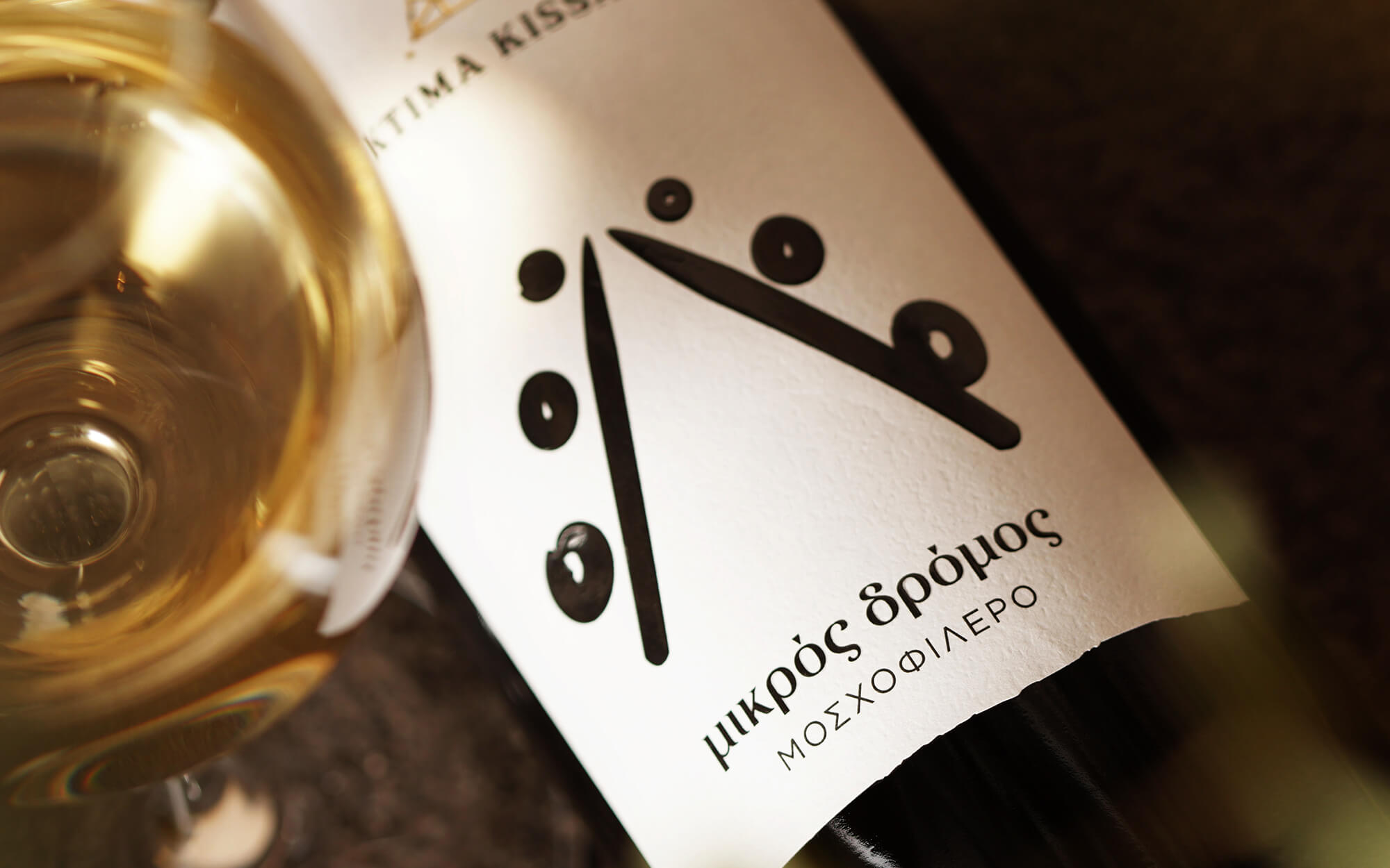
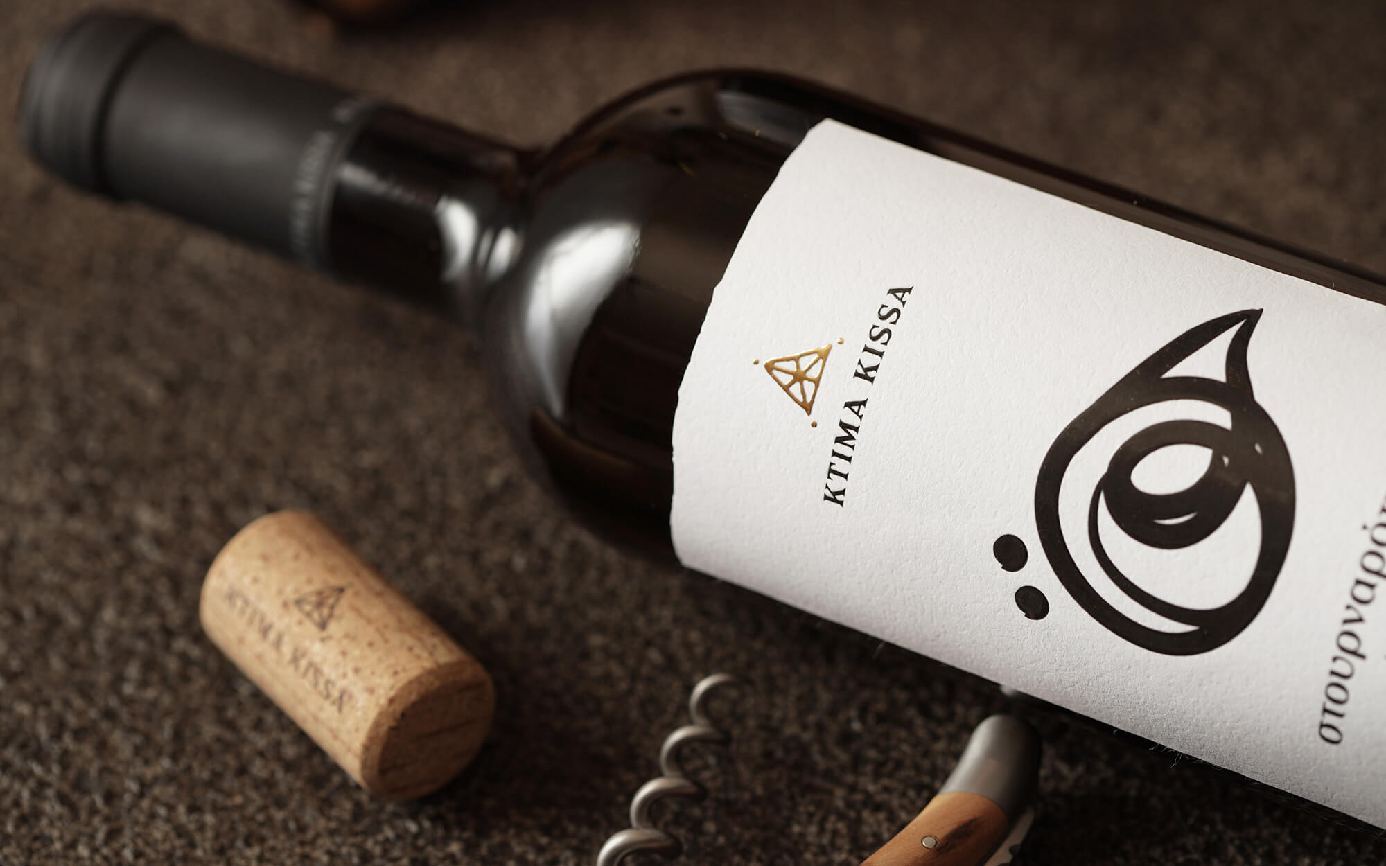
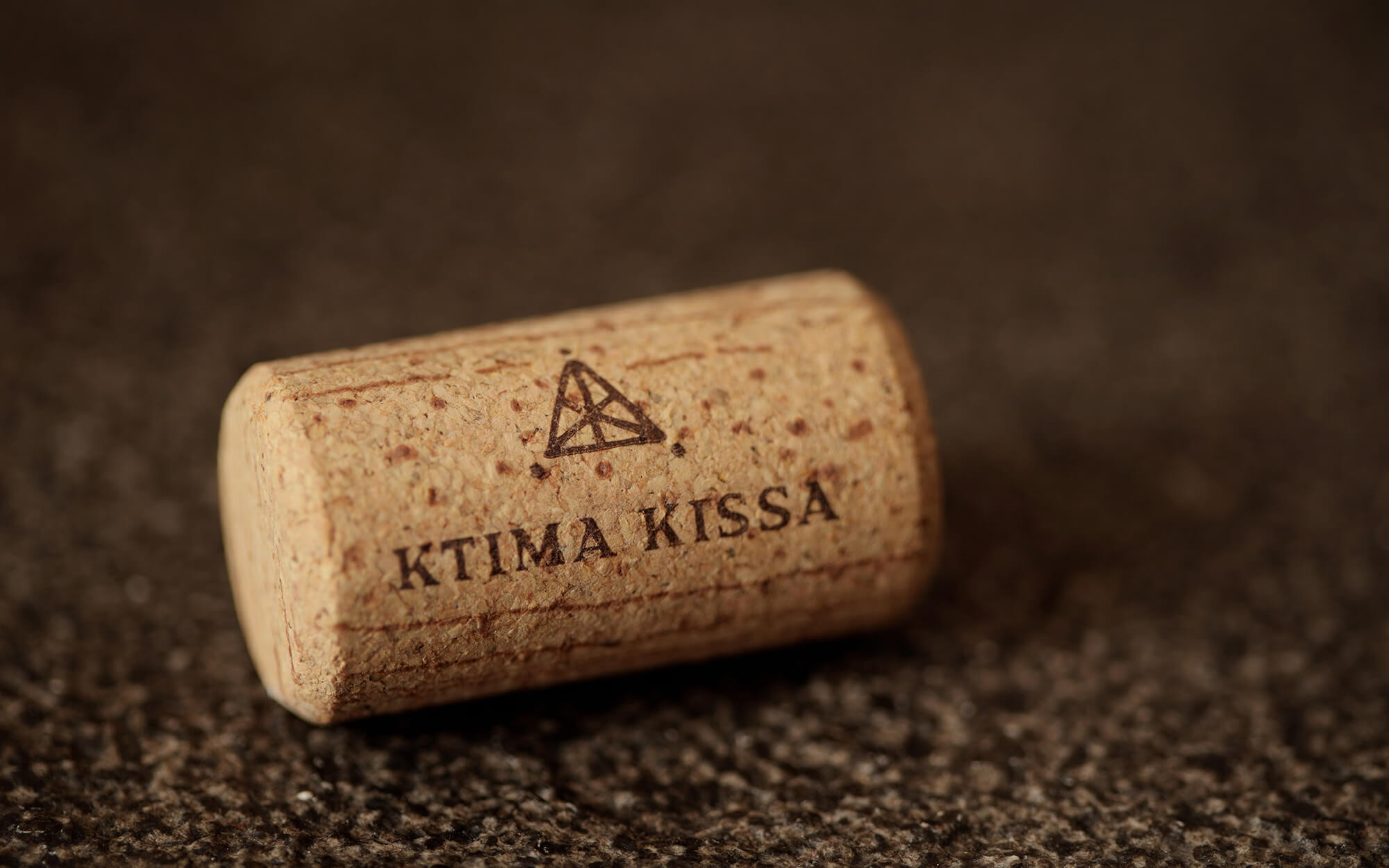
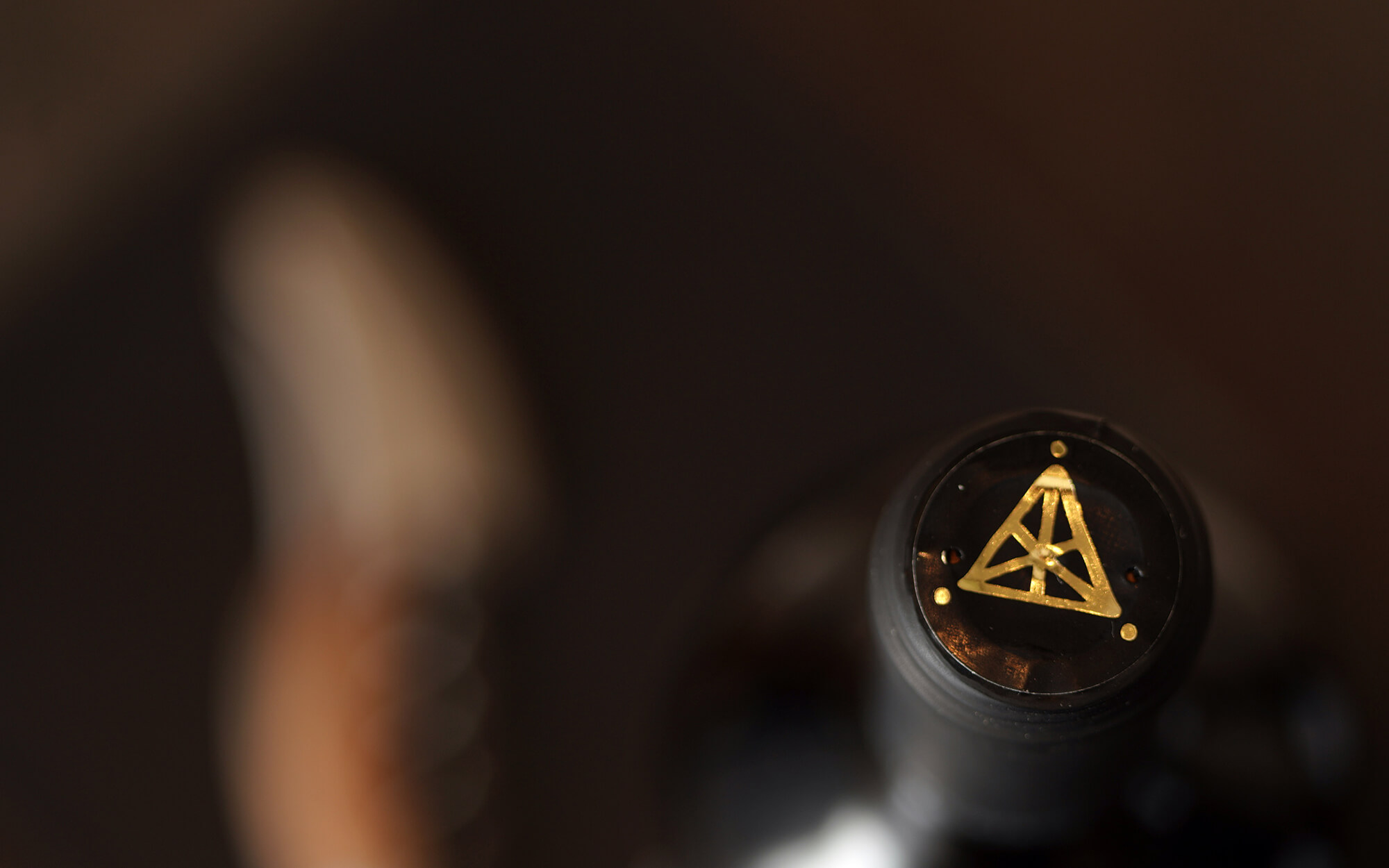
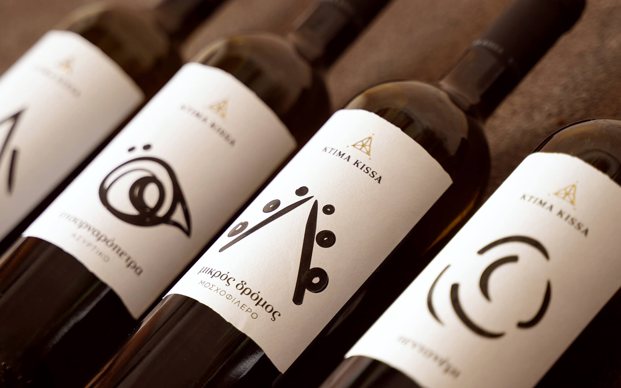
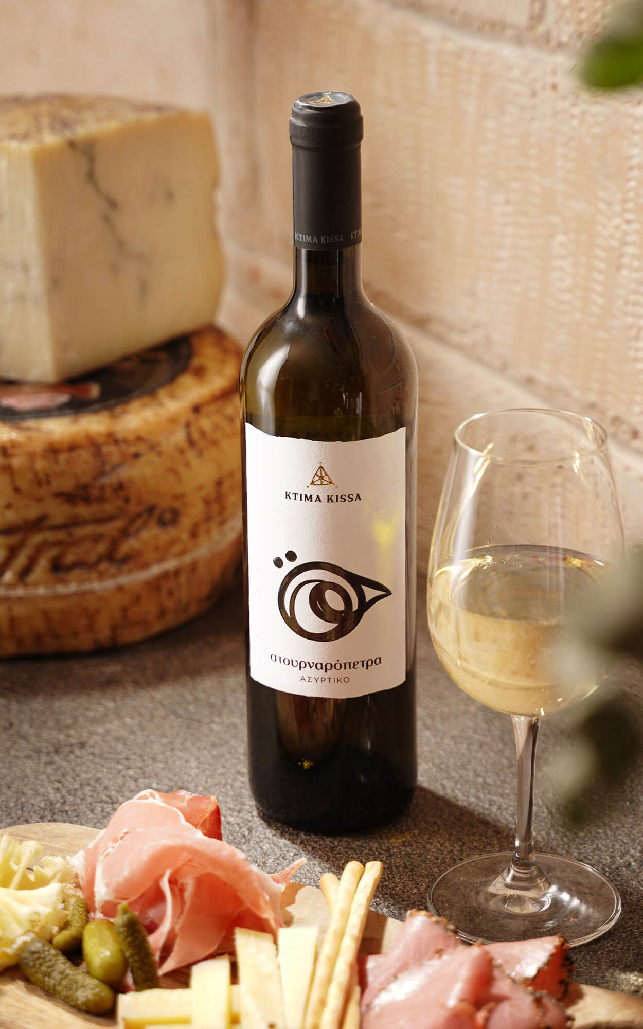
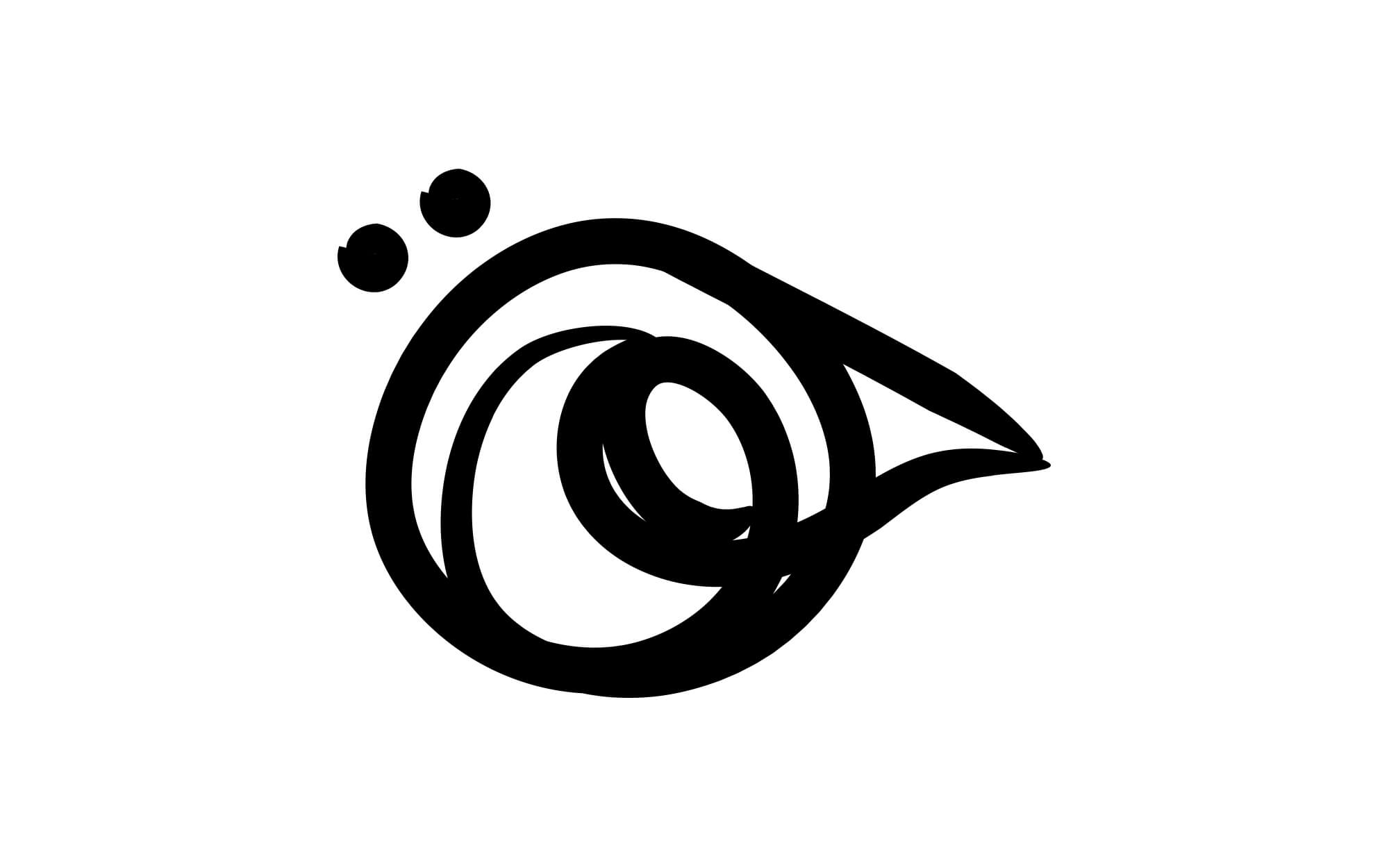
DESIGN APPROACH: The main logo is constituted by a hand-drawn triangle, with 3 dots at each corner suggesting the 3 mythical points of reference. The triangle contains some clearly defined lines, that can be perceived as 2 Ks united (the initial of the Brand), or plough lines that delineate the vineyards. This raw, primal design logic is carried over to the distinct visual language of the 4 wine labels available (Mikros Dromos, Mavrioros, Pentanemi, and Stournaropetra). Each label comes with its own interpretation of the main identity, with added references to distinct natural elements that spring from the very name of each label.


CREDIT
- Agency/Creative: Sophia Georogopoulou | Design
- Article Title: The Energy of The Land Inspiring a Powerful Rebranding
- Organisation/Entity: Freelance, Published Commercial Design
- Project Type: Packaging
- Agency/Creative Country: Greece
- Market Region: Europe
- Project Deliverables: Brand Creation, Brand Identity, Brand Redesign, Brand World, Branding, Graphic Design, Illustration, Packaging Design, Photography, Product Naming, Rebranding
- Format: Bottle
- Substrate: Glass Bottle


