


BrandMe were given the juicy challenge to refresh the iconic Terry’s Chocolate Orange design. The brief was to modernise and rejuvenate the brand, reminding consumers of Terry’s celebratory spirit all year round.
The new gift-worthy design reignites people’s love for Terry’s Chocolate Orange, not just as a seasonal icon, but also as a sparkling staple within year-round occasions.
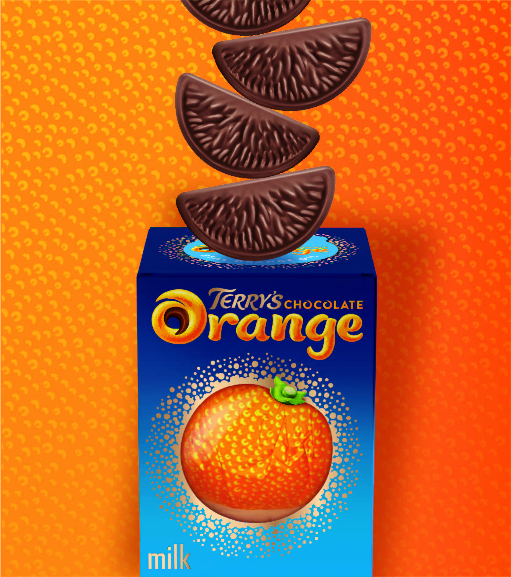
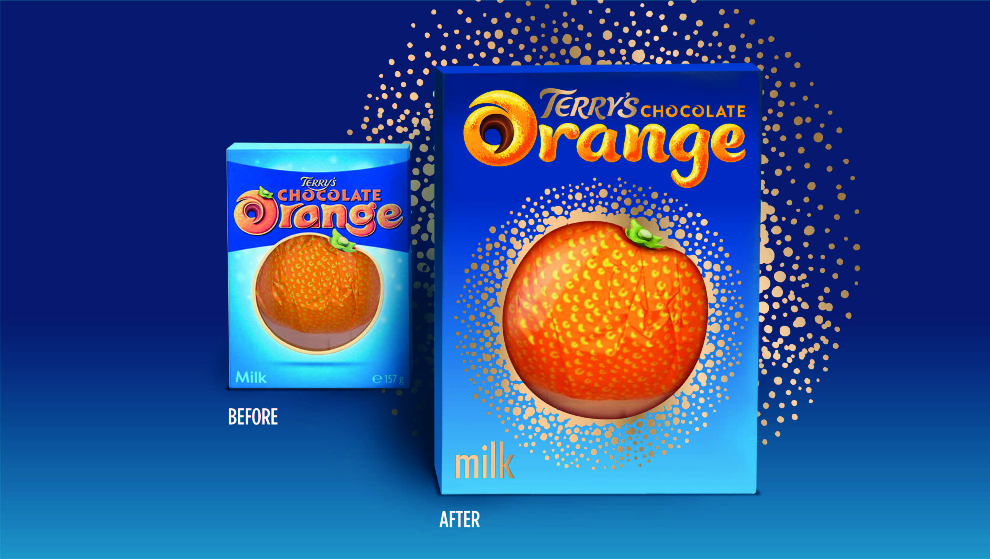
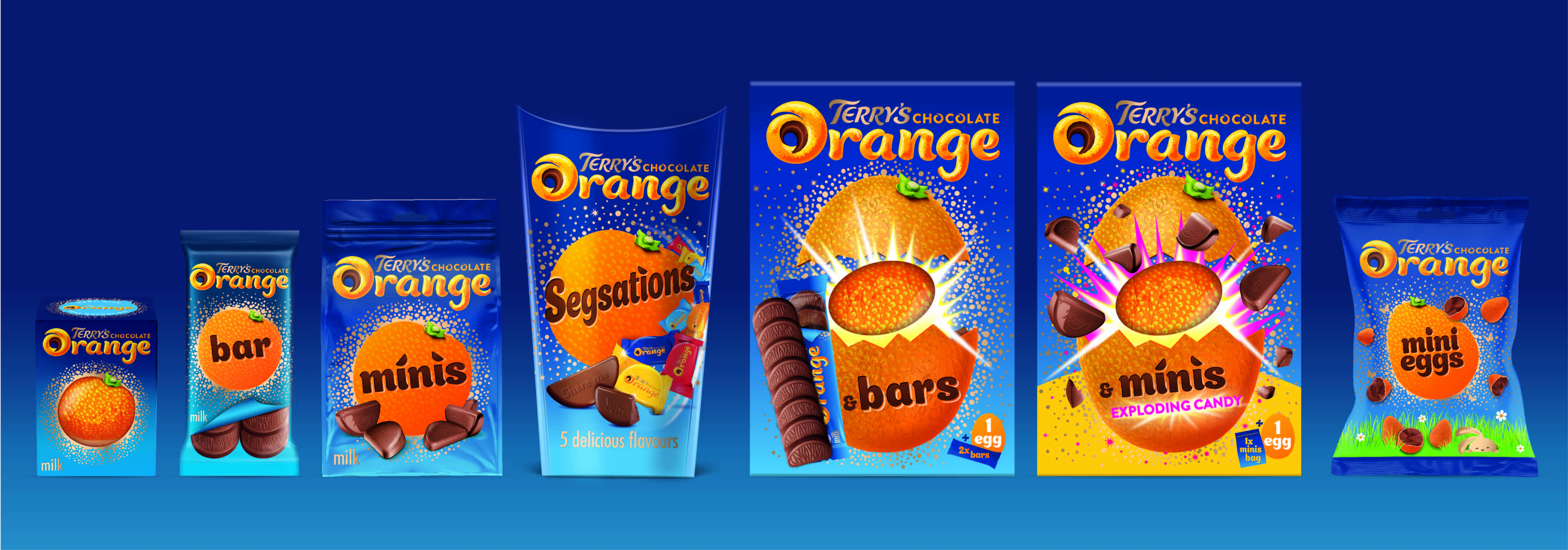
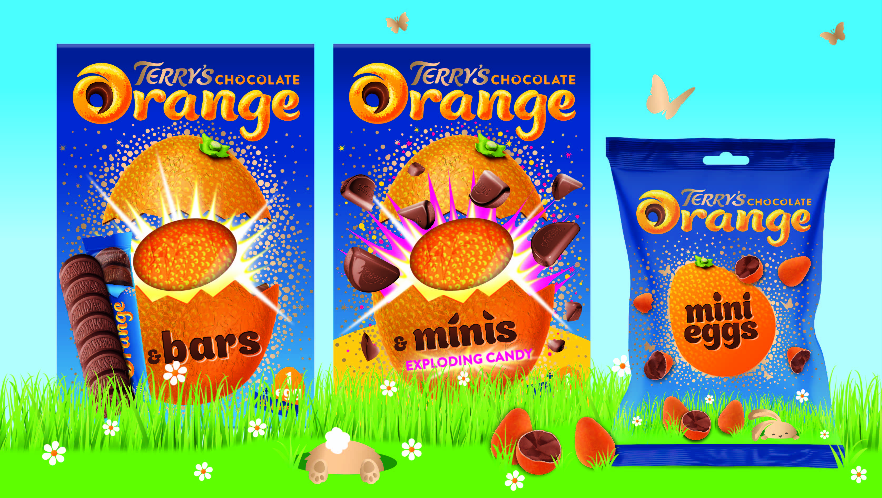
BrandMe simplified the brand identity and the pack hierarchy, placing more emphasis on the Terry’s brand name. BrandMe also created greater synergy between all formats across the range and shone a spotlight on Terry’s most ownable equity, the iconic chocolate orange ball. The golden sparkle emanating out of the window complements the unique format and becomes a focal point of the new look and feel. BrandMe kept the brand’s playful heritage and emotional connection with consumers at the heart of the design, creating a fun and quirky tone of voice on all sides of the pack, to bring to life the personality of this family favourite.
Charlotte Elder, Associate Design Director at BrandMe, says: “When you refresh such an iconic brand, respecting its heritage and the special place it holds in peoples’ hearts is vital. Terry’s Chocolate Orange brings back memories of special moments, and working with the existing colour palette ensures continuity and brand recognition, whilst introducing richer blues and gold elements helps to refresh the design. We ensured that the essence of this truly original brand was retained throughout.”
Laure Gentil, Senior Brand Manager at Terry’s, says: “This new pack design really dials up gift-worthiness and modernizes the brand whilst still remaining true to its heritage. We know from research that consumers really like our refreshed Terry’s Chocolate Orange packs and that this new packaging will drive further interest in the range.”
CREDIT
- Agency/Creative: BrandMe
- Article Title: Terry’s New Look Unwrapped!
- Organisation/Entity: Agency, Published Commercial Design
- Project Type: Packaging
- Agency/Creative Country: United Kingdom
- Market Region: Global
- Project Deliverables: Brand Architecture, Brand Identity, Brand Redesign, Brand Strategy, Branding, Packaging Design, Research, Structural Design
- Format: Box, Wrap
- Substrate: Pulp Carton, Pulp Paper


