


” How we brought Highland Spring’s story of provenance and purity to life…
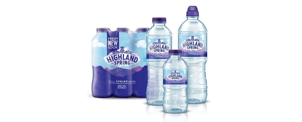
With the bottled water market growing year on year, this titan of Scottish brands was in need of a refresh to remain buoyant in an increasingly competitive category. We were called in to develop a timeless new look and feel that would transform Highland Spring into a Modern Scottish Classic.
Tasked with revolutionising both the visual identity system and 3D bottle structure, we teamed up with friends and structural design wizards, Touch to create an integrated pack design as pure and natural as Highland Spring water itself.
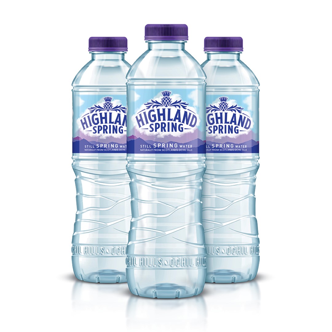
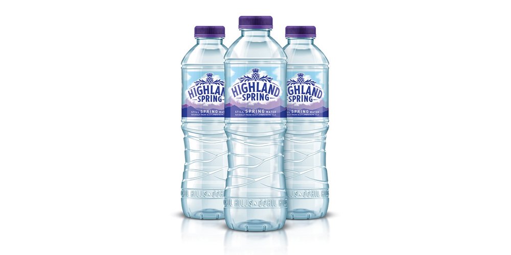
For a water famously sourced from its own special corner of Scotland, we turned to the dramatic landscape of the Ochil Hills as the perfect backdrop to balance the brand’s Perthshire provenance with modern simplicity. Featuring a 3D-effect logo that aligns this organic landscape with the elements that shape it, a groundbreaking transparent label elevates Highland Spring’s brand mark to the heavens and enriches its proud thistle crest with a modern edge.
The brandmark has also been simplified to increase standout and help Highland Spring cut through in a bolder way. As well as recrafting the type to create a clean, consistent type style, we’ve enlarged and redesigned the thistle crest so that it now sits, pride of place, as an integrated part of the Highland Spring brandmark.
Of course, Highland Spring wouldn’t be Highland Spring without its iconic purple colour. Inspired by Scotland’s finest heather, the new pack designs champion rich purple hues, which not only elevate a key brand equity but help Highland Spring sing from the shelves.
Beneath the label, a new bottle structure physically captures the strong and dynamic landscape of the Ochil Hills whilst also giving the bottle a stronger structural integrity. Highland Spring’s privately owned catchment area is also celebrated with 3D embossing around the base of the bottle, which proudly calls it out for all to see.
With Highland Spring set to nearly double production capacity by the end of this year, this Scottish heavyweight finally has a look befitting of its immense status and ambition. Iconic and crisp, contemporary but classic, the new designs are just what the doctor ordered, promising to connect consumers to Highland Spring’s powerful provenance for years to come.”
CREDIT
- Agency/Creative: Taxi Studio
- Article Title: Taxi Studio – Highland Spring Refresh
- Project Type: Packaging
- Format: Bottle
- Substrate: Plastic


