


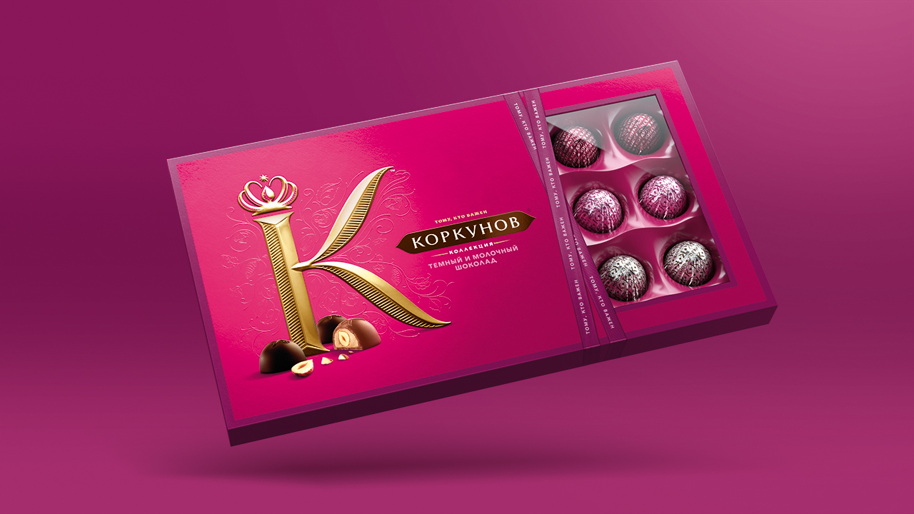
Quality always starts with a K. In its 20 years of existence, Korkunov has defined the standards in chocolate gifting, and its pralines have become synonymous with the feeling of ‘you mean something to me’. But in recent times, the category has evolved – and definitions of luxury and premium have also changed.
Faced with the commercial challenge of 70% of sales coming from formal seasonal gifting, we needed to help shift the perception from being the go-to gifting product of choice to Russia’s leading chocolate brand. In doing so broadening the occasion for the brand and providing the platform to set the standards for Russian Chocolate for the next 20 years.
To achieve this, Korkunov needed to address their perception, to not only ensure they realigned with these new definitions but also to shift its attention from its eponymous founder. And for a brand that was only two decades old, it had acquired an unnecessarily old-fashioned image it needed to shake.
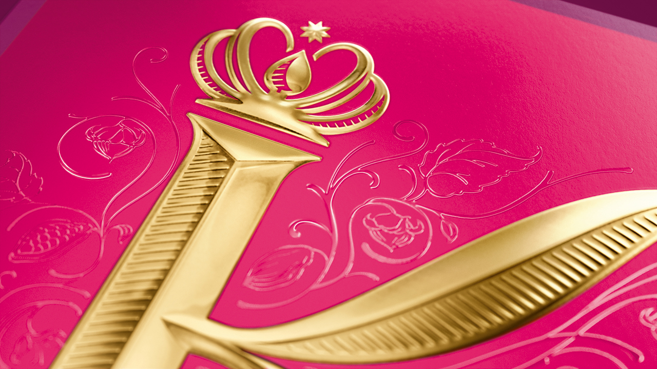
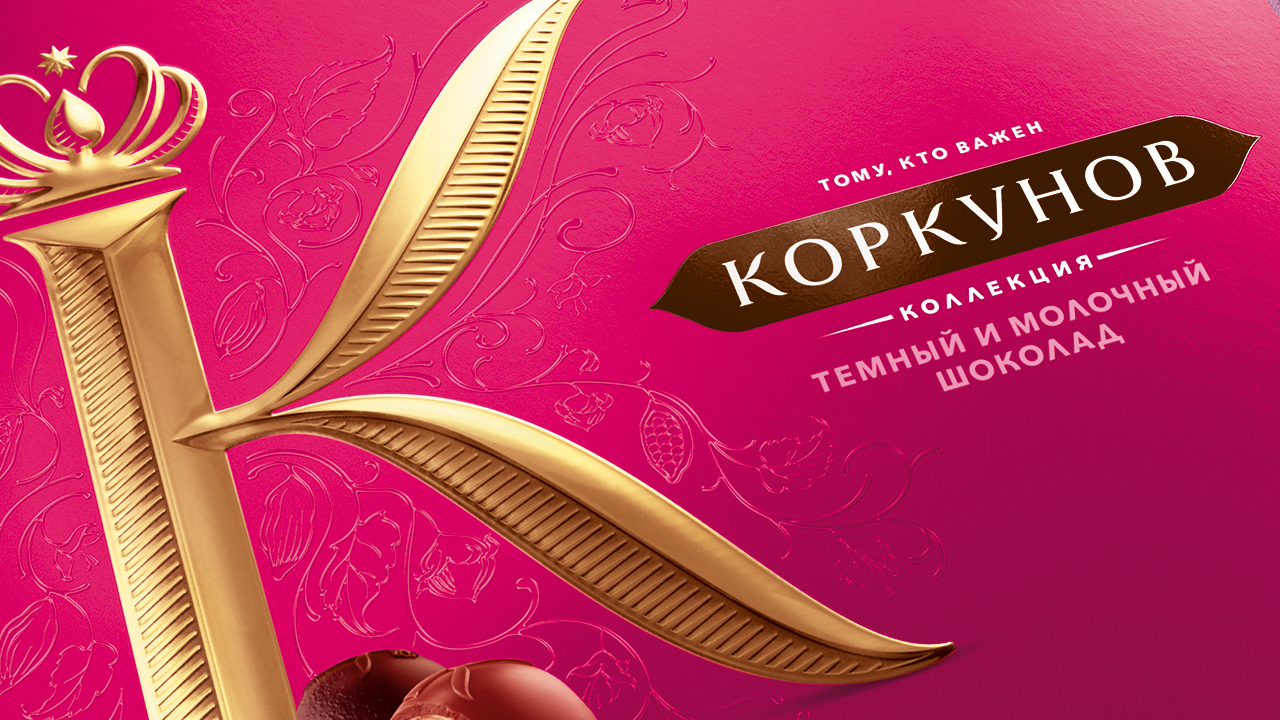
By carefully crafting, refining and underlining the core property of the brand, not only was a more contemporary visual identity of the brand developed, but a renewed sense of quality was injected. Serendipitously, both the Russian word for quality – kachestvennyy – and the brand name itself begin with the same letter. This permitted parallels to be drawn with the brand expression – ‘quality always starts with a K’.
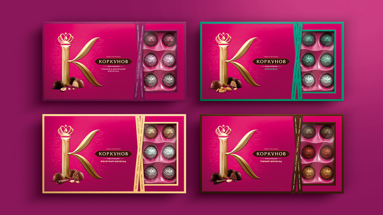
The new focus was firmly on the multitudes of future consumers, driving radical reappraisal and injecting an increased sense of premiumisation into every brand encounter. And the new brand expression has been developed to successfully accommodate the growing portfolio of Korkunov products and driving greater integration and brand presence across a range of retail environments.
CREDIT
- Agency/Creative: Taxi Studio
- Article Title: Taxi Studio Helps Korkunov Redefine Russian Gifting
- Organisation/Entity: Agency, Published Commercial Design
- Project Type: Packaging
- Agency/Creative Country: United Kingdom
- Market Region: Europe
- Project Deliverables: Brand Architecture, Brand Identity, Brand Redesign, Brand Refinement, Brand Rejuvenation, Brand Strategy, Brand World, Branding, Identity System, Packaging Design, Product Architecture, Research, Retail Brand Design, Structural Design, Tone of Voice
- Format: Box, Sleeve, Tray
- Substrate: Pulp Carton


