


Hearted Design & Strategy – Grano Artisan Breads
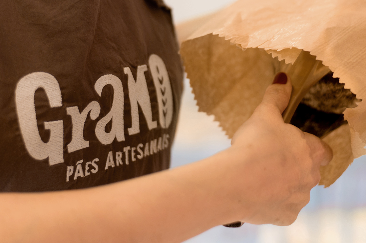
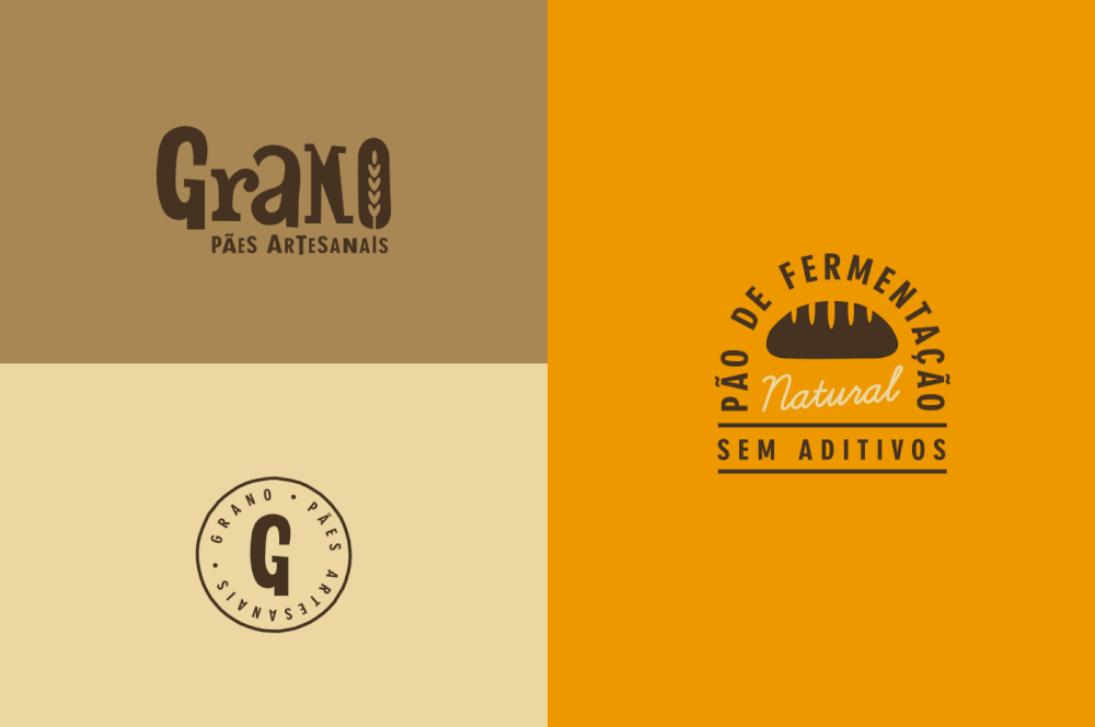
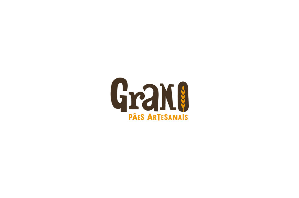
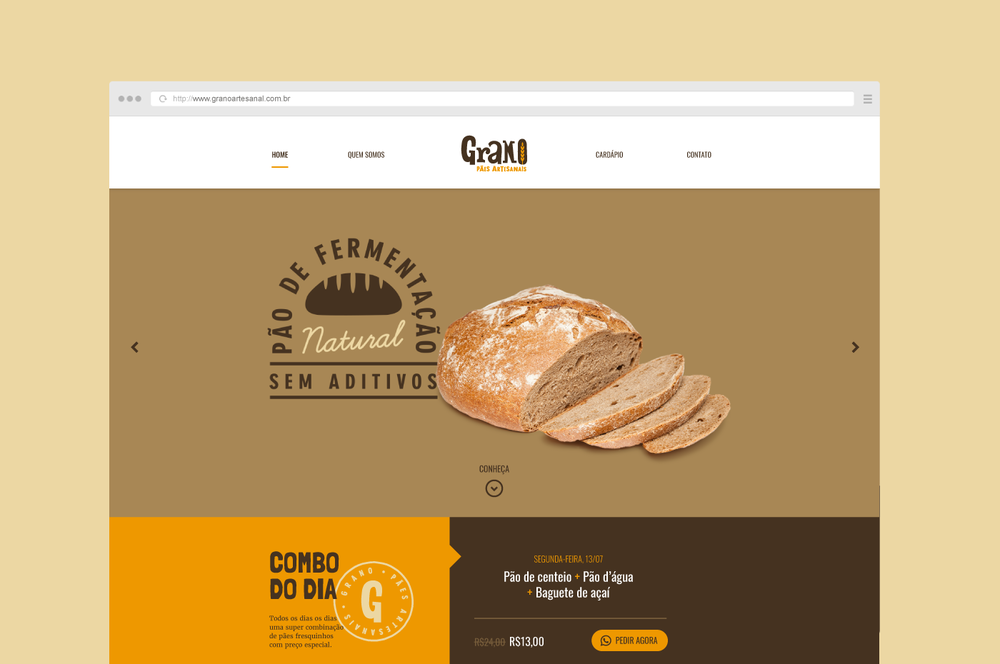
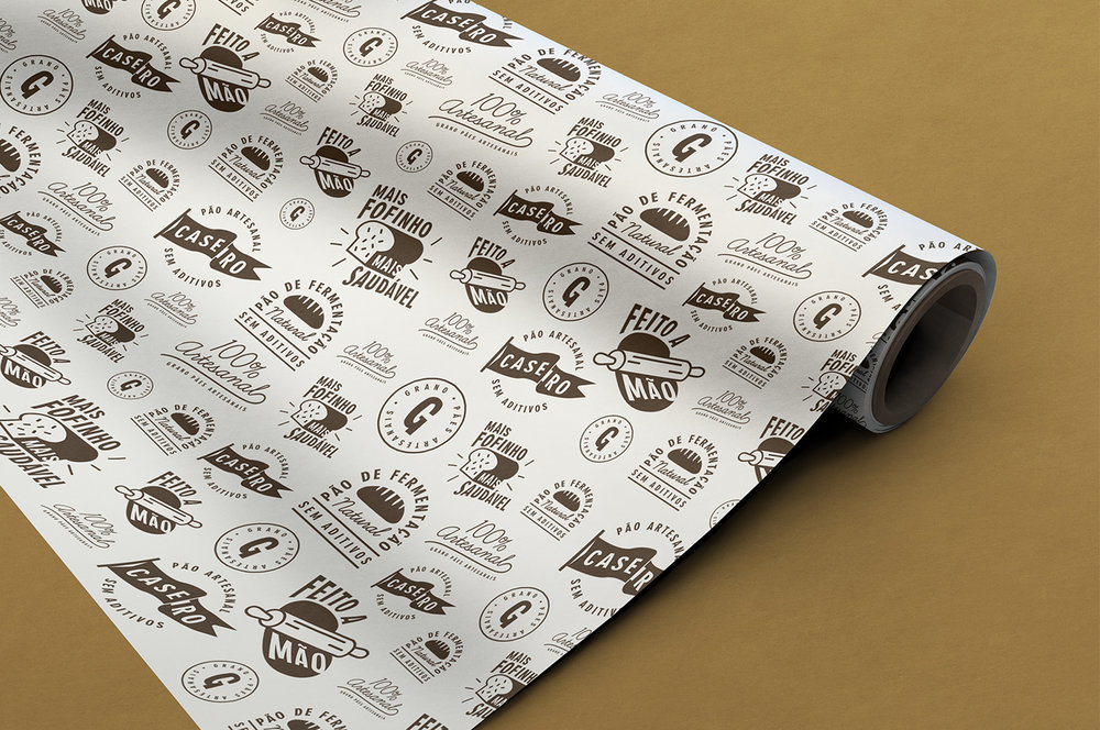
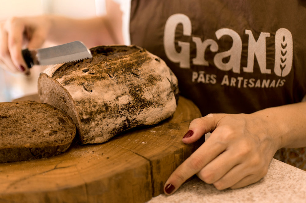
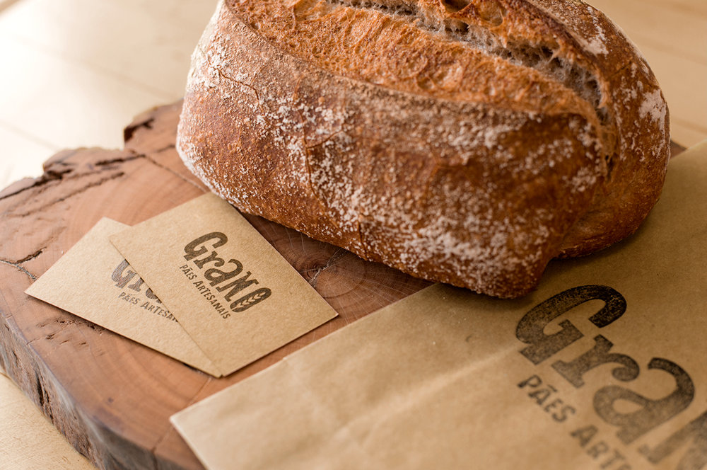
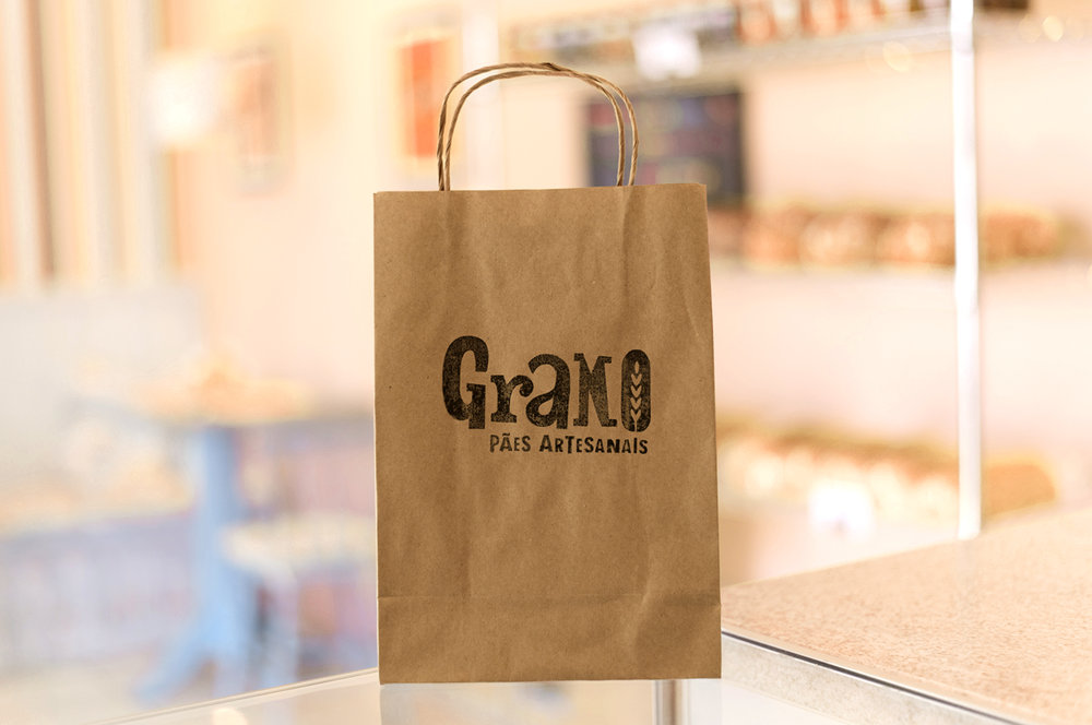
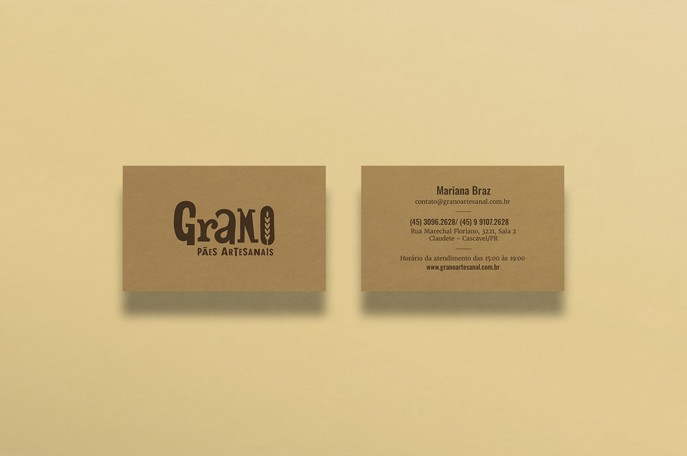
Grano Artisan Breads is the first artisan bakery in Cascavel, Brazil. Working with natural fermentation breads the bakery needed a visual identity that convey the essence of the brand, presenting their products as healthier and tastier than industrialized breads. The logo was created with personalized letters inspired by the old wood types, with organic and imperfect trace, highlighting the rusticity of the product. The branch of wheat in the letter “O” refers to the name Grano, which means wheat in Italian. Since these were new products in the local market, there was a need to present its benefits to a public still unfamiliar with natural fermentation breads. With that in mind, custom stamps have been created that visually resume the key attributes of the product. The color palette is made by shades of brown and orange, present both in the product itself and in its kraft paper packaging.

CREDIT
- Agency/Creative: Hearted Design & Strategy
- Article Title: Tasty Visual Identity for the Artisan Breads Brand “Grano”
- Project Type: Packaging
- Agency/Creative Country: Brazil
- Market Region: South America
- Industry: Food/Beverage


