


Like most successful start-ups, Sydney Brewery’s year on year growth saw them expand at a huge rate since opening the doors in 2012. Unfortunately – such rapid growth generally comes with its complications.
Sydney Brewery went to brand consultants Boldinc with the challenge of re-booting their brand, defining their position in the market and at the same time, figuring out how to manage 2 different brewery sites (one not even in Sydney), an out-of-control product range where beers and ciders overlapped and polarising packaging that wasn’t relevant to anyone outside Sydney’s Eastern suburbs.
It was already clear that the existing branding was too Sydney-centric, alienating drinkers that weren’t in on the Sydney references. They ultimately wanted a brand everyone can enjoy and relate to, whether in greater New South Wales, a Queensland pub, or a Melbourne laneway burger joint. No easy task when “Sydney” is half of your brand name!
In this instance Boldinc drew inspiration from the truth that drives most craft brewing: our place & our people. Founded in a 100 year old brewpub in the heart of Surry hills, a vibrant melting pot on the fringe of the Sydney CBD. Equally eclectic and unexpected is the diverse team behind Sydney brewery. People from all walks of life coming together with one vision – to make exceptional beer for all kinds of people.
By designing to Sydney Brewery’s truth and not passing category trends, Boldinc were able to create a unique creative positioning that can stand the test of time. Driven by their eclectic home, bold independence and welcoming nature – Sydney Brewery is all kinds of different.
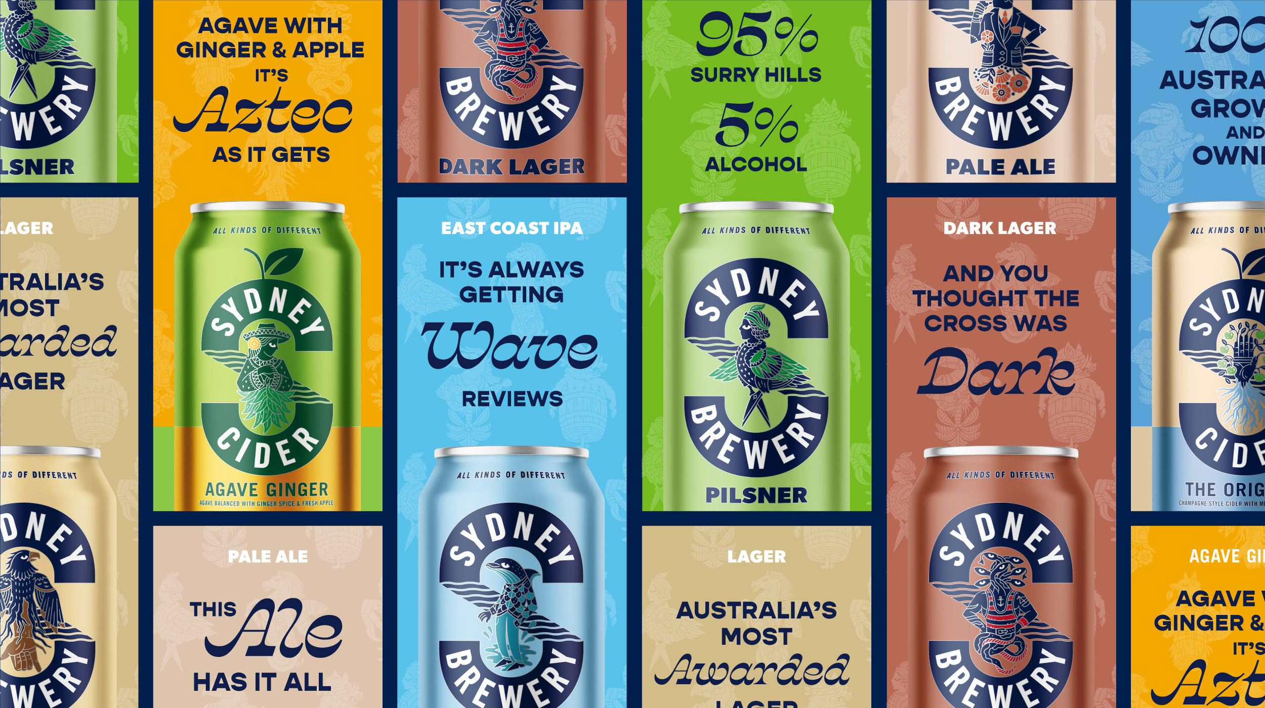
Bringing character to Sydney, where each beer has its own unique story to tell. Everyone’s got a story to tell. It’s not always turned up to 11, but it can be if that’s your thing.
“As independent brewers, the second biggest asset these guys have (behind awesome beer) is the stories their beers can tell, and we’re proud to help them tell those stories through this redesign.” Says Steve Smith, Boldinc creative director. “We really wanted to build a brand that captured the down to earth, the quirky, the artistic and the unexpected aspect that is at the heart of Surry Hills, but also sums up the team’s brewing philosophy. We’re pretty happy with the result!”
In a nod to the past, the new identity was formed around the traditional oval shaped label that has adorned many iconic Australian beer brands over the years. Boldinc then gave that a twist into becoming the ’S’ for Sydney with a subtle nod to the Harbour Bridge reflected in the water. Each beer is overlaid with their own Character. Designed to capture the unique story, flavour and experience of each brew, brought to life by contemporary Australian artist Joshua Noom. Sydney Brewery. All kinds of different.

CREDIT
- Agency/Creative: Boldinc Brand Innovation
- Article Title: Sydney Brewery Revamped Identity and Packaging by Boldinc
- Organisation/Entity: Agency, Published Commercial Design
- Project Type: Packaging
- Agency/Creative Country: Australia
- Market Region: Oceania
- Project Deliverables: Brand Architecture, Brand Guidelines, Brand Identity, Brand Naming, Brand Redesign, Brand Refinement, Brand Strategy, Branding, Identity System, Illustration, Packaging Design, Product Architecture, Product Naming, Tone of Voice
- Format: Can
- Substrate: Metal


