


Popular ice cream lolly brand Twister has revealed a new identity, bringing out its intrinsically playful personality. In delivering a credible message of positive nutrition, the updated design aligns with Unliever’s commitment to make and market responsibly to kids.
Independent design agency Sunhouse Creative worked with the Wall’s team at Unilever to re-launch the brand and reflect its repositioning as a permissible treat. With a focus on maximising deliciousness in a wholesome and contemporary way, the updated design needed to appeal to children looking for something fun to eat, parents looking for something guilt-free to give them, and adults looking for a carefree moment out of their frantic grown-up lives.
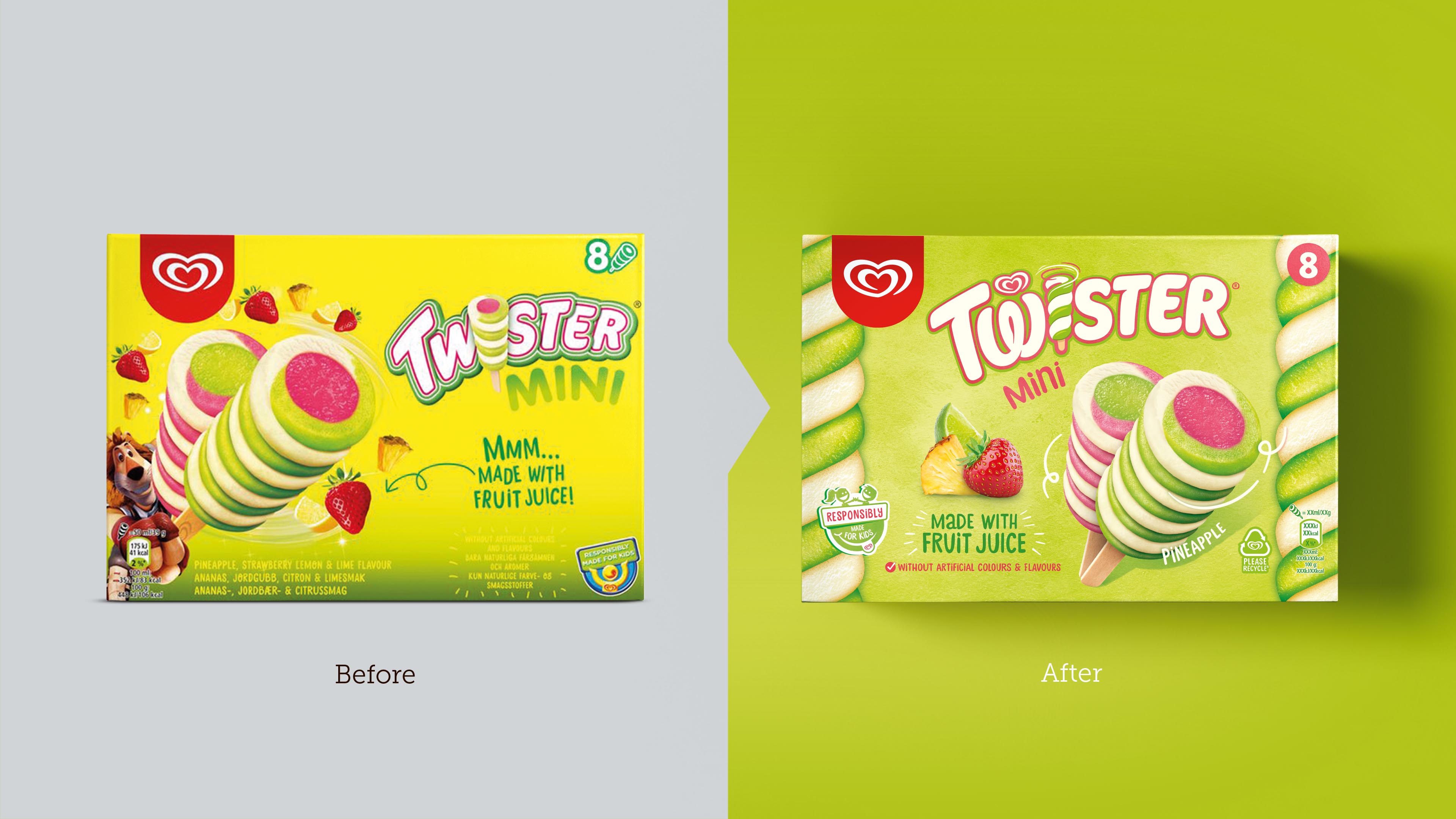
“Walls is a trustworthy brand that consumers have known, loved and relied upon for decades,” comments James Giles, Sunhouse Owner and Creative Director. “While its current global identity system delivers strong brand presence worldwide, it also sacrifices a bit of the individual brand personality. Thus, Twister may be an iconic product, but its brand and packaging were not.”
Bursting with Character
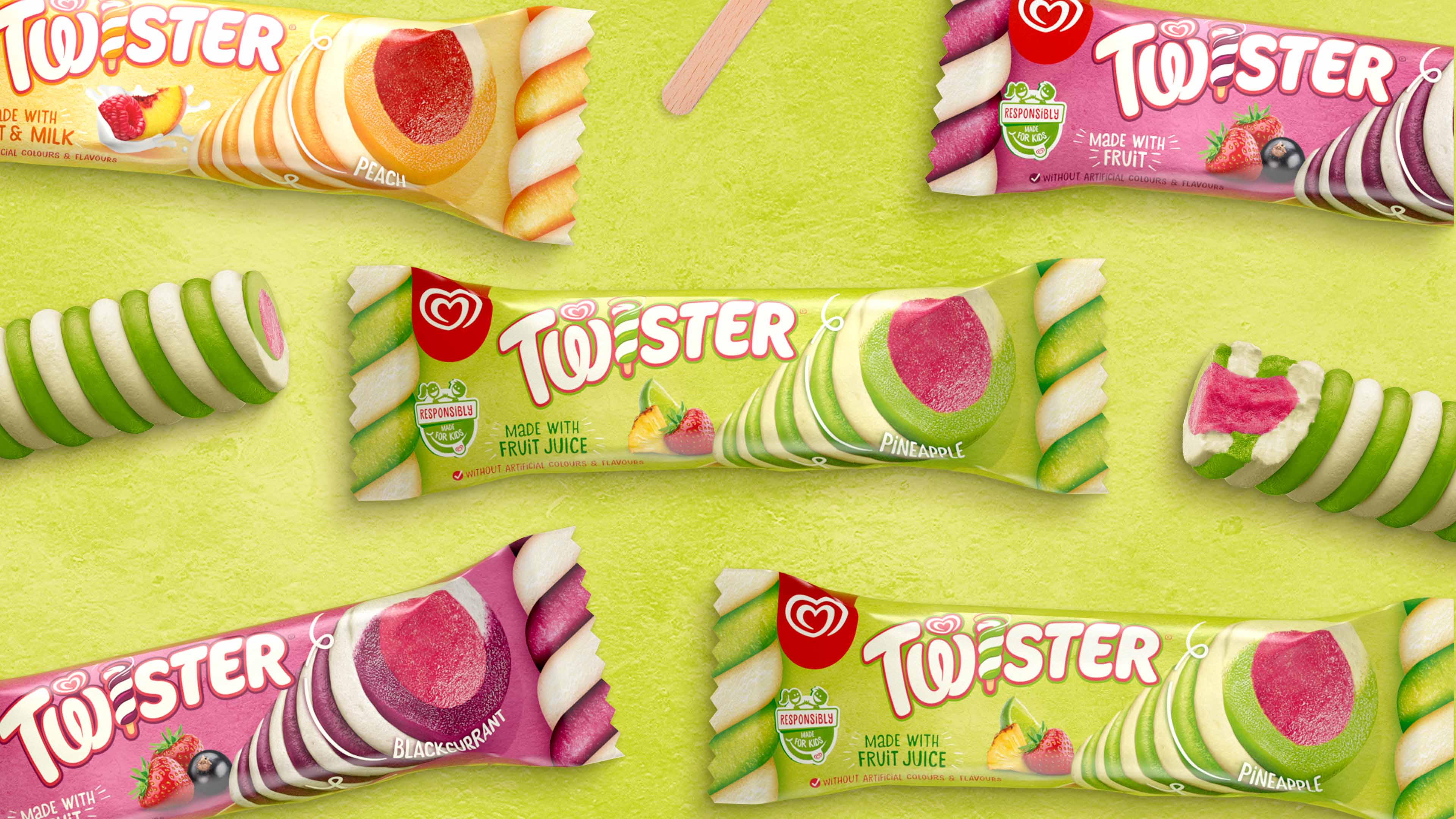
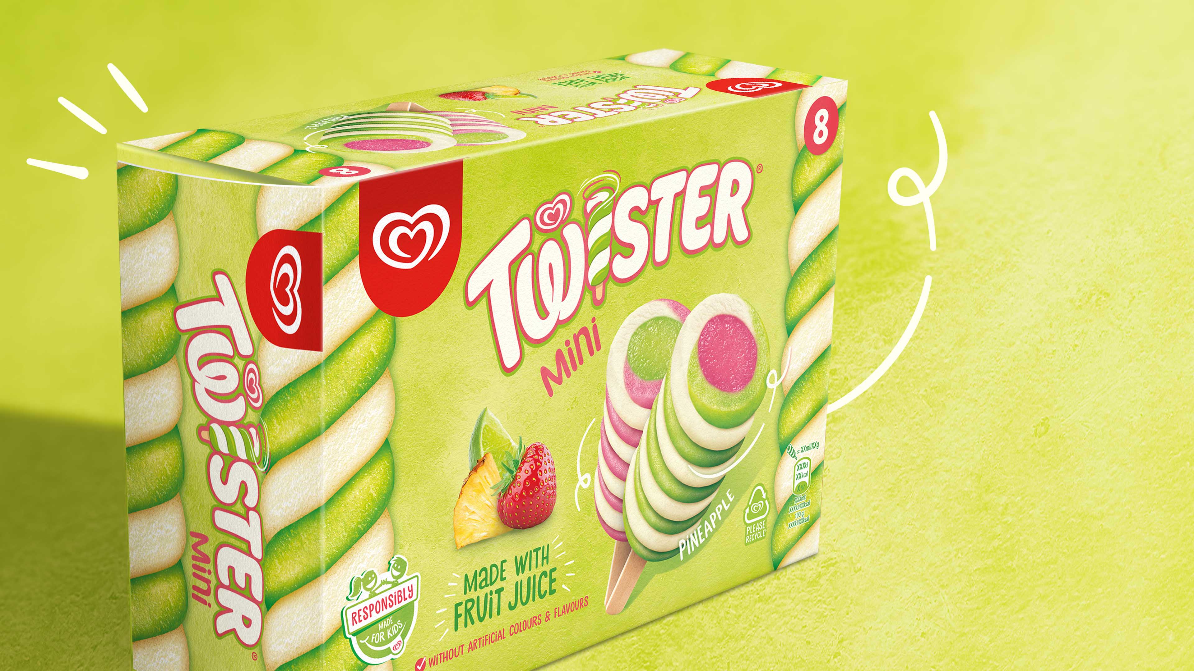
With a bold visual language that champions ‘positive nutrition,’ the new identity reflects Twister’s playful and imaginative character in a way that is still recognisable. The brand marque has been modernised with a smaller and lighter typography created in collaboration with type designer Rob Clarke. Deliciously twisted sidebars not only aid shelf standout and navigation, but also create a stage for the iconic product to shine. Images of real fruit and a more natural textured background drive taste appeal and permissibility at the same time. A new icon has been developed and introduced to the packaging to reinforce the claim that Twister is “Responsibly Made for Kids.”
“Twister has always had a sense of excitement,” comments Giles. “By simplifying the clutter and amplifying core equities, the brand’s playful confidence can shine through in a way that is refreshingly positive and effortless. This powerfully sends the message of positive nutrition without any compromise on Twister’s spirited character.”
“Twister has made a bold step towards transforming the brand so it can fulfil its promise of better ice cream and healthier, happier children,” comments Ian Maskell, VP Global Brand Development at Unilever. “The redesign retains the energy of this cult classic treat with an affectionate familiarity that will resonate with consumers in the UK and beyond.”


CREDIT
- Agency/Creative: Sunhouse Creative
- Article Title: Sunhouse Gives Twister Packaging Design a Positively Different Spin
- Organisation/Entity: Agency, Published Commercial Design
- Project Type: Packaging
- Agency/Creative Country: United Kingdom
- Market Region: Multiple Regions
- Project Deliverables: Brand Identity, Brand Redesign, Brand Strategy, Brand World, Branding, Graphic Design, Packaging Design
- Format: Box
- Substrate: Pulp Carton


