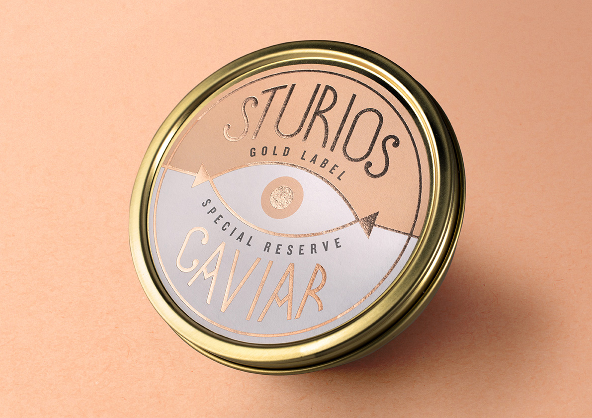
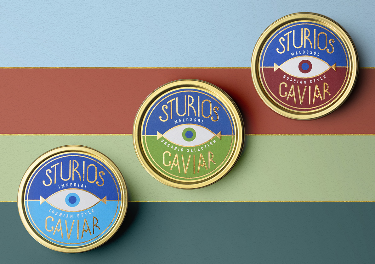
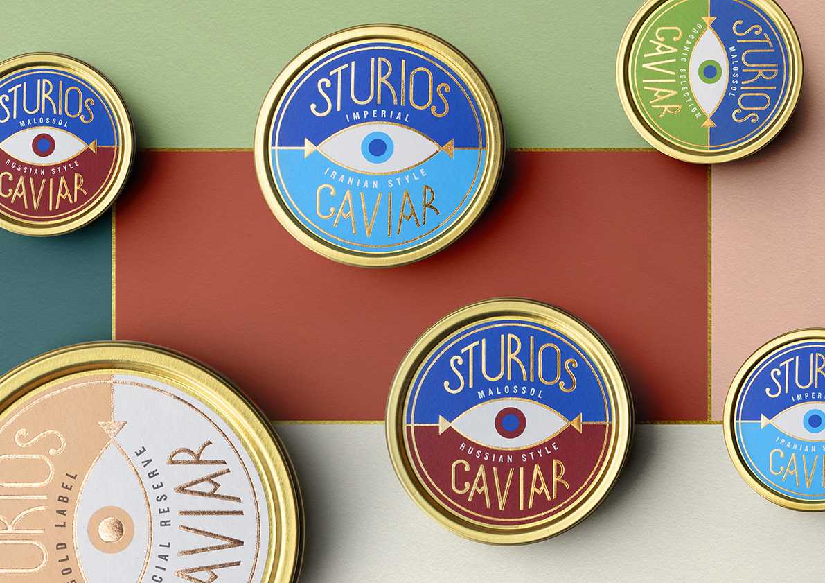
In the world of caviar, exclusiveness and elegance are recognised as paramount. When we began working with Sturios, we set ourselves a clear goal: differentiate the brand from its competitors through a highly unique, authentic and memorable concept. We aimed at going beyond the traditional rules of this segment, so that to present a brand with a different style, conveying the personality of its founder, a bold and visionary entrepreneur.
When designing this brand identity, we drew upon the aesthetic of the roaring 1920s, when caviar became a symbol of status and prestige. Consequently, we created a unique element, with many possible readings, for this brand: a sturgeon, which is the source of this product; an eye, symbolising a company in the pursuit of the best caviar worldwide; and finally, the Nazar, an eye-shaped amulet believed to bring good fortune and luck in many cultures.


CREDIT
- Agency/Creative: lacía Packaging Design
- Article Title: Sturios Brand and Packaging Identity by Lacía
- Organisation/Entity: Agency, Published Commercial Design
- Project Type: Packaging
- Agency/Creative Country: Spain
- Market Region: Global
- Project Deliverables: Brand Architecture, Brand Identity, Packaging Design, Tone of Voice
- Format: Tin
- Substrate: Metal


