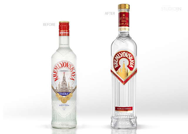
“The STUDIOIN was issued a challenge to increase the premiality and strengthen the international status of vodka «KREMLYOVSKAYA». Previous efforts to reveal a true character of this product, which were taken by some European design studios, have been failed. The designers of STUDIOIN took an approach to solving this task with respect and interest, as it should be when it comes to history.
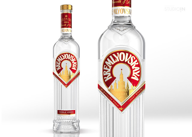
A new design of «KREMLYOVSKAYA» kept the key historical elements of look, such as: architectural component of Soviet time, strict lines and colour palette. Tall and symmetrical bottle, no redundant details – this is a new interpretation of one of the main symbols of Russian statehood.
Having sustained a history vector, we tried to maintain continuity between different time periods, thus it has resulted in a modern and complete design conception. An advantageous brand awareness on the product shelf – this is a new reality of Soviet-Classicism and basis of brand policy for «KREMLYOVSKAYA».
A product launch took place in the end of February at “Prodexpo 2015”. ”