


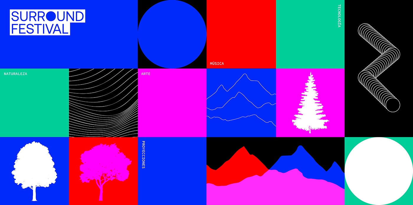
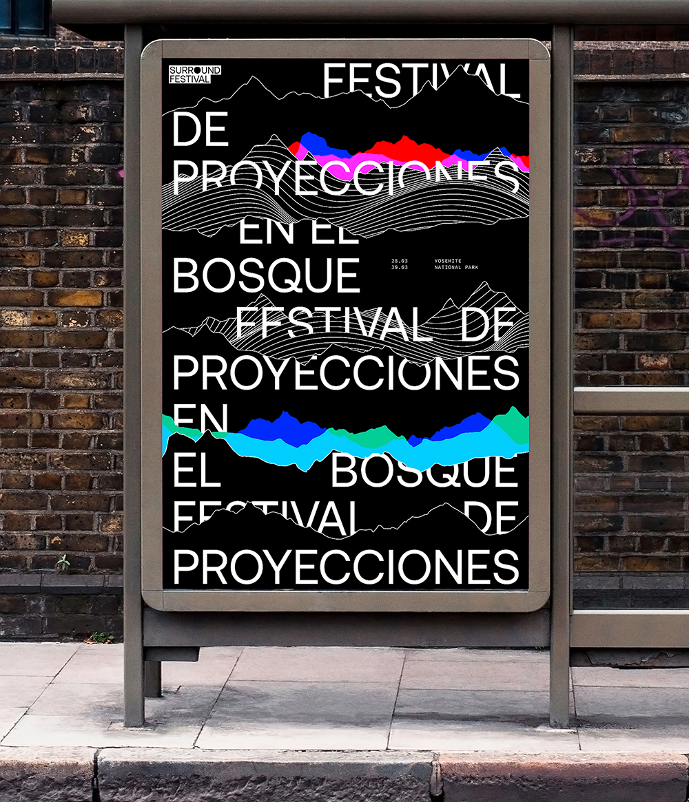
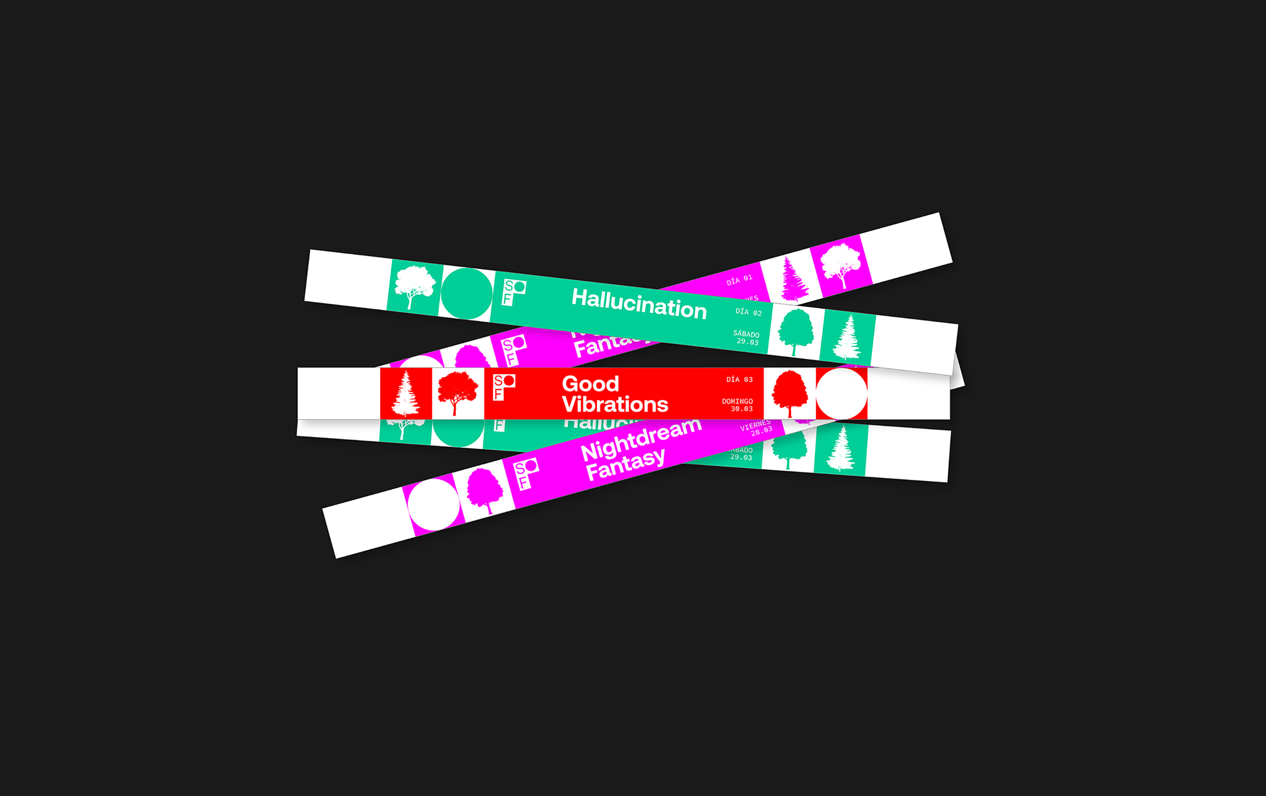
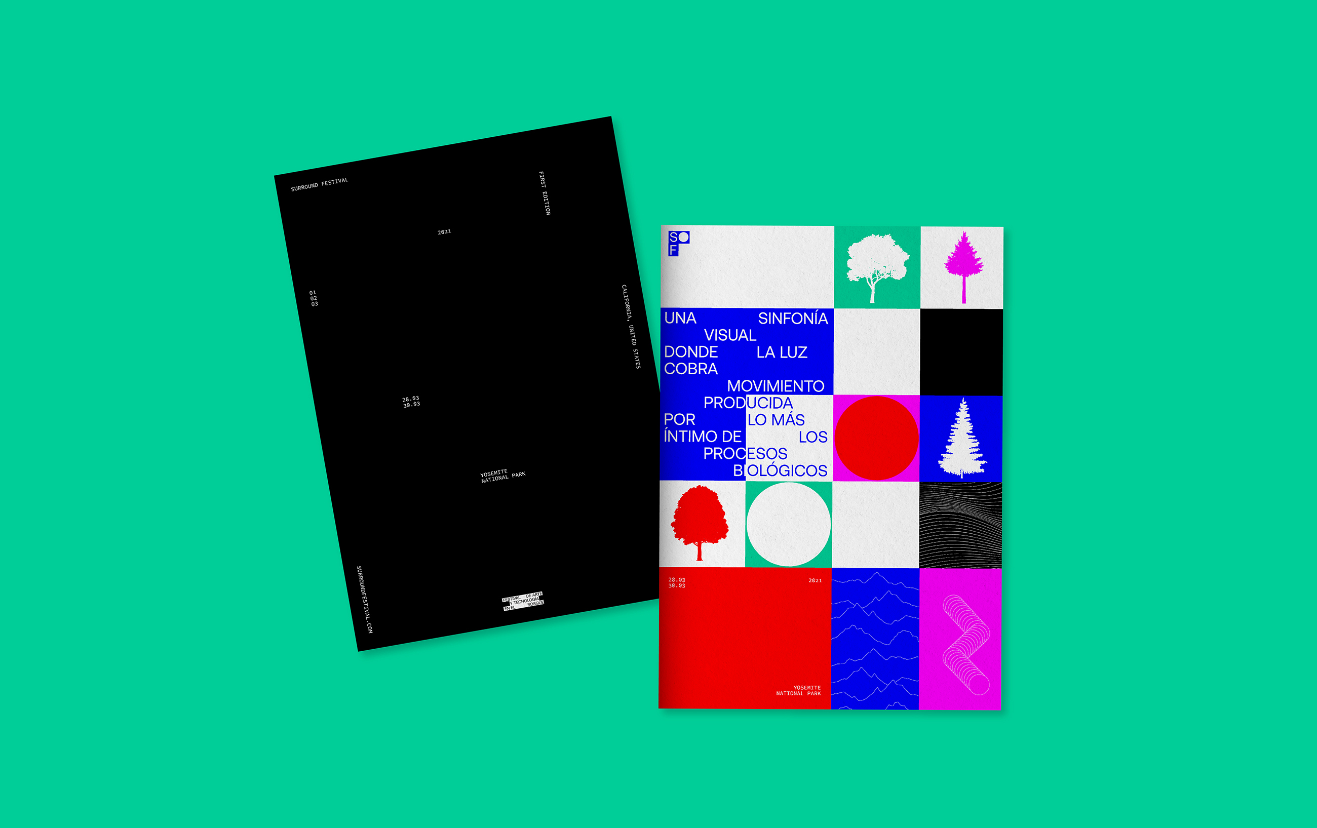
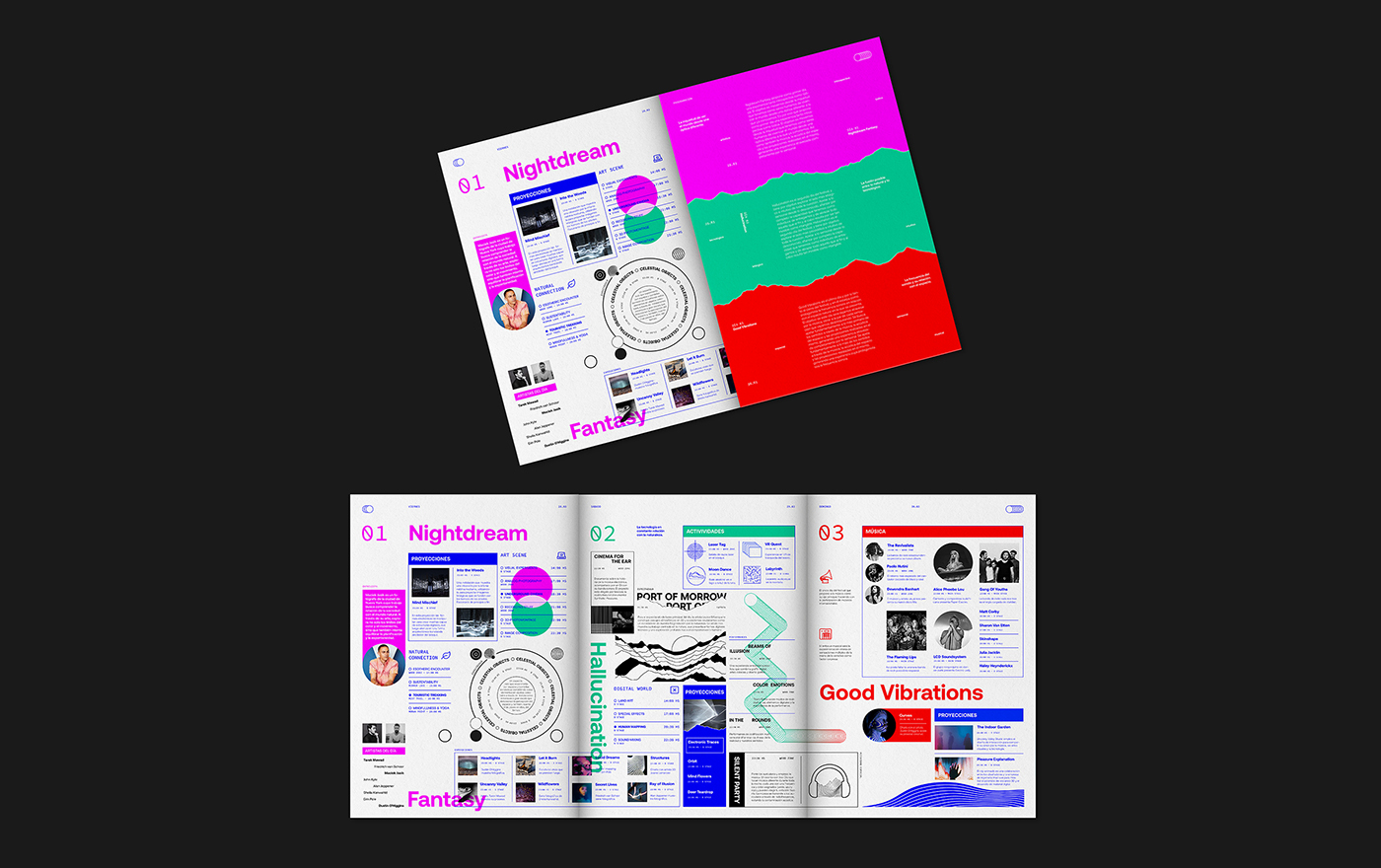
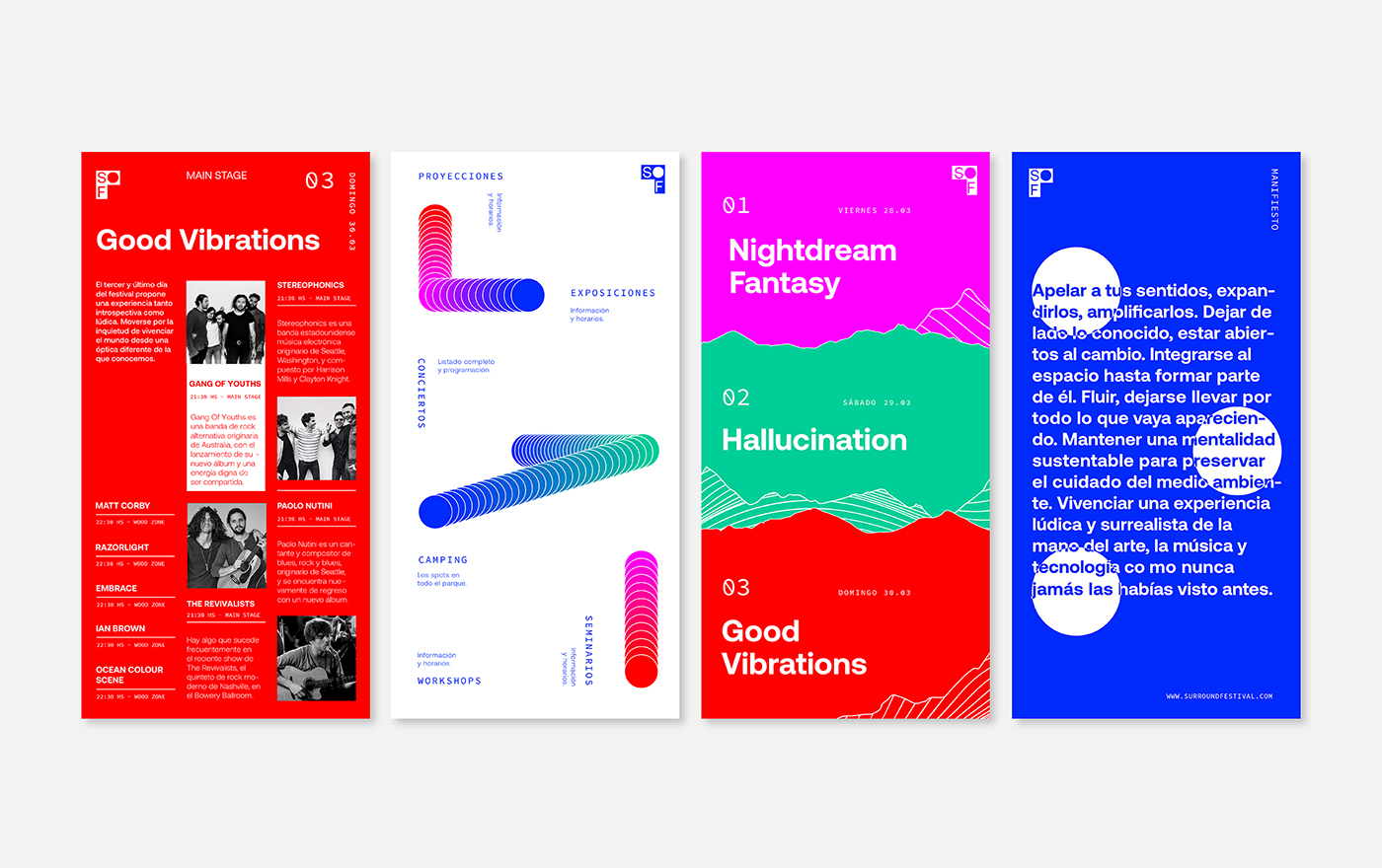
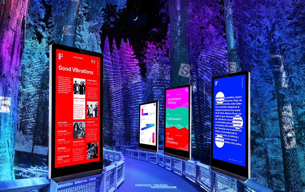
Surround is a festival of projections, art, technology and music held in Yosemite Natural Park, in California, United States. The objective is to merge two different worlds between the natural in its purest state and the arts scene, to explore the relationship between all the elements that make up this fusion, and how they coexist with each other and in relation to nature. It seeks to create a playful and surreal experience through the intervention of space, hand in hand with activities and artists that accompany and enrich this idea. Each day is crossed by a different theme, with art, technology and music as protagonists but always in dialogue with nature. The importance of preserving the environment is also emphasized. Mainly, it seeks to appeal to the senses through sound, the acoustics of the space and the projections made in it, and the ability to integrate into nature, with art, technology and music as mediators.
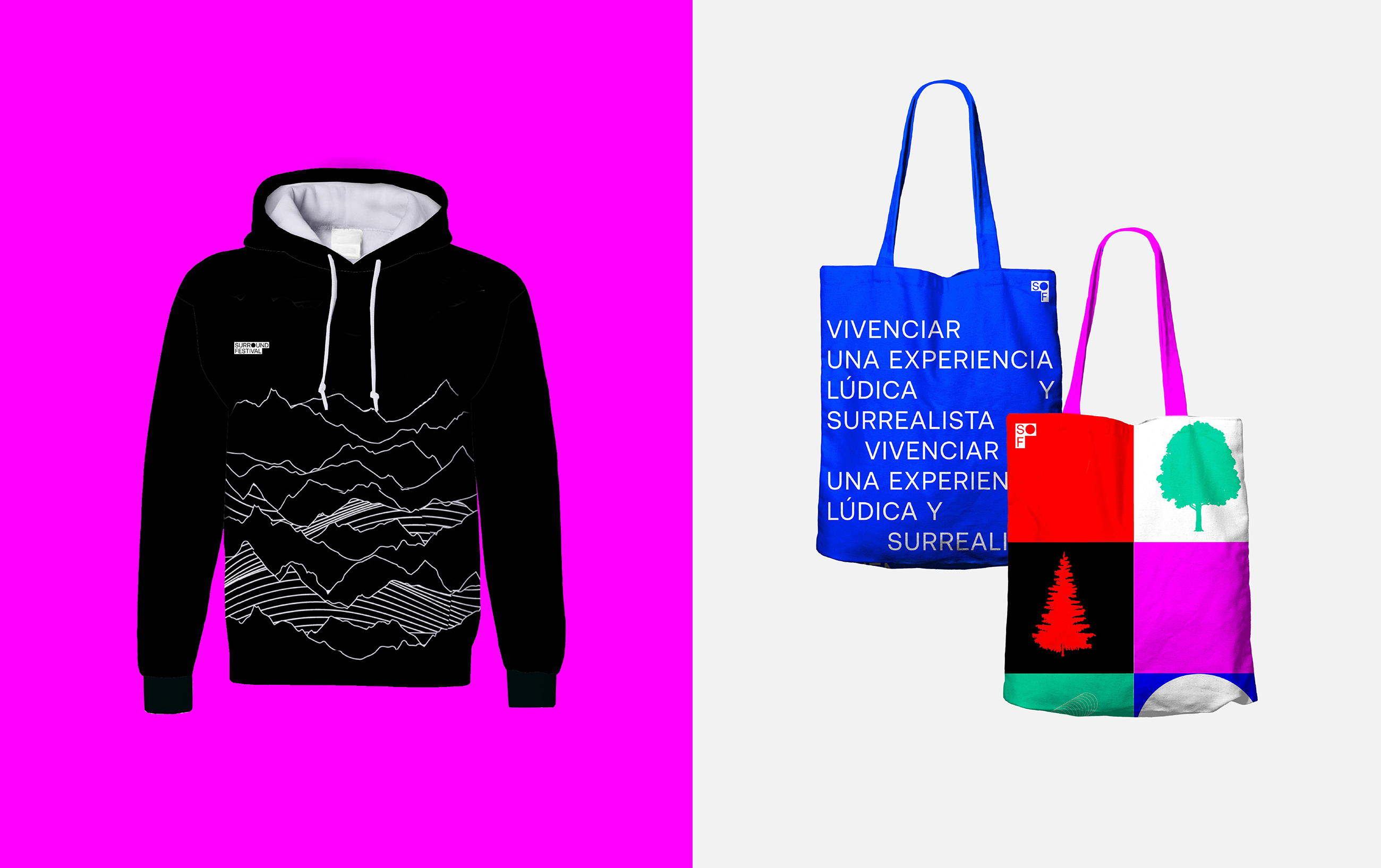
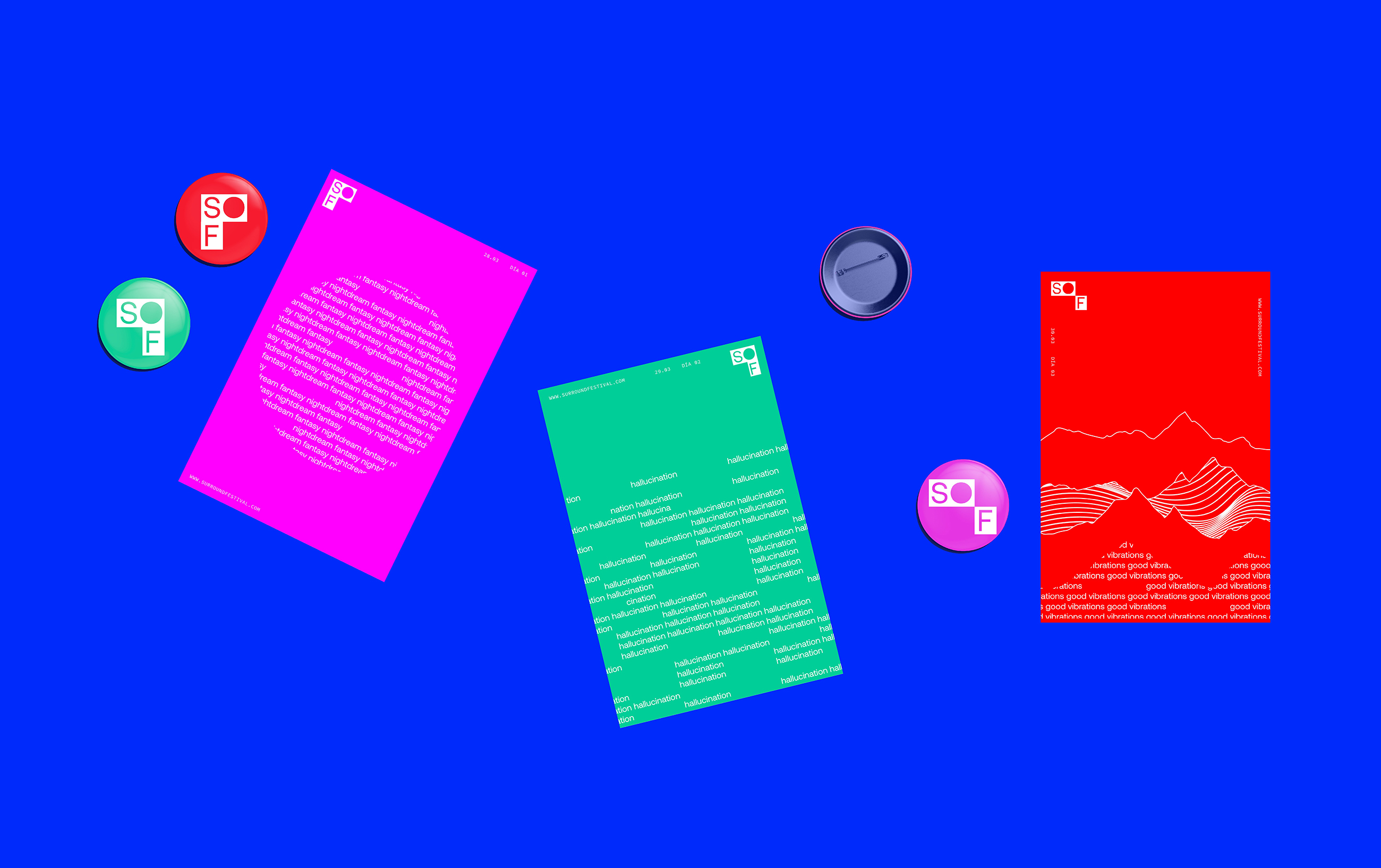
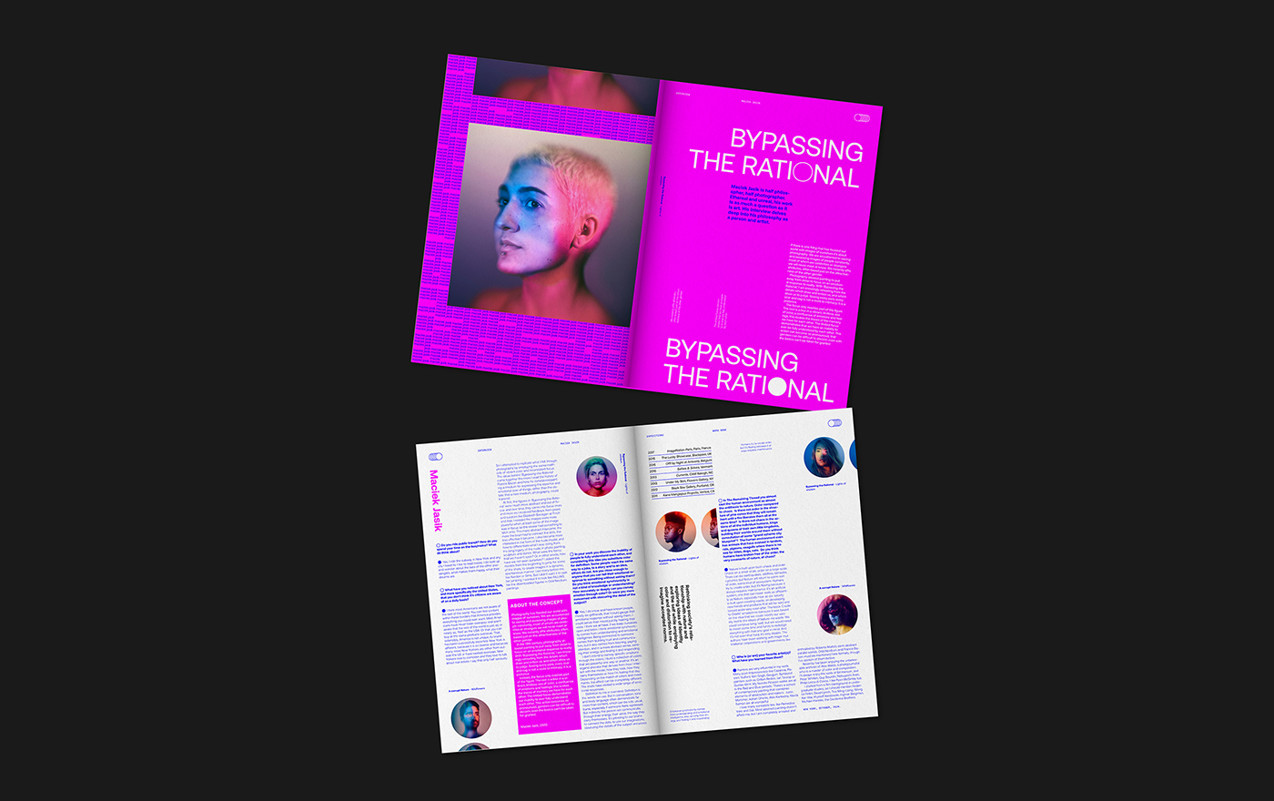
The brand is based on morphologically organic elements that appeal to nature, as well as more geometric elements that refer to technology and the human presence. Both ends of the elements are brought into play through the intervention or alteration of frames and repetitions that make up the shot. It is composed spatially (nature) and / or also in a modular way (technology). It seeks to generate a language in which both universes coexist. To talk about projections, seeks to generate a graphic treatment of overlapping colors and patterns, through the forms in play with the typography. The typeface used in the first place was Aeonik, with organic and geometric lines at the same time, it seeks to reinforce the idea of nature in dialogue with technology. The use of Source Code Pro is also present, a purely technological typeface that seeks to highlight this identity aspect through its subtle use. With regard to the idea behind the logo, it is sought that through the typographic counterform resource a seal is generated that can both be distinguished from the rest of the information in the system and the ability to be projected on different surfaces.
CREDIT
- Agency/Creative: Agostina Colantonio
- Article Title: Student Brand and Graphic Design for Surround Festival
- Organisation/Entity: Student, Published Self Promotional Design
- Project Type: Identity
- Agency/Creative Country: Argentina
- Market Region: North America
- Project Deliverables: Brand Creation, Brand Identity, Brand Naming, Branding, Graphic Design, Identity System, Product Architecture, Research
- Industry: Technology
- Keywords: branding, editorial design, graphic design, festival, identity, typography, logo, layout, display


