


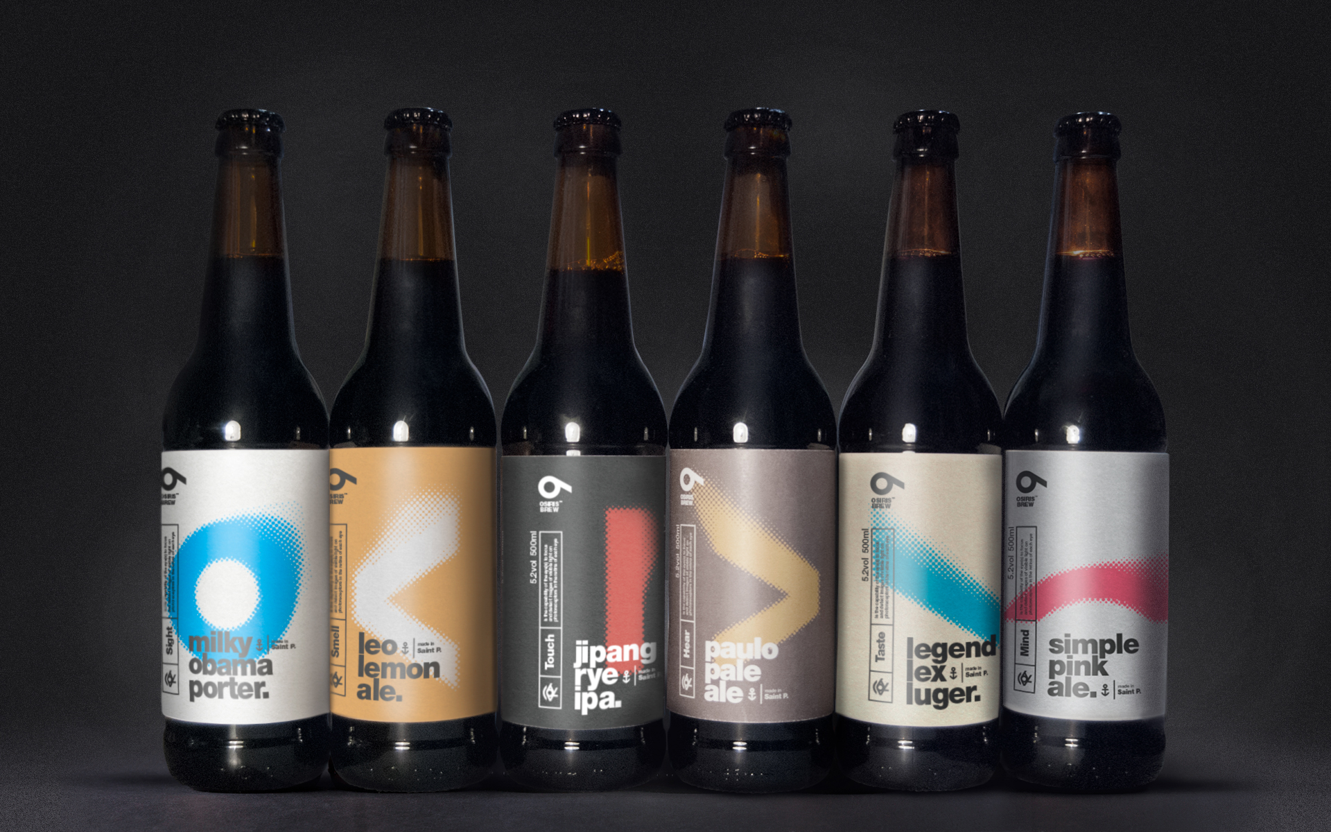

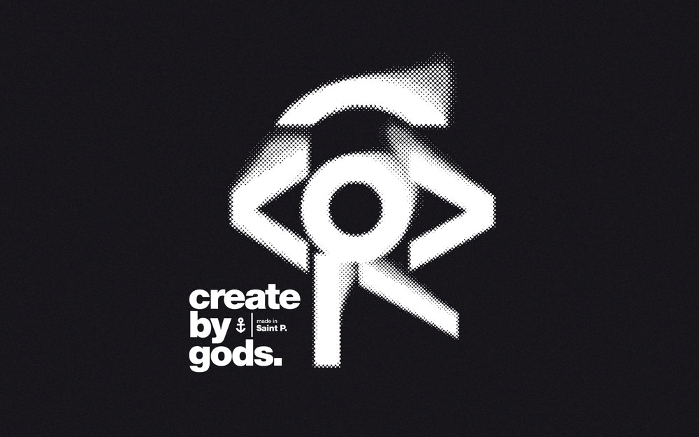
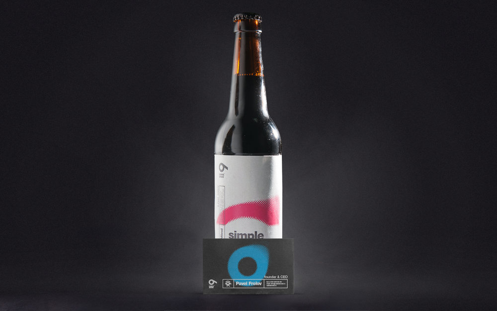
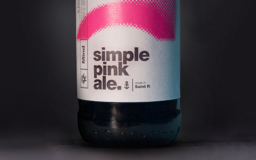
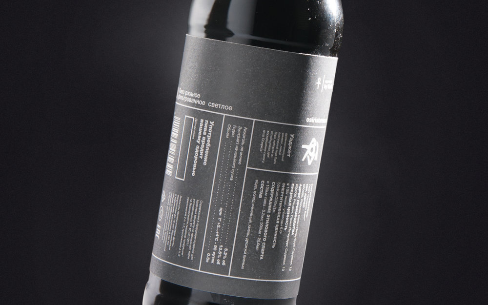
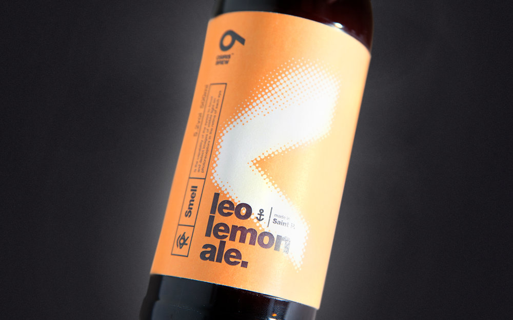
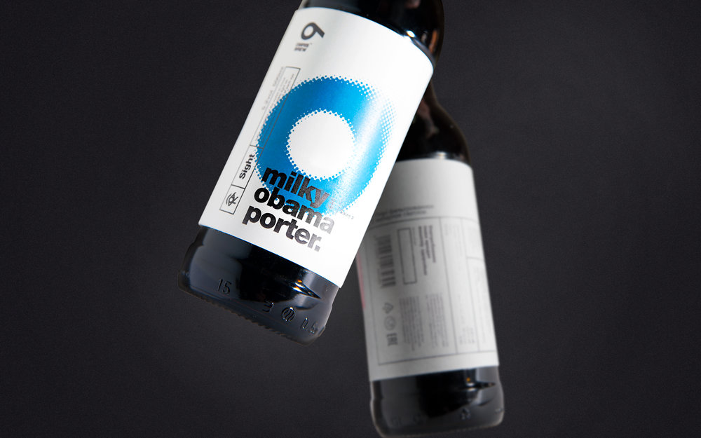
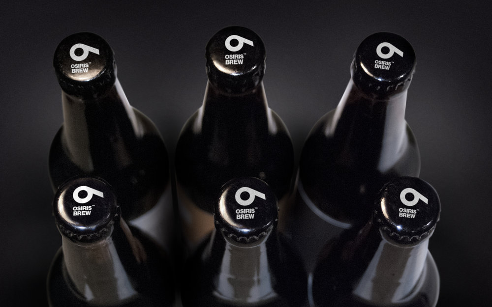
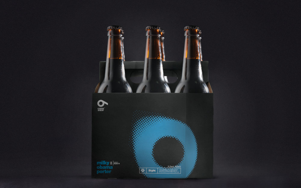
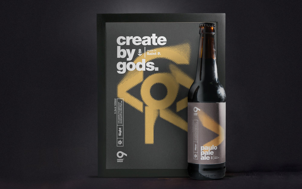
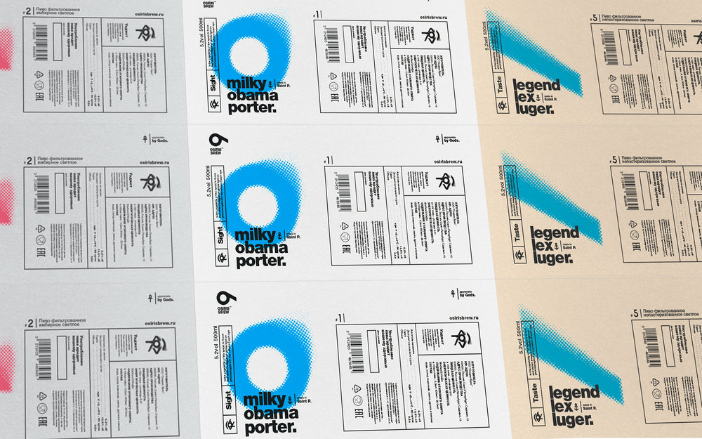
” Osiris is a small Brew crafting brewery in St. Petersburg (Russia). When they contacted me company produces three beers and planning to expand the line. Their problem is that everyone follows the beer comes up with individually, without regard to the previous file. As a result, the company has had quite disparate labels which did not have succession and can not be read as the goods of one company. It was decided to unify the label and make a logo redesign. As the style was chosen by the Swiss minimalism so as to unify different positioning and the name of different varieties. As a new company logo was selected Eye of Horus, the son of the Egyptian god Osiris, who is the most recognizable symbol of the Egyptian, and the most famous legend of Osiris. Graphically, the logo represents a figure lying on its side 6, which visually resembles the eye of Horus and the same refers to the number of beers in the lineup. Each label has its unique character, which in turn is part of the eye of Horus symbol in Egyptian mythology is associated with the feeling of a person. Each label has its own legend, which is described on the label, which involves the buyer in an interesting game and encourages him to collect the entire collection. Six bottles in a row composes in a single word – Osiris!”

CREDIT
- Agency/Creative: Stepan Solodkov
- Article Title: Stepan Solodkov – Osiris Brew
- Project Type: Packaging
- Format: Bottle, Box
- Substrate: Glass, Pulp Paper


