


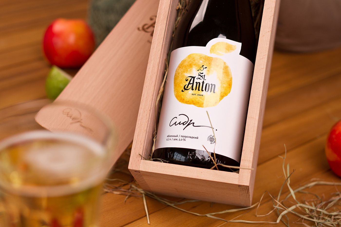
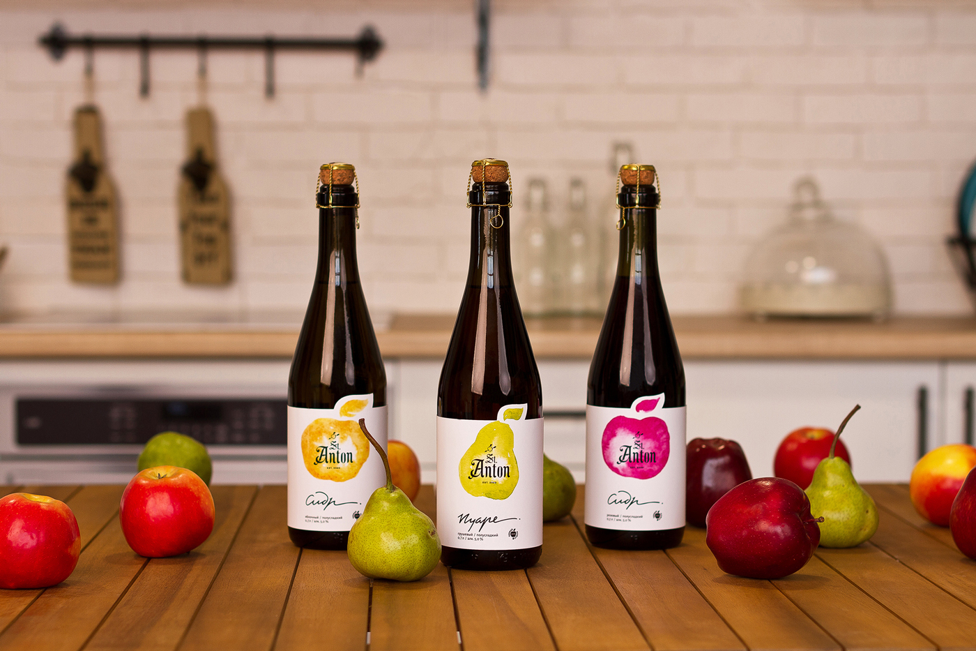
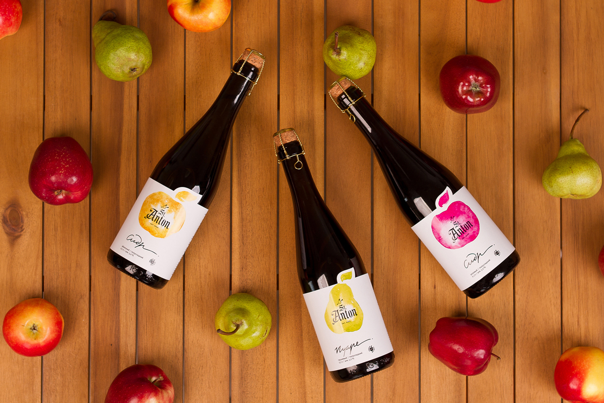
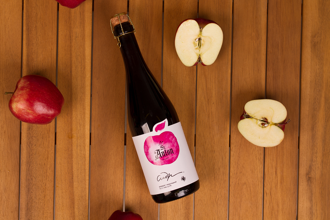
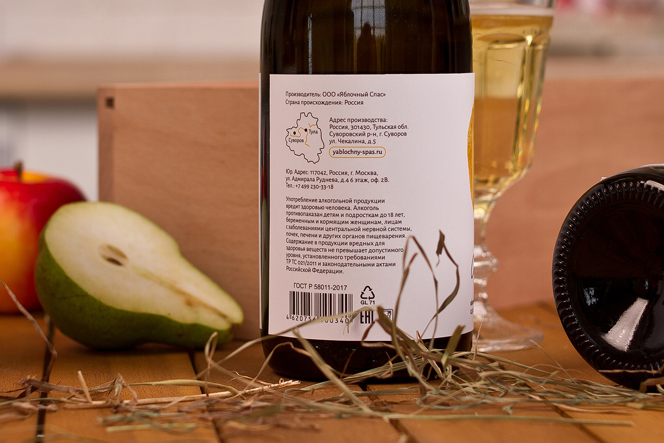
St. Anton – is a brand leader in the segment of natural cider producers in Russia. The founders set themselves a goal to revive traditions of production of apple cider exclusively from domestic apples, and the company with the production located in Suvorov city, Tula region, starting from 2000 until now is a leading producer of apple cider in the craft segment.
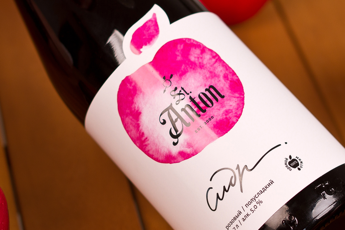
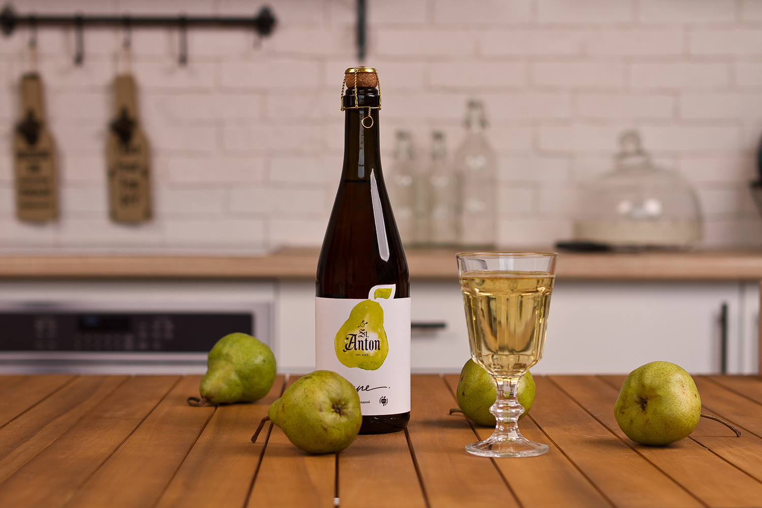
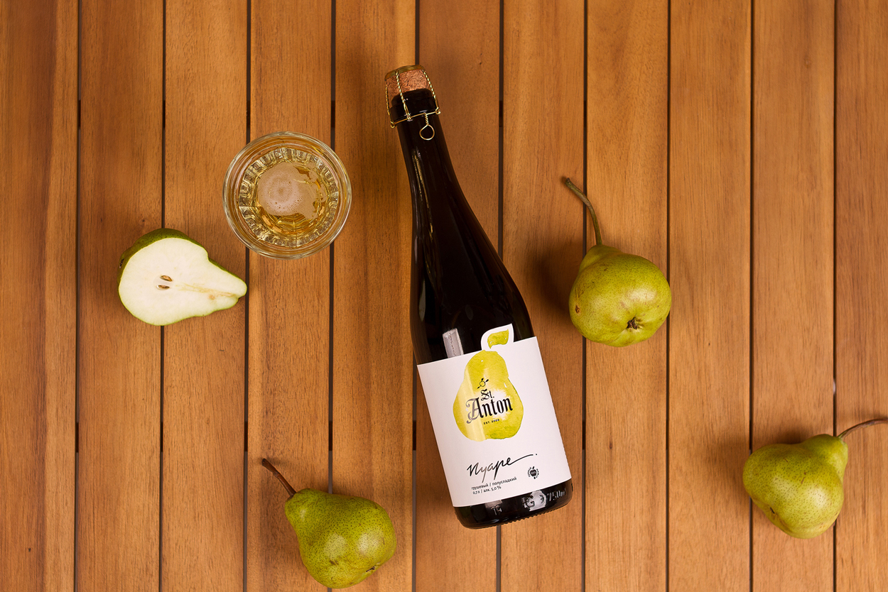
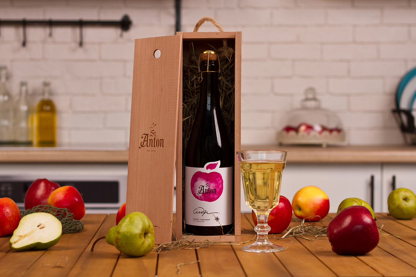
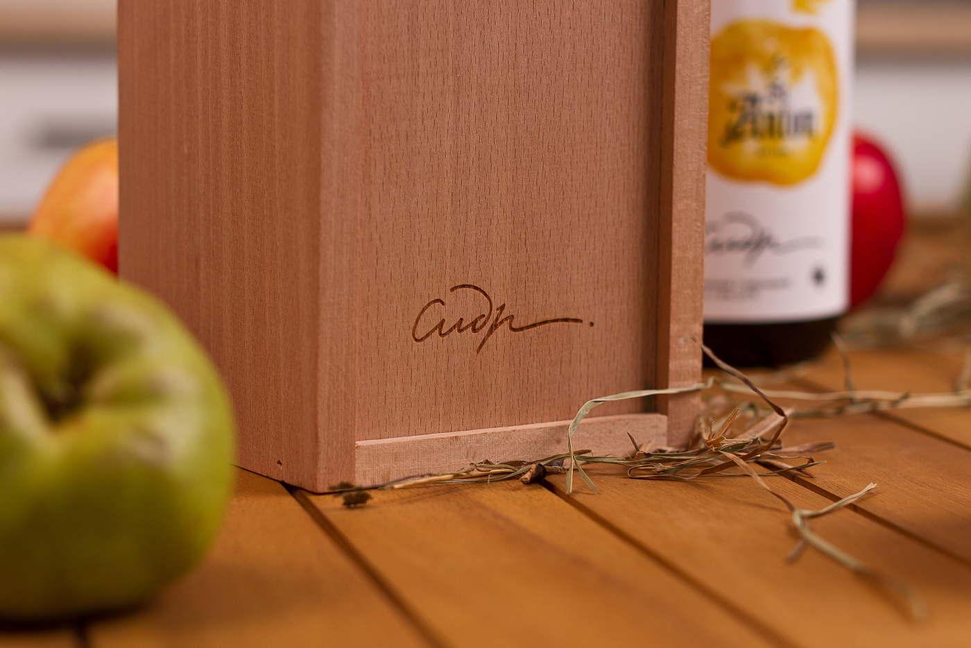
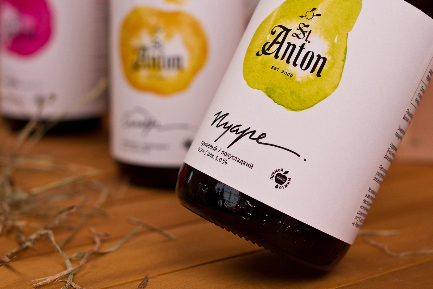
Since the target public of the drink are millennials and lovers of a craft beer, the design concept has been aimed at attracting their attention. To reflect the freshness and quality of cider we have created a watercolor drawing and lettering in the outline of the taste, all this has been done on a white paper with the highlighting of individual elements by UV varnish

CREDIT
FEEDBACK
Relevance: Solution/idea in relation to brand, product or service
Implementation: Attention, detailing and finishing of final solution
Presentation: Text, visualisation and quality of the presentation


