


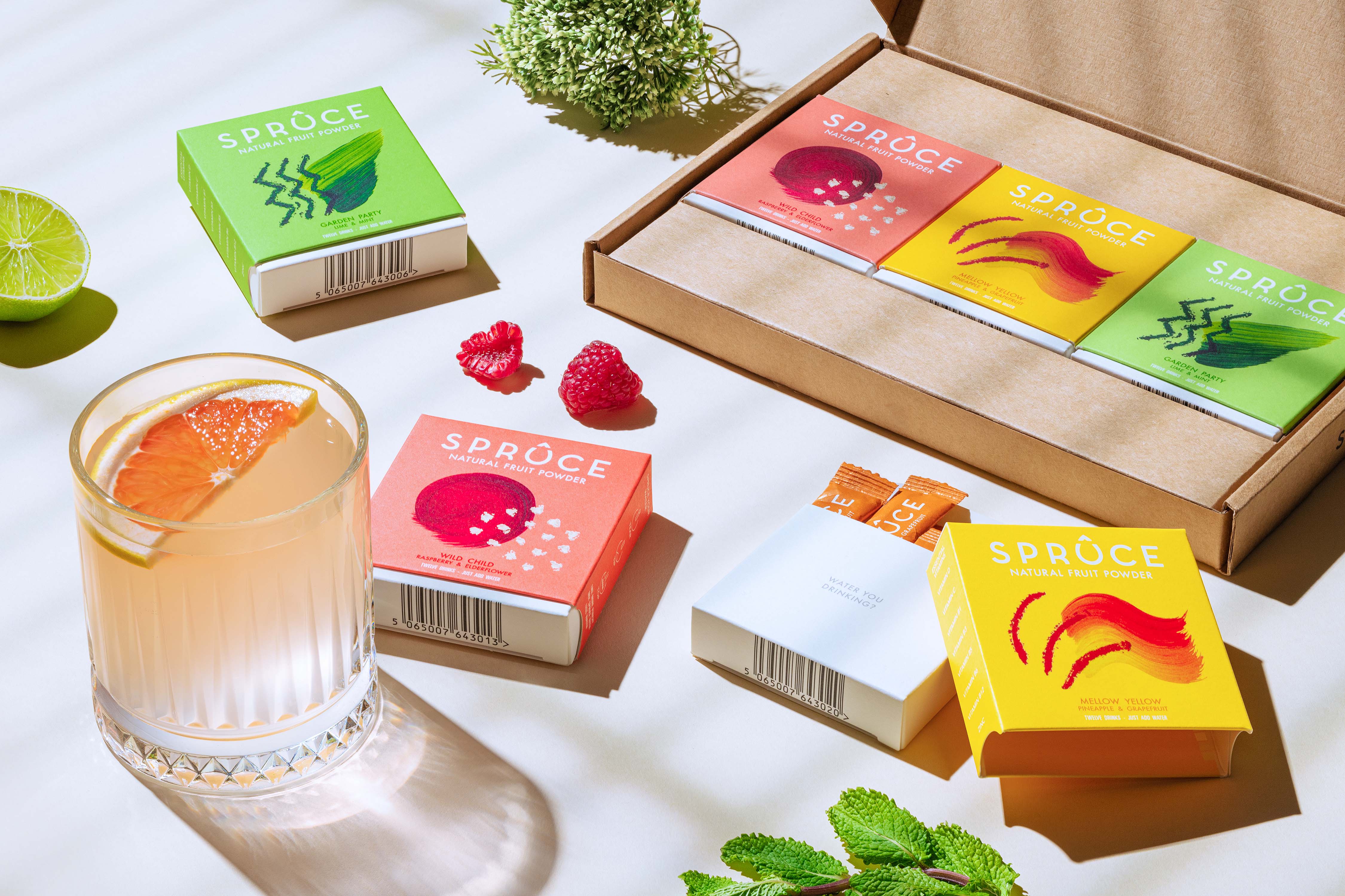
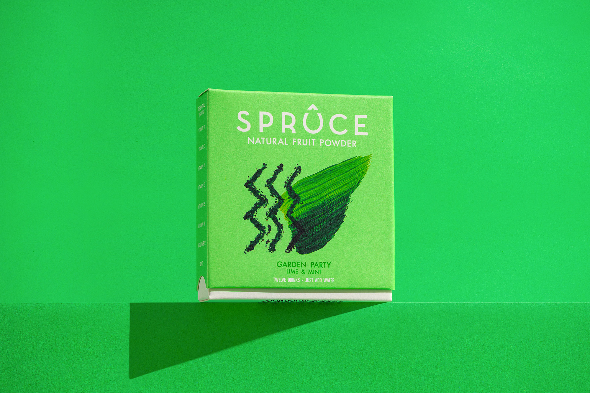
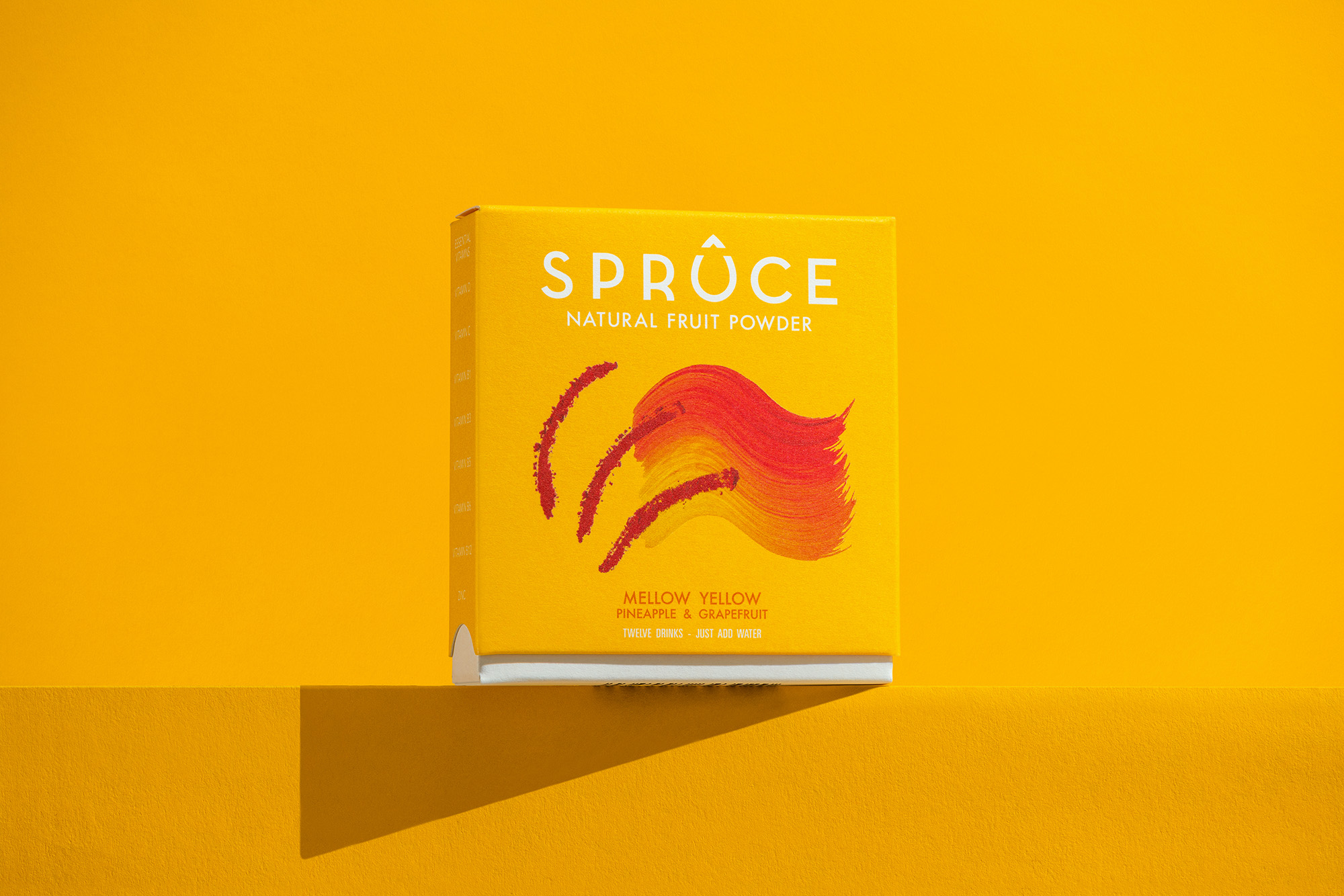
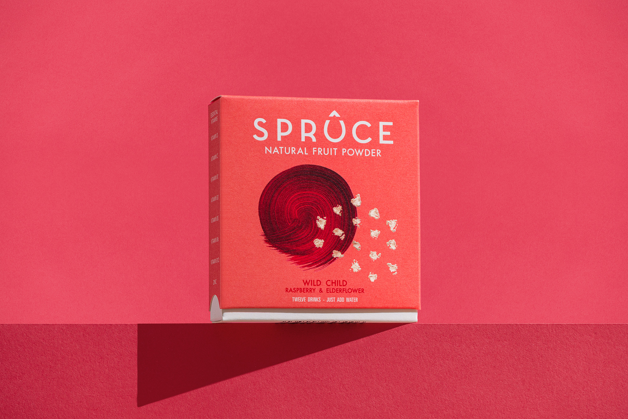
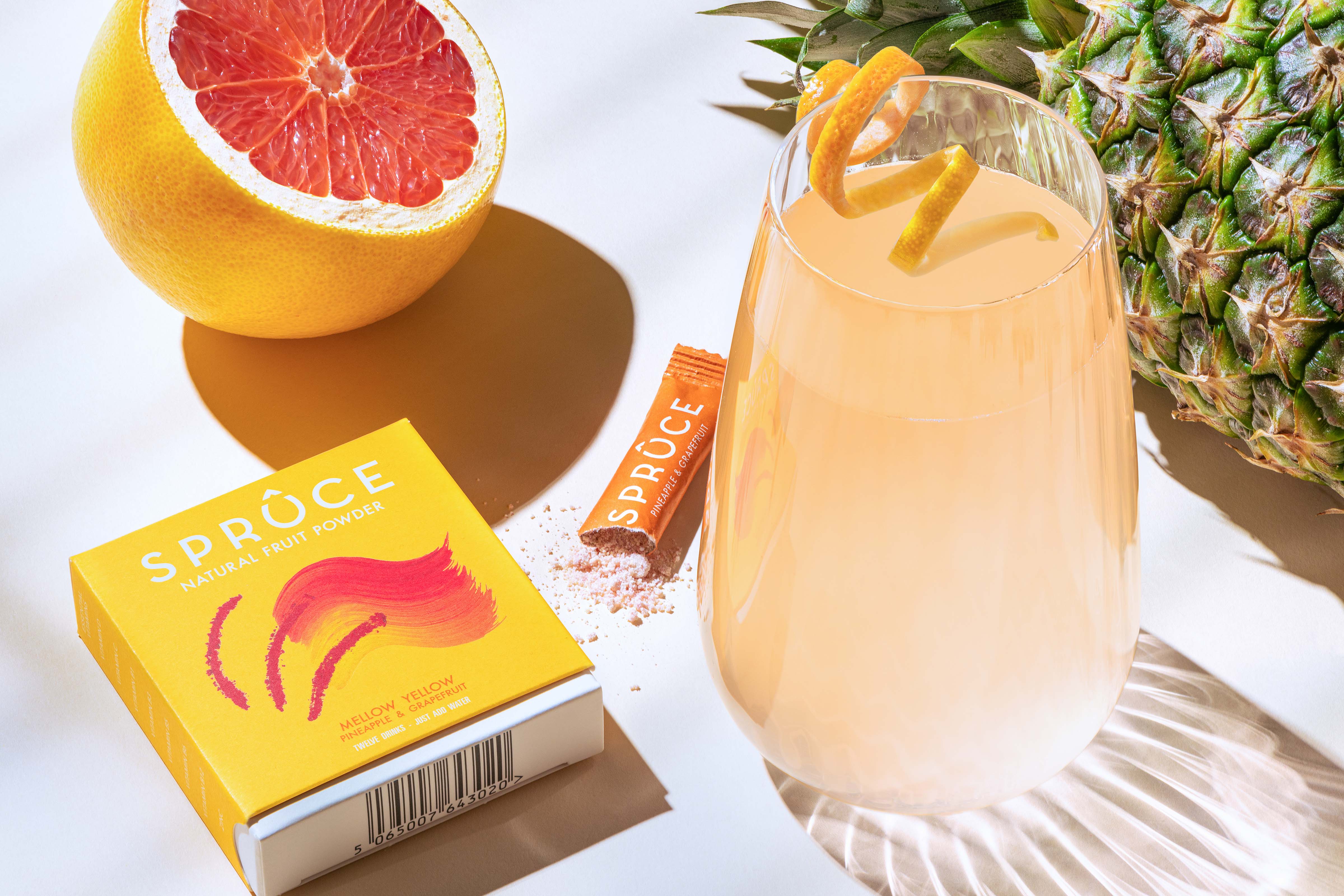
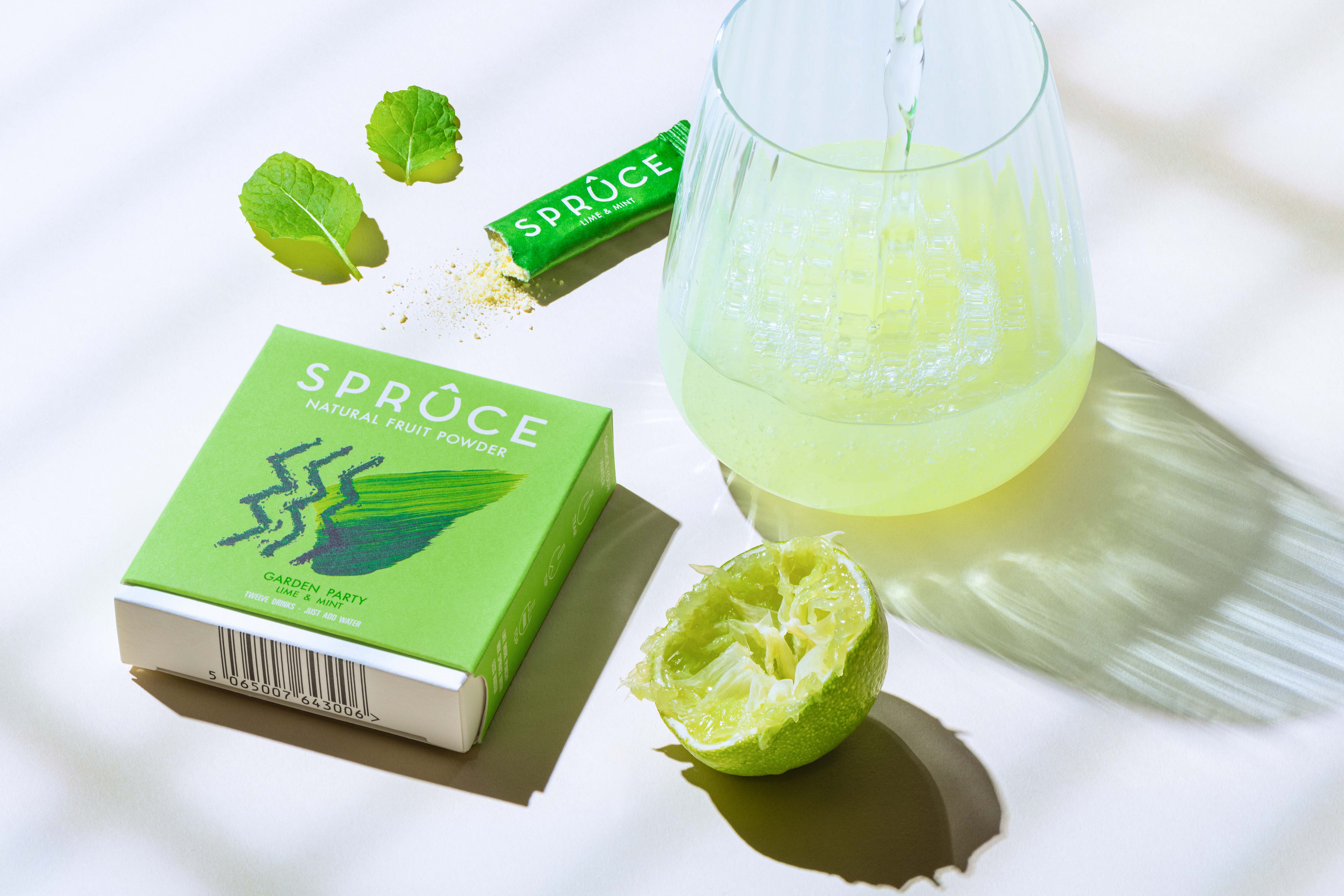
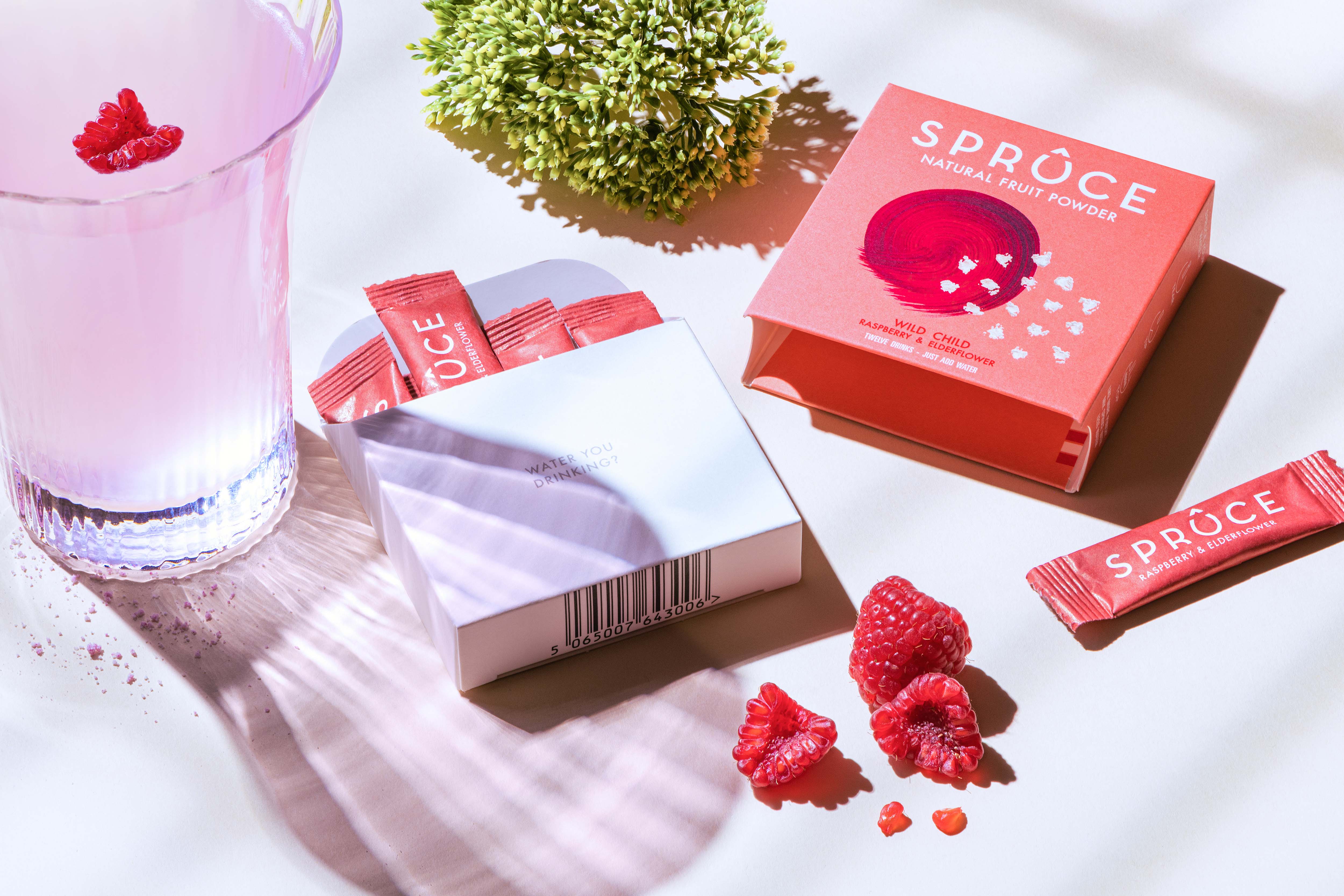
What water are you Drinking?: Spruce is a natural fruit powder made with real fruits, no sugar and packaged in plastic-free compostable sachets. How do you brand and package a delicious, thirst-quenching drink that happens to be a powder? Dearness Only didn’t shy away from the product’s nature, instead of working with it to create a premium, desirable and beautiful new brand. Spruce up your water!
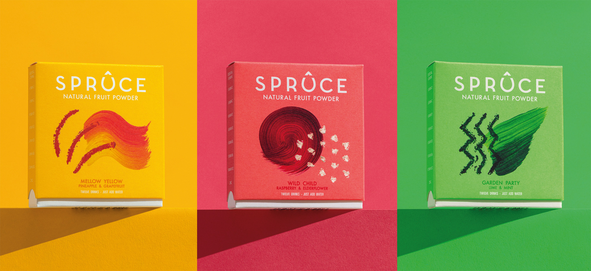
Powder, Glass and Droplet: Starting with the brand identity we symbolised three crucial components of Spruce. The glass in the form of the ‘u’ character, the powder itself in the small triangle and then they are combined to create the droplet. The Spruce droplet logo is a constant reminder of Spruce’s mission to elevate water.
Powder and Paint Punch: The Spruce brand world is an abstract expression of the flavours and textures in the brand and product. A collision of dry and wet media convey the product before and after use as well as flavour, aroma and texture. Desirable and distinctive on the pack and of infinite utility across various communications channels.
“Spruce is a simple concept with bold ambitions. To me, this meant the branding and look had to be on point. Working with Dearness Only was one of the best decisions I made. They understood Spruce from day one, and James’ ability to evolve my scattered thoughts into something so meaningful, original and eye-catching, has been amazing to watch unfold. I hope to do a lot more work with them in the future.” – Jonny Cazaly, Head Water Boy at Spruce
CREDIT
- Agency/Creative: Dearness Only
- Article Title: Spruce Up Your Water With the Sugar-free, Plastic Free Squash
- Organisation/Entity: Agency
- Project Type: Packaging
- Project Status: Published
- Agency/Creative Country: United Kingdom
- Agency/Creative City: London
- Market Region: Europe
- Project Deliverables: Advertising, Brand Creation, Brand Identity, Brand Tone of Voice, Copywriting, Illustration, Packaging Design
- Format: Box, Sachet
- Substrate: Pulp Board
- Industry: Food/Beverage
- Keywords: WBDS Agency Design Awards 2021/22
-
Credits:
Creative Director: James Taylor


