


In the early 2000s, an English lady moved to The Netherlands. She became immersed in a fascinating and interesting culture, where bread played a vital part in Dutch daily life. Delicious loaves were available on every street corner and were a popular meal choice for both breakfast and lunch; as the joke goes, ‘What is the difference between breakfast and lunch in Holland?’, ‘About 4 hours!’. The people of Holland were lost without a “boterham” (sandwich) and some cheese!
She started investigating how these tasty breads were baked, stumbling upon some interesting products used by professional Dutch bakeries. Many of these products were not available back in her homeland, the United Kingdom. And so began Spoon & Pinch! A team of passionate bakers got together and started supplying these speciality products back to England, initially through a network of families and friends.
Since then, this expert team have brought their passion for baking into the homes of many English and European families. Spoon & Pinch became well-known for the highest quality speciality ingredients, making bread baking a little less frustrating and a bit more of an exciting, enjoyable, and reliable experience.
15 years later; Spoon & Pinch has a wealth of experience but is still selling the same reliable products. These wonderful products are now available to bakers of all levels, from beginners to experts – using the highest quality ingredients which always give the best possible results.
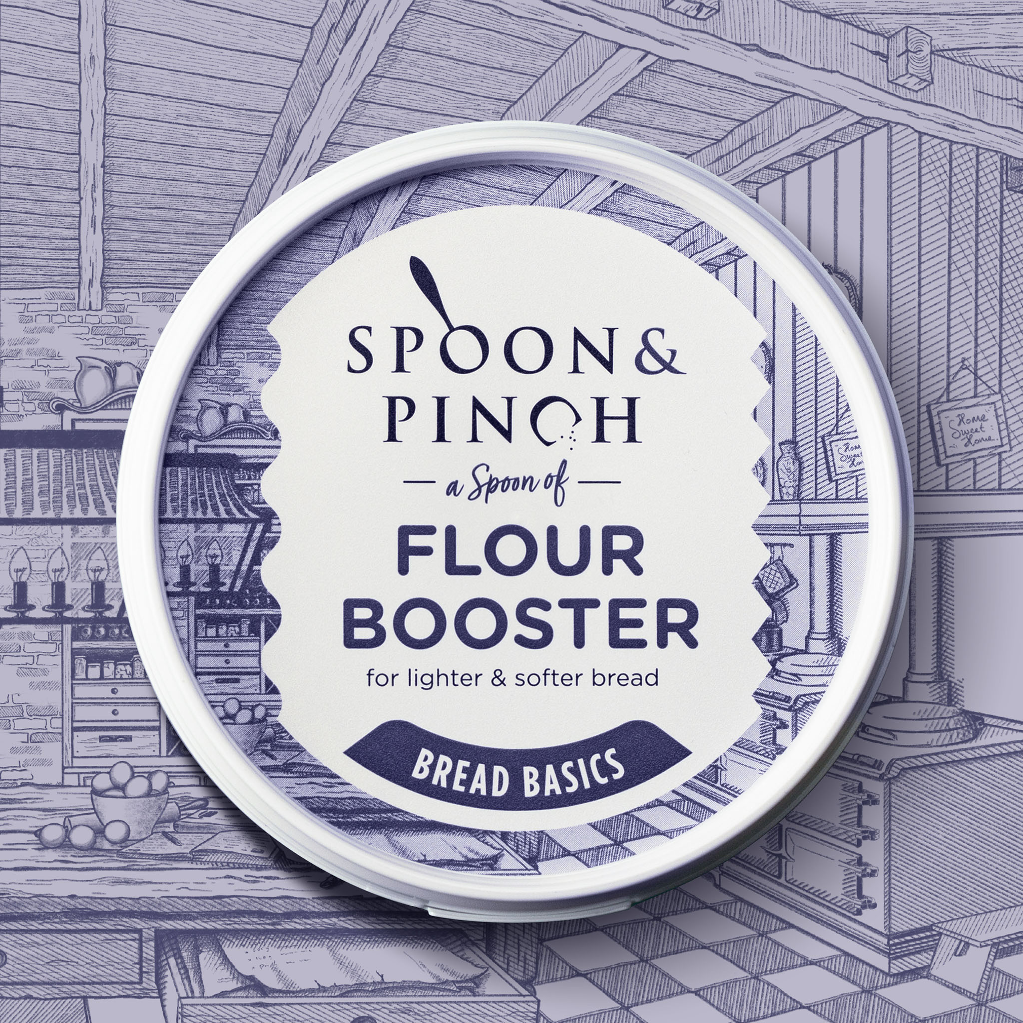
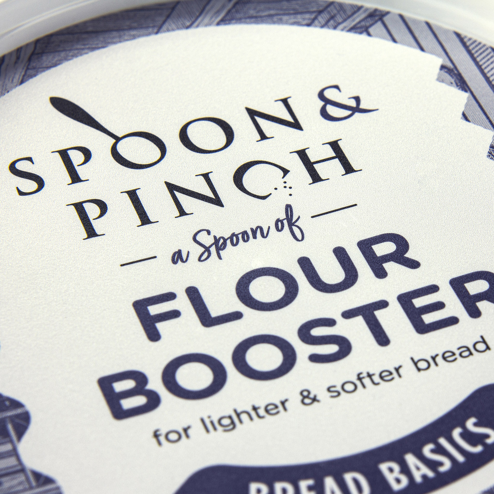
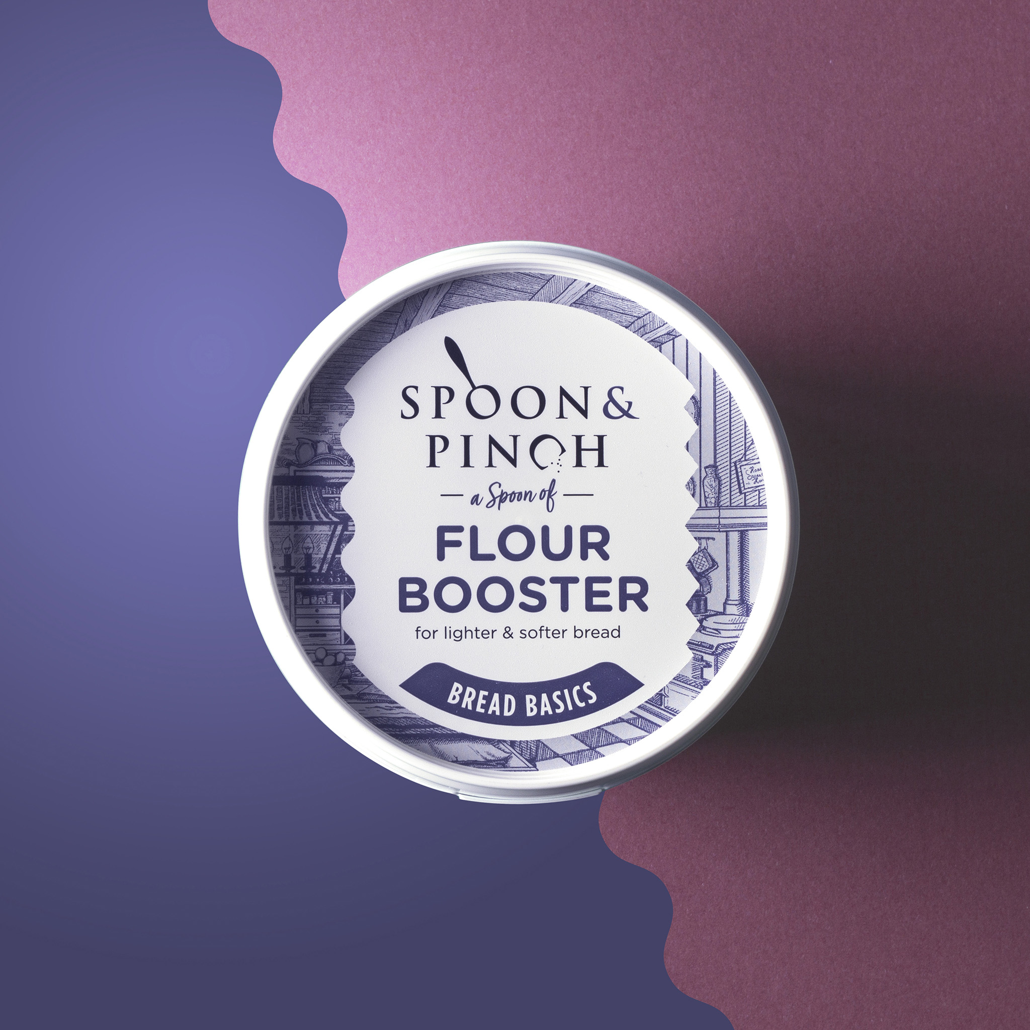
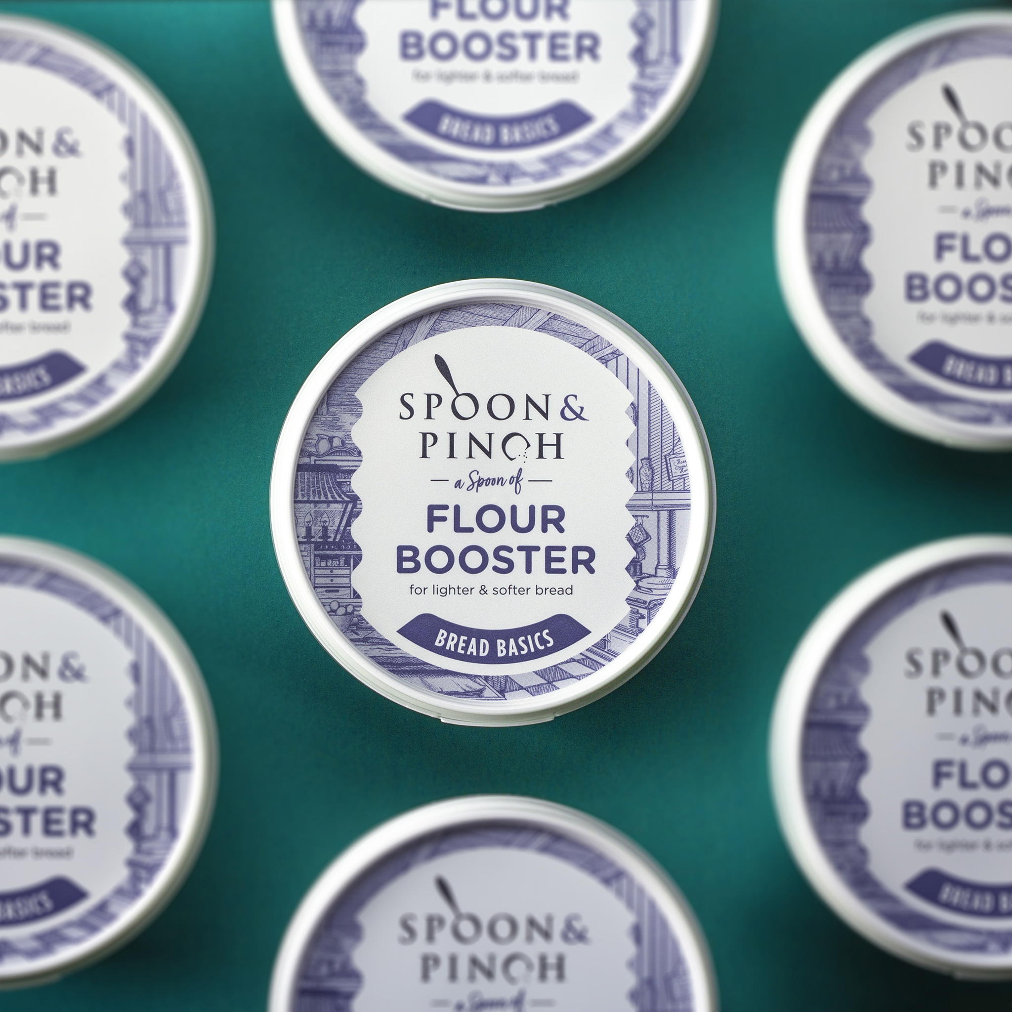
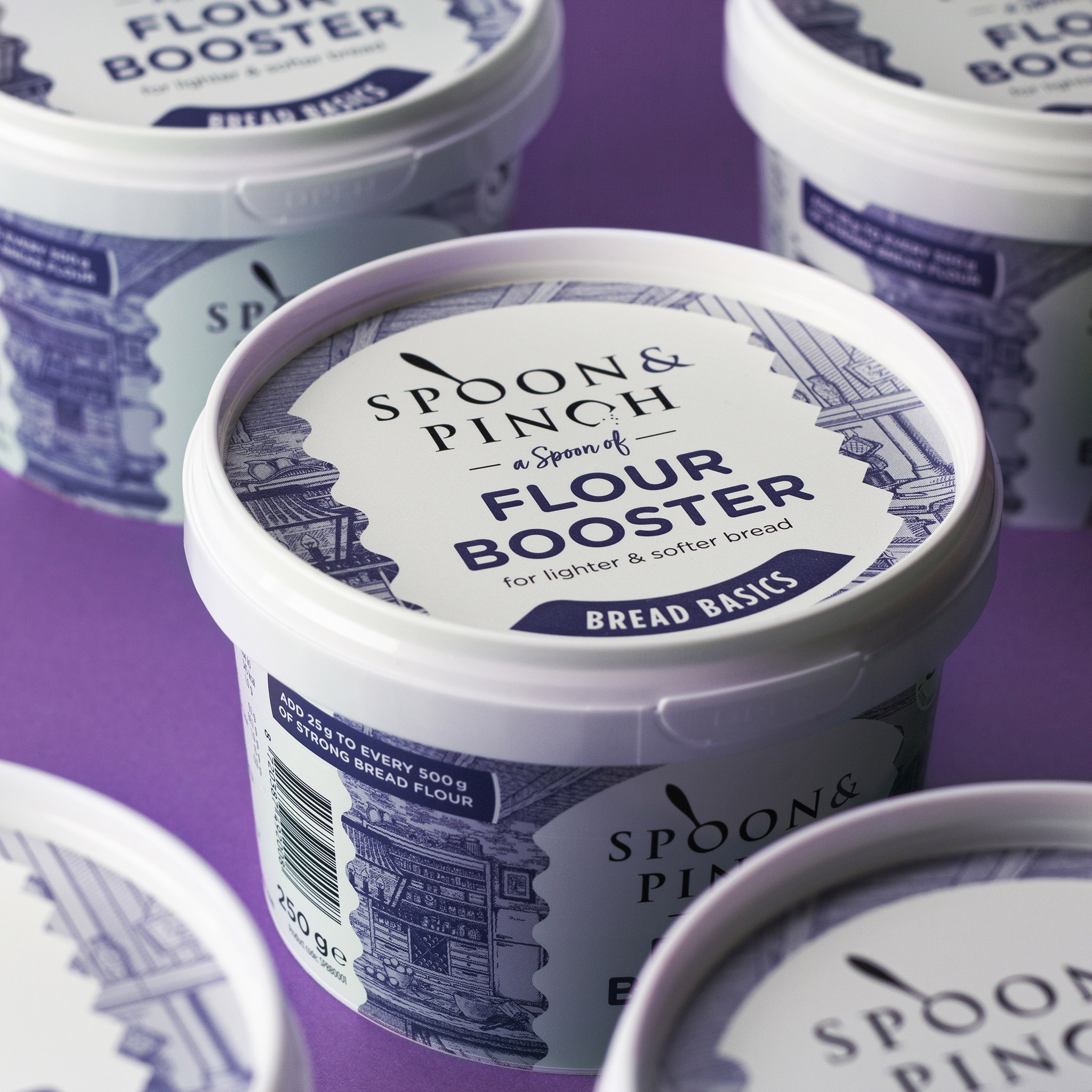
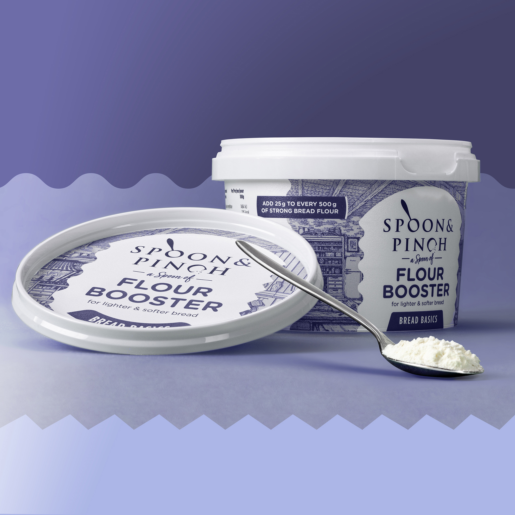
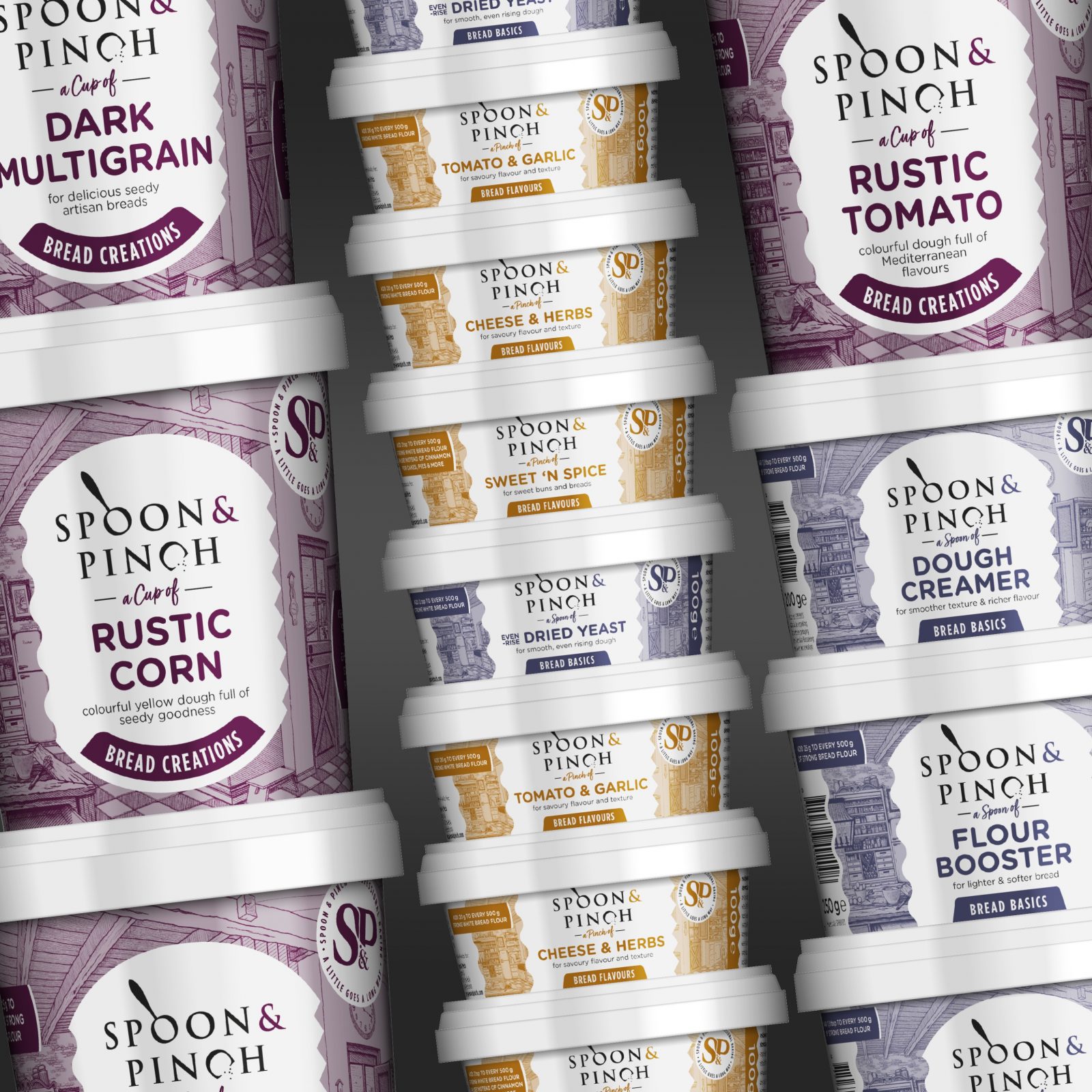
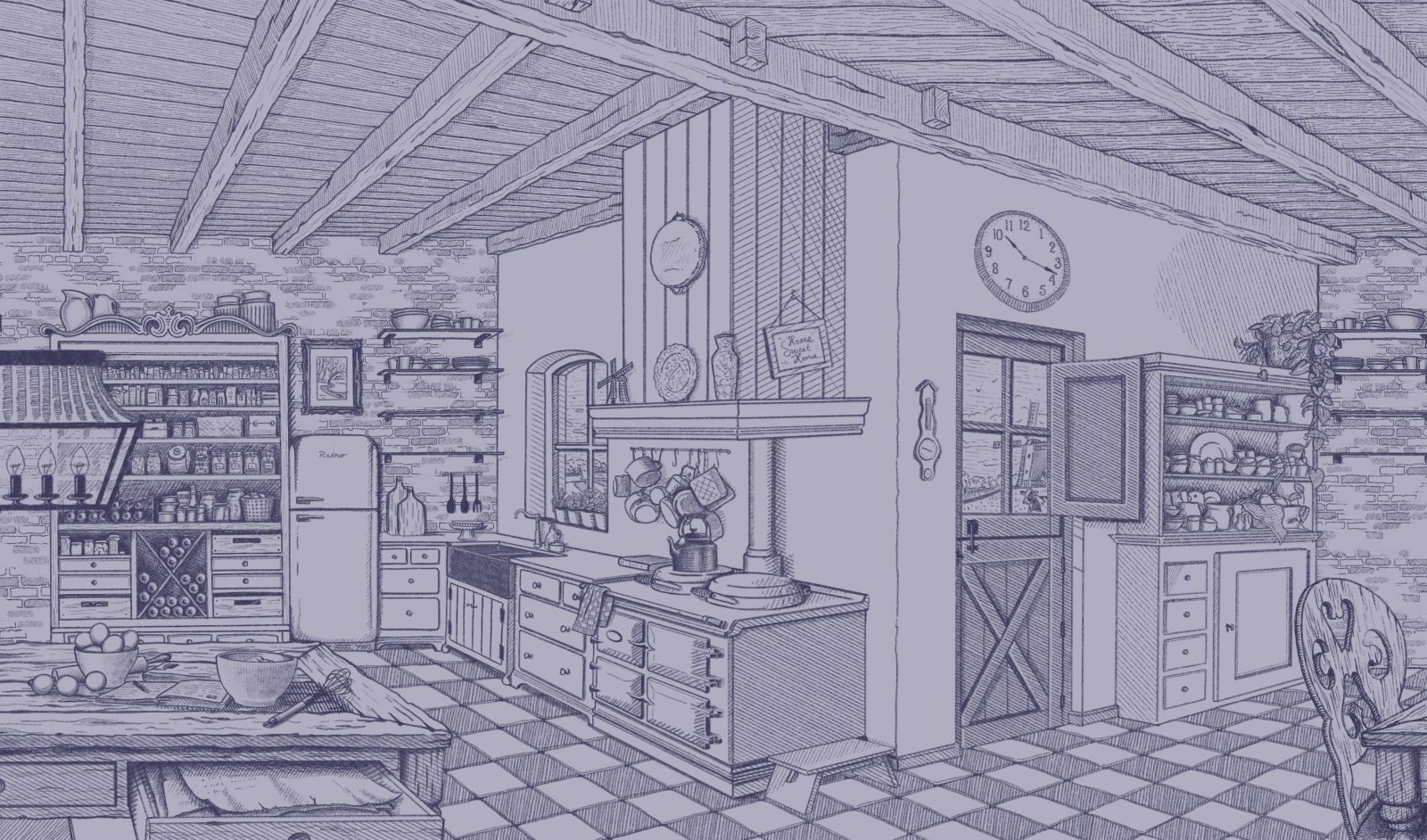
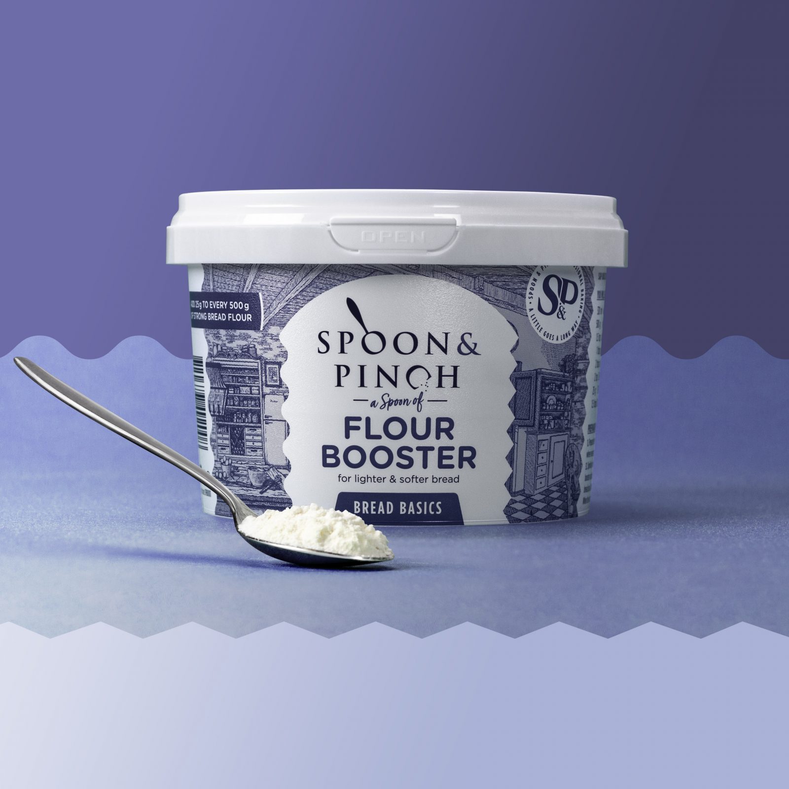
For this amazing brand we were asked to develop a new identity including logo and packaging design. The handmade illustration on the packaging takes you back to the English heritage and the old-fashioned kitchens. Through the playful bordering, representing the pinch of salt (triangles border) and the flower (wavy border), it keeps the branding light and modern. Also, the logo was created in a more modern way to keep the identity in balance and plays with the pinch and spoon as it is used in the actual baking process.
CREDIT
- Agency/Creative: Van Heertum Design VHD
- Article Title: Spoon & Pinch Packaging Design Created by Van Heertum Design
- Organisation/Entity: Agency
- Project Type: Packaging
- Project Status: Published
- Agency/Creative Country: Netherlands
- Agency/Creative City: Tilburg
- Market Region: Europe
- Project Deliverables: Brand Creation, Illustration, Logo Design, Packaging Design
- Format: Bucket
- Substrate: Plastic
- Industry: Food/Beverage
- Keywords: WBDS Agency Design Awards 2021/22
-
Credits:
Owner: Philippa Suurmond


