


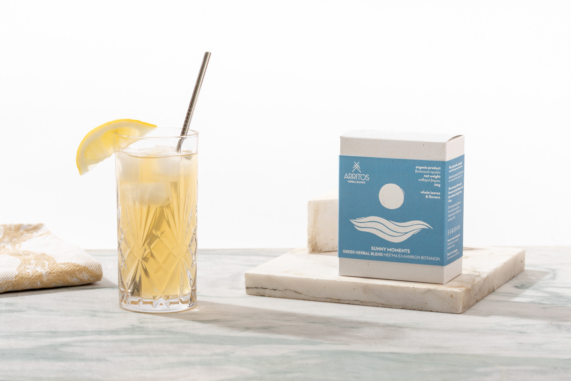
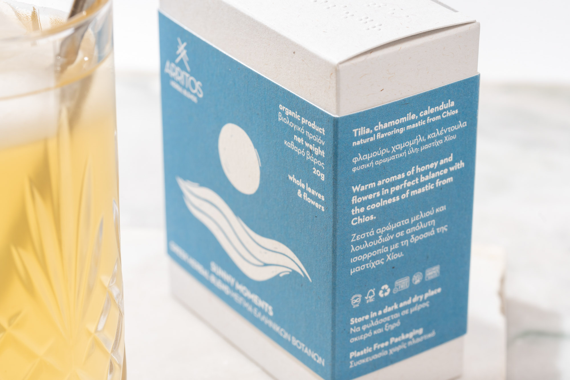
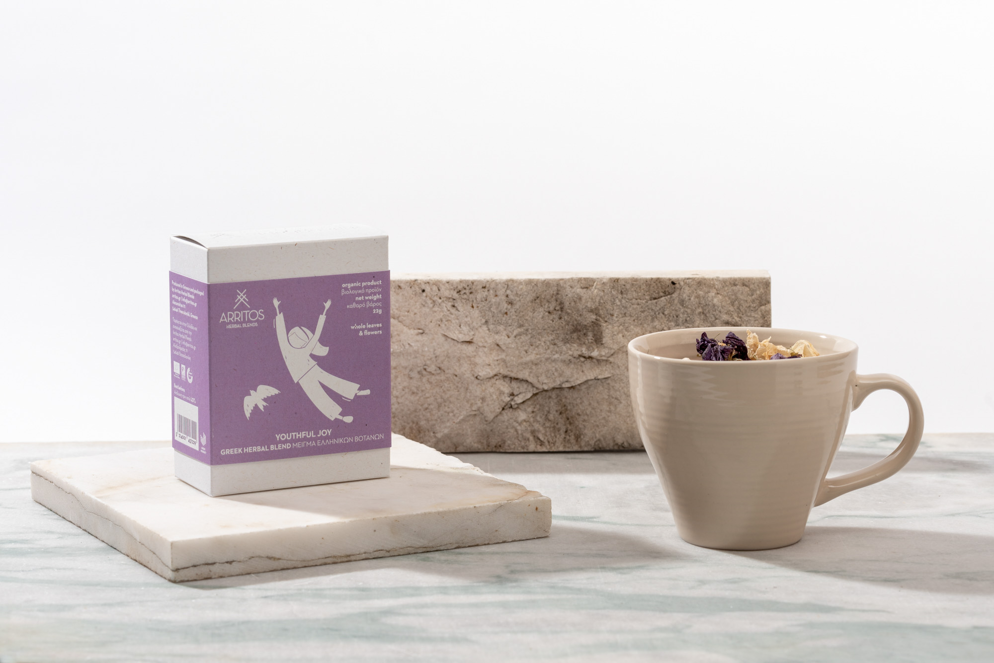
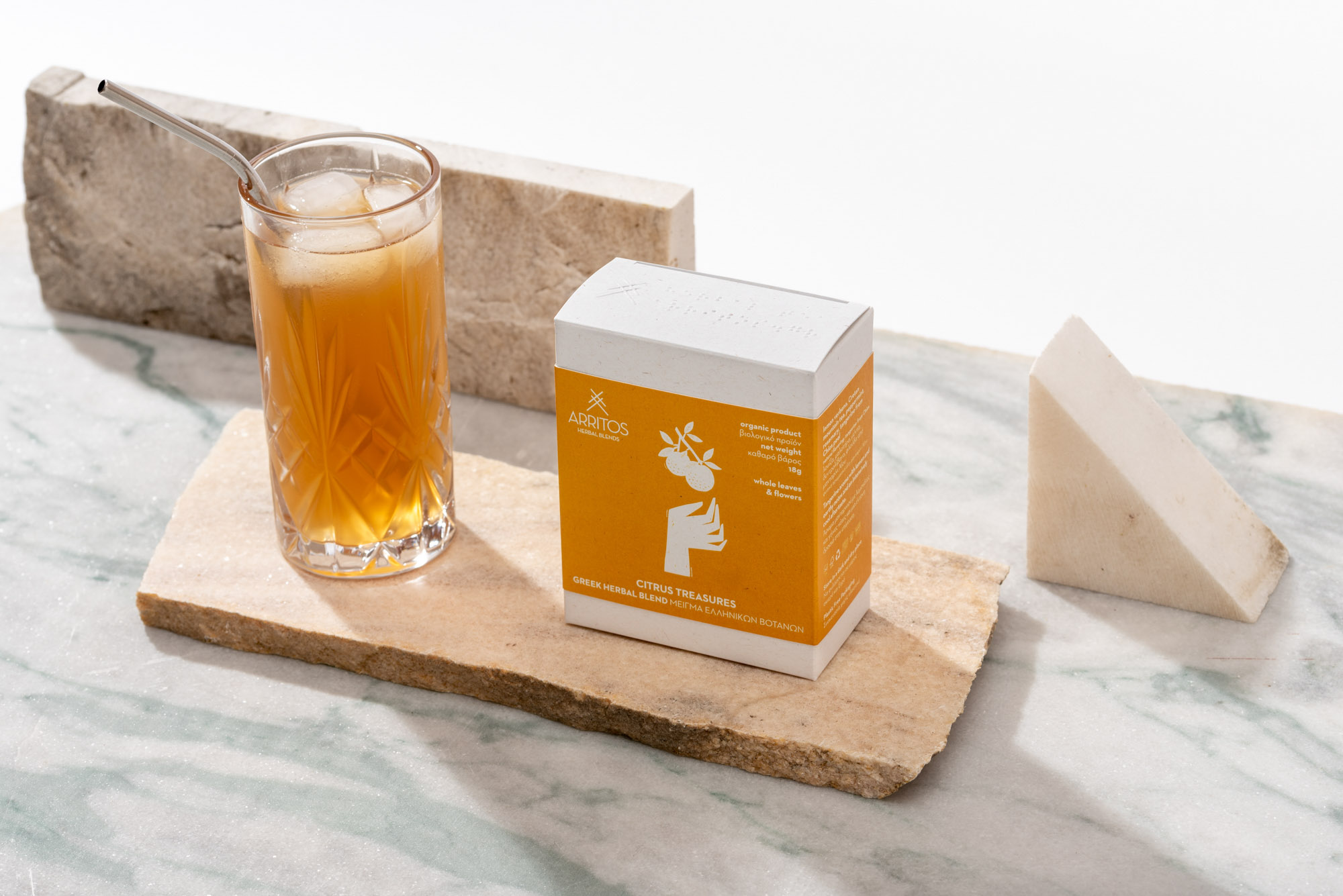
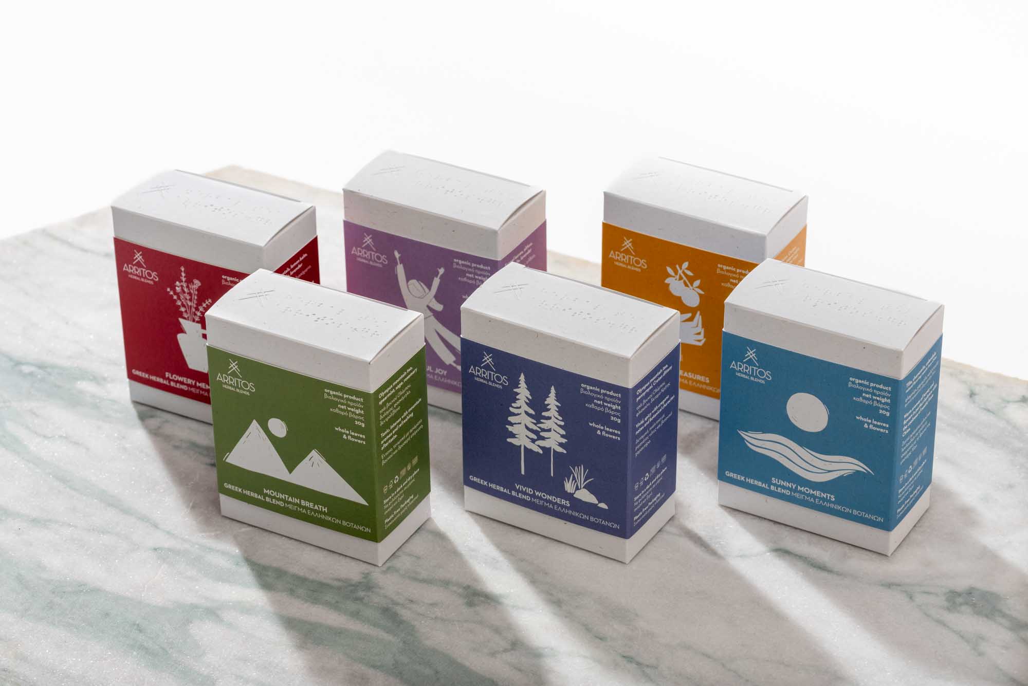
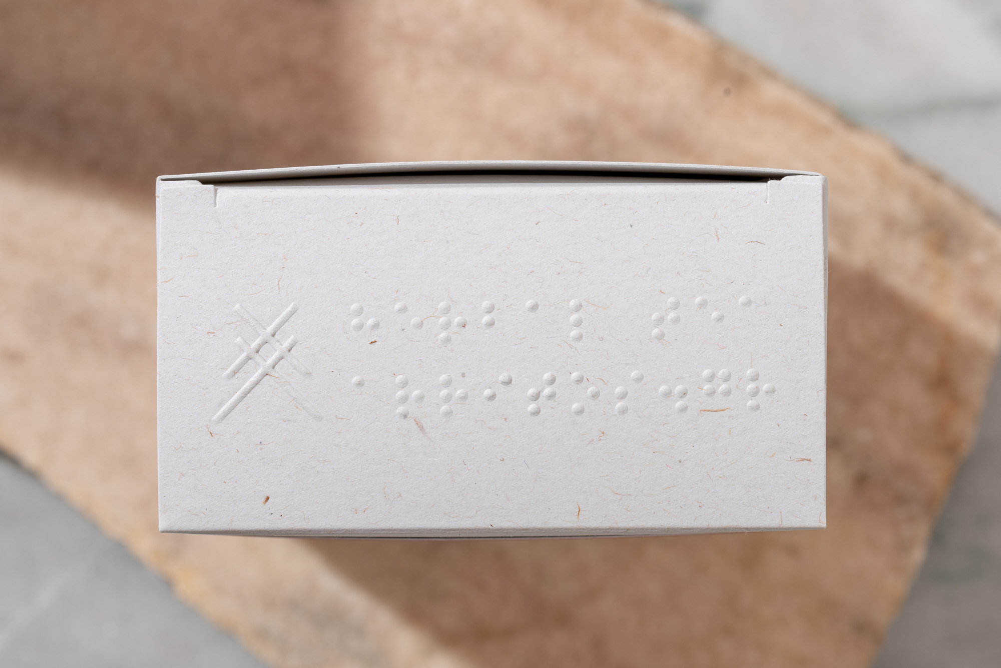
The word Arritos in greek means something that can not be said or described. It is a word that characterizes the unique experiences of Arritos herb blends. Therefore, the objective of designing the packaging of the packaging series was to visualize this concept. The starting point of this visualization was the logo, an abbreviated “A” formed by crossed lines, thus symbolizing the impossibility of describing the experience in words. At the same time, the form of the symbol also works as a reference to the tradition, with which Arritos connects, visualizing the wooden beams of the roofs in the Greek villages.
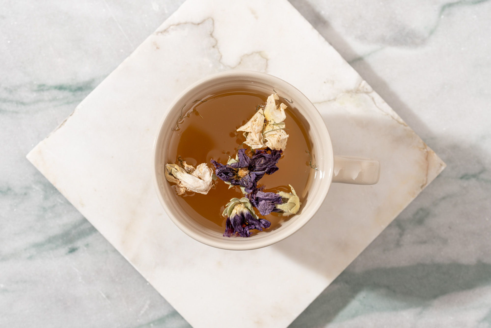
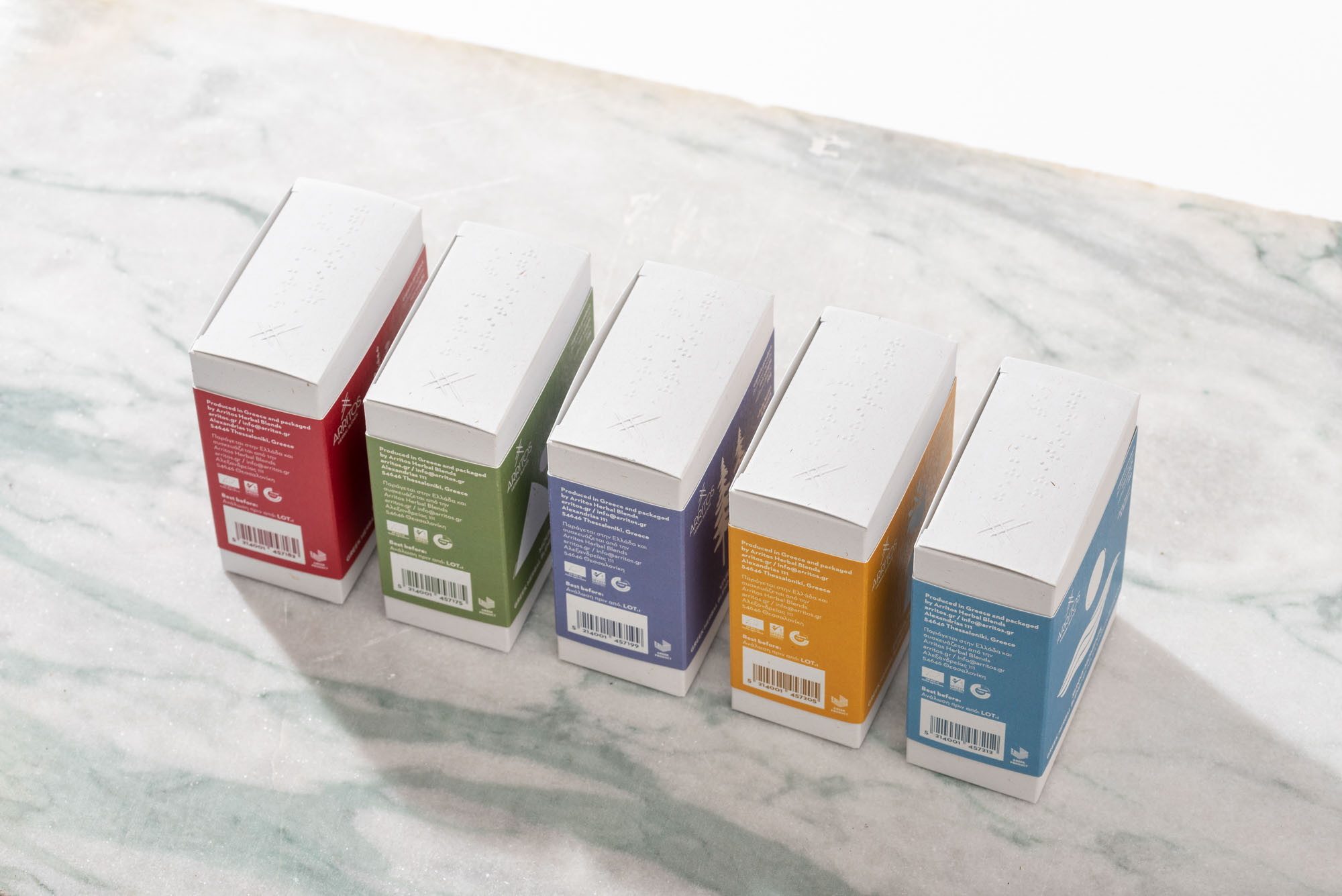
Through the new packaging for Arritos we sought to present a creative, economical and practical solution. Regarding the design direction we followed, Arritos asked us to create packages that would highlight the character of each mixture and would inspire the tea drinker to drink them hot and cold. We decided not to show the product through a cutter as this would alter the quality of the content. We created illustrations that are inspired by each product, not by the ingredients, but by the experience. At the top of the package, in addition to the embossed Arritos symbol, you will also find Braille characters for the visually impaired. In terms of materials, avoiding plastic in the whole package was one of the goals of the brand and ours. At the same time, we selected recycled and recyclable papers.

CREDIT
- Agency/Creative: slab design studio
- Article Title: Slab Design Studio Create the Packaging Design for Arritos Herbal Blends from Greece
- Organisation/Entity: Agency
- Project Type: Packaging
- Project Status: Published
- Agency/Creative Country: Greece
- Agency/Creative City: Thessaloniki
- Market Region: Europe
- Project Deliverables: Packaging Design
- Format: Box
- Substrate: Pulp Paper
- Industry: Food/Beverage
- Keywords: tea, herbal blends, greece, box design, illustration
-
Credits:
Designer: Nikos Giuris
Illustrator: Fani Rampota
Photographer: Giorgos Oikonomou


