


SKL group is one of the largest manufacturers of sanitary ware and bathroom products in Russia. In 2019, the top management of the company realized the need to change the strategic orientation, developed a new strategy and formulated a new mission of the company.
SKL is ambitious about the future: it plans to enter foreign markets, actively develop sales and promotion in the Internet, invest in international logistics. All these are prerequisites for the renewal of the identity.
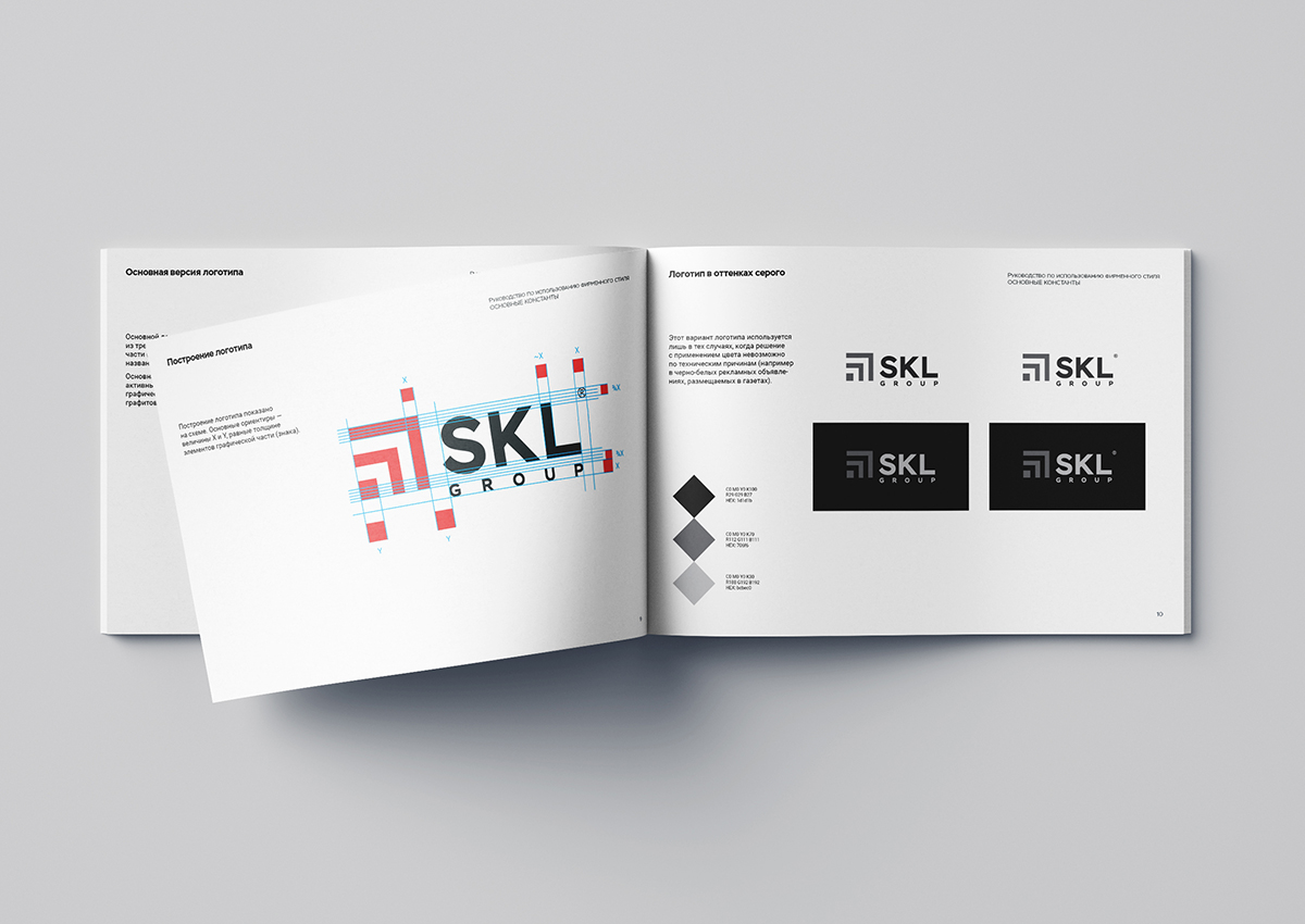
Having carried out a visual analysis of the existing corporate block, we identified several problematic moments. The design team proposed 3 concepts for logo renewal, and as a result, the most successive option was chosen.
The mark has become more stable, and the whole name block is more balanced, easy and readable by adjusting the color scheme, geometry and the name’s spelling.
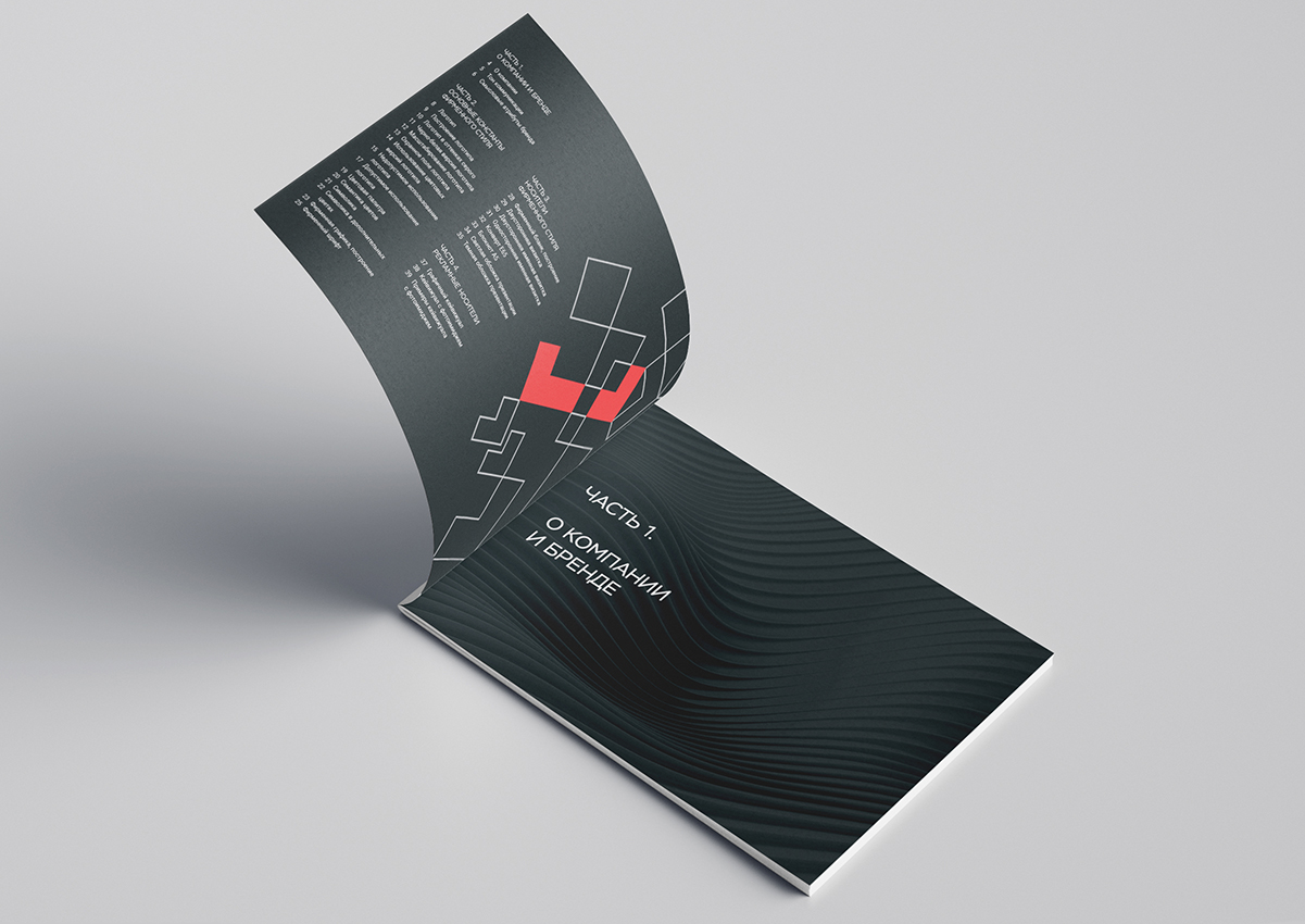
New corporate graphics
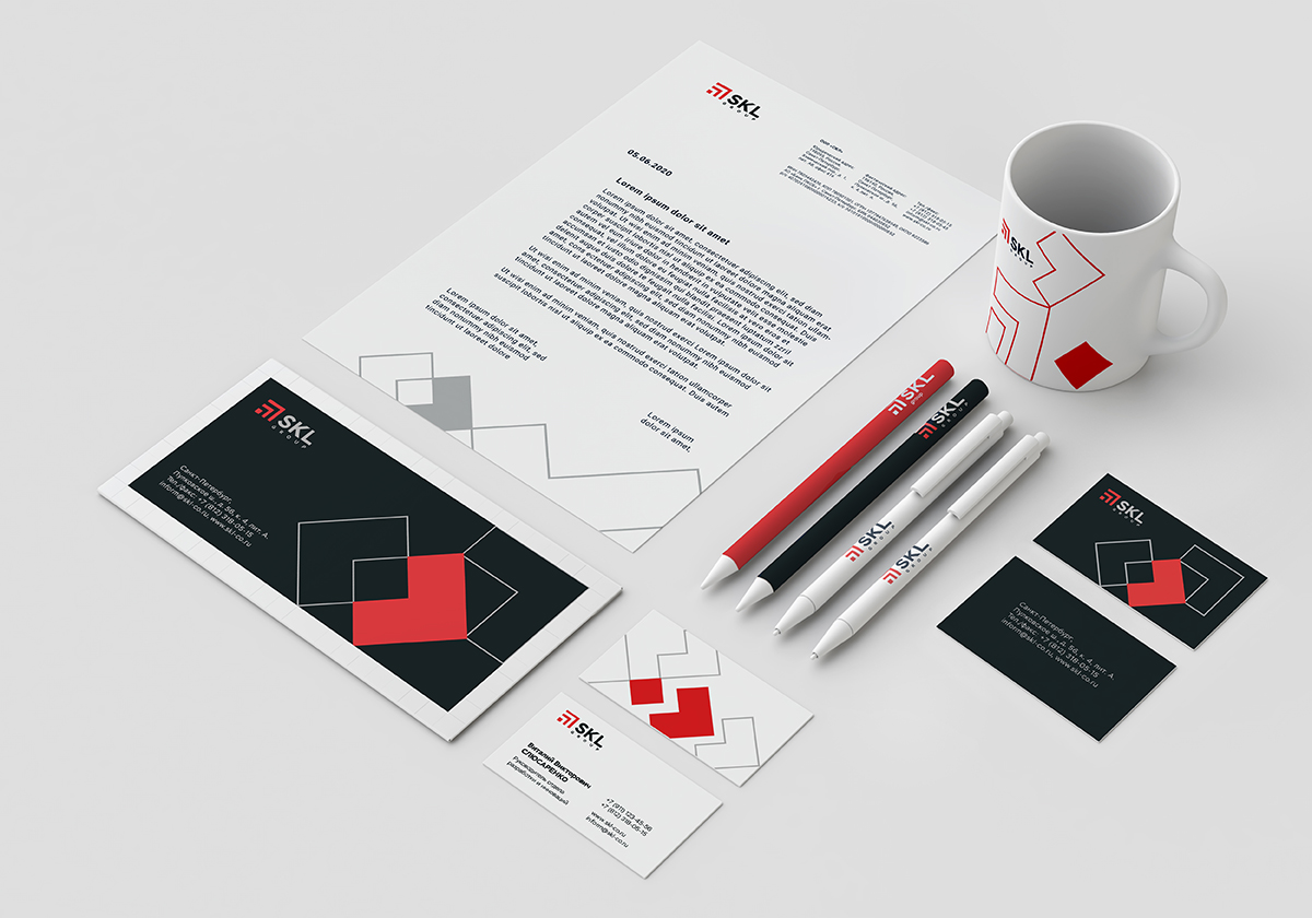
Designers of the studio offered two color palettes: basic and additional. General corporate identity is solved in the basic colors. This range is restrained, and the color accent – on dynamics and movement forward.
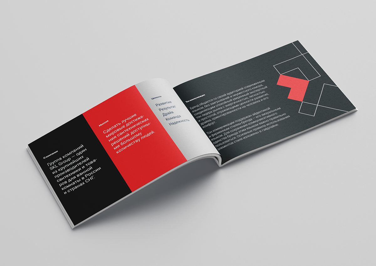
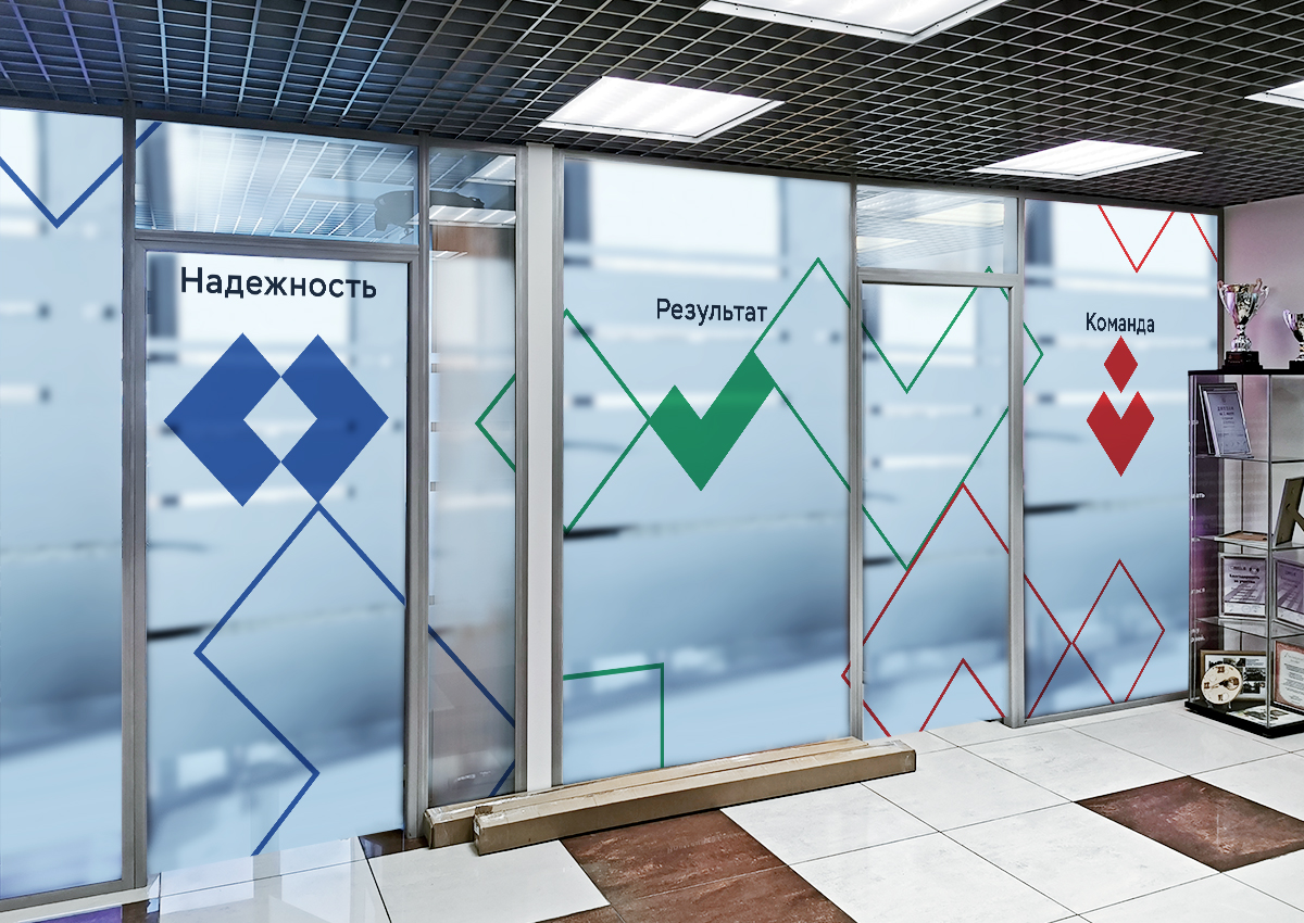
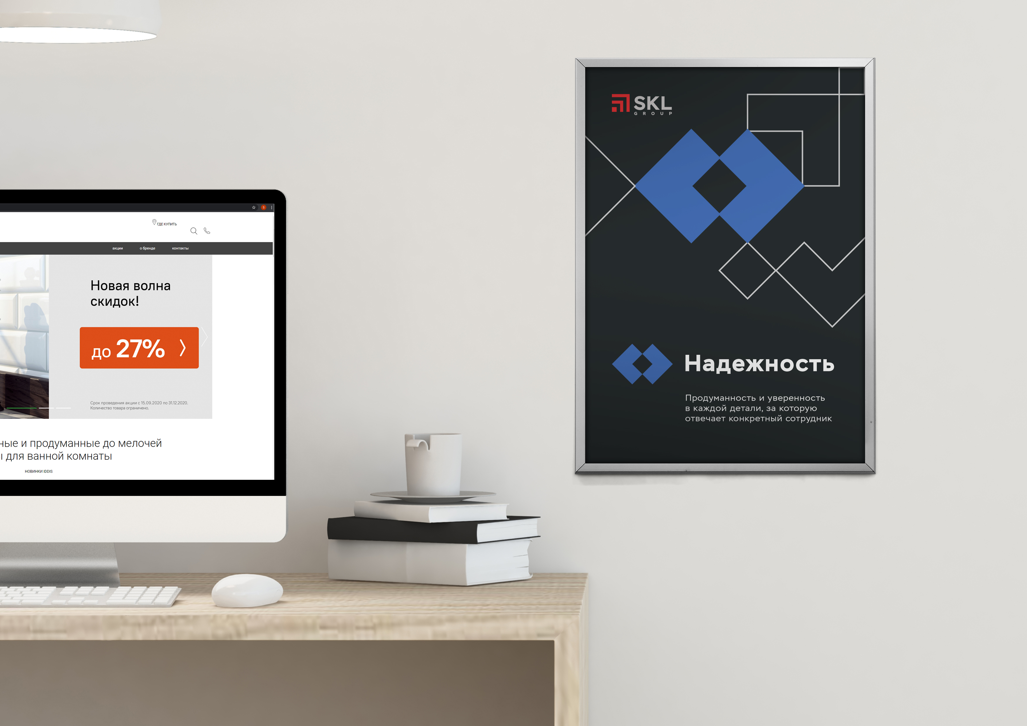
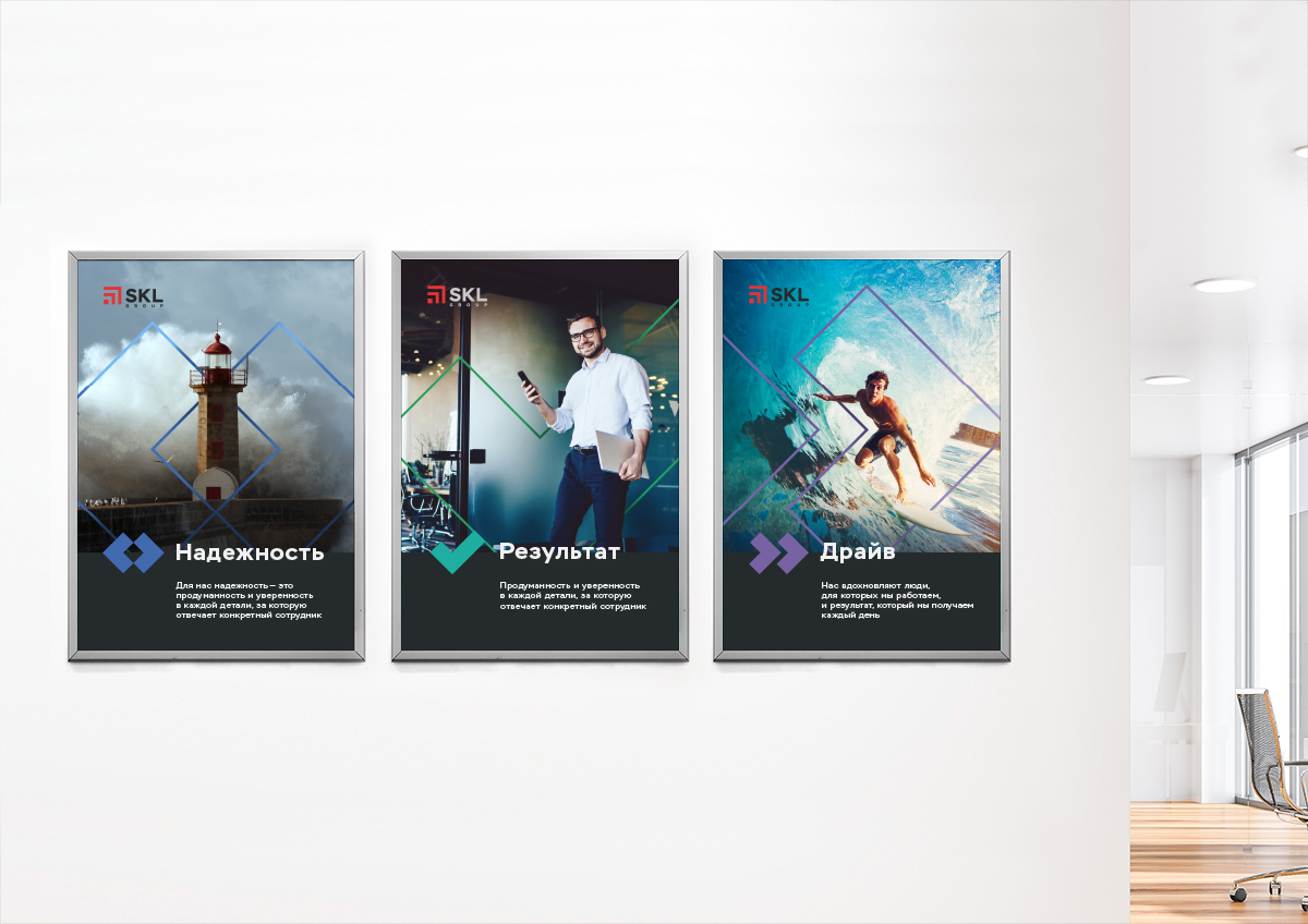
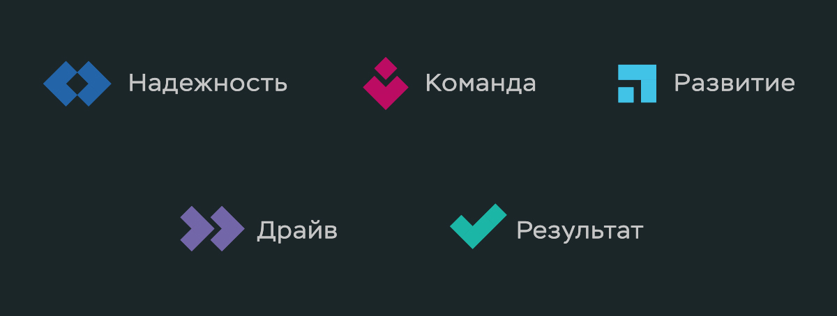
Additional colors are focused on communication tasks within the company. The identity is based on a common graphical method – a combination of symbols of the five main values of the company. Each value reflects a concise symbol, which is based on the plasticity of the sign.
The concept of key visuals – emotional, active photo images that convey the spirit of aspiration for the goal, achievement, result orientation, team game. Identity is used as colorographic accents.
Brand designers from DEZA have carefully restyled the logo for SKL: they have balanced the sign and the font part, reduced the severity and made the construction lighter. The brand has additional elements of identity, as well as two colors – basic and additional.
The work of two teams – agency and client – resulted in motivational posters for employees and the concept of office space design. For SKL, leadership is a necessity, and this was clearly shown in the design. Identity through its geometry, color, rhythm transmits that SKL is a strong, leading, heroic brand.
CREDIT
- Agency/Creative: DEZA
- Article Title: SKL Group Brand Identity Update By Studio DEZA
- Organisation/Entity: Agency, Published Commercial Design
- Project Type: Identity
- Agency/Creative Country: Russia
- Market Region: Europe
- Project Deliverables: Brand Architecture, Brand Guidelines, Brand Identity, Brand Strategy, Branding, Graphic Design, Identity System, Research
- Industry: Retail
- Keywords: Branding, Agency, Rebranding, Logotype, Identity, Design, Russia, Design Agency, Redesign, Brand Guidelines, Russia, Graphic Design


