


Moço Wine Branding – Singellus
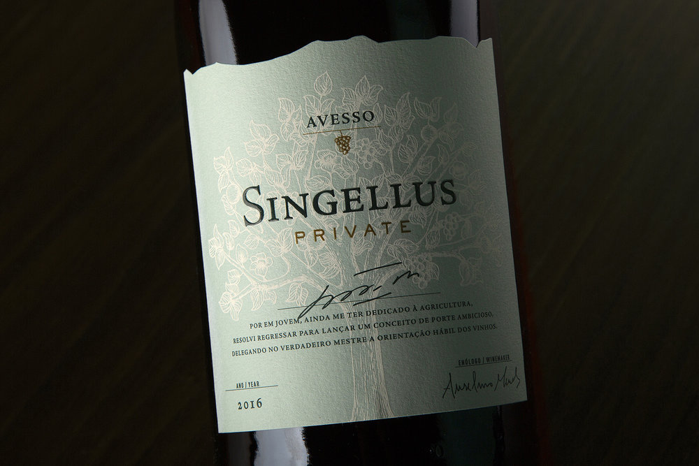
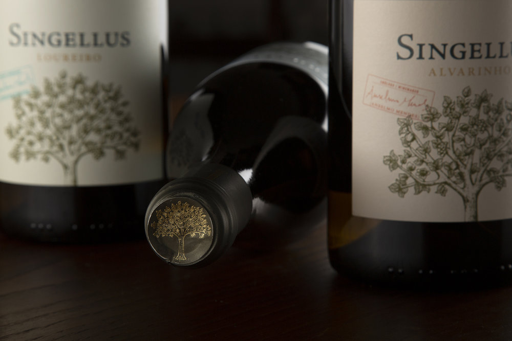
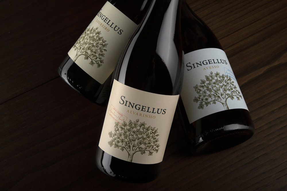
Singellus is the latest great project of Belmiro de Azevedo and a tribute to his life. This industrial entrepreneur was one of the greatest visionaries and leaders of Portugal’s business history and a model of entrepreneurship.
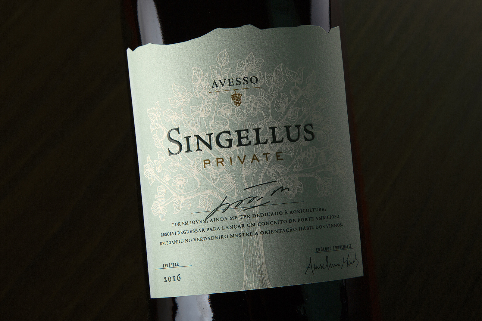
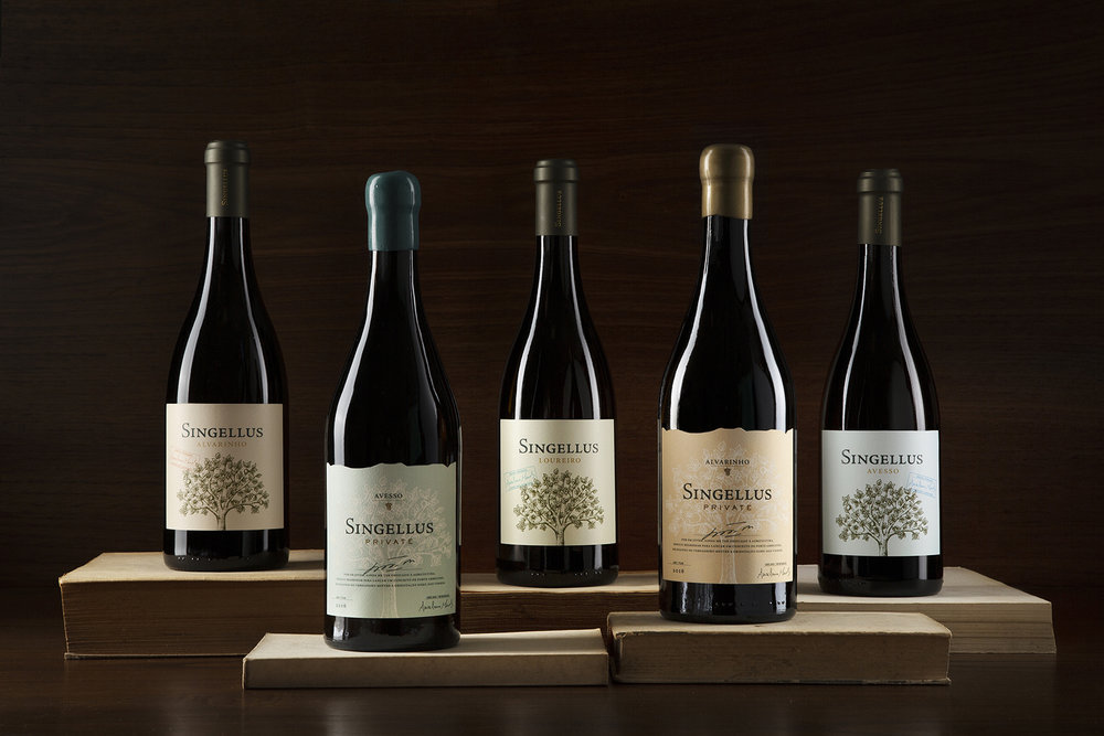
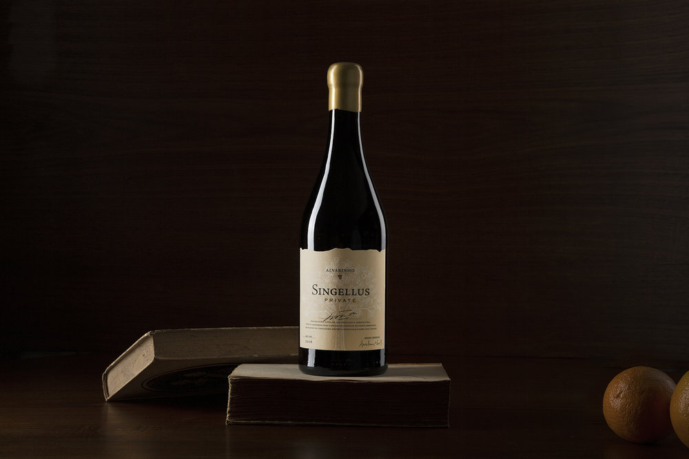
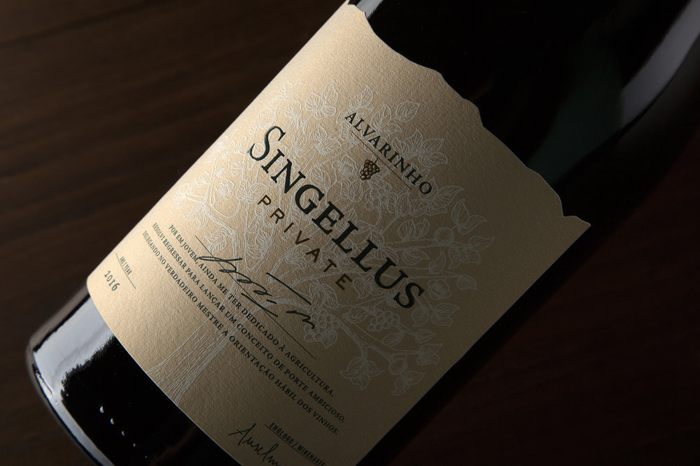
The wine has its origin in the Azevedo’s vineyard, their family farm located in Marco de Canaveses. A botanical garden has been created within this refuge, where vegetables and fruits are also produced. Thus, the entrepreneur’s passion for botany and viticulture was the starting point for the concept of Singellus – a name derived from Latin with Roman influence.
Singellus is born as a reflection of the Tree, the Great Mother, symbol of the duality of Life and the cyclical character of regeneration – the symbol of Life and Resilience for Belmiro de Azevedo – offering its fruits with simplicity, abundance and magnificence.
CREDIT
- Agency/Creative: Moço Wine Branding
- Article Title: Singellus Wine Graphic Packaging Design From Portugal
- Organisation/Entity: Agency Commercial, Published
- Project Type: Packaging
- Agency/Creative Country: Portugal
- Market Region: Europe
- Format: Bottle
- Substrate: Glass


