


The Cotswold Pie Co is a family run business; whose pies are handmade in the Cotswolds (incase the name didn’t give it away!). They use only high quality ingredients, and all meat is sourced from British farms, and local where possible.
In a time of lockdown where cooking at home became more popular, these pies made their way into the market, to be cooked at home without all the preparation work. We wanted to make sure they stood out, and grabbed the attention of consumers through bold packaging.
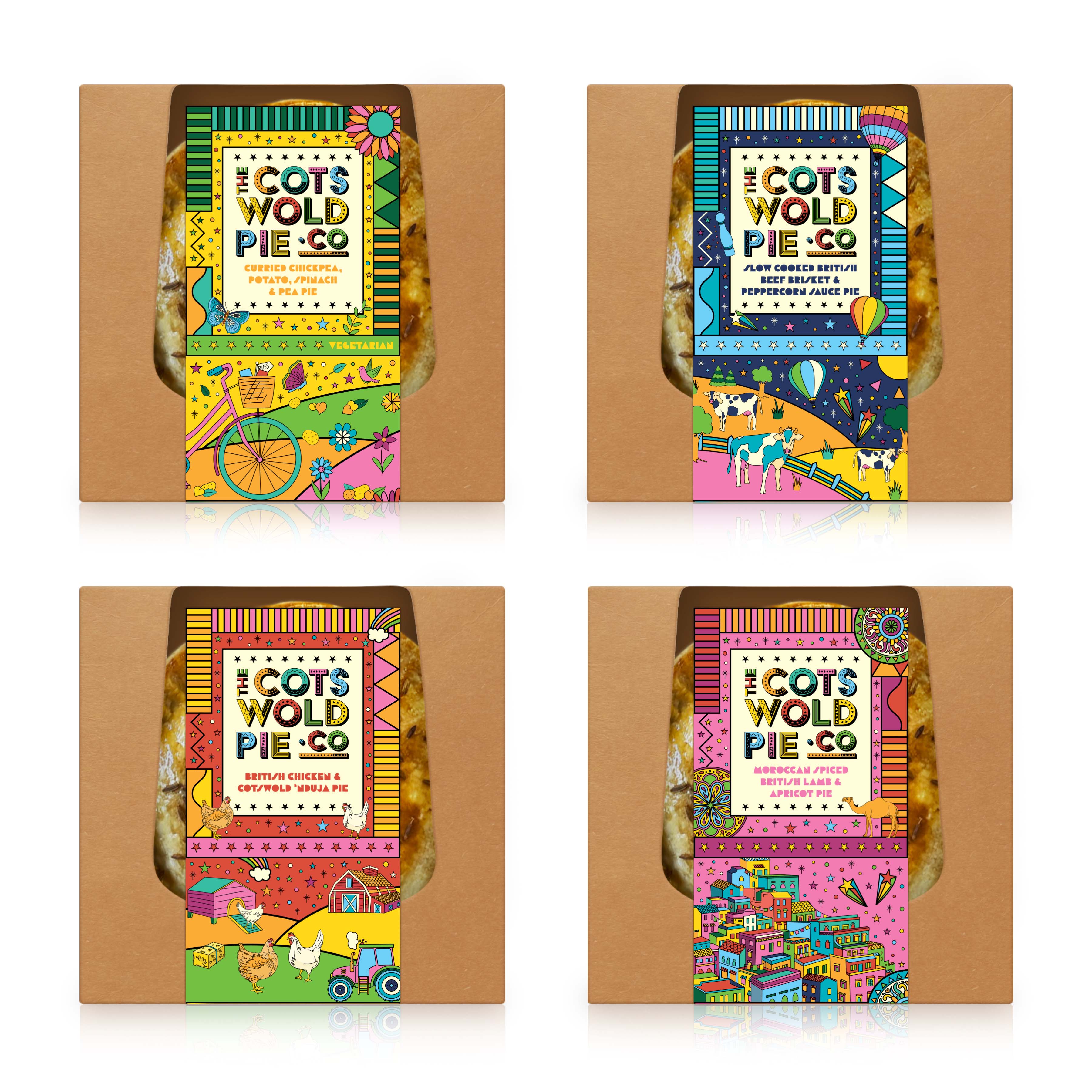
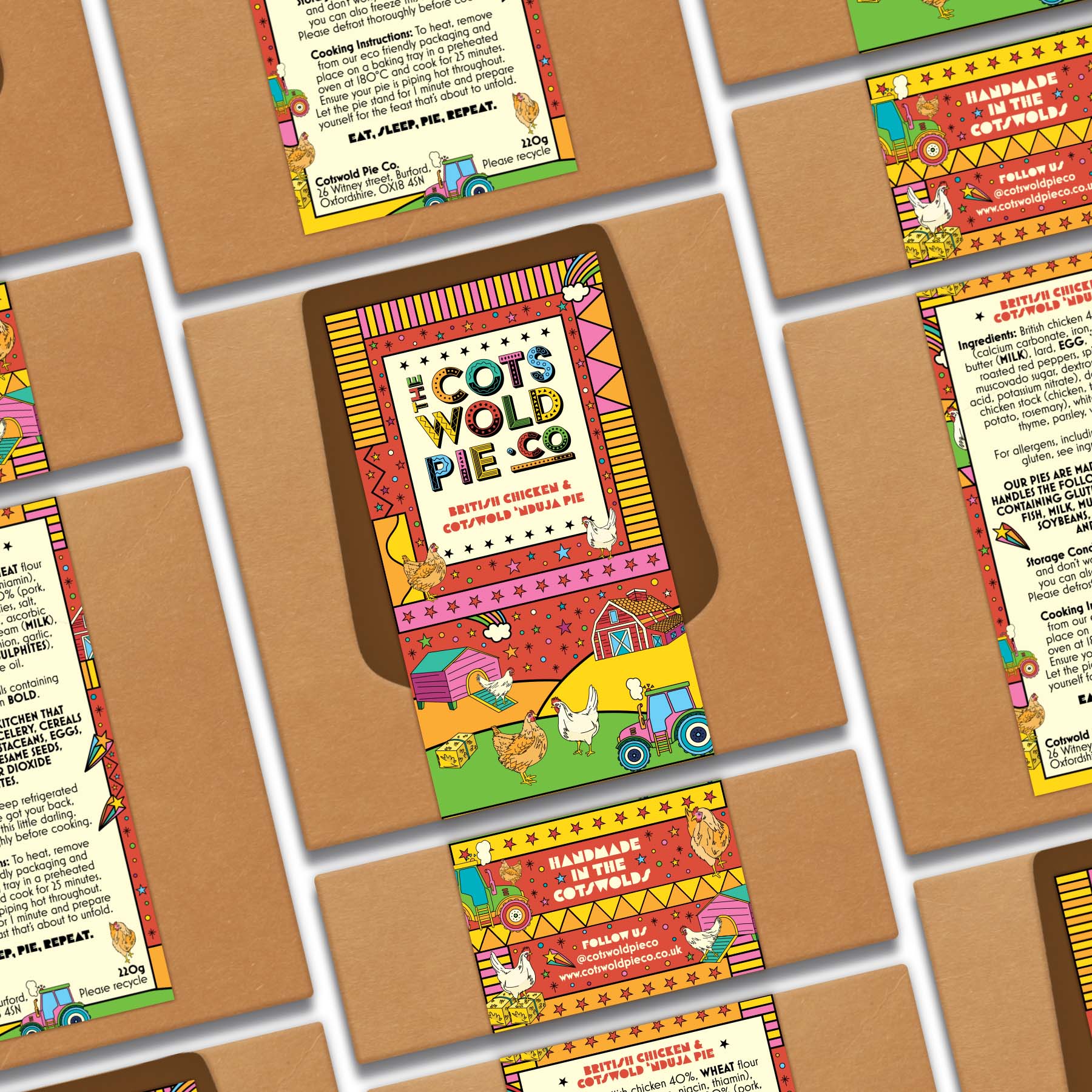
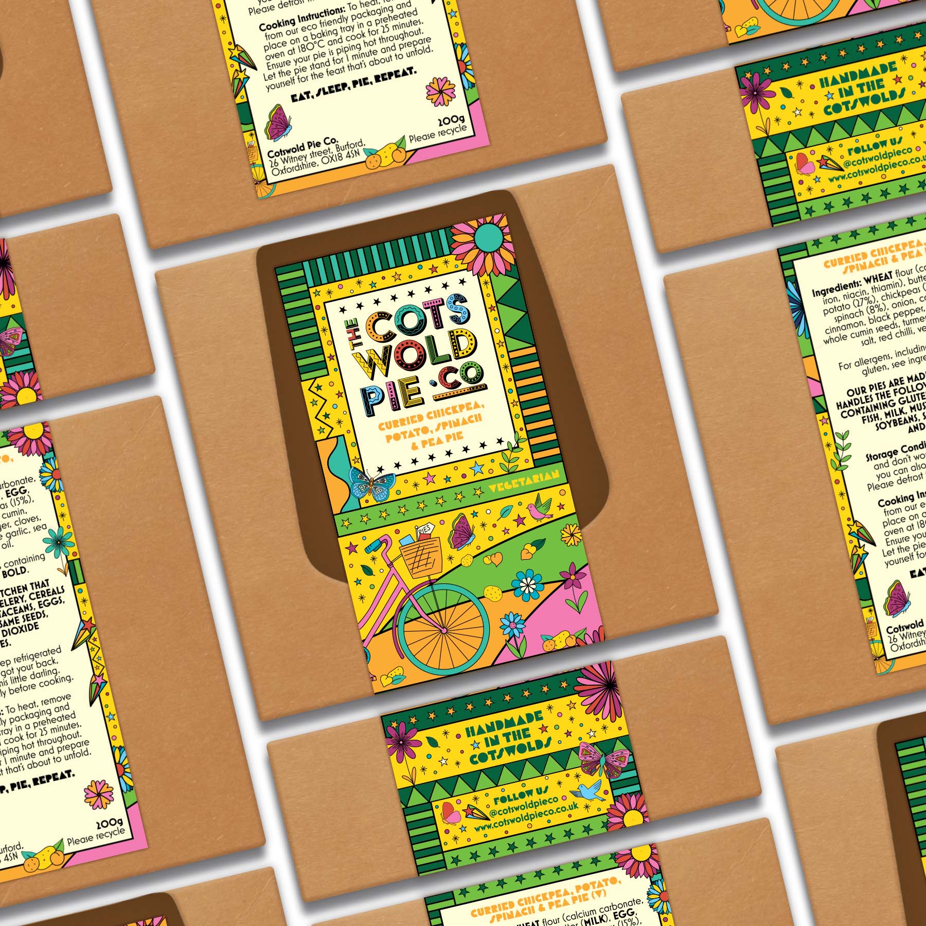
It was hugely important to the brand that the ingredients played a role in the packaging and that the overall branding was colourful and joyous, reflecting their family feel and happiness behind the company and their delicious products.
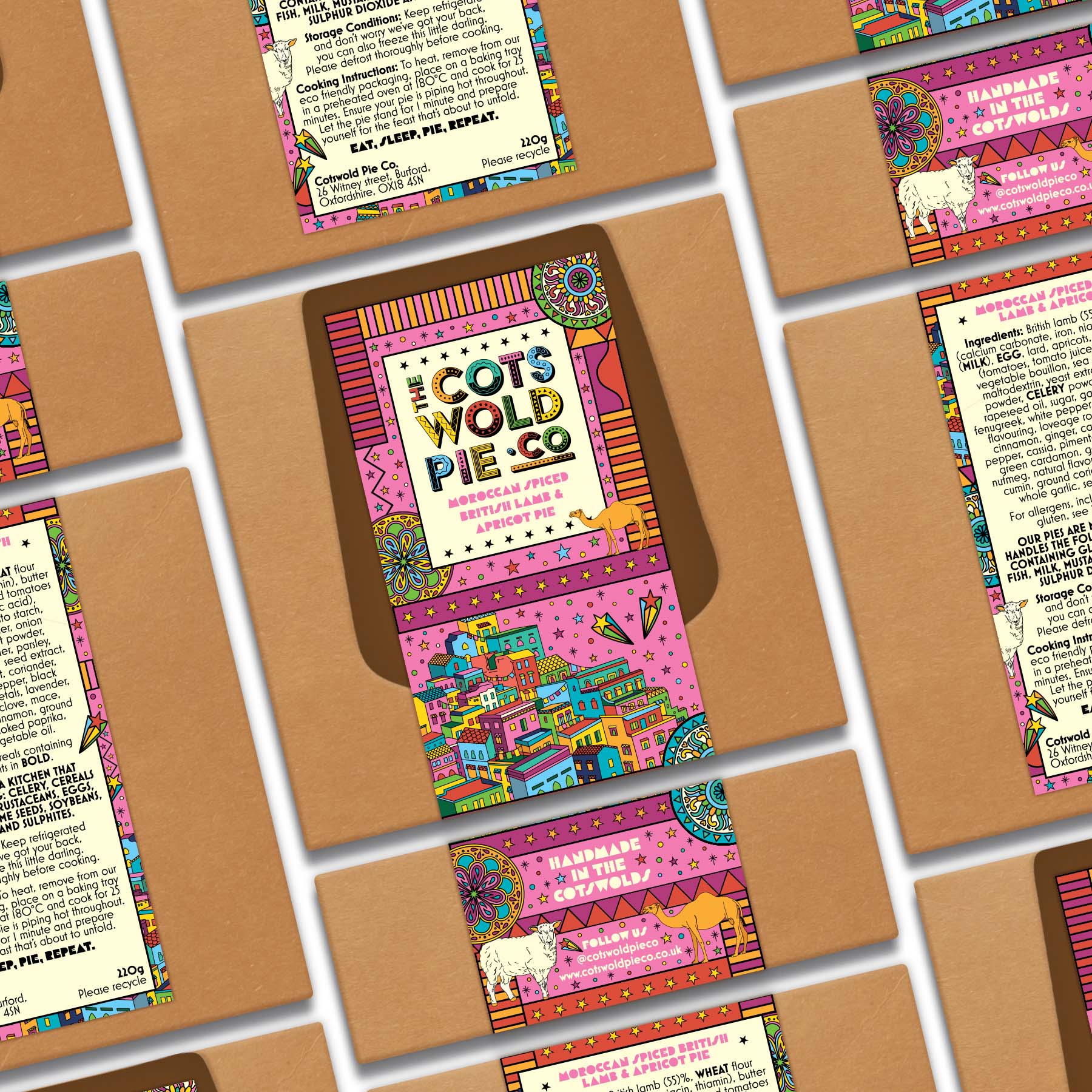
The Cotswold Pie Co. wanted to make sure their branding appealed to an audience of all ages, by creating a sense of enjoyment through its design. The sustainable Kraft box had already been chosen, and we chose to create a wrap around label that was fully recyclable, meaning that the entire box can be recycled, and would also survive the freezer, as that is a selling point of the pies!
Given potential future plans for The Cotswold Pie Co, we were inspired by bright colours with a festival feel. We created a vibrant colour palette and bold illustrations to depict the ingredients within the pie and the environments those ingredients may be found in. Combining these colours and inspirations together allowed us to create labels which were striking individually but also worked cohesively when together on shelf.
We wanted the design to ooze fun and have a feeling of difference about them. Who knew how well colourful Moroccan buildings from one label could sit, next to a cow in a pink field on another? Each pack reflects the flavour of the pie through illustration whilst repeating patterns in different colour ways to keep brand consistency. The individual labels each have a main colour that also represents the flavours within.
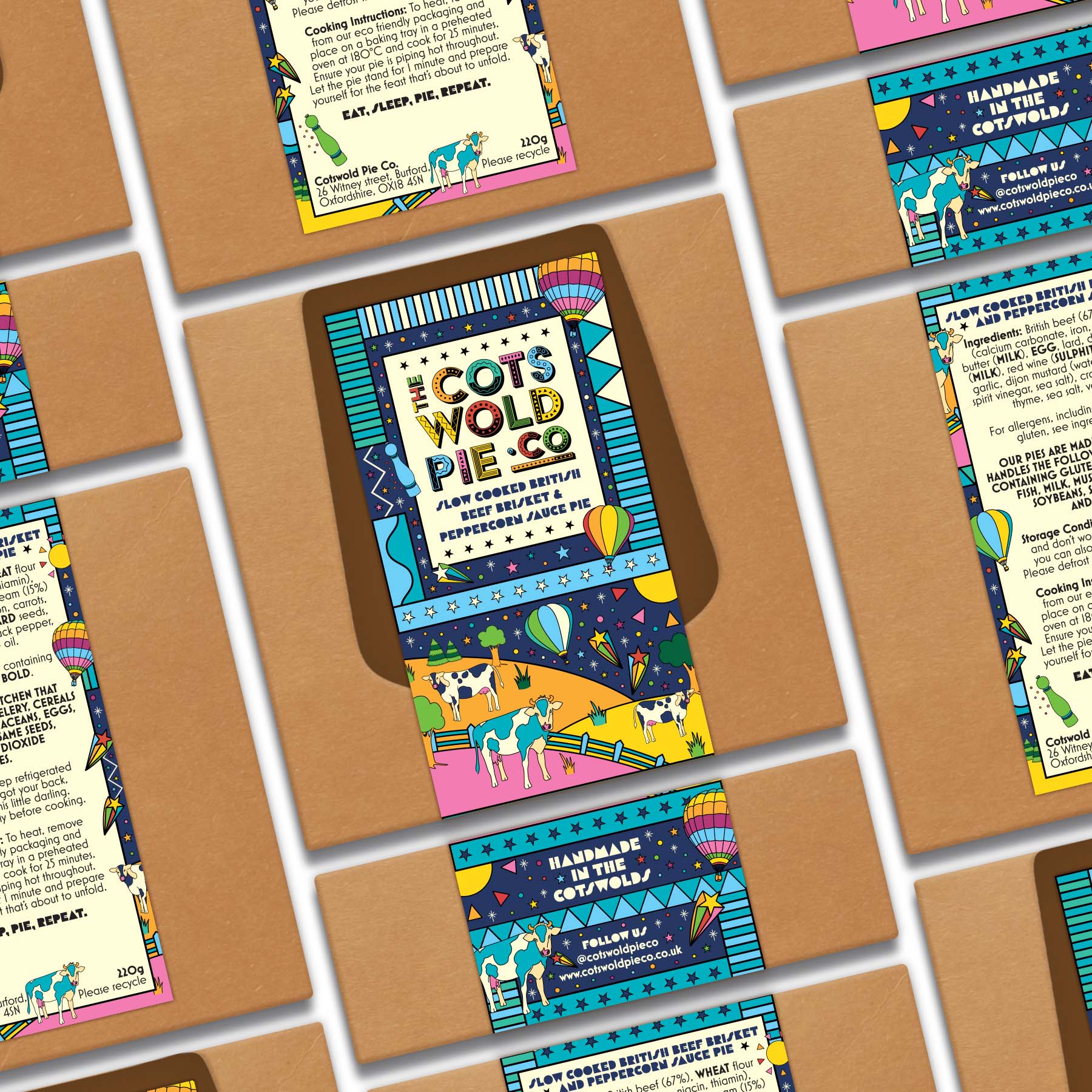
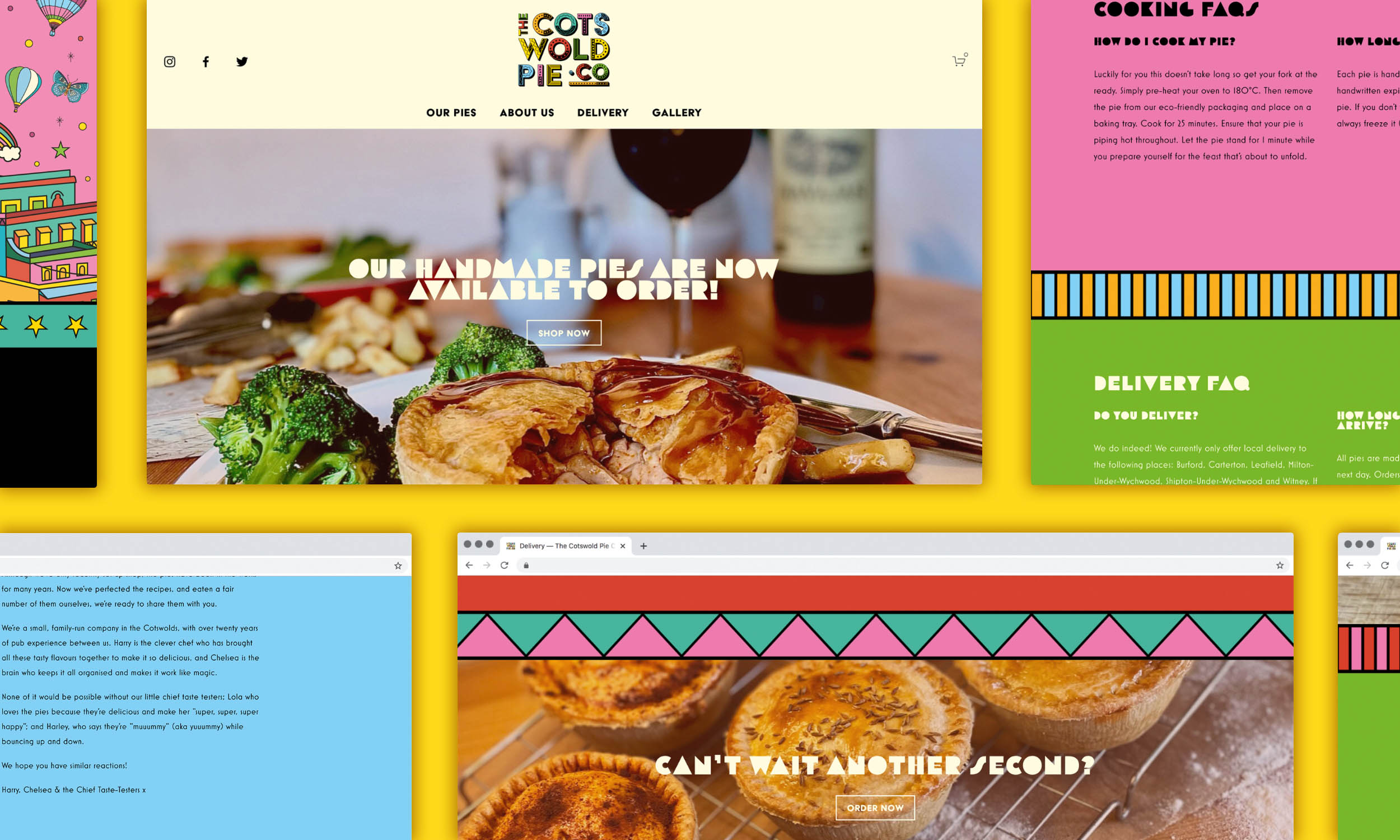
We used the same colour palette and playful illustrations across all branding from business cards to their website, to give the flavour and ingredient illustrations more character and more of a life. Thanks to the flavours and packaging design, these have become an integral part of the brand’s identity.
CREDIT
- Agency/Creative: Sesame Creative Design Studio
- Article Title: Sesame Creative Design Studio Create Brand and Packaging Design for The Cotswold Pie Co.
- Organisation/Entity: Agency
- Project Type: Packaging
- Project Status: Published
- Agency/Creative Country: United Kingdom
- Agency/Creative City: Altrincham, Greater Manchester
- Market Region: Europe, Global
- Project Deliverables: Brand Creation, Brand Design, Brand Guidelines, Brand Identity, Brand Mark, Brand Tone of Voice, Branding, Copywriting, Creative Direction, Graphic Design, Illustration, Logo Design, Packaging Design, Packaging Guidelines
- Format: Box
- Substrate: Pulp Carton
- Industry: Food/Beverage
- Keywords: WBDS Creative Design Awards 2021/22
-
Credits:
Founder and Designer: Alice Letherbarrow


