


About the Project: The Ohmybrand team and the “Sense and Benefit” brand of toppers clearly share goals and values. We like to make a good thing even better and add taste to life. That is why it was so exciting to work together and create a new packaging design for healthy salad seed mixes. The brand “Sense and Benefit” has all the right ingredients for success — a high-quality interesting product of seed mixes that add flavour and originality to salads, an attractive niche of healthy nutrition, a growing target audience of healthy lifestyle lovers. Only the right recipe and the final image were probably missing.
Therefore, Ohmybrand was faced with the task of developing it — specifically, creating a packaging design and a logo that would clearly explain why you need to choose this brand among the increasing number of competitors in a new product category.
Concept: An additional difficulty with positioning was precisely the novelty of the niche. Buyers are not yet used to the fact that salads can include not only the usual vegetables and spices, but also toppers – which, meanwhile, significantly increase the usefulness of the dish and add flavor accents.
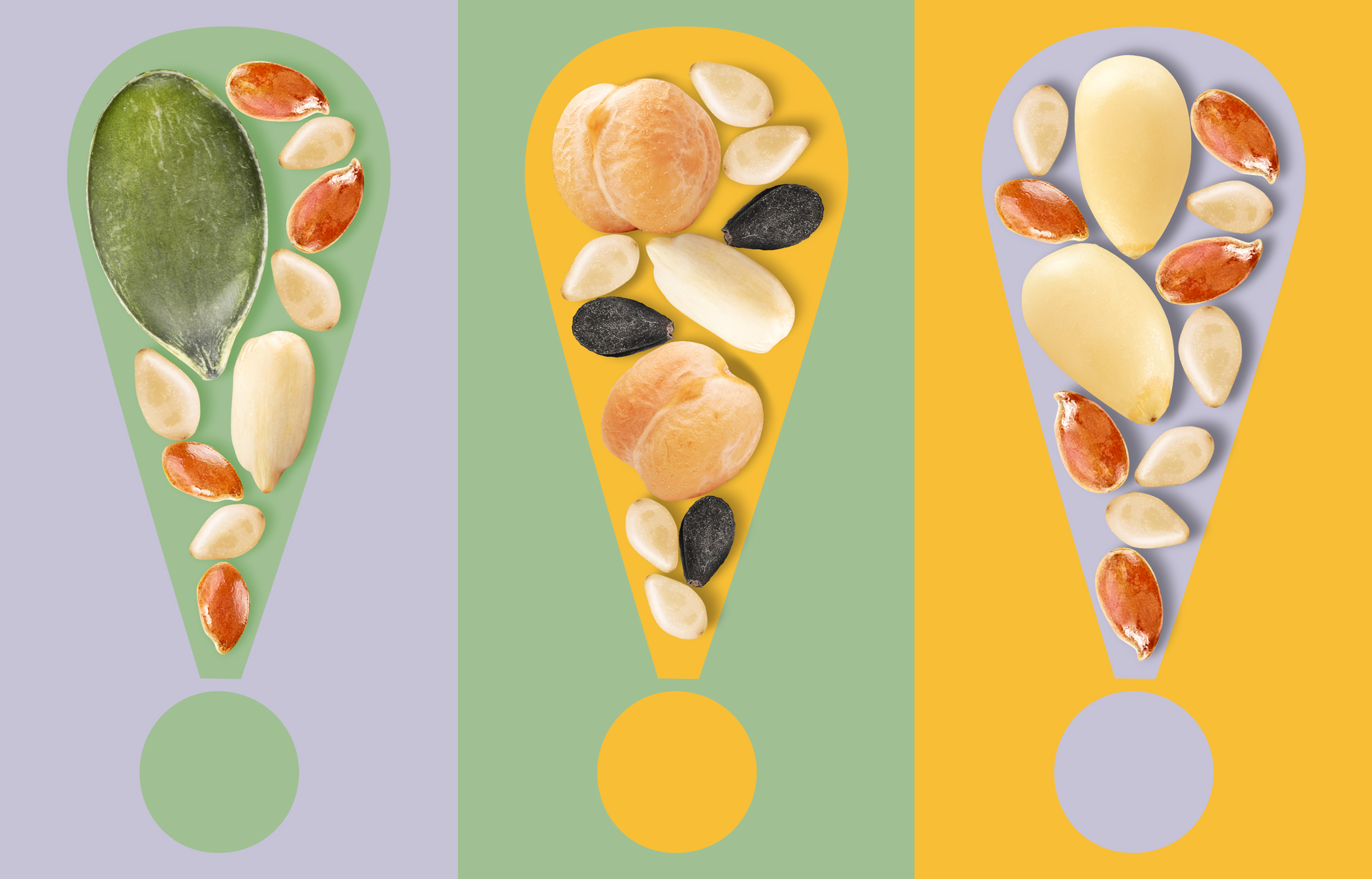
It was from the idea of adding accents that a new design concept was born. After all, sprinkling a freshly prepared salad with pumpkin seeds, flax or sesame seeds and pine nuts is like putting a full stop at the end of a sentence – or rather an exclamation mark.
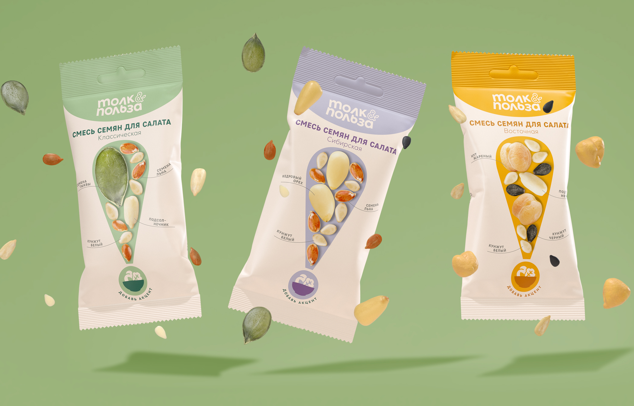
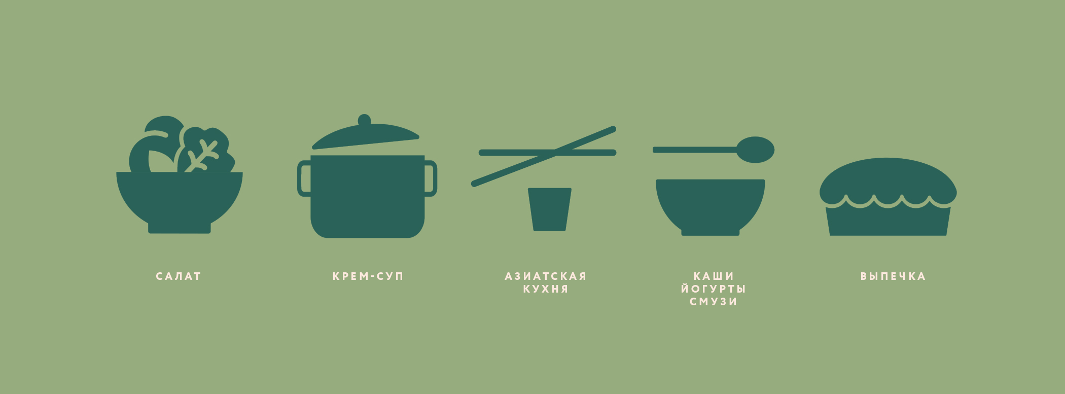
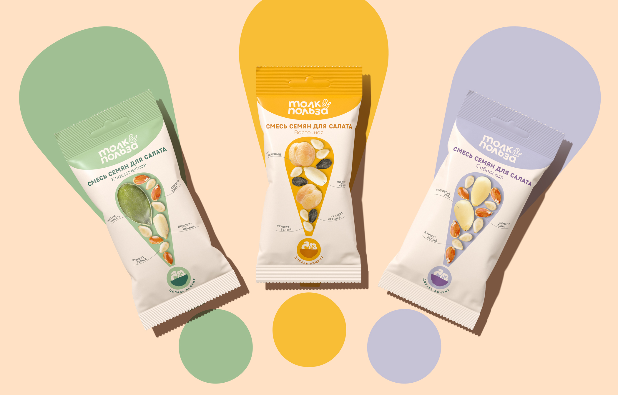
Visual Solution: For now there are three mixes in the “Sense and Benefit” line — Classical, Eastern and Siberian. The back side contains all the necessary information, as well as examples of salads where the topping can be used.
A different color was chosen for each mix: light green, orange or light purple. At the same time the basic neutral tone of the package does not distract from the ingredients. The images of all the seeds and nuts inside are shown on the exclamation mark, and the inscription “Add an Accent” at the point was symbolically the last to appear during the development of the new design.
The pictogram in the point also serves as an additional identifier of the line, since the brand is not going to stop and is planning to expand. Soup and porridge mixes are coming next. More of the sensible and beneficial habits are on the way!
CREDIT
- Agency/Creative: Ohmybrand
- Article Title: Sense and Usability Design Development for Seed Mixtures
- Organisation/Entity: Agency
- Project Type: Identity
- Project Status: Published
- Agency/Creative Country: Russia
- Agency/Creative City: Moscow
- Market Region: Asia, Europe
- Project Deliverables: Art Direction, Brand Identity, Brand Redesign
- Industry: Food/Beverage
- Keywords: Packaging, Design, Eco, Food, Toppers, Toppings, Brand Identity
-
Credits:
Creative Director: Nadezhda Parshina
Designer: Eugenia Kudrinskaya
Project Manager: Anna Tsareva


