


Making Sense Studio – Sangrita De Chapala
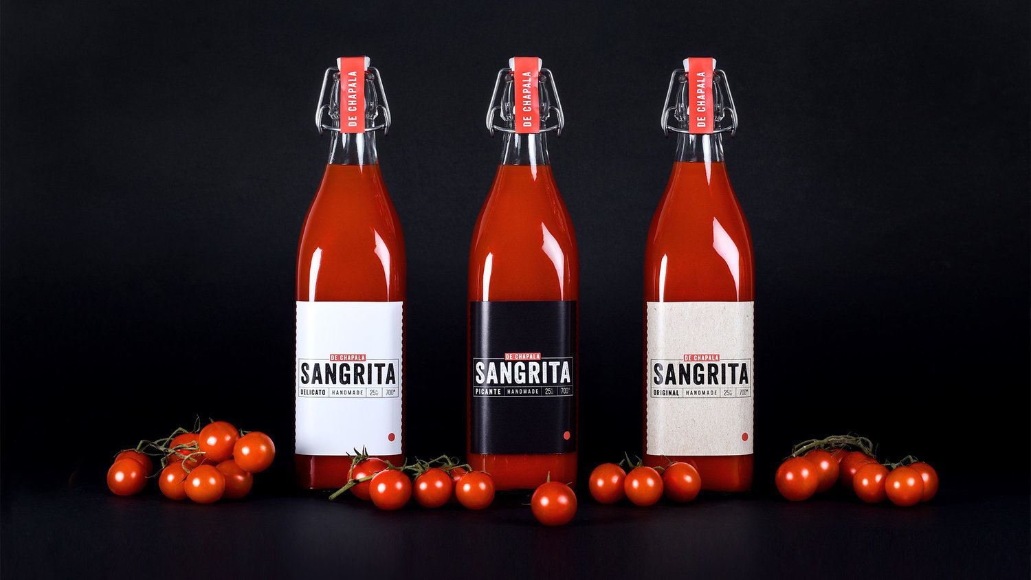
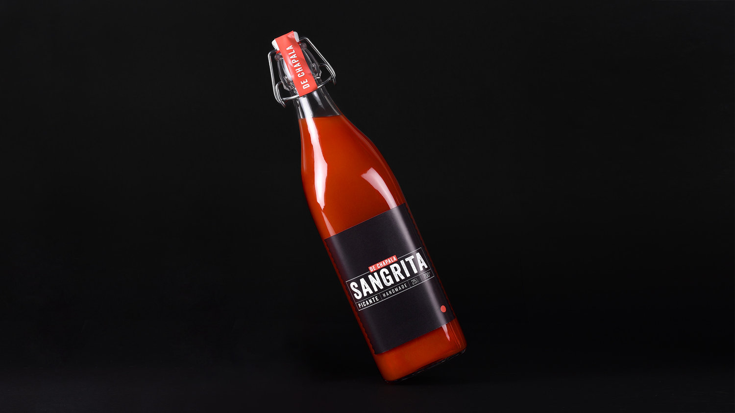
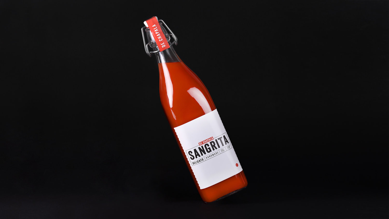
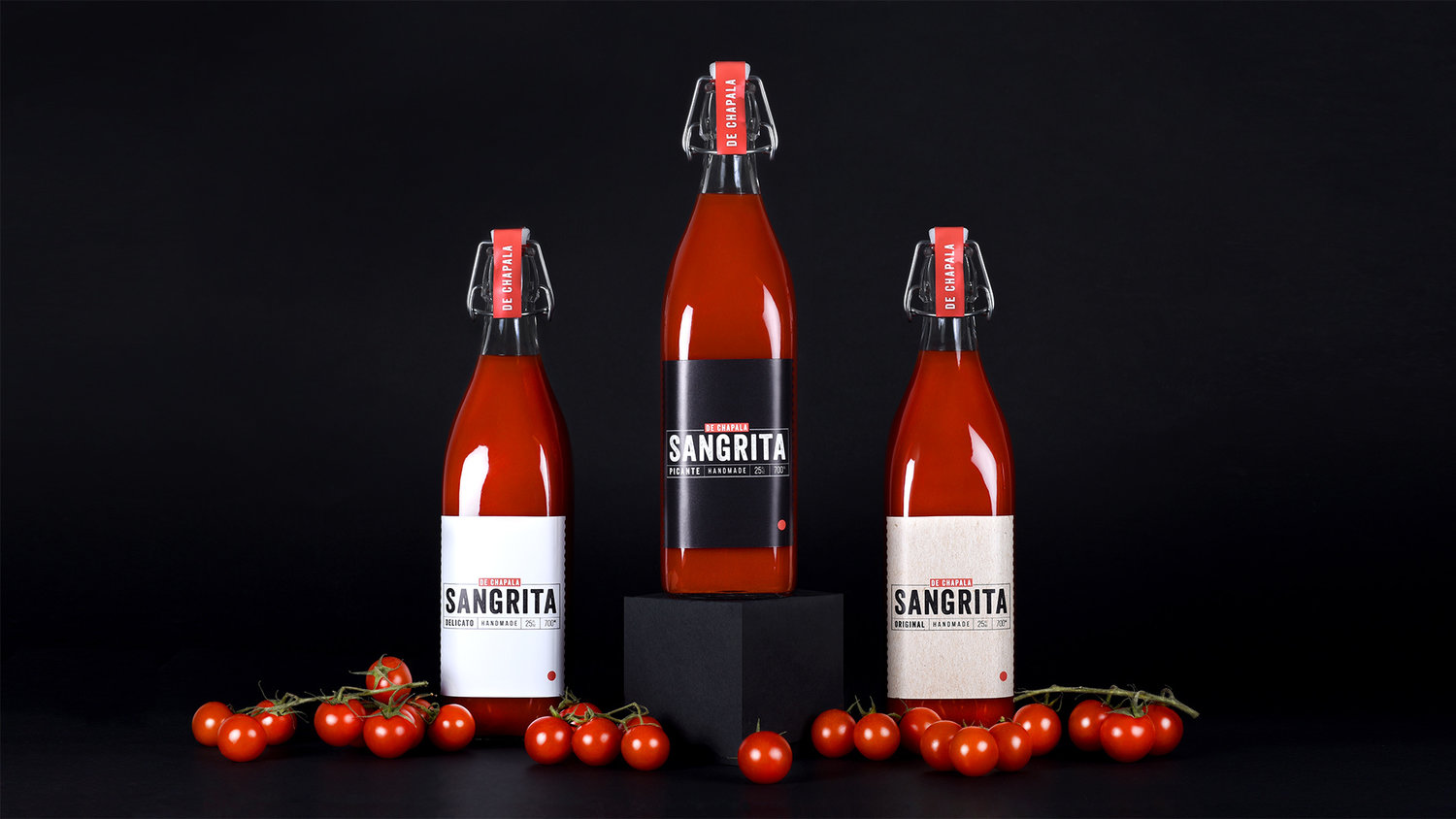
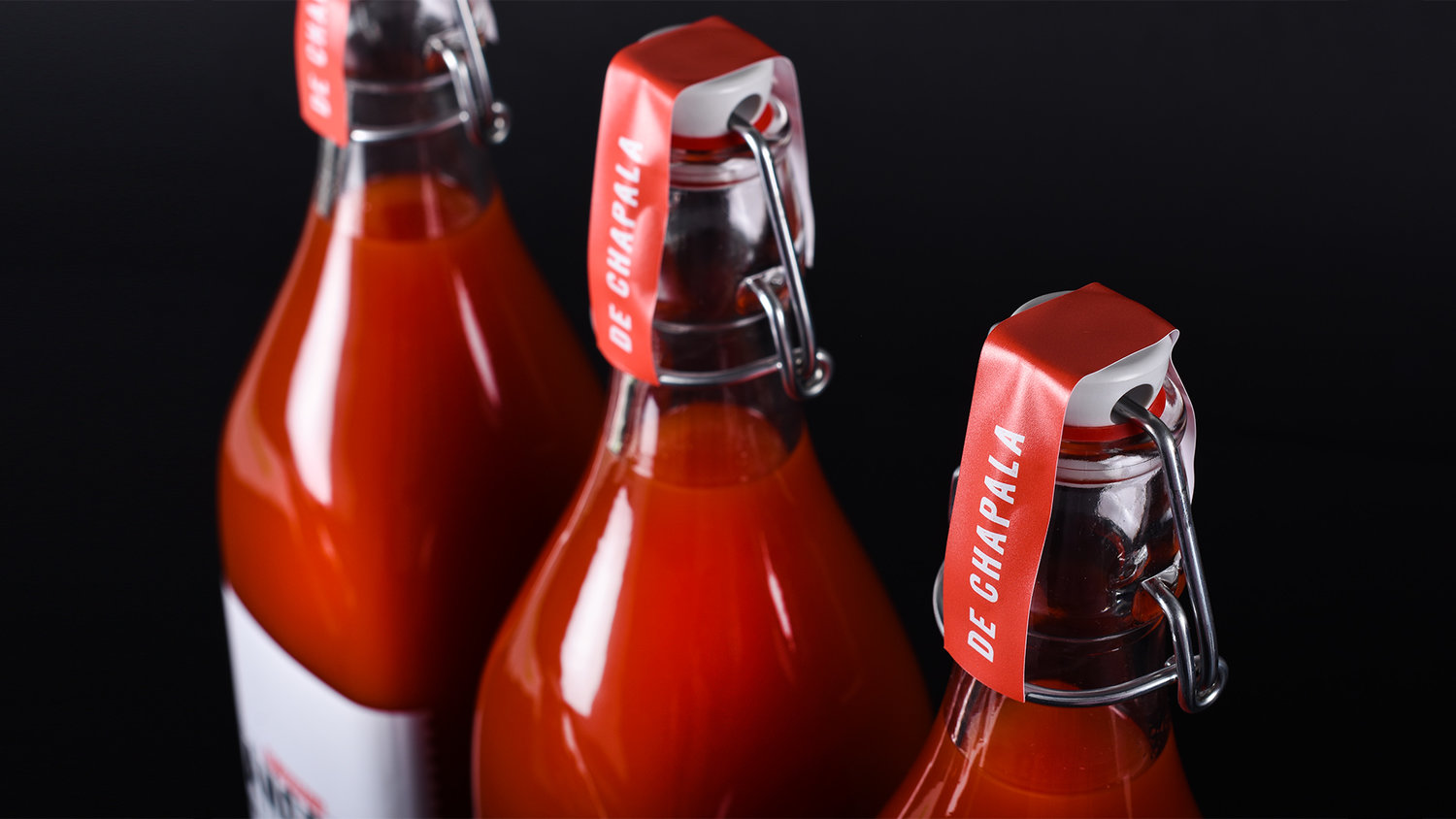
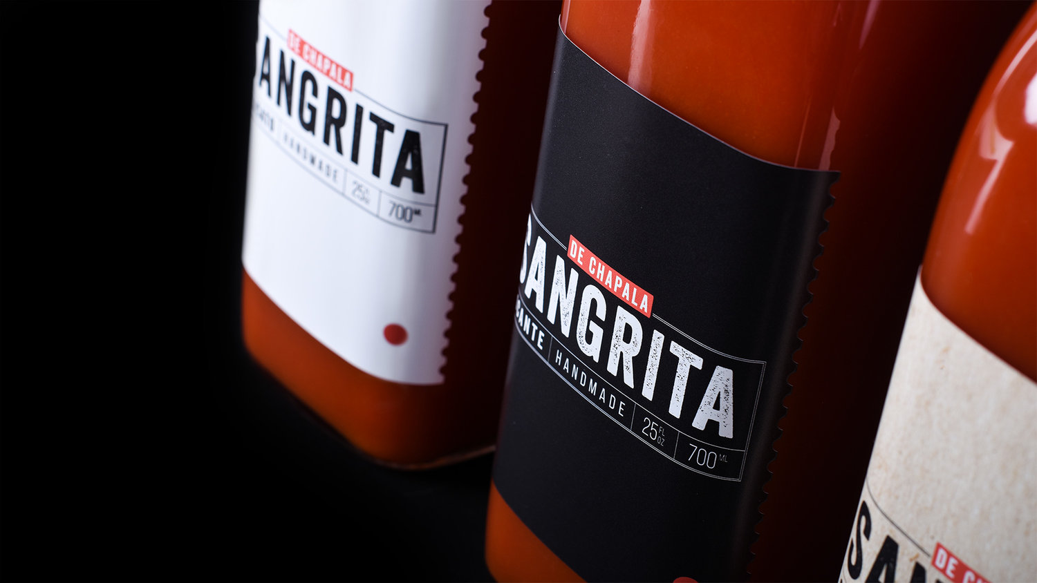
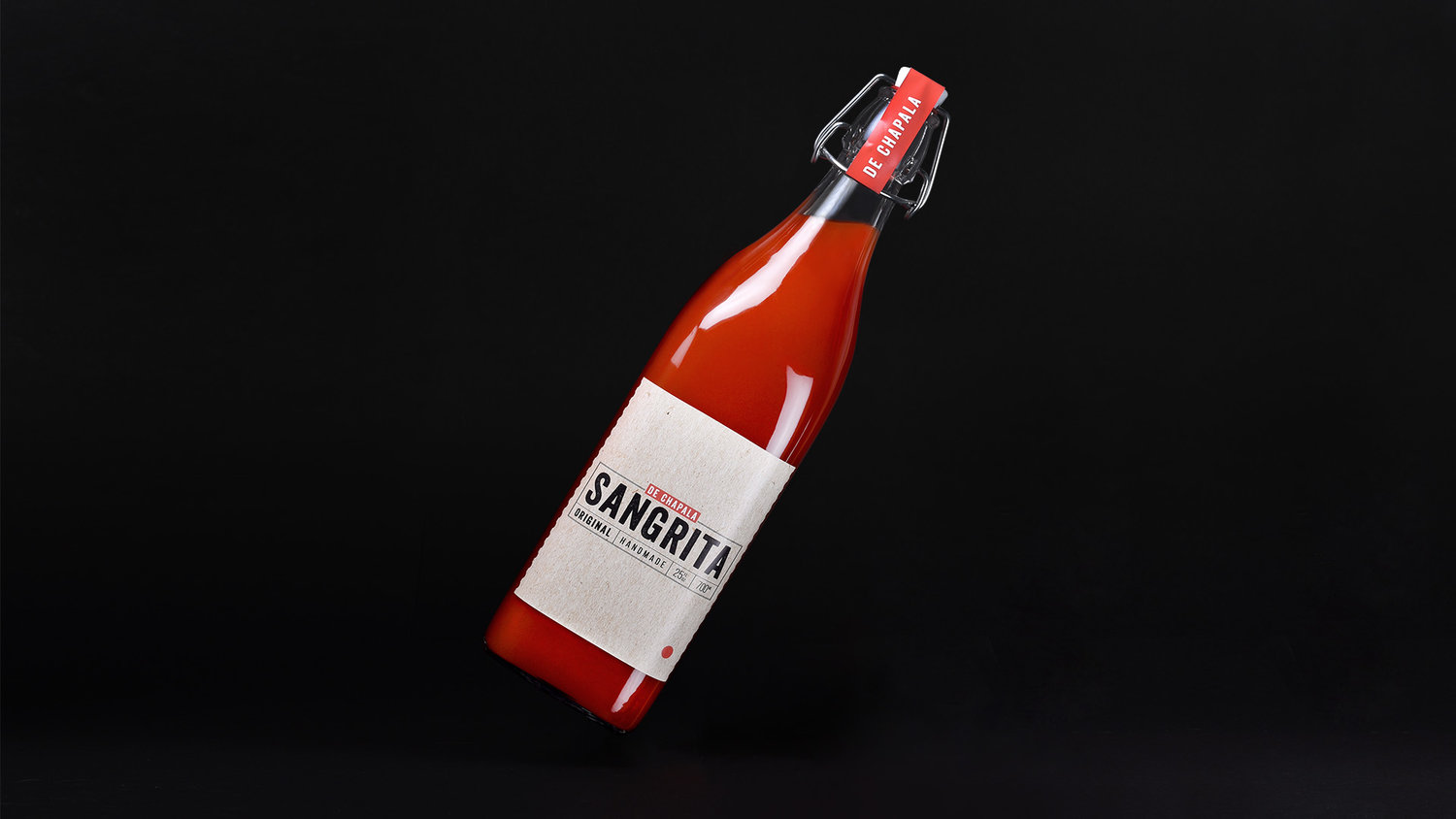
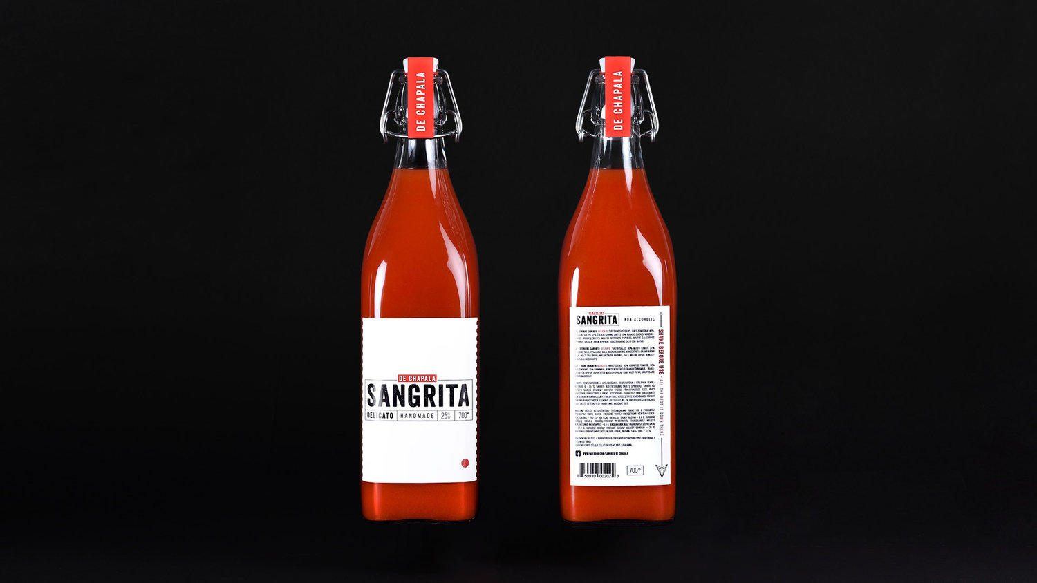
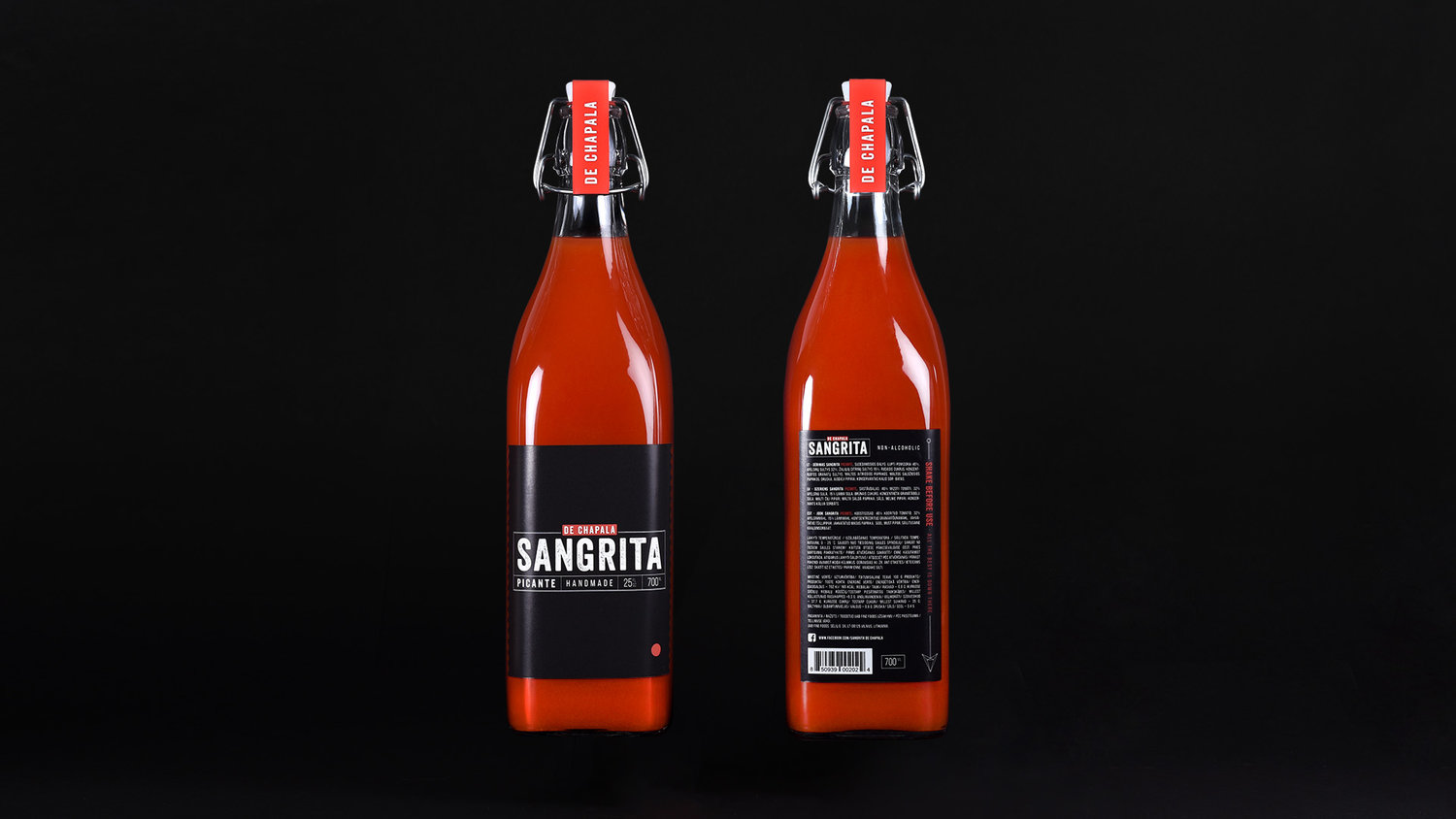
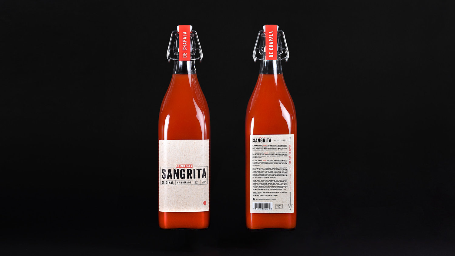
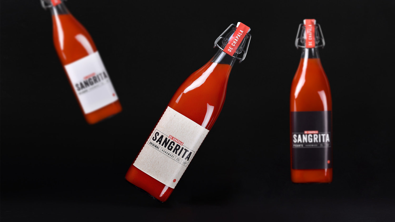
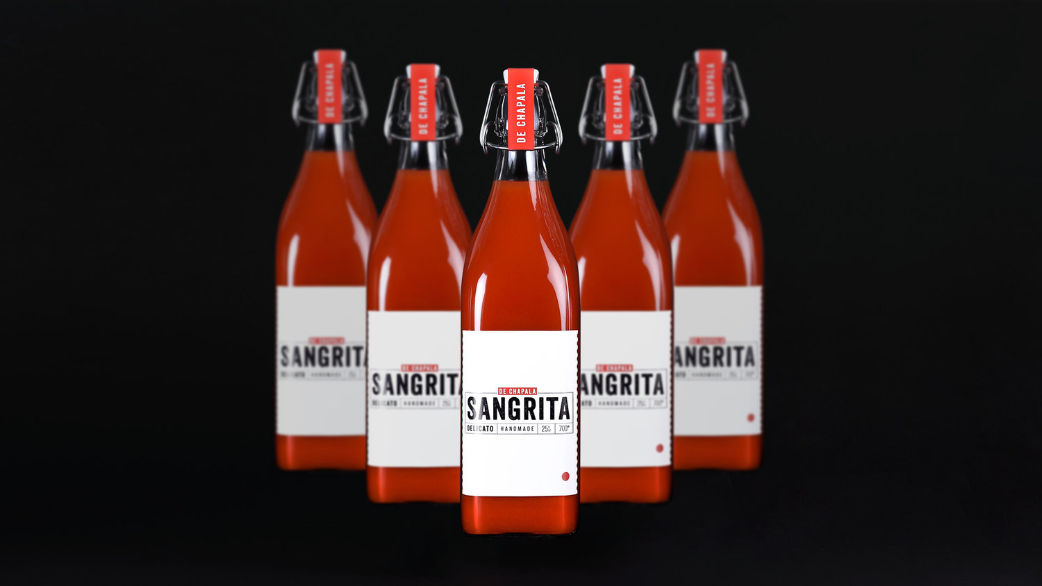
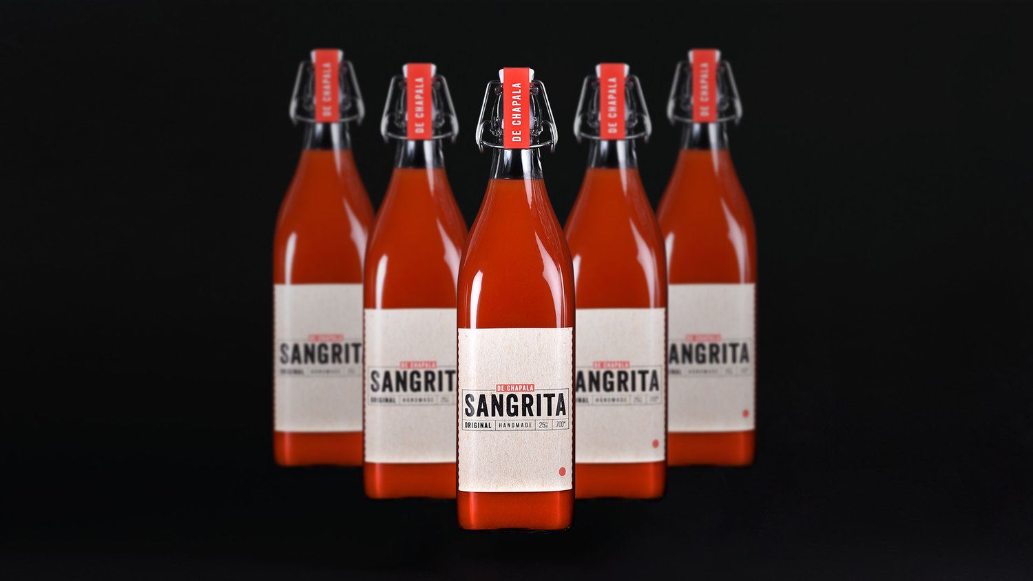
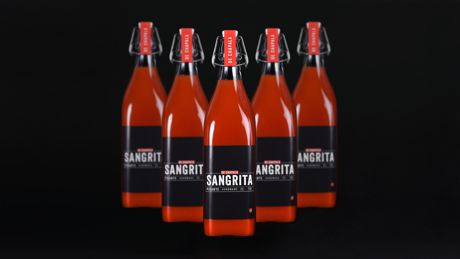
SANGRITA DE CHAPALA Packaging DesignTASKSangrita has origin dates back to the 1920s, is a customary partner to a shot of straight tequila. A non-alcoholic accompaniment that highlights tequila’s crisp acidity and cleanses the palate betweeneach peppery sip. The basic conception of Sangrita is to complement the flavour of 100% agave tequila, which is also peppery and citrusy in taste. Sangrita is made of tomato juice, orange juice, lime juice,chilli, grenadine, salt and black pepper. All ingredients are pure natural.Our task was to create new premium brand and packaging who can stand out at the shelves.SOLUTIONAfter our market research we noticed how similar are all other packaging of Sangrita. The typical bottle of Sangrita looks old school style. Most labels are really overcrowded with old school typerface, looks blank. Our solution was to stand it out from others in different direction. Minimal style with modern typerface was chosen. For taste differences we chose different backgrounds instead of typical solution to change the color of text or elements. The minimal red dot represents tomato and could be used as further brand identity illustration.
CREDIT
- Agency/Creative: Making Sense Studio
- Article Title: Sangrita De Chapala Packaging
- Organisation/Entity: Agency, Published Self Promotional Design
- Project Type: Packaging
- Agency/Creative Country: Lithuania
- Market Region: Europe
- Format: Bottle
- Substrate: Glass


