


An old case study but one that shouldn’t be forgotten. An great example of how good packaging and brand design can save a business, encouraging further investment and future acquisitions.
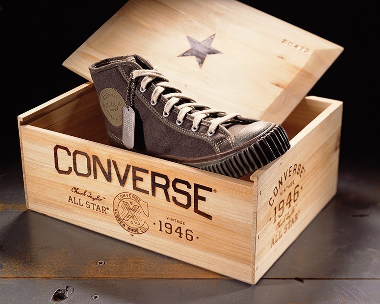
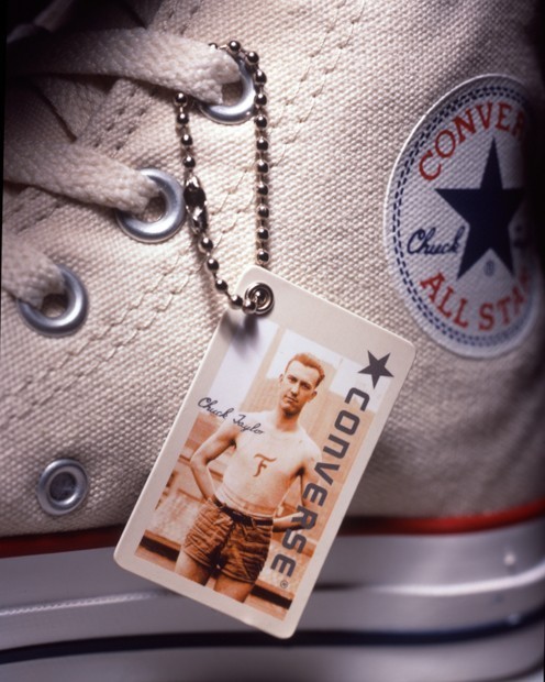
Nearing bankruptcy, Converse came to us to help them revive their flagging and once beloved brand. Our solution was to differentiate them from all of their competitors by uniting their product heritage (as the first basketball shoe) with their iconic counter-culture brand credentials. We created a new identity, and applied it to their business papers, packaging, and environmental systems. We adopted several elements from the ubiquitous All-Star shoes as brand icons, including the rubber sole and grommeted air vents. (That’s right, we just used “ubiquitous” and “grommeted” in the same sentence.) After the success of our first few initiatives, Converse asked us to get involved in everything from product and showroom design, to sub-brand naming and iconography to catalogs and point-of-sale. We even helped them with their sales presentations. Results? Two years after we began working with them, Converse was back in the black and subsequently acquired by Nike. It has since grown to become a billion-dollar company and one of the jewels in Nike’s sub-brand strategy crown. You know, if they actually had a crown.
CREDIT
- Agency/Creative: Sandstorm, Portland
- Article Title: Sandstrom Partners – Converse
- Project Type: Packaging
- Substrate: Wood


