


M&A Creative Agency – Quinta D’Amares
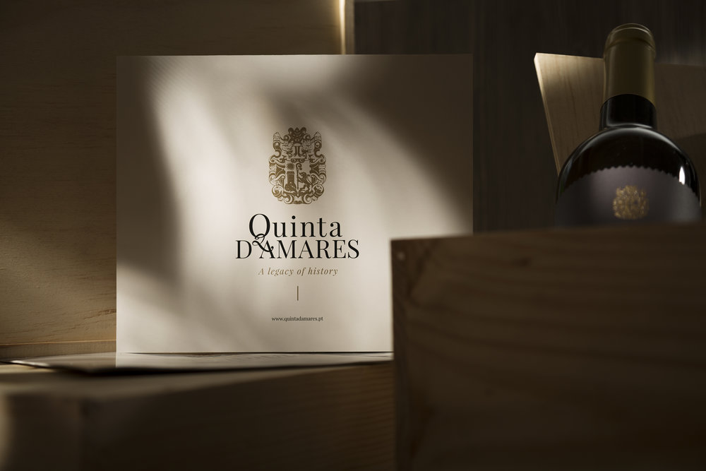
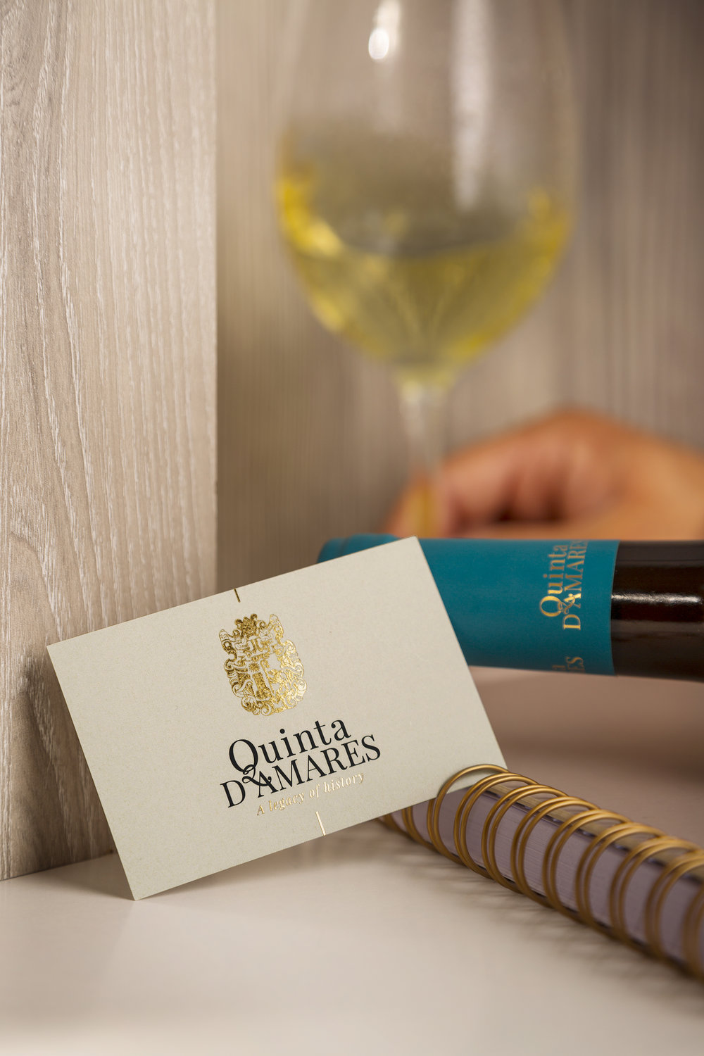
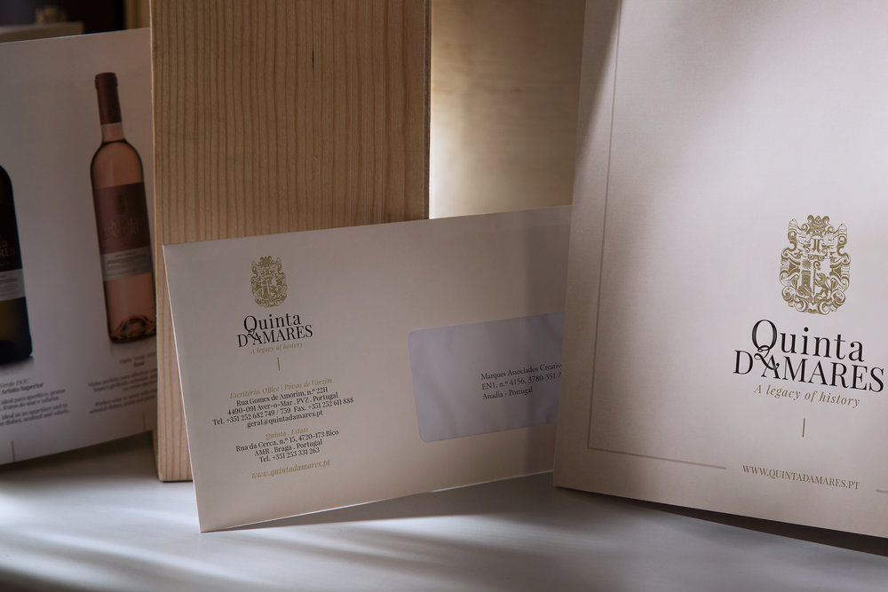
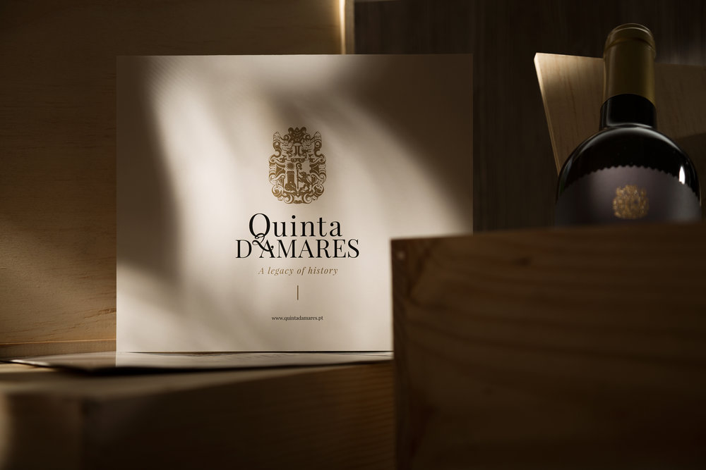
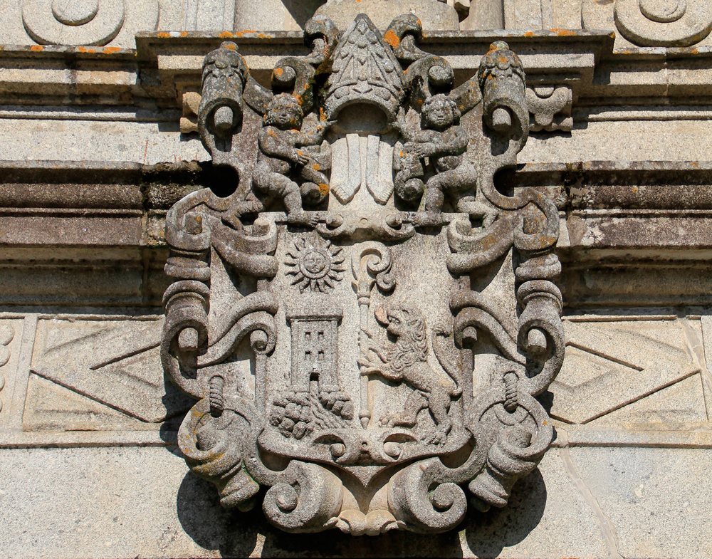
“Quinta D’Amares breathes history and tradition, in a perfect symbiosis between the Monastery of Rendufe and a seventeenth-century Aqueduct, perpetuating memories of other times in the midst of vineyards. Located in Amares, in the village of Santo António de Rendufe, is exposed to the south, blessed by the sun, providing exceptional conditions to produce Vinho Verde with unique characteristics. Located in a land of deep religious heritage, Quinta D’Amares felt the need to modernize and modify the its visual identity. For this rebranding the main premise was to maintain the base of what already existed – the family crest – but updating the concept to a contemporary version.
The slogan “A legacy of history” was also created and associated with the new logo. Beige tones were used to establish the connection to the land and terroir of Quinta D’Amares and the golden ones, representing the nobility, elegance, quality and refinement that the brand demands.”
CREDIT
- Agency/Creative: M&A Creative Agency
- Article Title: Renewed Visual Identity with Origin of Monastery Estate Crest and Traditions of the Estate
- Organisation/Entity: Agency Commercial / Published
- Project Type: Packaging
- Agency/Creative Country: Portugal
- Market Region: Africa
- Substrate: Pulp Paper


