


Agénus is an organic skincare brand from France. Using only natural ingredients, including fruits and home-grown herbs, Agénus has been steadily expanding its market shares ever since its first founding in 2008. After 13 years in the business, the French cosmetics maker is now ready to expand its customer base to other European markets. However, to prepare themselves for this new expansion, Agénus requires a complete overhaul of its branding.
Tasked by Rébecca and Antoine Lapointe, the business’s owners, LNM Production, a creative team lead by Nhat Minh Ly, the team’s founder and executive creative director, set out to create a brand-new identity for the Agénus in addition to a new packaging system for the business to prepare Agénus for further expansion in the future.
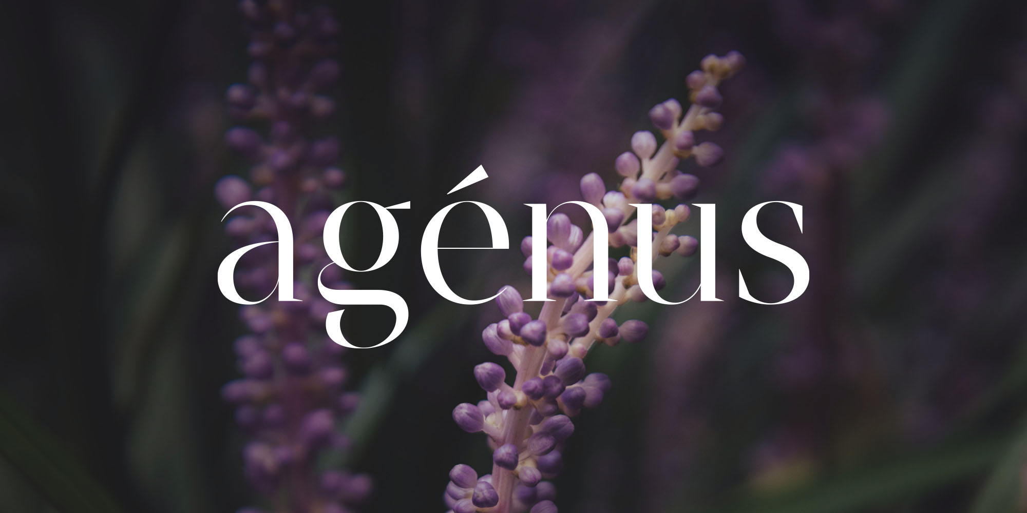
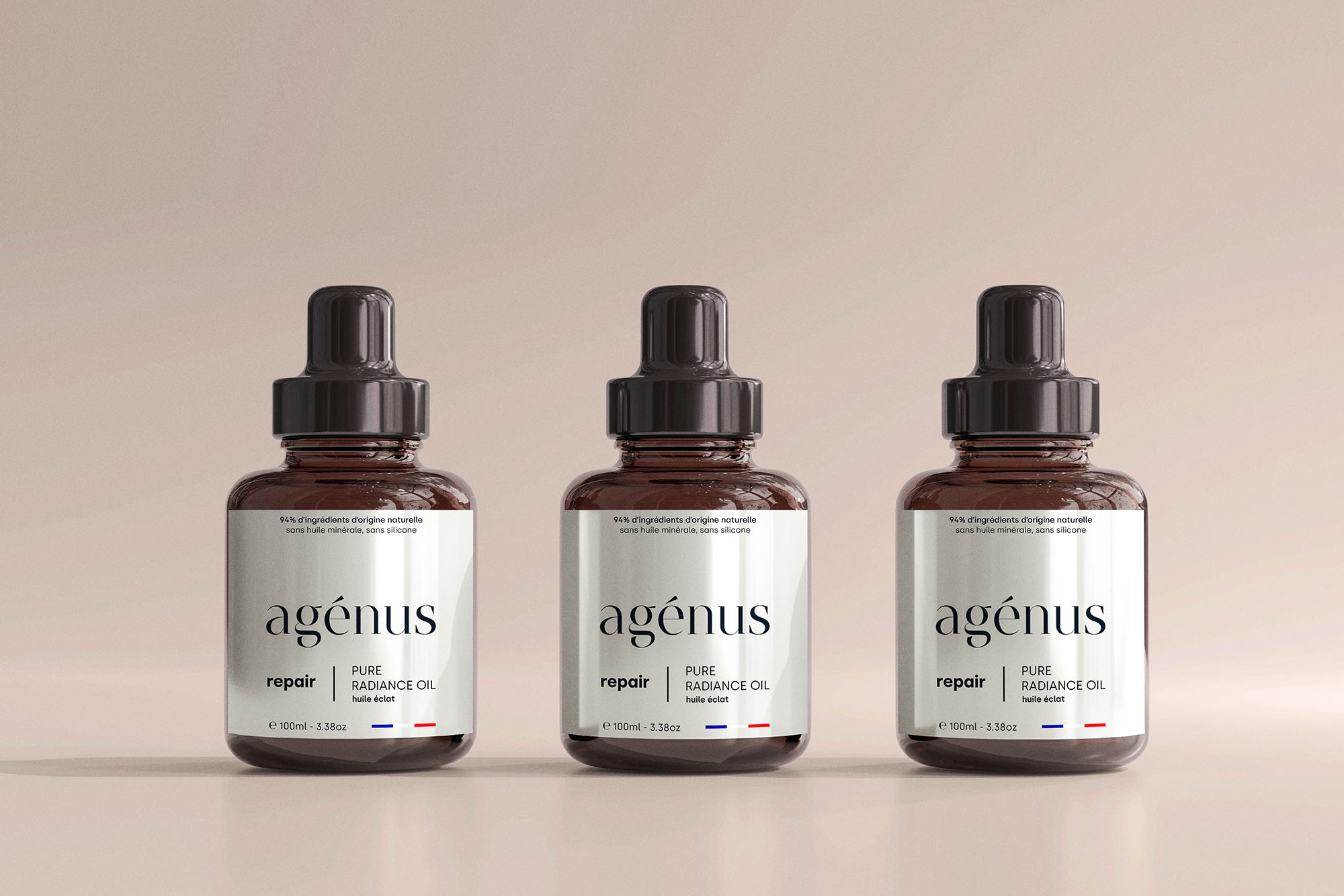
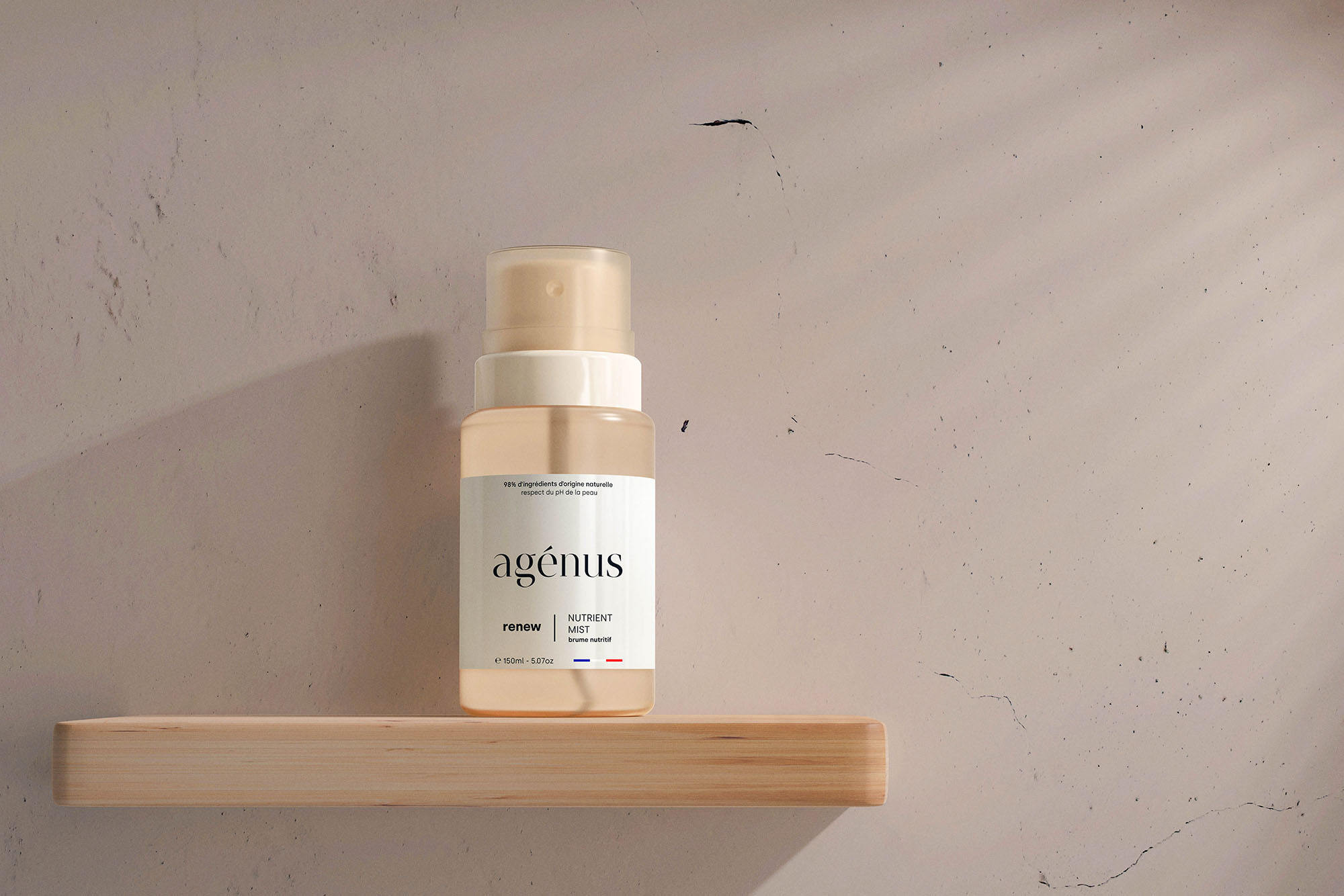
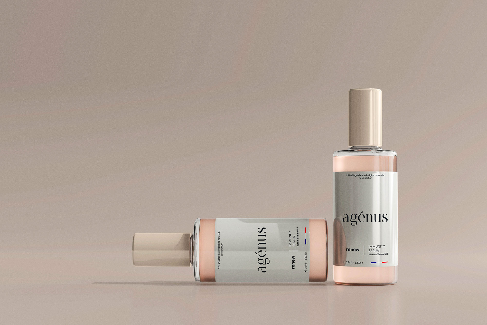
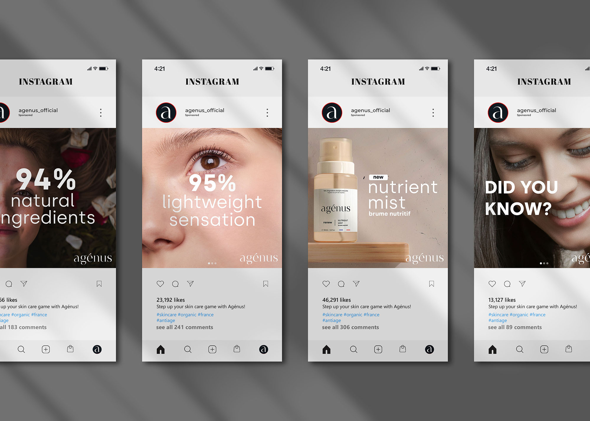
Inspired by French designs, typefaces, and artworks, in addition to traditional French values, LNM Production sought to craft a new identity for Agénus through the combination of thick and hairline strokes. Furthermore, the team also devised a new color using Neutral White (#FFFFFF) and PMS Black 6C (#101820) together with light tones to create an elegant, sophisticated feeling, yet easy-to-the-eye atmosphere for Agénus. The final result is an elegant identity for Agénus, which not only conveys the brand’s value, story, but also its visions.
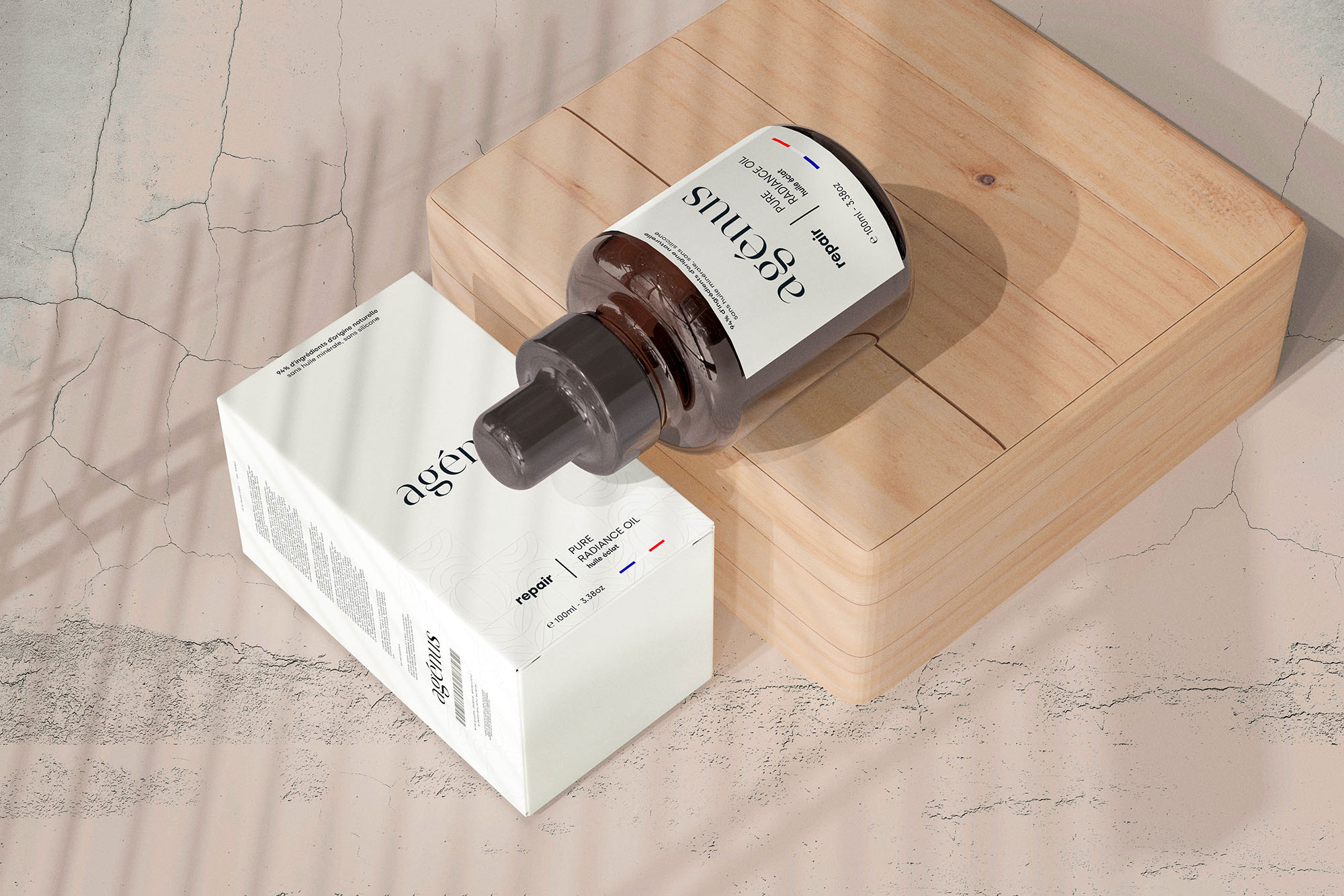
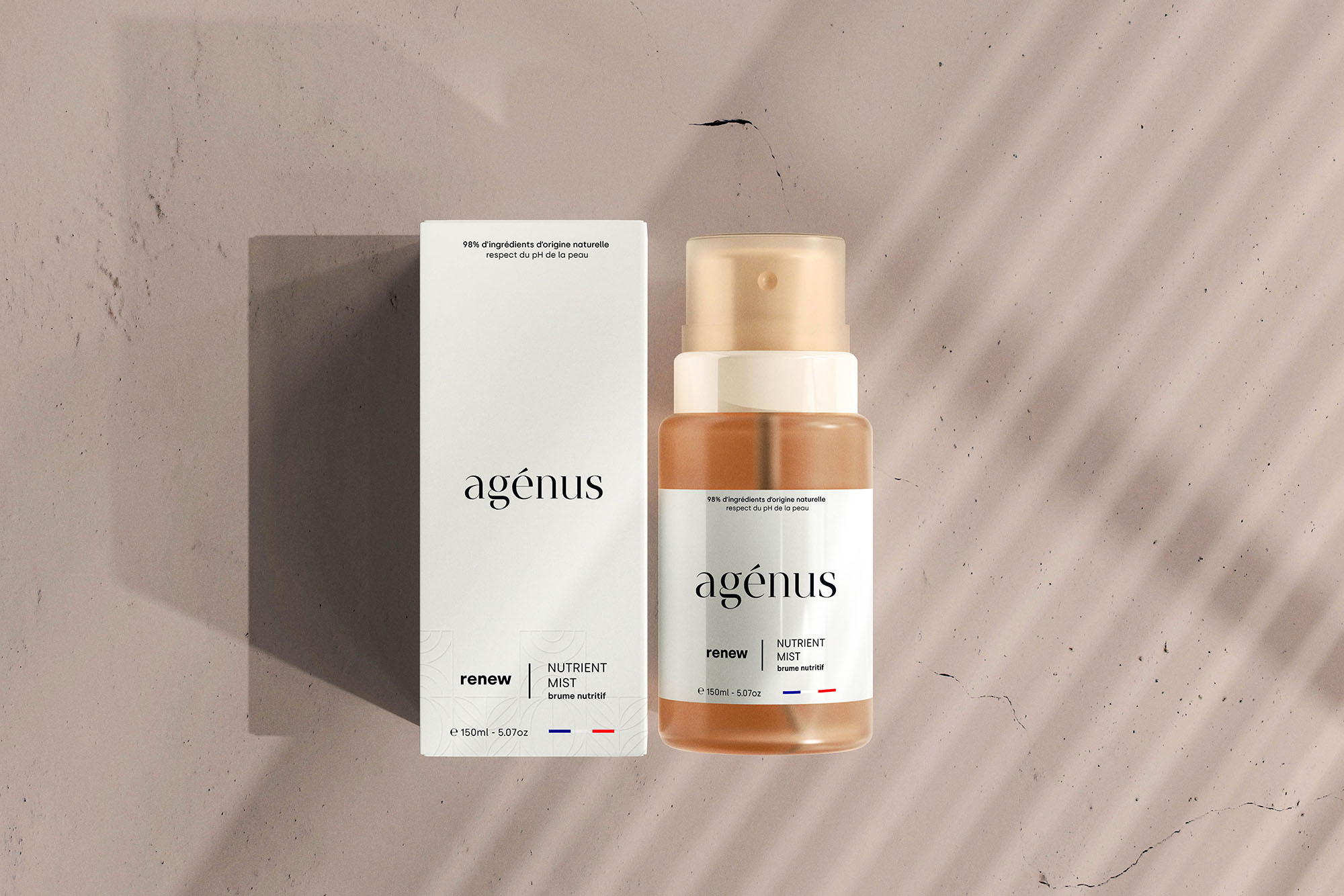
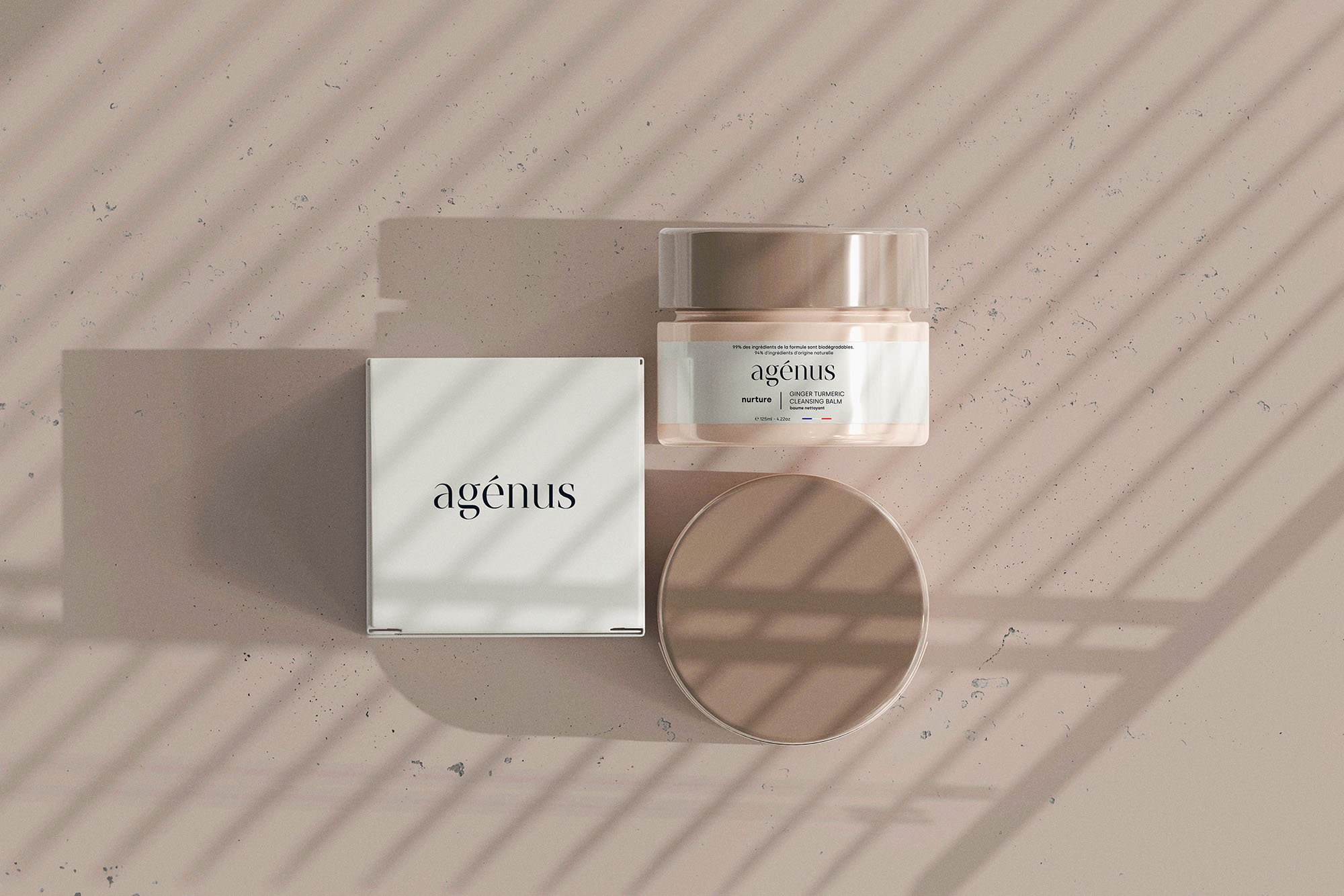
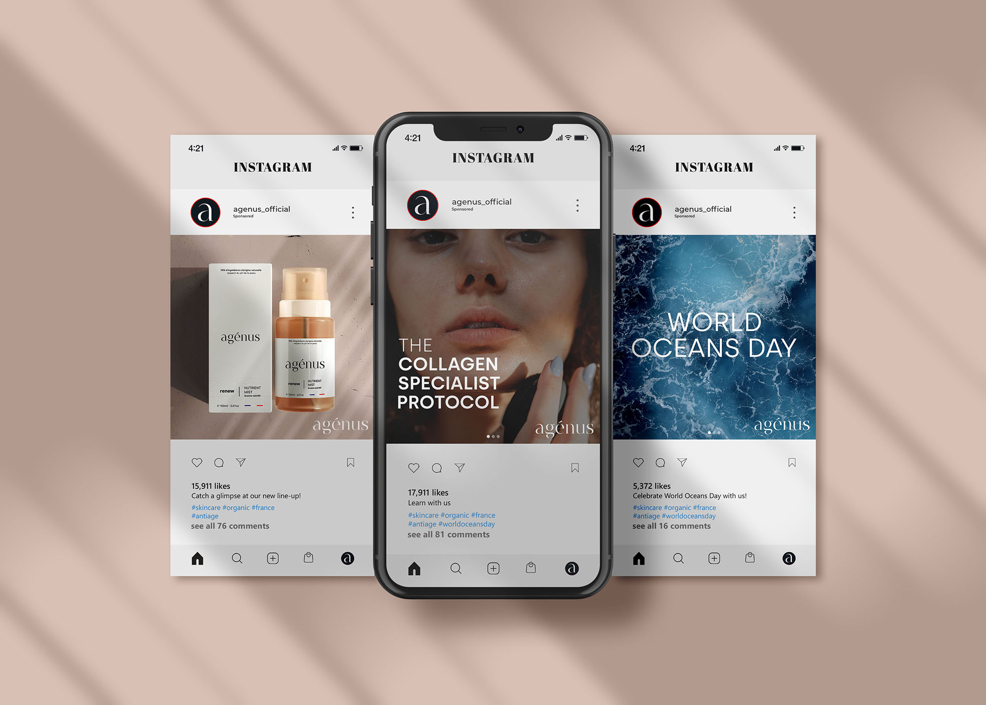
What’s more, LNM Production also devised a unique graphic motif system using inspirations coming from the natural ingredients employed in the products themselves. This graphic motif system is then employed in a subtle manner throughout the identity system (from envelopes, business cards, etc. to the packaging system) so as to add another layer of personality, separating Agénus from its competitors.
For the packaging system, LNM Production chose to employ Glass Bottles for the main products as these bottles not only create a luxury feeling but also helps to maintain the quality of the products over time. For the outer packaging, LNM Production chose to use high-quality paper with high mass and employ emboss techniques with digital printing to give personalities to the products themselves and to make the products recognizable even for customers with visual impairments.
CREDIT
- Agency/Creative: Nhat Minh Ly / LNM Production
- Article Title: Redesigning of New Identity for a French Skincare Business
- Organisation/Entity: Agency
- Project Type: Identity
- Project Status: Published
- Agency/Creative Country: Japan
- Agency/Creative City: Tokyo
- Market Region: Europe
- Project Deliverables: Art Direction, Brand Design, Brand Identity, Branding, Packaging Design, Packaging Guidelines
- Industry: Health Care
- Keywords: Beauty, Branding, Packaging, Visual Communication
-
Credits:
Executive Creative Director: Nhat Minh Ly
Business Owner: Rébecca Lapointe
Business Owner: Antoine Lapointe
Marketing Team Leader: Florence Romilly
Product Development Team Leader: Adeline Dubois


