


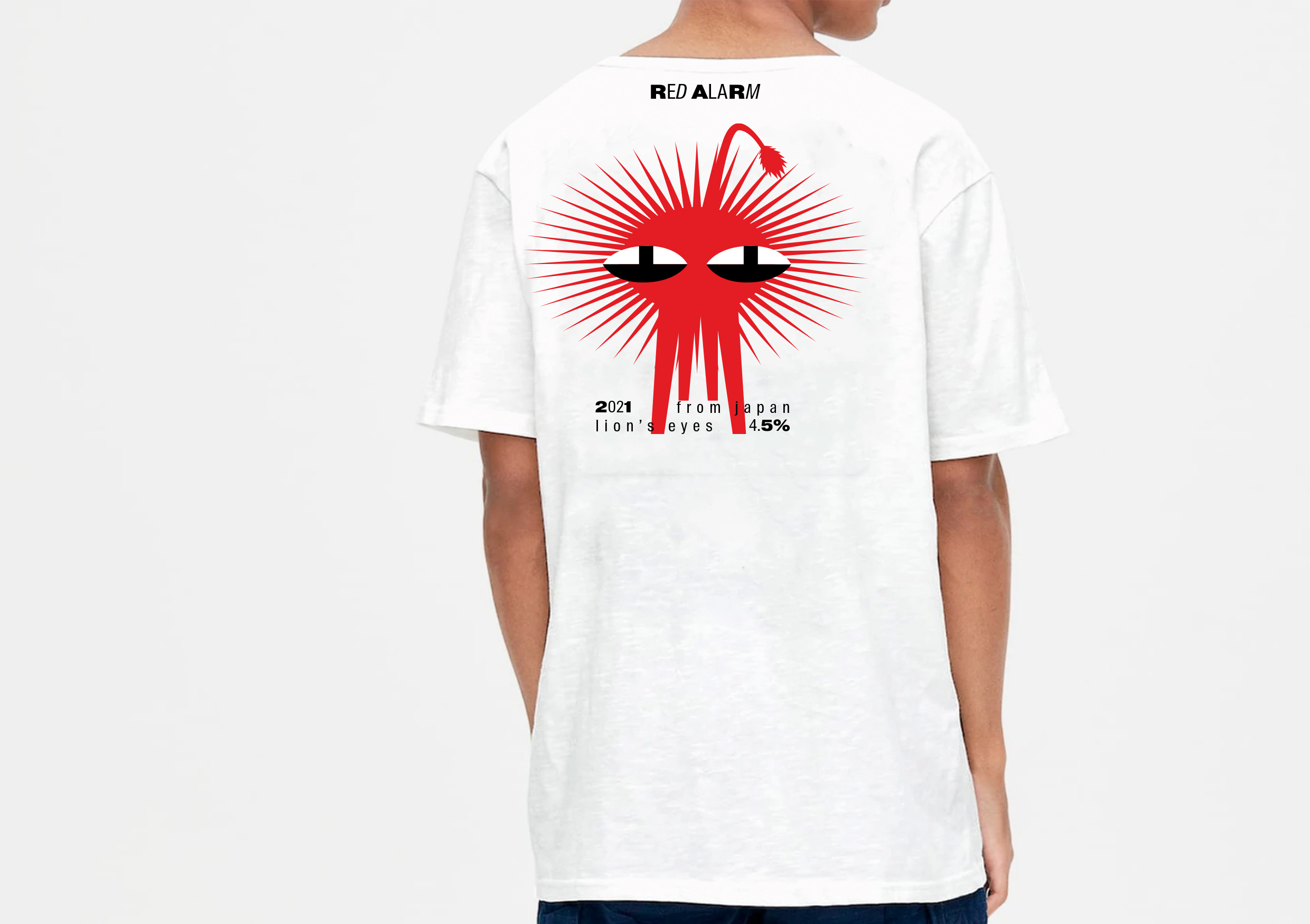
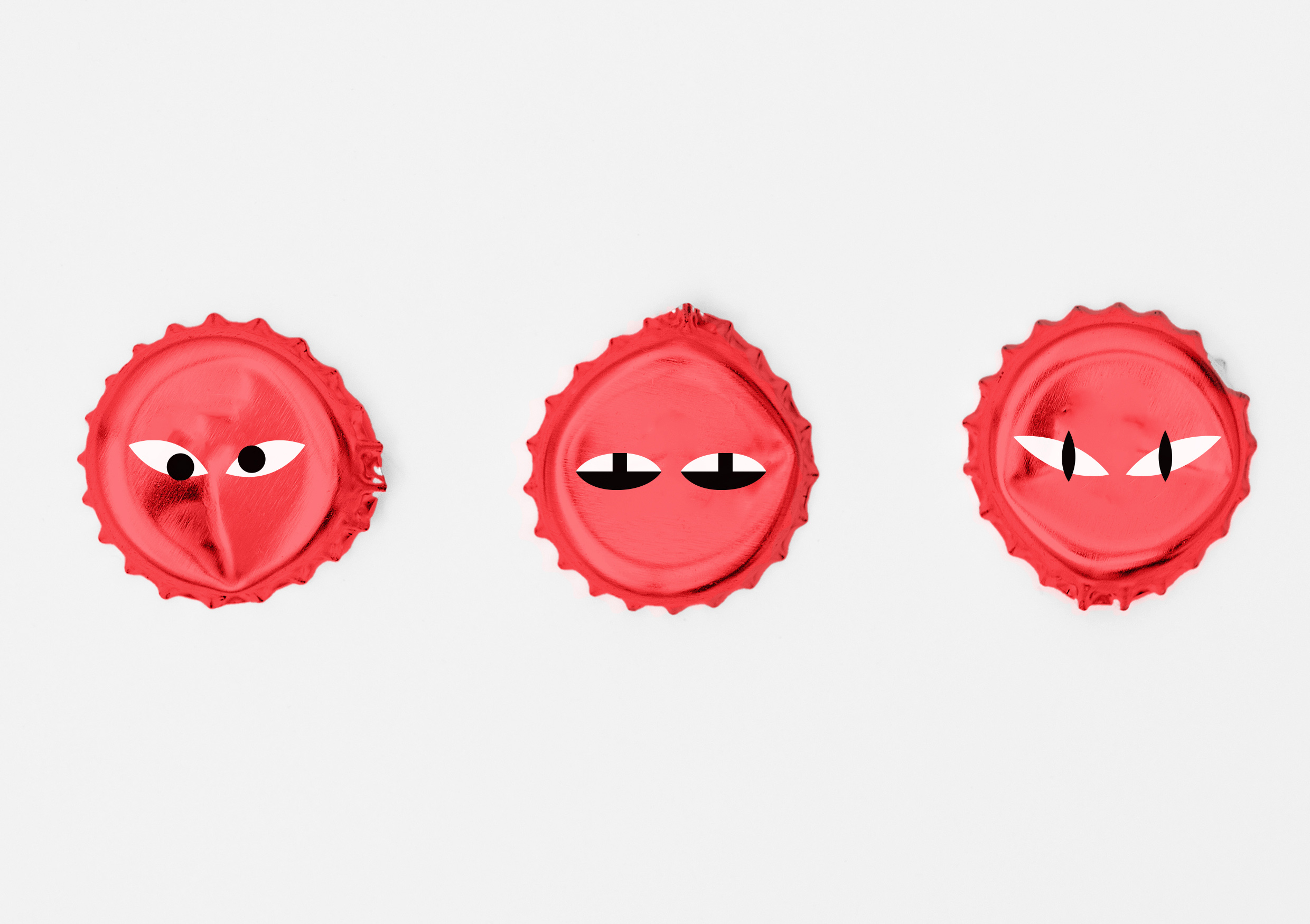
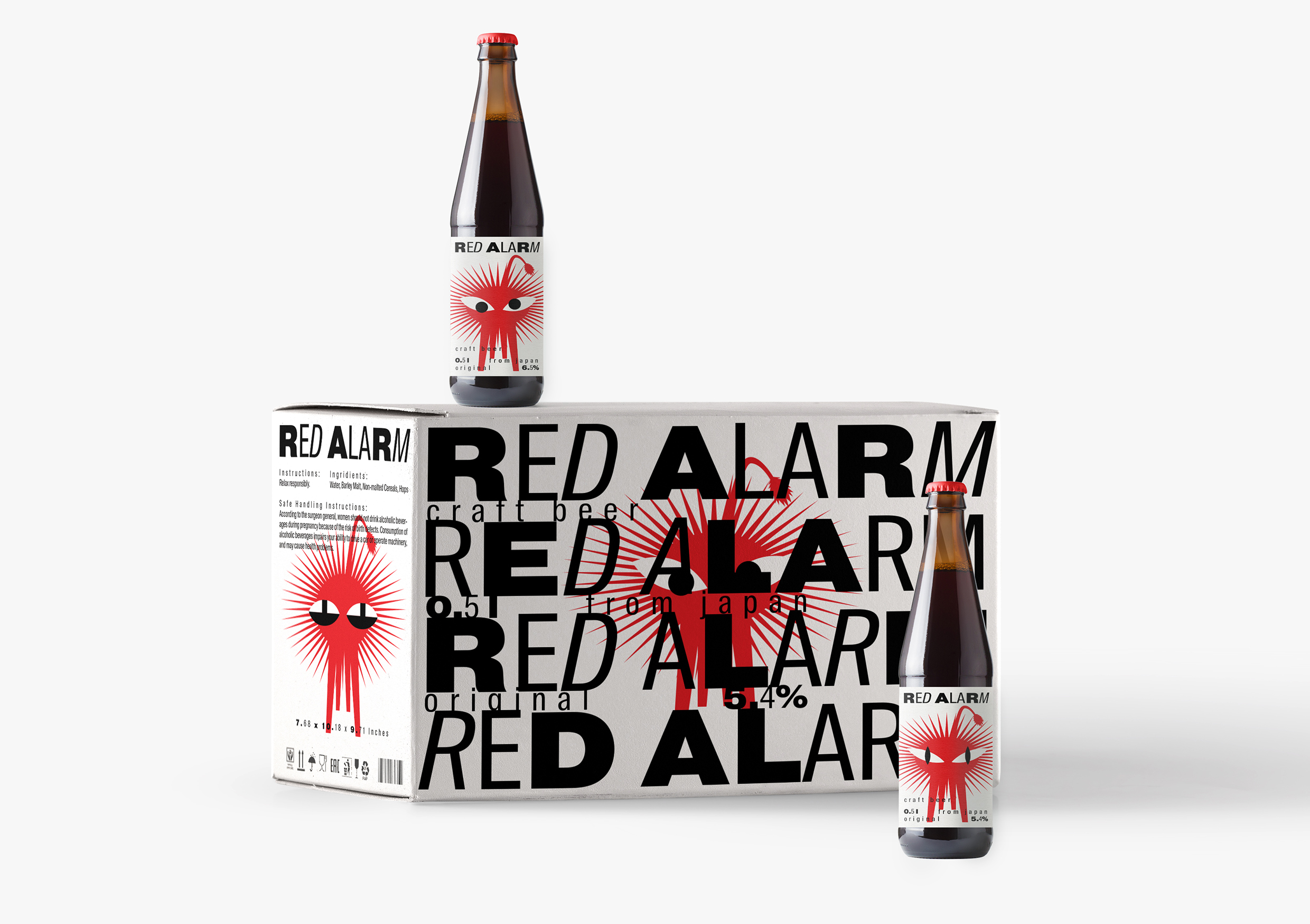
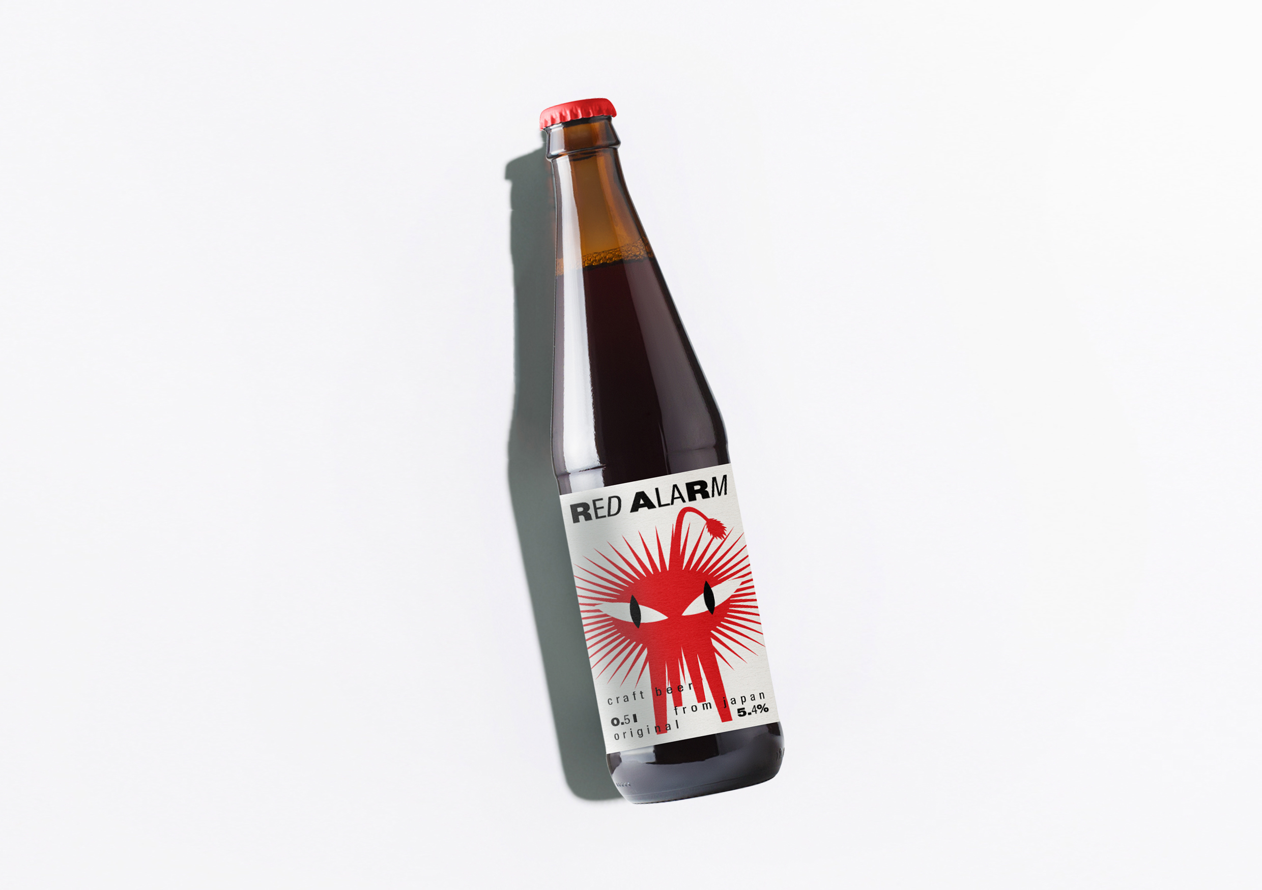
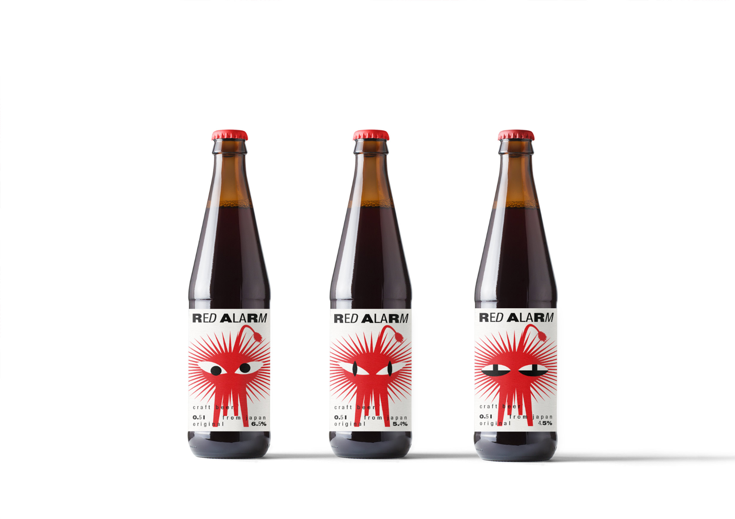
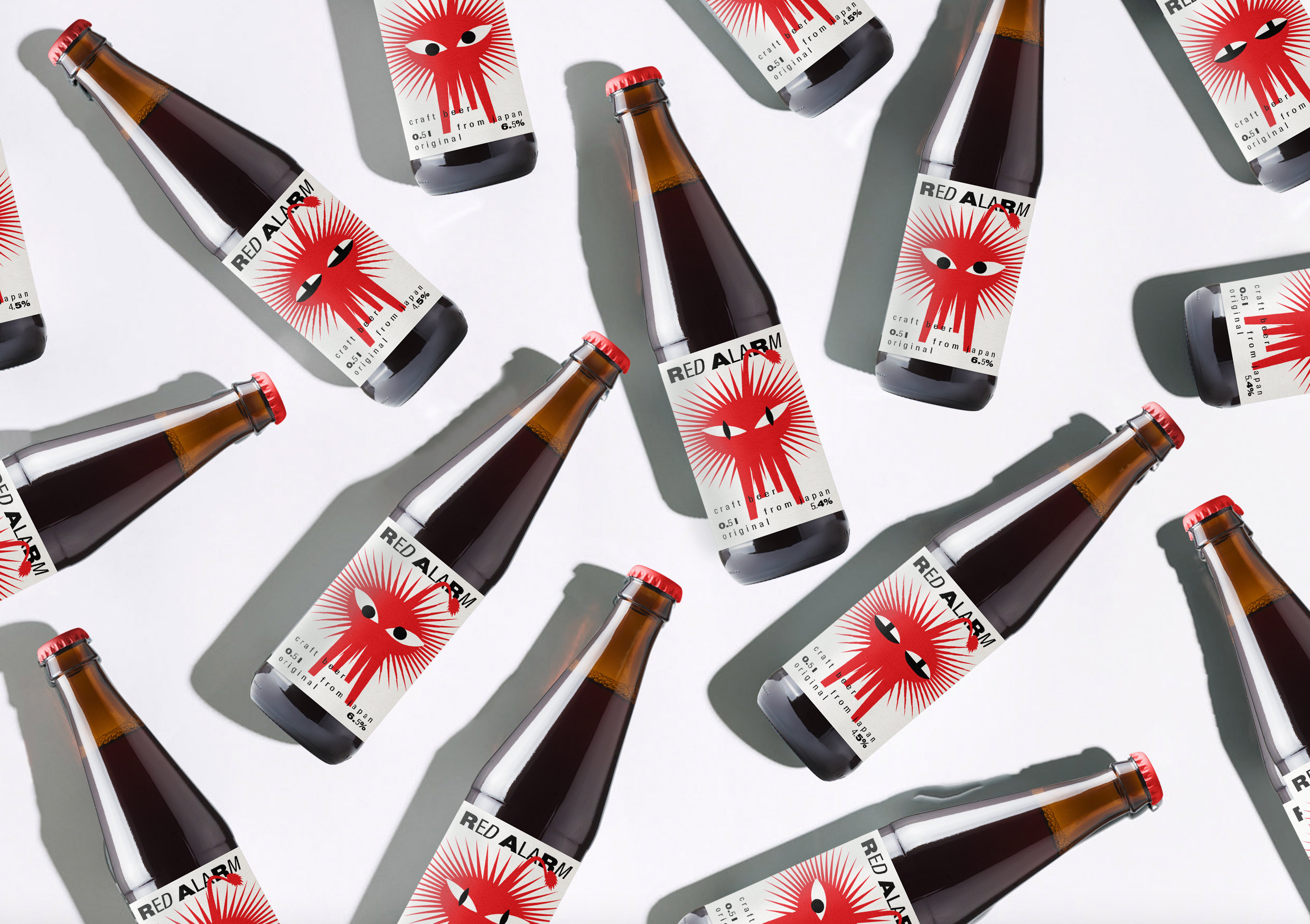
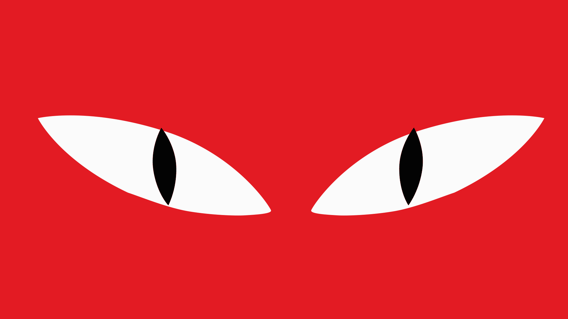
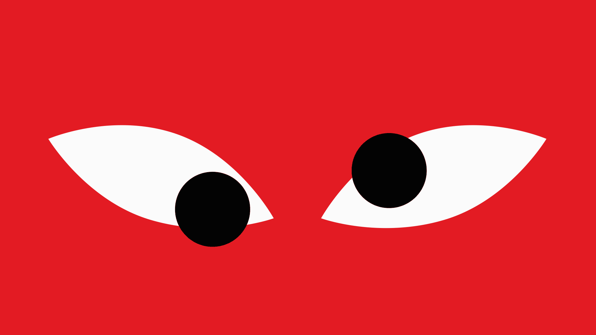
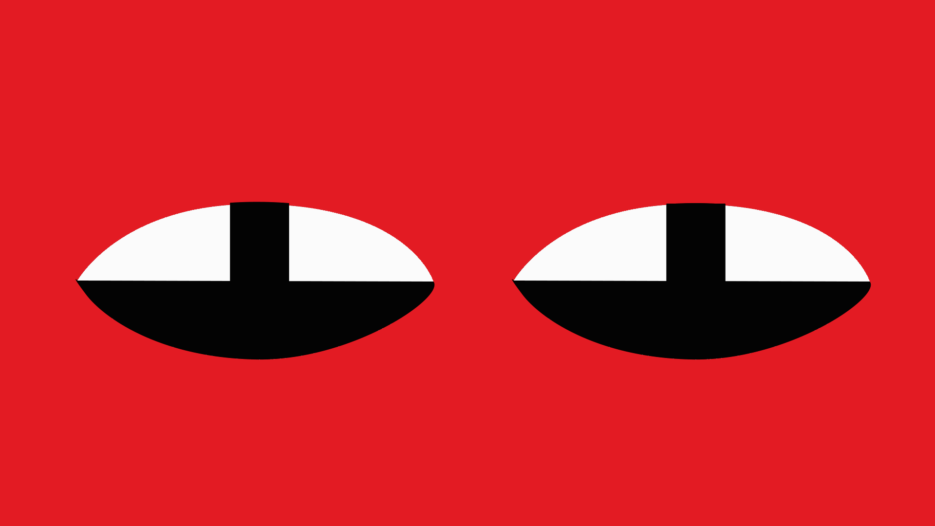
The main task was to create a lion image and after that use it in a packaging design. Thus, I was thinking about a concept where I can use an illustration with typography. Looking for inspiration I have remembered a talented Japanese graphic designer. And the idea of a brand became from famous designer Kazumasa Nagai’s, who known both as a modernist and a japаnese traditionalist. His poster, which is dedicated Ueno Zoo inspired me to make an illustration. I was astonished by it’s form. Because we can know it is a lion even without a full face, only eyes and main from. And red sharp mane gave me a thought about something urgent, like drinking a beer is such an emergency situation from one point. Then I had to think about how to make a differentiation between one brand. I decided to concentrate on eyes as it is tend to be the first indicator of getting drunk. I also putted lion’s eyes on the top of beer in order to help people in the market find this product. Beer’s product line is differentiated by various degrees of getting drunk with diverse lion’s eyes. Such spontaneous atmosphere is also presented in typography. There is a combination of bold, regular and italic typefaces that helps to understand tone of voice. Visual language let me use type as instrument to demonstrate diverse taste of beer. Words can be applied on each other. While making visual part of packaging I needed to find a name, which would perfectly fit into graphics. ‘Red Alarm’ gave me anxiety feelings, a moment when of realising to buy some beer, some event that have brought a person to the store. Regarding audience, it is purposed to focus on younger people, who appreciate being drunk and become as red as that lion illustration. I find this packaging design not only extremely fresh but also a tribute to super talented Japanese graphic designer. I wish more projects were inspired from other cultures as it makes sense to looking for another point of view. As a result, we observe vivid packaging, which can absolutely support any excited mood.
CREDIT
- Agency/Creative: Natalia Radnaeva
- Article Title: Red Alarm Japanese Beer Packaging Design by Natalia Radnaeva
- Organisation/Entity: Student, Published Self Promotional Design
- Project Type: Packaging
- Agency/Creative Country: Russia
- Market Region: Europe
- Project Deliverables: Brand Naming, Branding, Illustration, Packaging Design, Tone of Voice
- Format: Bottle, Box
- Substrate: Glass Bottle


