


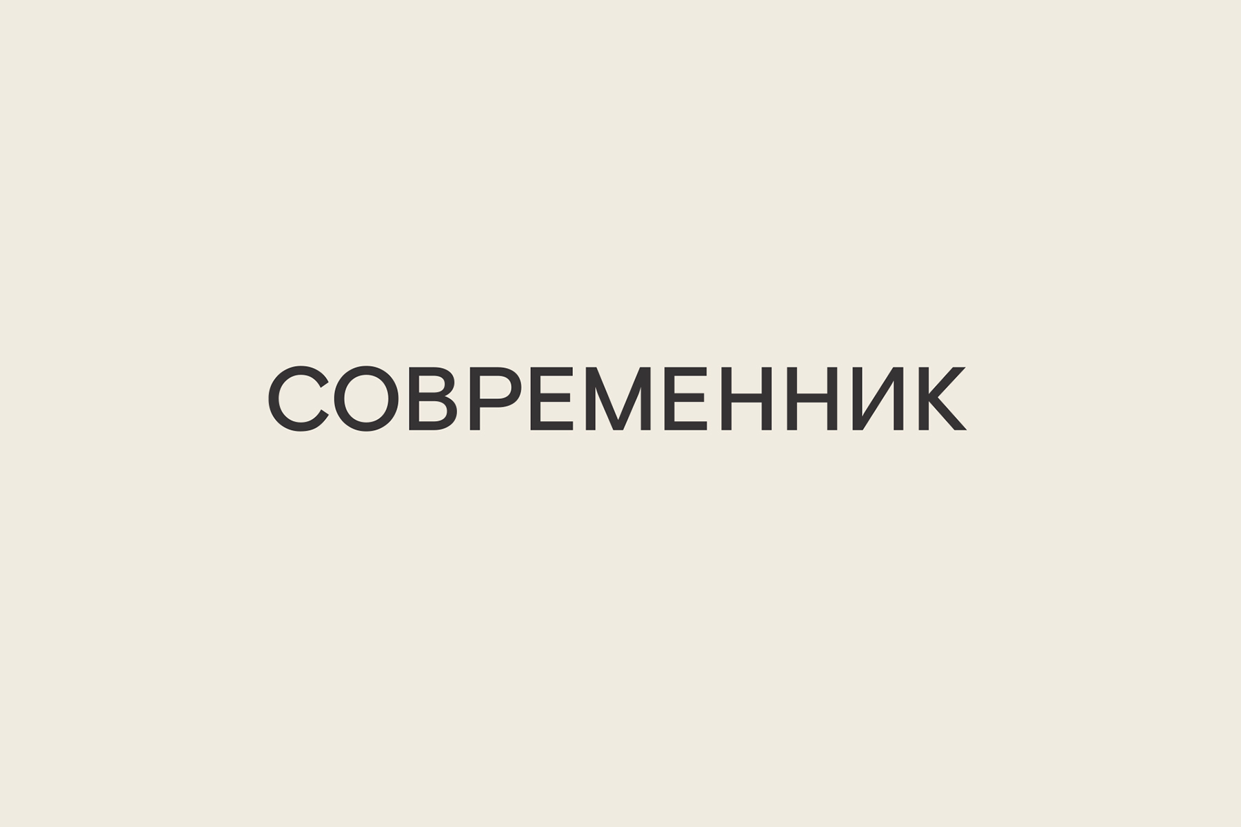
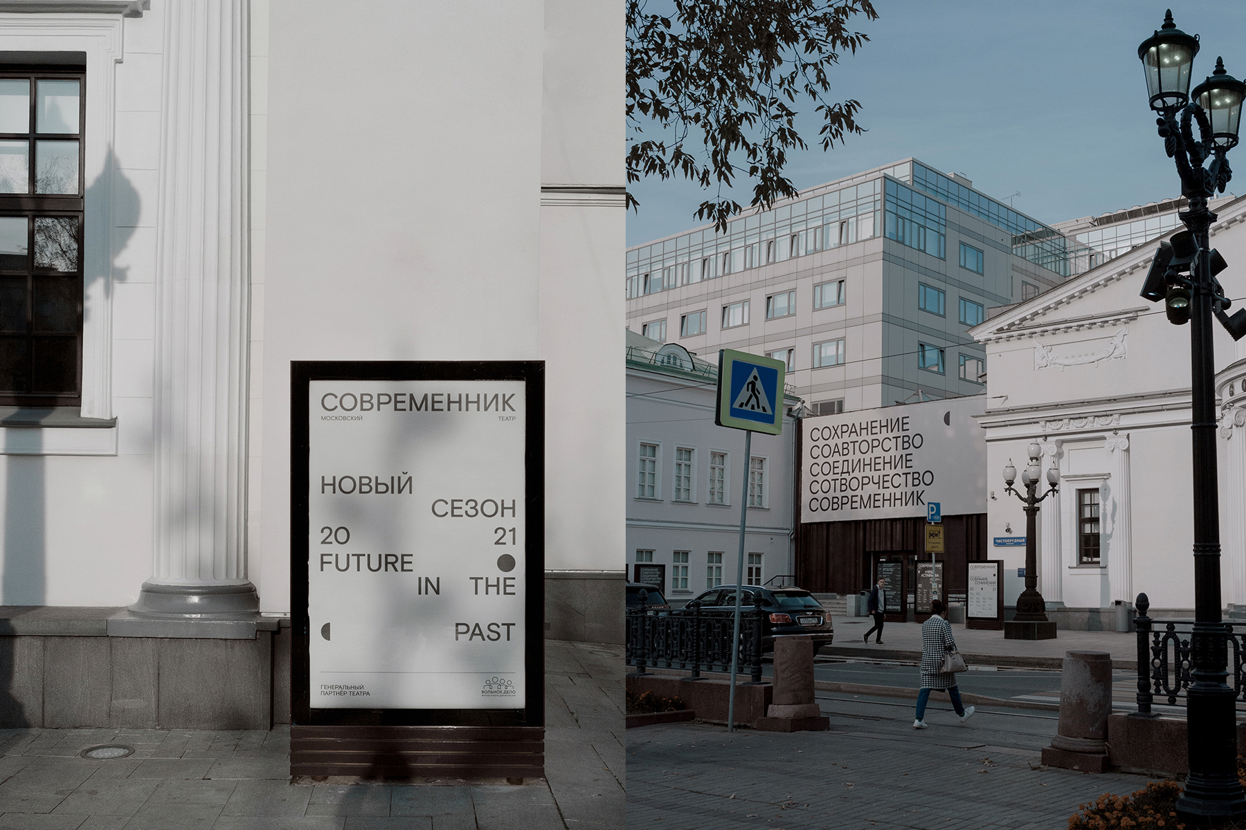
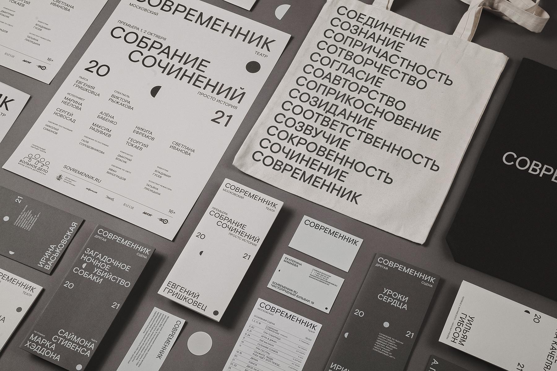
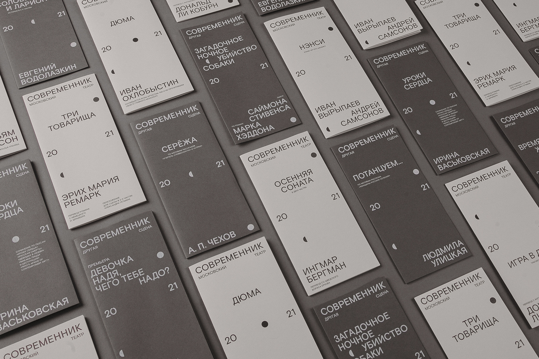
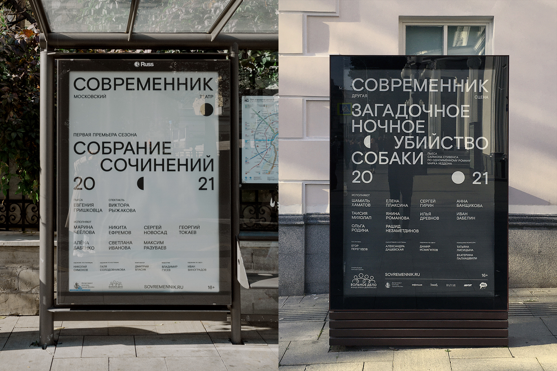
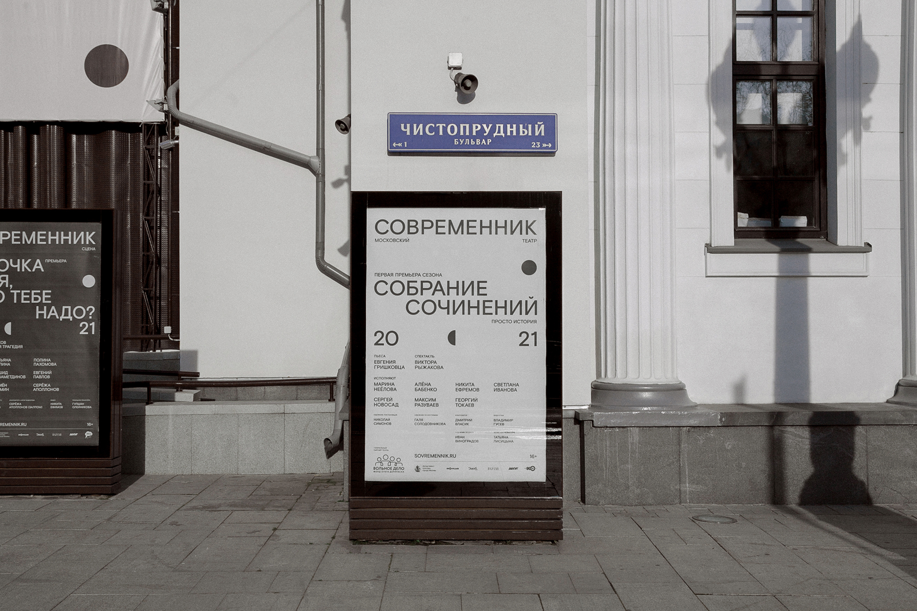
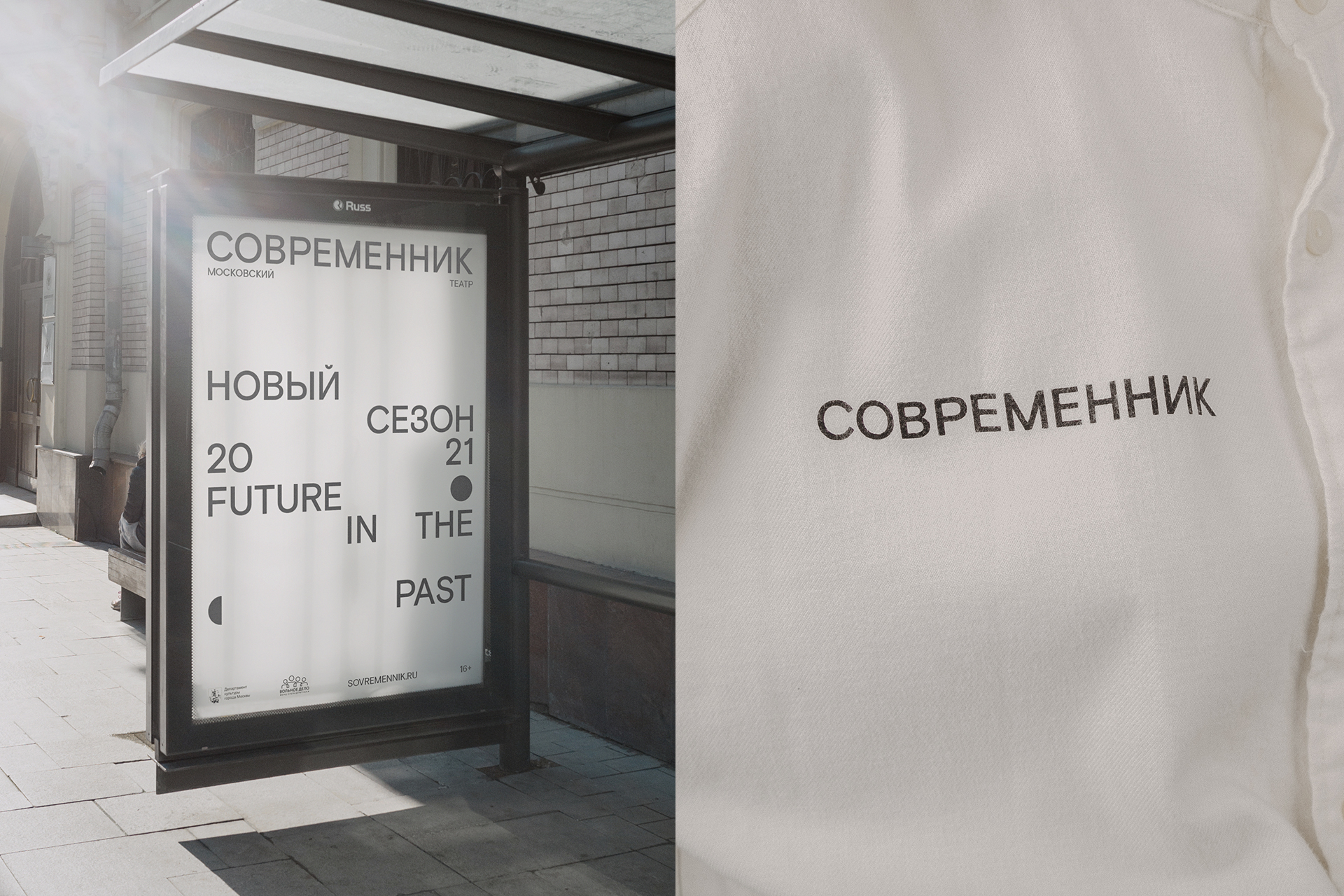
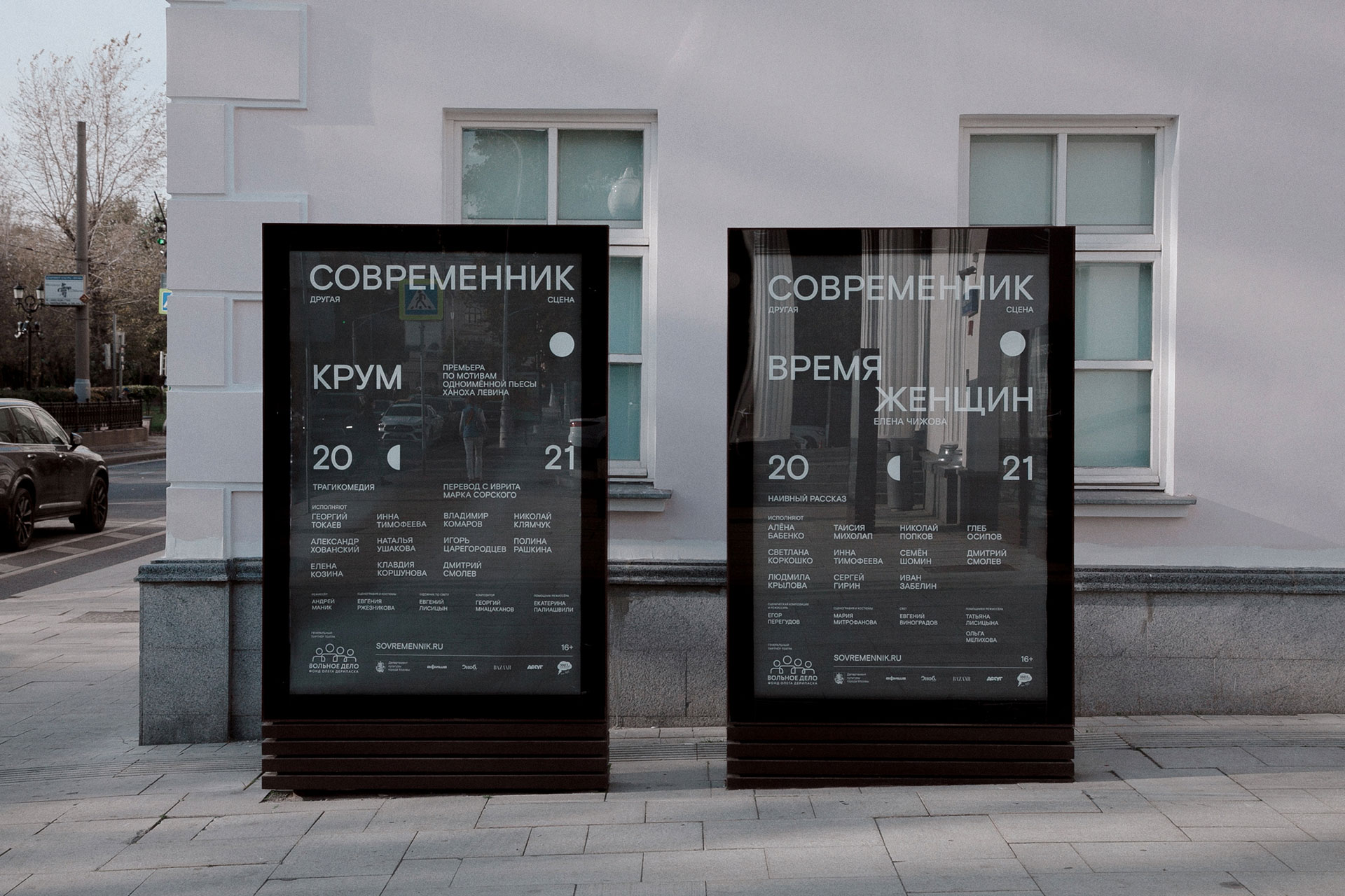
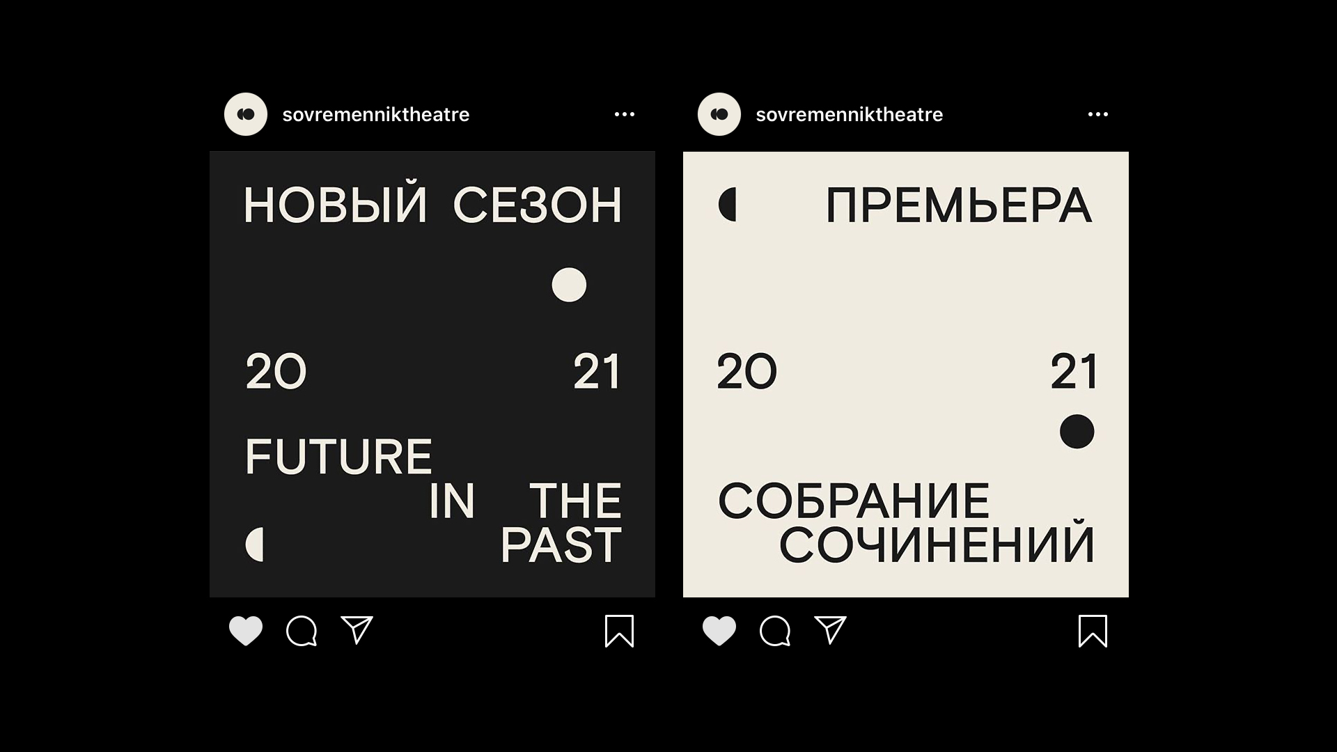
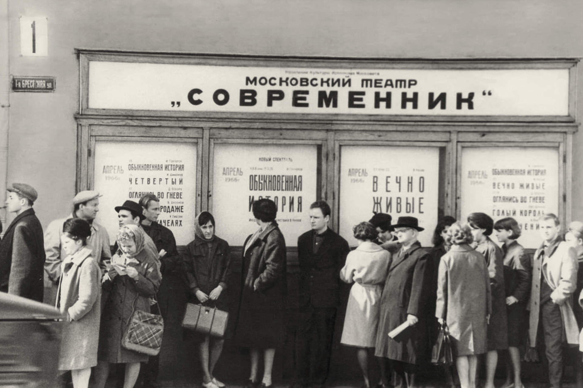
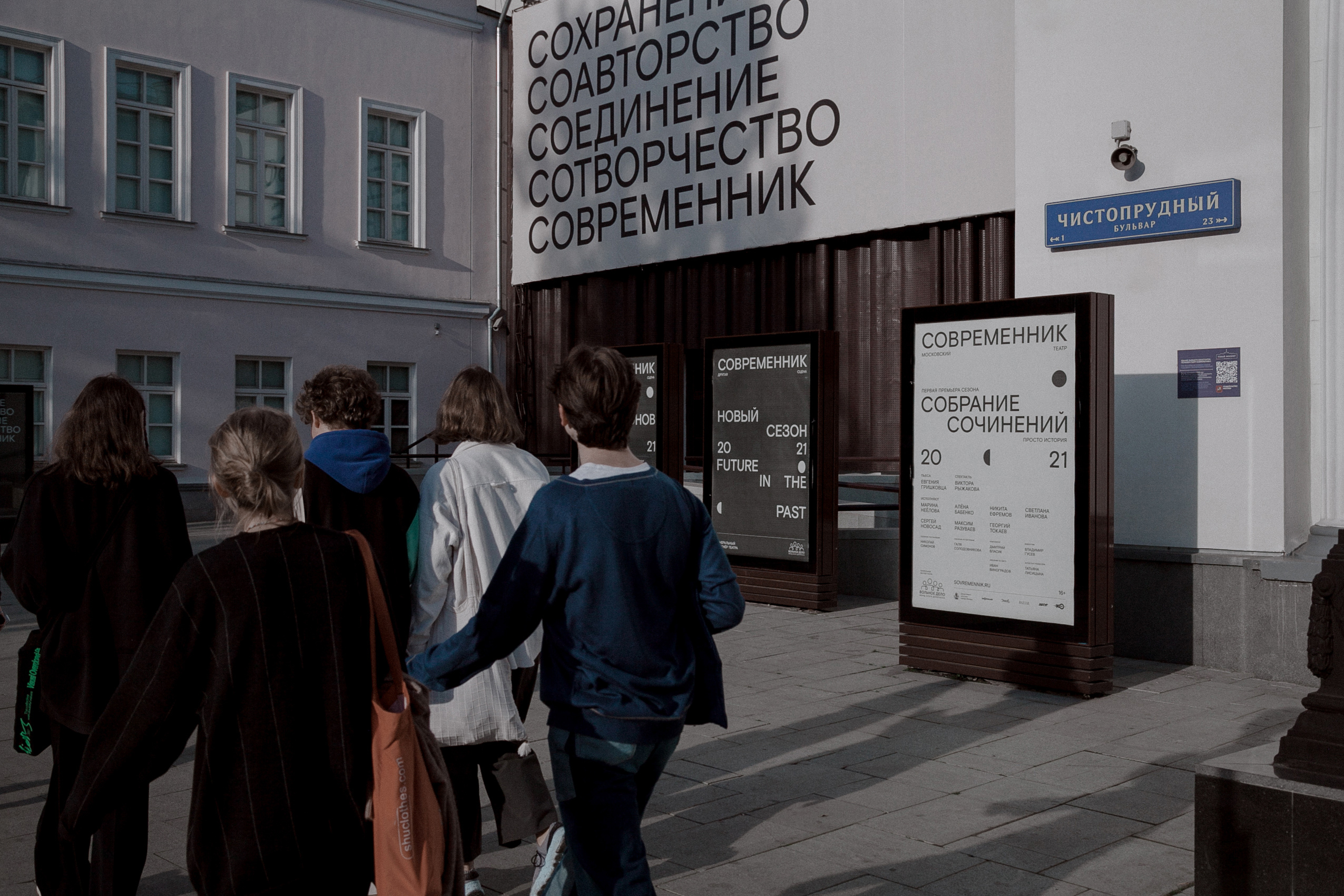
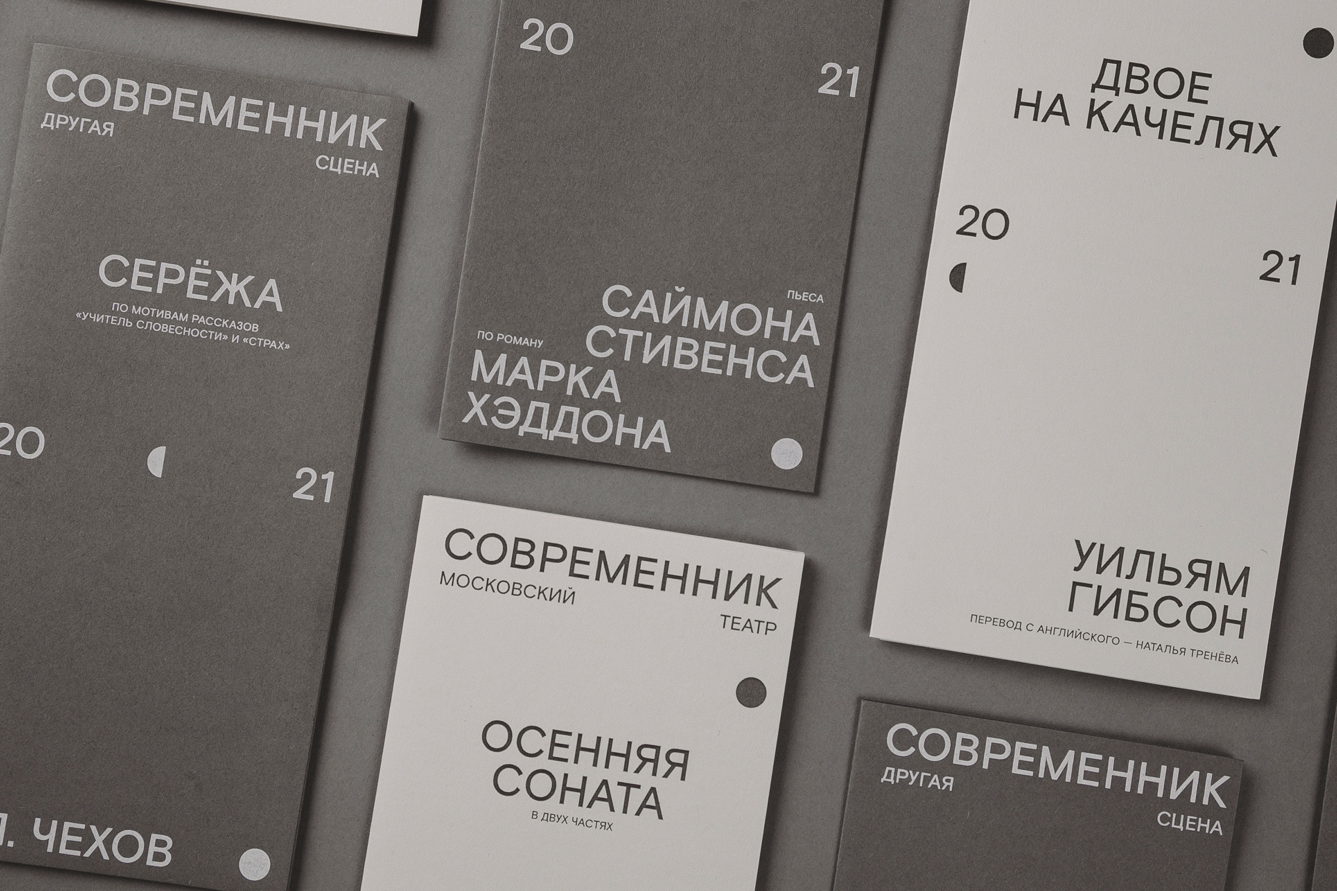
While working on the new identity for Sovremennik Theatre we went through a lot of theatre’s archive materials, old posters from 60s and 70s. Back then all posters were based on typography, just type with no images. We though that it would be nice to take the same approach into the new identity, but without decorations and stylised fonts.
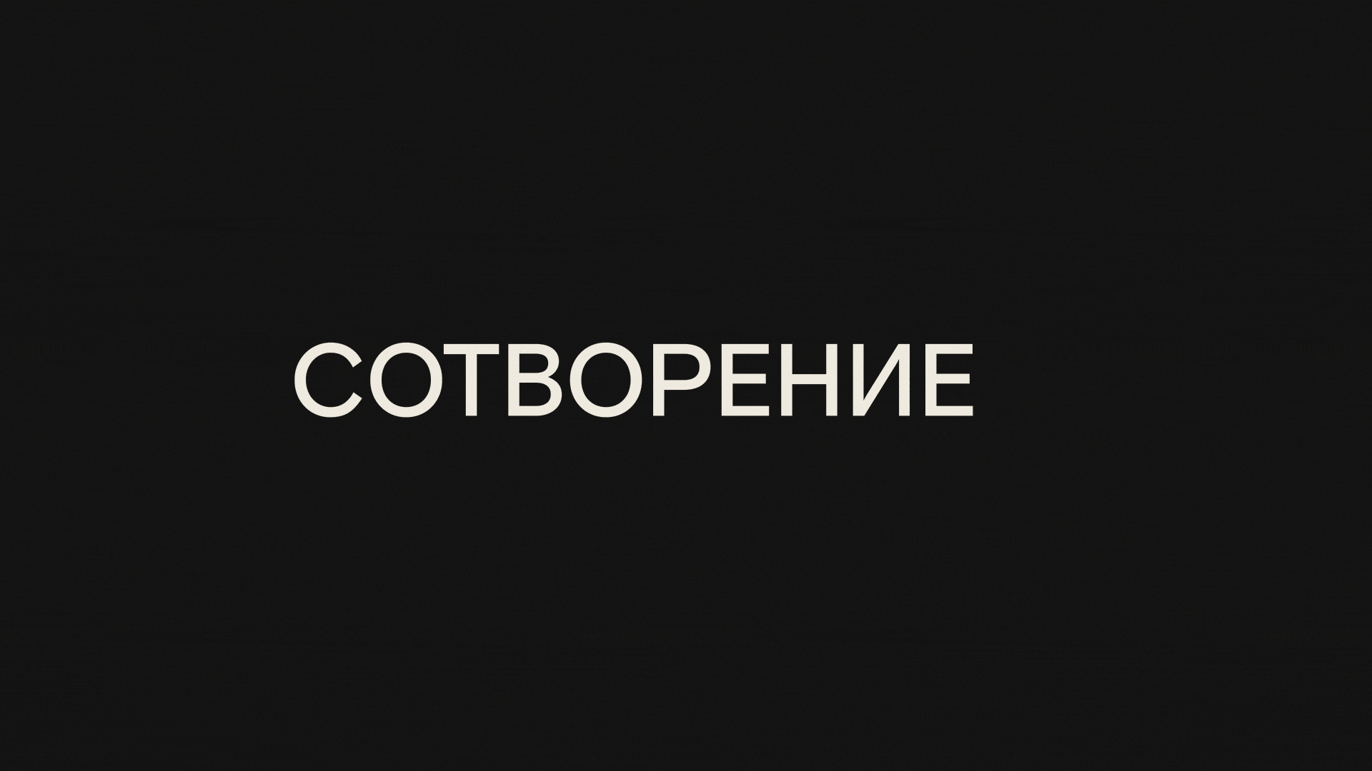
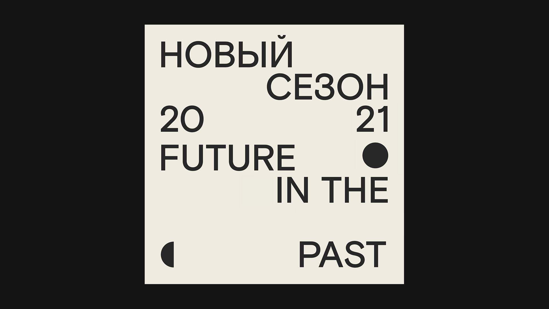
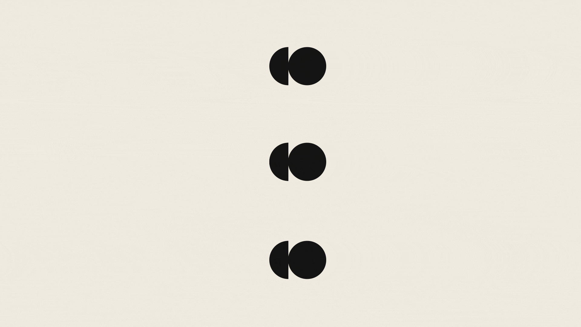
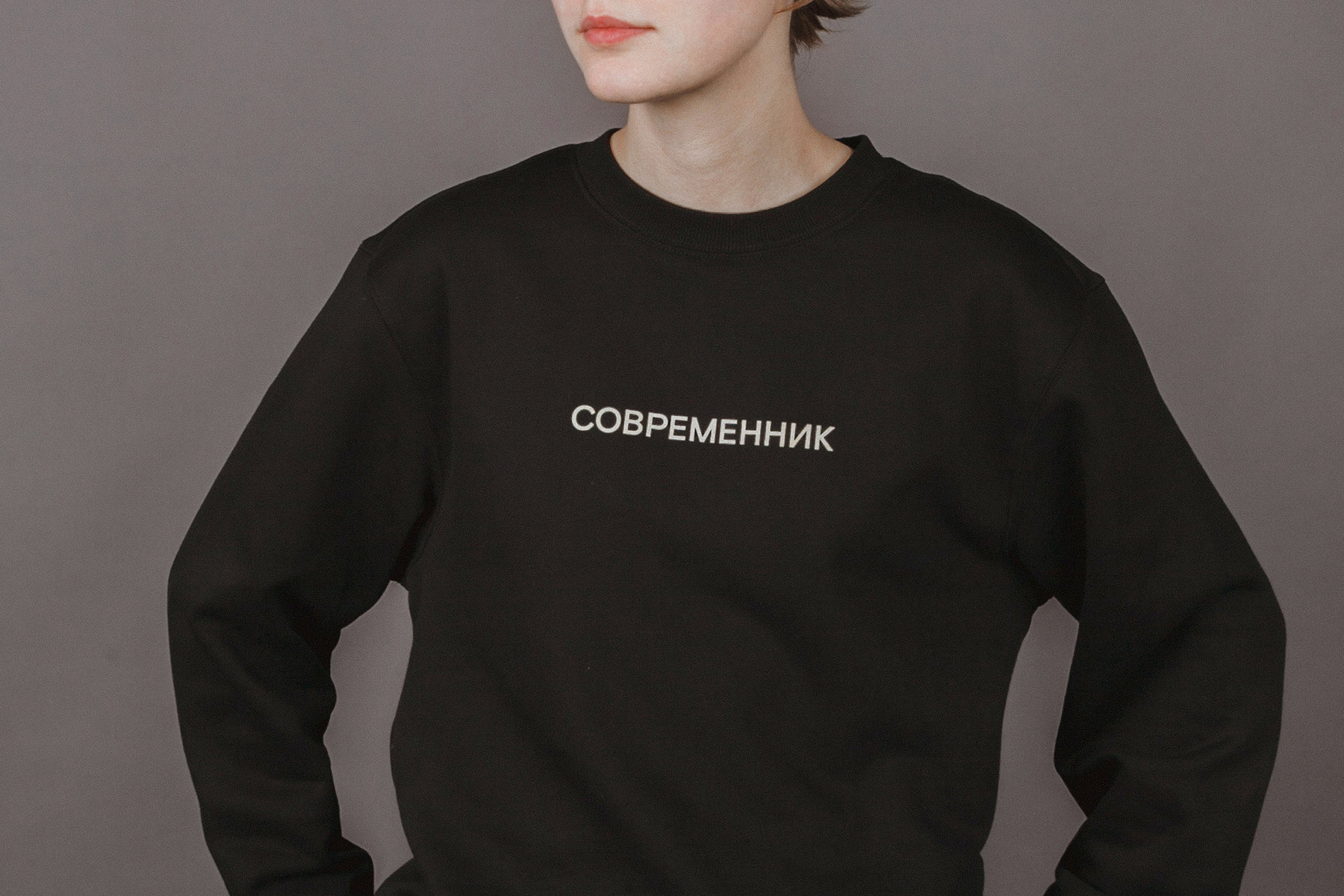
We have experimented with the name “современник” (“современник” means contemporary in Russian) and found a lot of words with the same prefix “СО” that matched the new concept of the theatre and it’s core values. We have also used this “СО” prefix to make a logo, but it’s not your usual logo in the bottom corner of a poster, it’s stands differently across all layouts. We also put years of the current season in all the layouts (now it’s 20—21), showing both past and future, “современник” stands right in-between.
CREDIT
- Agency/Creative: esh gruppa
- Article Title: Rebranding of Sovremennik Moscow Theatre Designed by Esh Gruppa
- Organisation/Entity: Agency, Published Commercial Design
- Project Type: Identity
- Agency/Creative Country: Russia
- Market Region: Europe
- Project Deliverables: Brand Advertising, Brand Guidelines, Brand Identity, Brand Redesign, Brand Strategy, Branding, Graphic Design, Identity System, Rebranding, Tone of Voice
- Industry: Entertainment
- Keywords: theatre, theatre identity, culture, typography


