


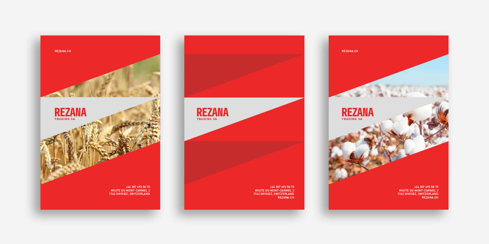
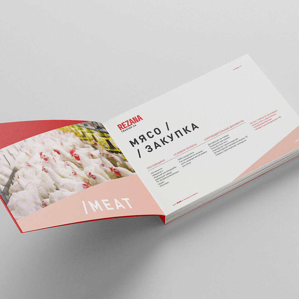
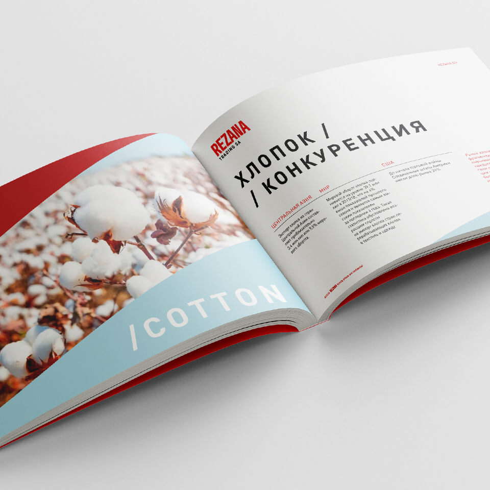
Rezana is a large trading company. It supplies sugar, meat, grain and cotton worldwide, buying it all in Russia and Central Asian countries. Rezana is headquartered in Switzerland and has representative offices in all the key business cities: New York, London and Moscow. The company’s capacity allows it to be a prominent player in the global market: e.g. in Tajikistan, it provides financing to cotton planting nationwide.
We had to revise the existing Rezana style by making it more modern and offering options for development of a sub-brand system. At the same time, it was important to maintain the vibe of a Swiss company, which helps to create an image of a reliable European brand and ensures the trust of partners – the most valuable asset in the B2B market today.
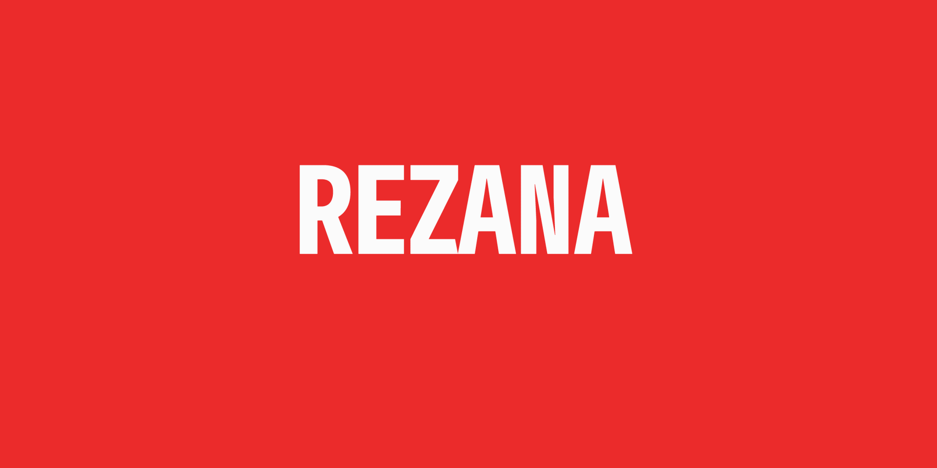
Despite the Swiss origin of the company, the name Rezana is Russian. In the 9-12 centuries, Rezana was a monetary unit of the Kievan Rus and neighboring nations, half of an Arabian dirham. A whole dirham was equal to one marten skin (about 3 grams of silver) and was not good for small bargains. In the updated logo, this metaphor appears as a cut-out between the letters Z and A, right in the middle of the word.
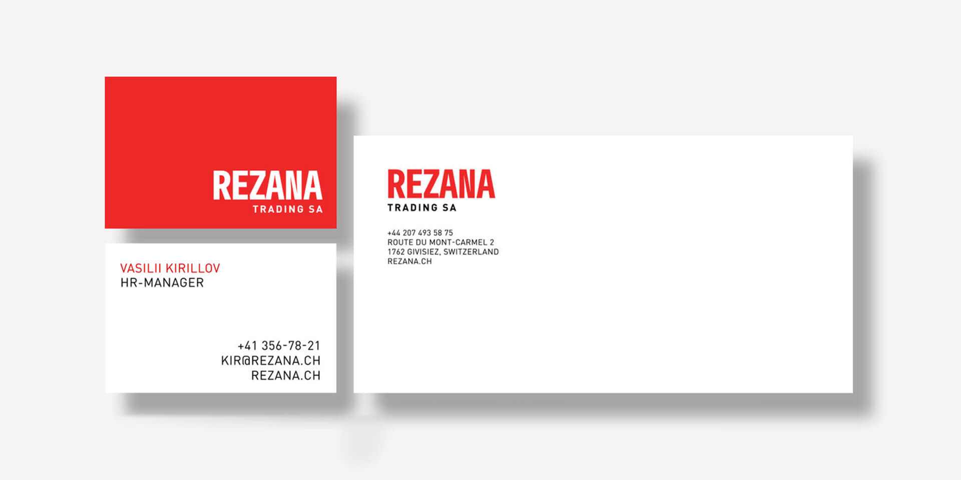
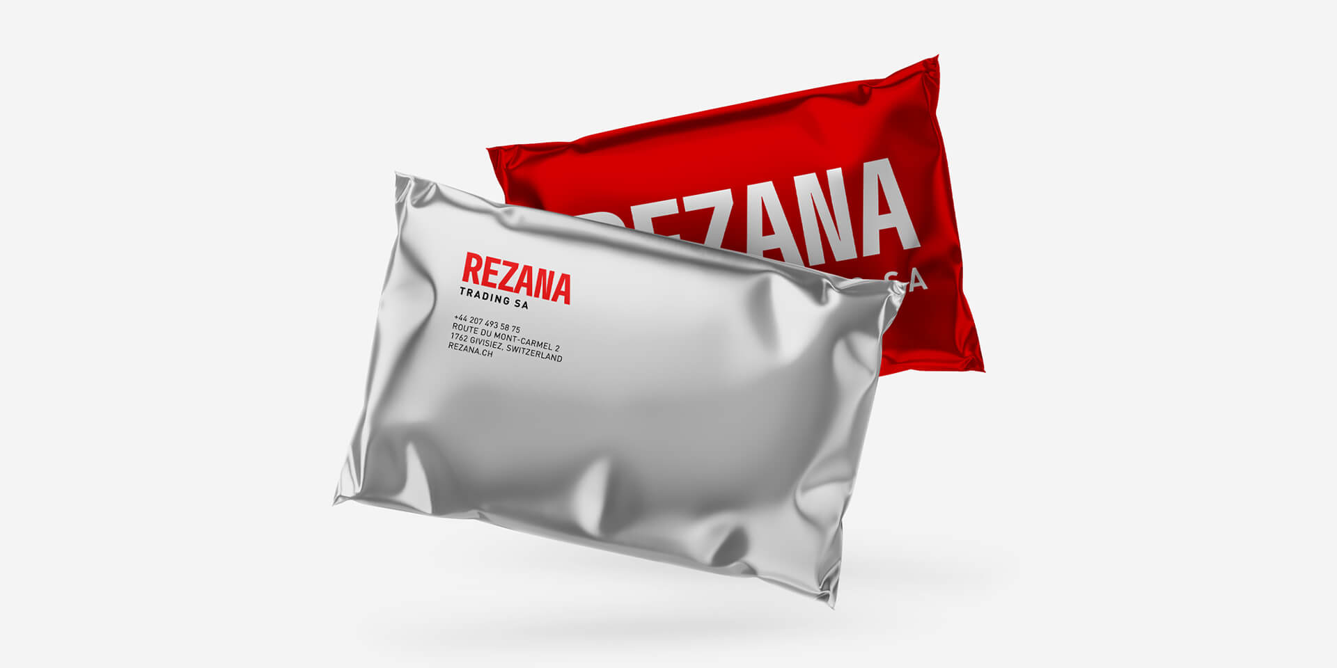
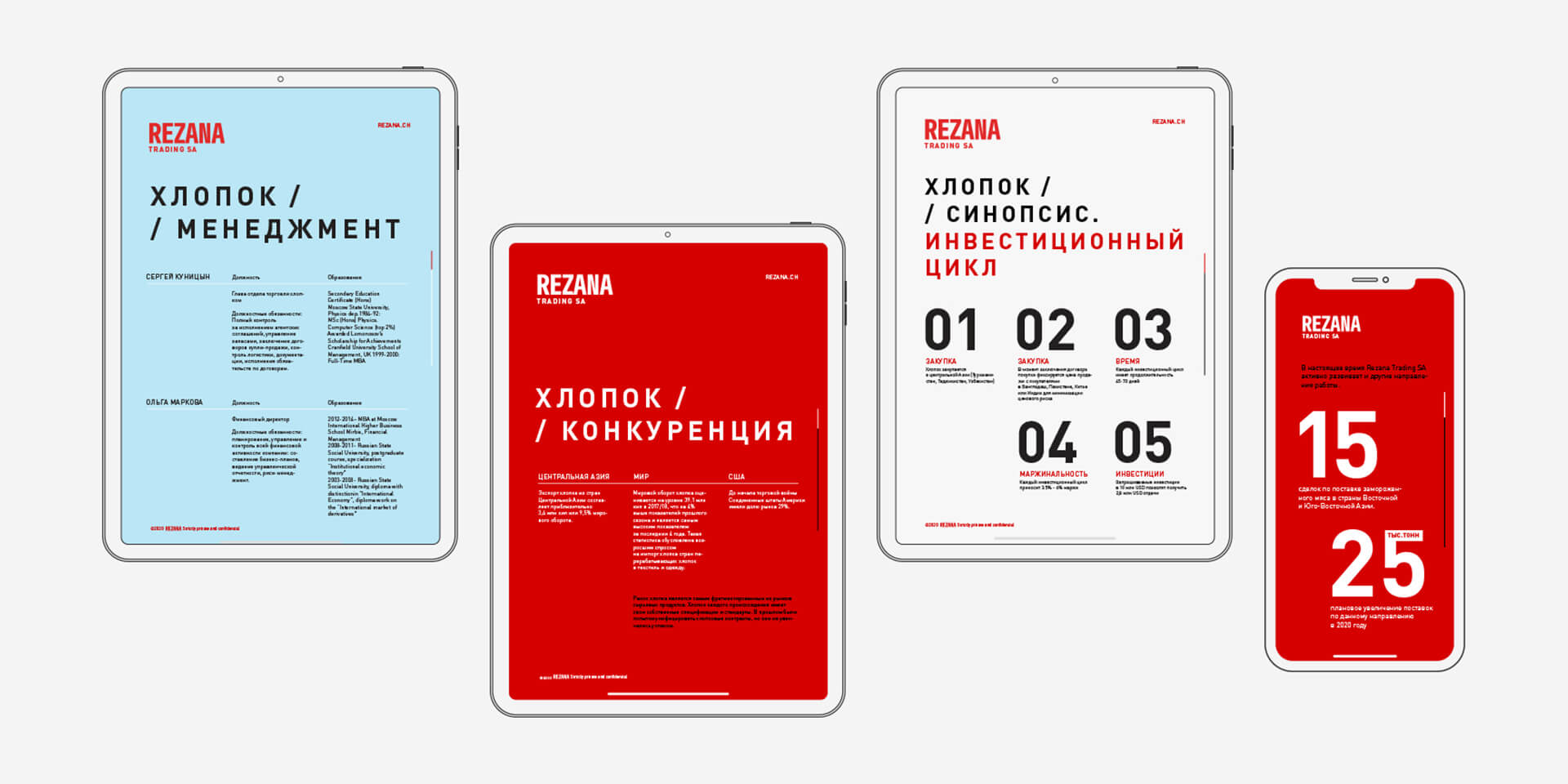
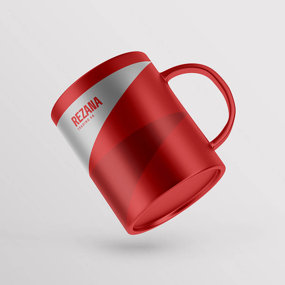
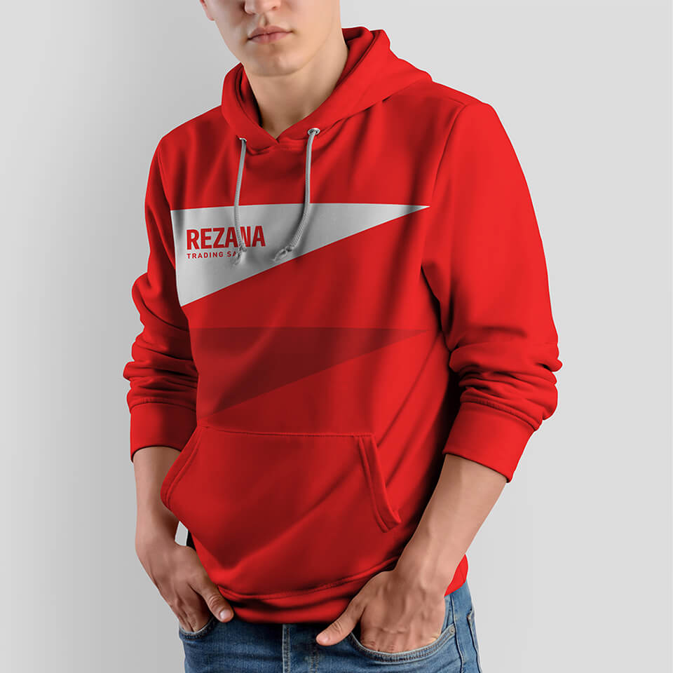
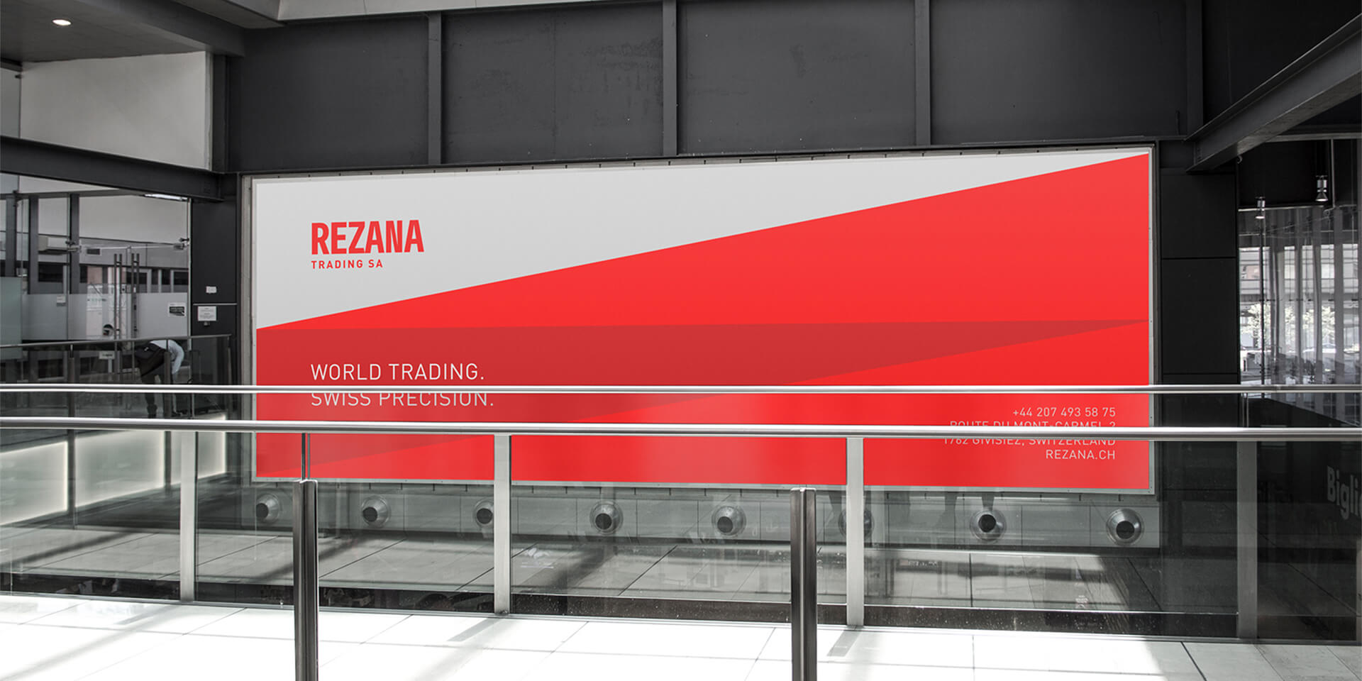
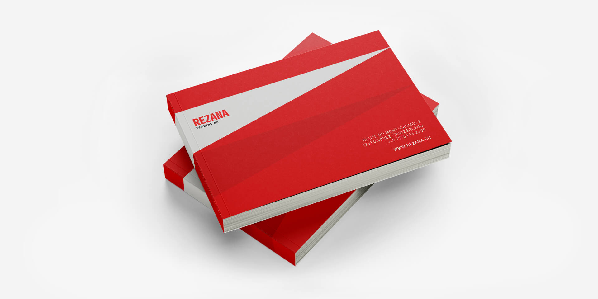
The style is based on the elements firmly associated with Switzerland. The red color and the outstanding features of Swiss design: bold layout, restrained texts, contrasting color combinations, large headings. The expressive composition of corporate media refers back to the art of a classic Swiss poster.
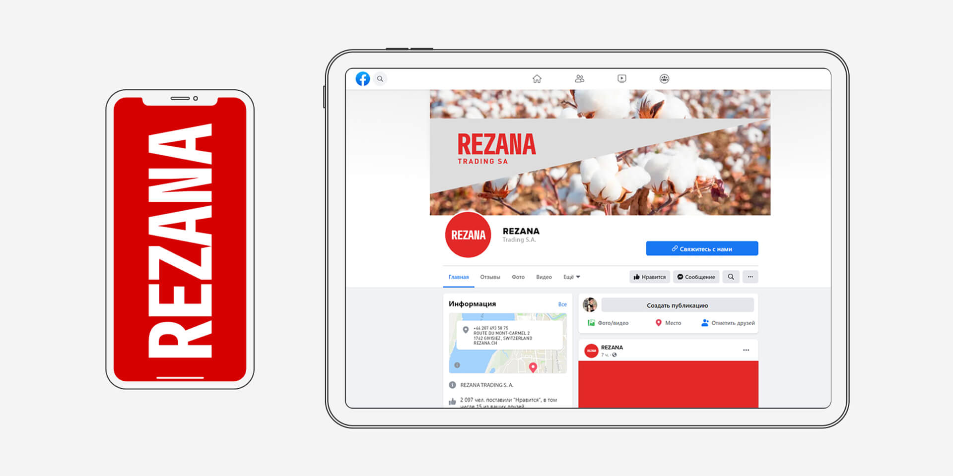
The company is constantly expanding its sphere of interest, connecting new industries and products to its trading chain. That is why the corporate identity provides for a flexible sub-brand system, so that any new direction could be easily integrated into the general range.
Rezana interacts with a variety of partners in different parts of the world. Each one has their own mentality, culture and priorities. However, regular deliveries, punctuality and responsibility are important for them all. The new style allowed us to reflect these qualities in the brand image more accurately, and became an important advantage for entering new European markets.
The project was prepared by request of Elje Group, an international group of creative companies.

CREDIT
- Agency/Creative: lovemedo branding agency
- Article Title: Rebranding of Rezana Trading SA International Trading Company Created by Lovemedo Branding Agency
- Organisation/Entity: Agency, Published Commercial Design
- Project Type: Identity
- Agency/Creative Country: Russia
- Market Region: Europe
- Project Deliverables: Brand Identity, Branding, Graphic Design, Product Architecture, Rebranding, Research
- Industry: Transport
- Keywords: logodesigner / creativelogo / logoconcept / identitydesign / brandidentity / branding / identity / visualstyle / rebranding / designoftheworld


