


How to update a traditional labour of love for the modern market?
The Finnish jam brand Dronnningholm was established in the 60s, and it is little wonder they were excited for a change. Both traditional and natural, they have won over consumers by producing a delicious, indulgent jam that forms part of their breakfasts, sweets and new recipes. With this in mind, the brand seized the opportunity to modernise its packaging, without losing its essence.
The Challenge
To transform Dronnningholm’s graphic universe, without compromising its image as an authentic, traditional and natural product, known for being a handmade labour of love.
The Solution
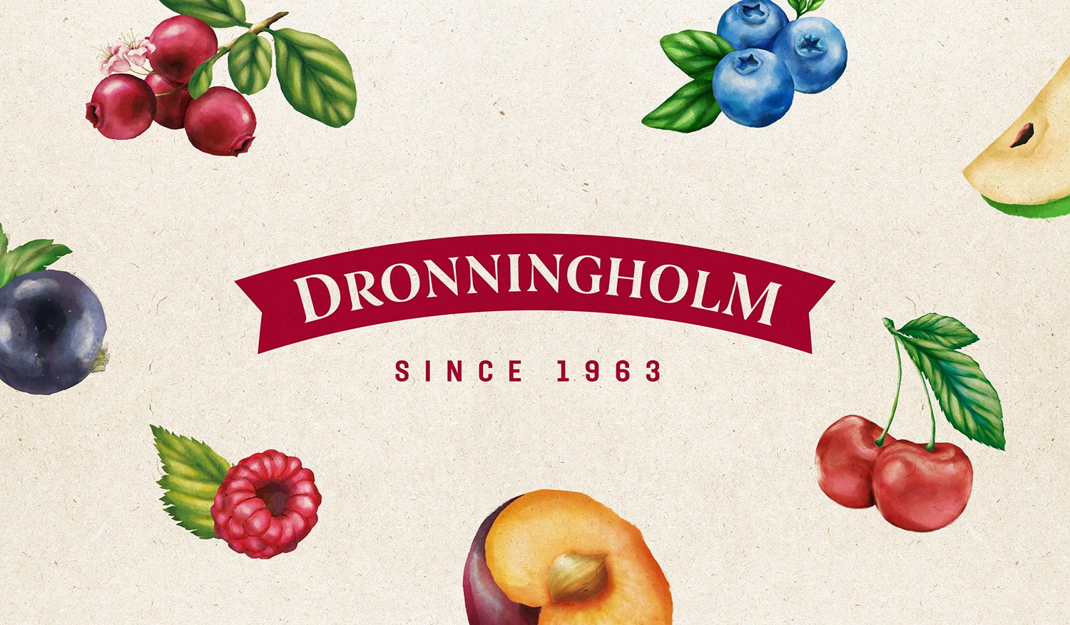
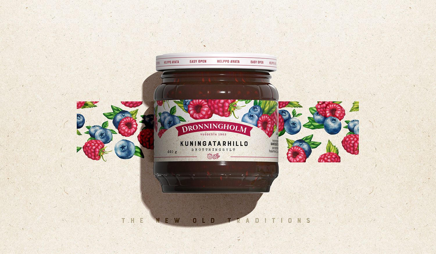
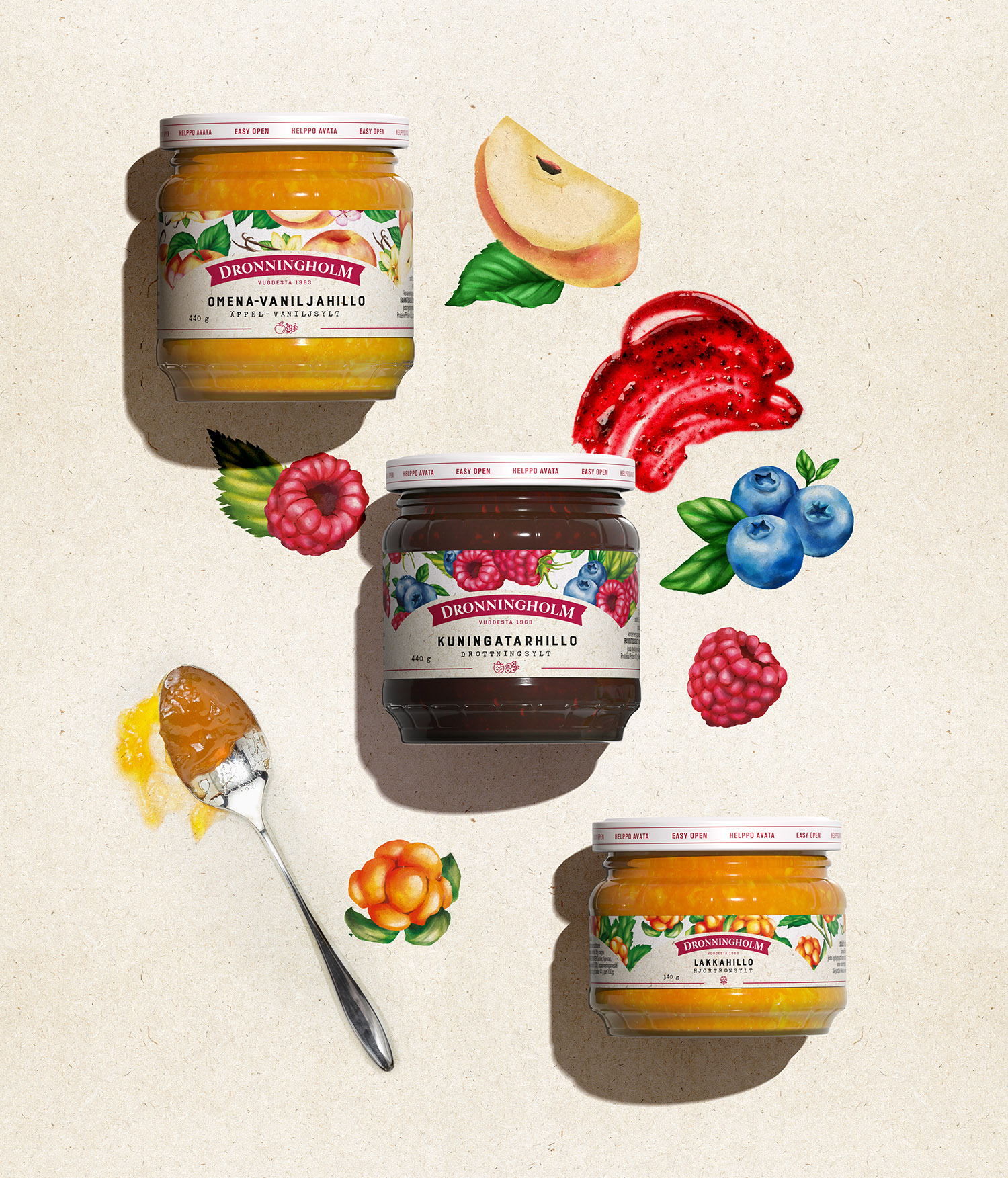
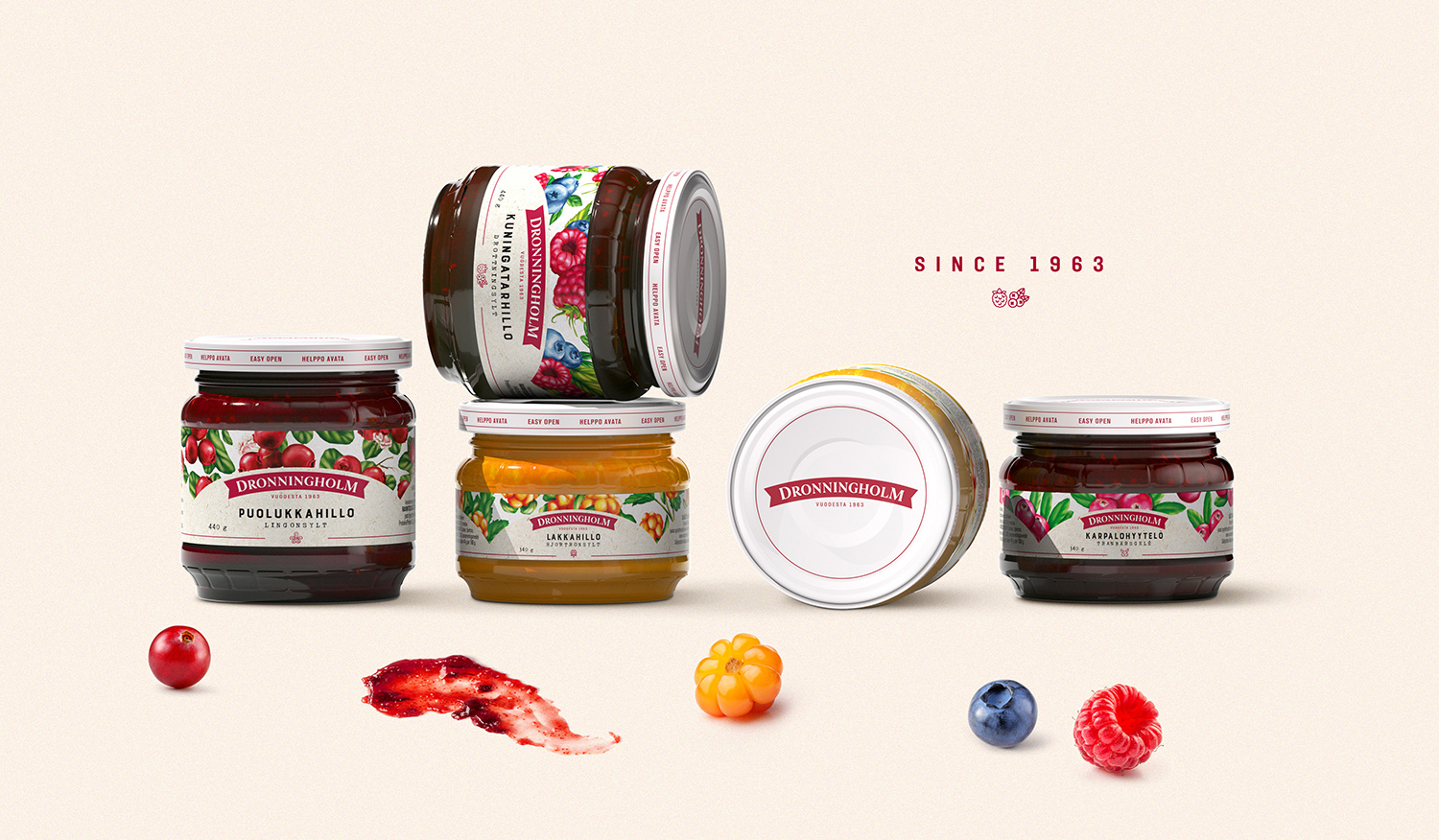
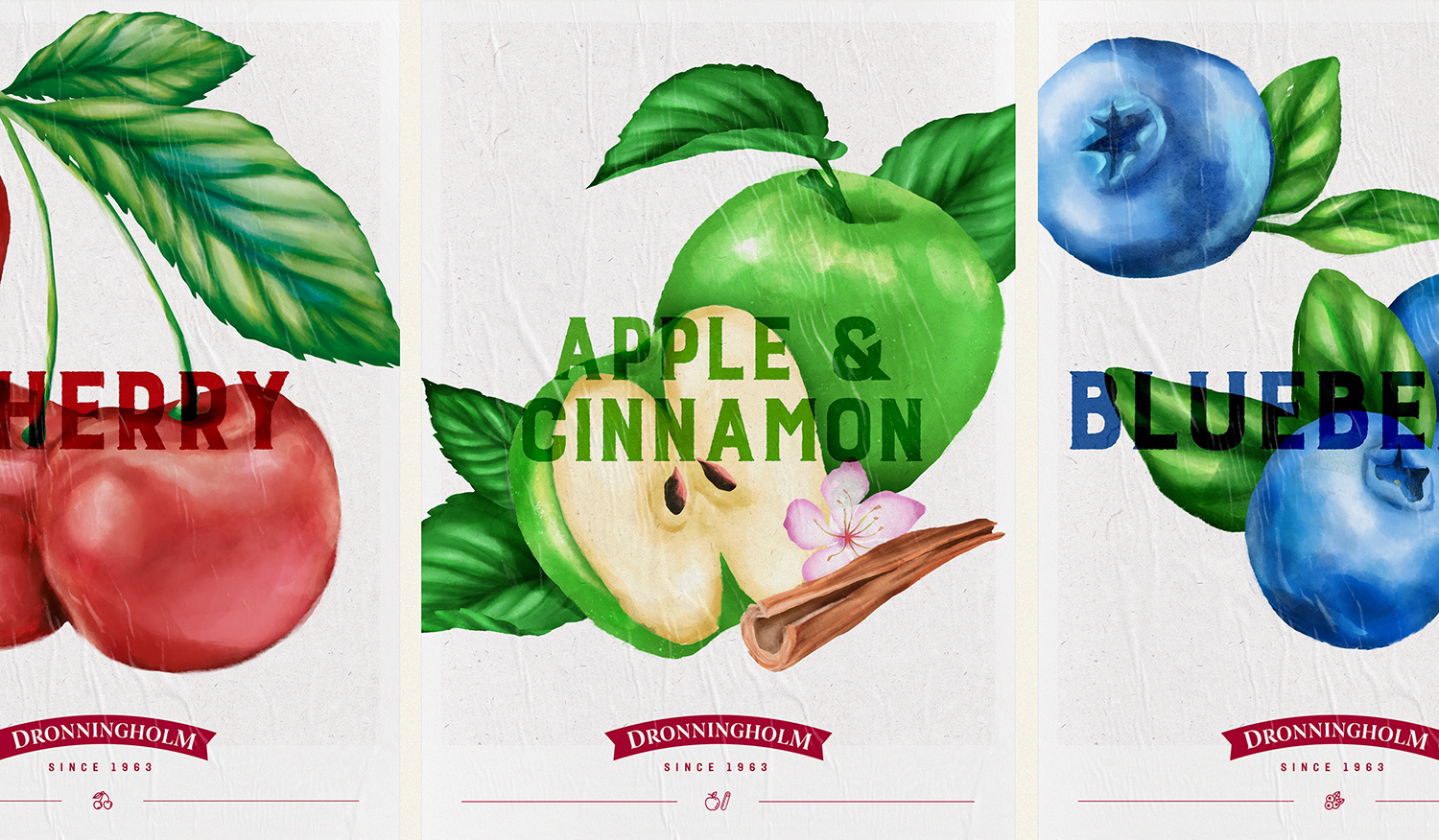
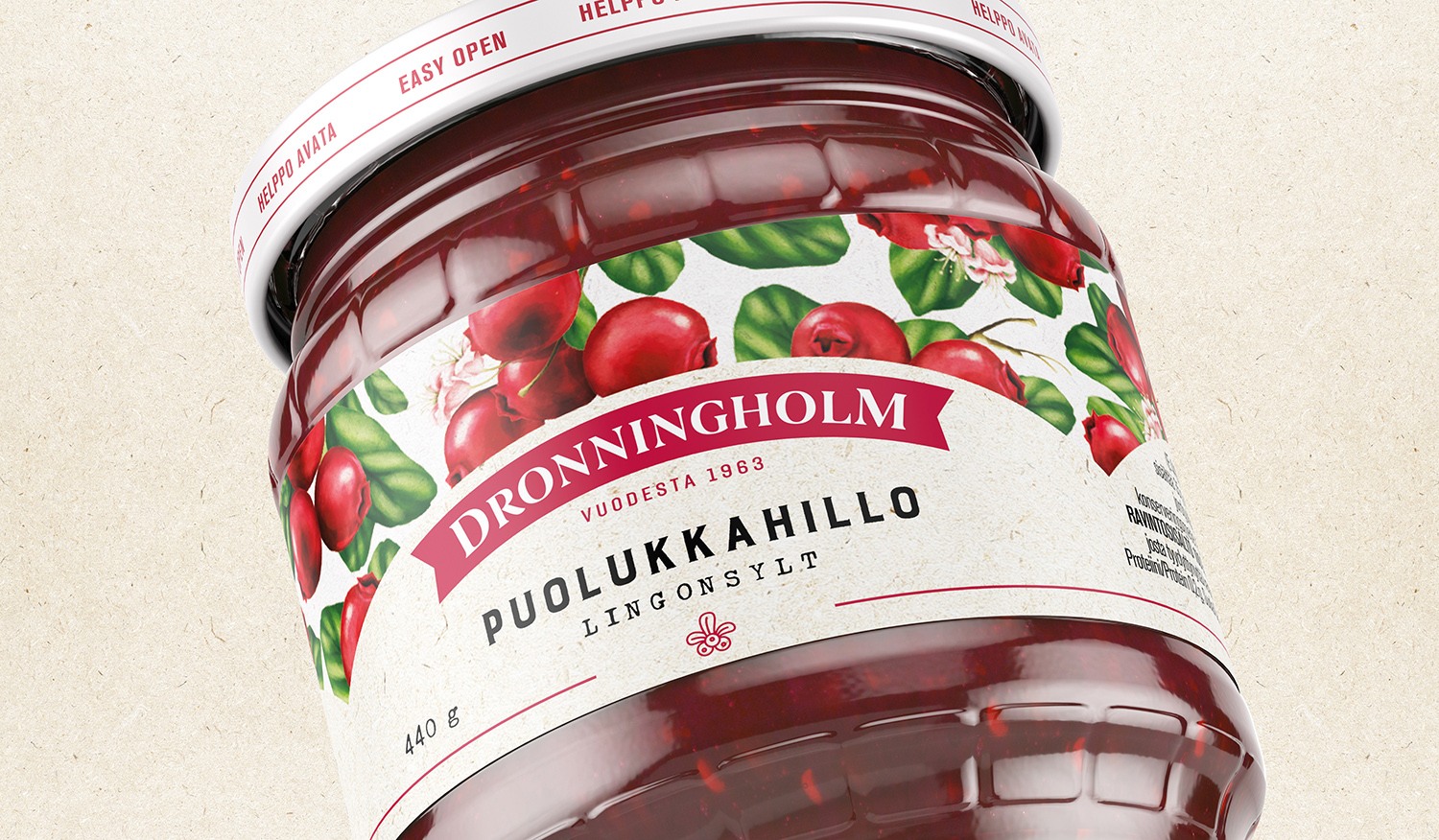
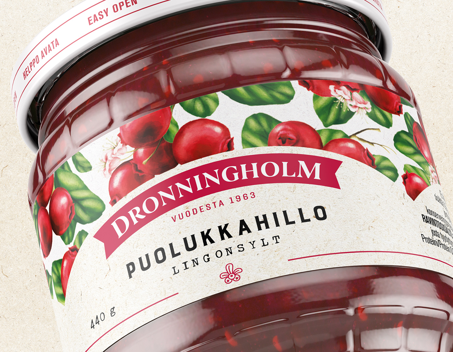
Based on the Brand Essence the “Tradition’s secret”, we decided to highlight the details that Dronnningholm has carefully maintained for more than 50 years. To achieve this, we created a series of 15 hand-made illustrations with a botanic and elegant touch. These were aimed at demonstrating the care with which their fruits are chosen Regarding its 50 years of tradition, we kept the serif-style typeface, though we made it somewhat bolder to mimic the satisfaction of tasting such truly delicious fruit. Furthermore, we retouched the original red to make it a little darker, similar to the precious colours that fruits take when they are slowly stewed to make jam. Last but not least, we changed the label material for a texturized paper, to remind us of those secret recipes that our grandmothers kept safe. A warm and human touch, for a regal jam that satisfies even the most demanding of palates.
CREDIT
- Agency/Creative: Pointbleu Design
- Article Title: Rebranding of Dronningholm Created by Pointbleu Design
- Organisation/Entity: Agency
- Project Type: Packaging
- Project Status: Published
- Agency/Creative Country: Spain
- Agency/Creative City: Barcelona
- Market Region: Global
- Project Deliverables: Illustration, Logo Design, Packaging Design, Rebranding
- Format: Jar
- Substrate: Glass Jar
- Industry: Food/Beverage
- Keywords: Jam, Finland, Saarioinen, Rebranding
-
Credits:
CEO: Guillaume Collinet


