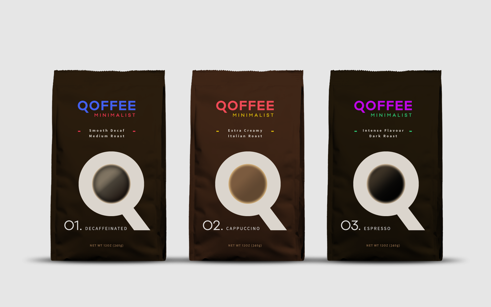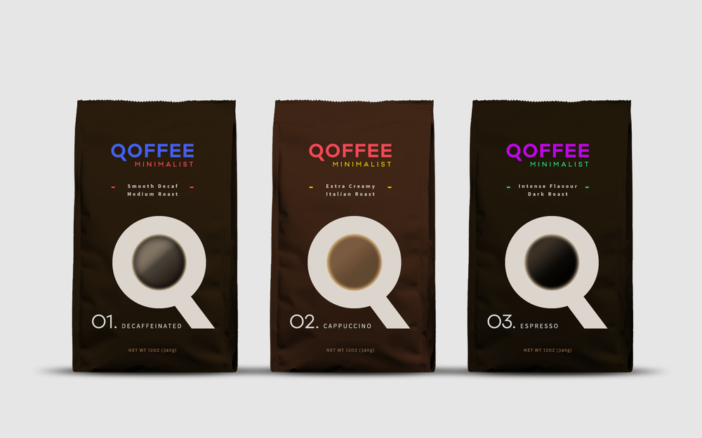
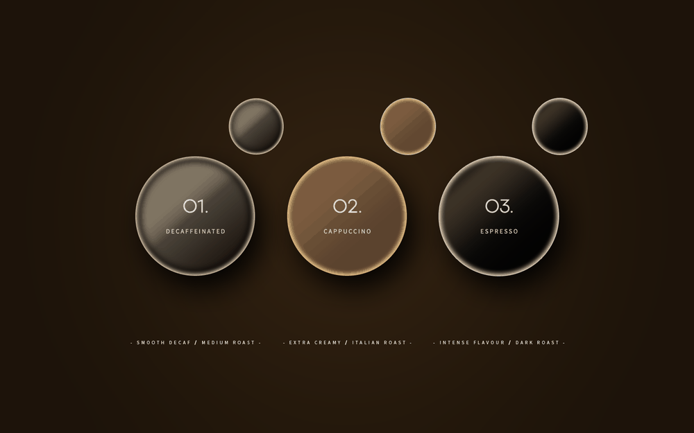
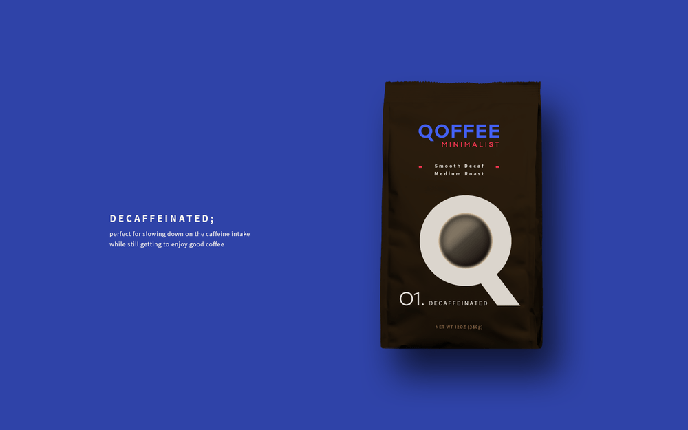
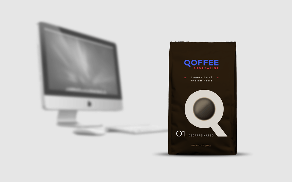
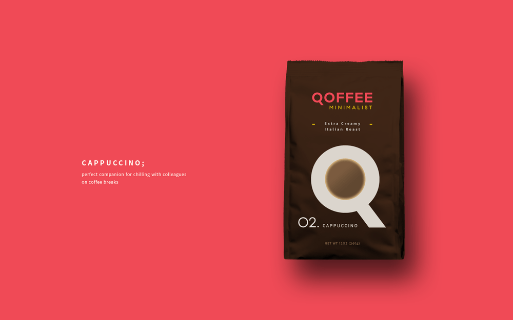
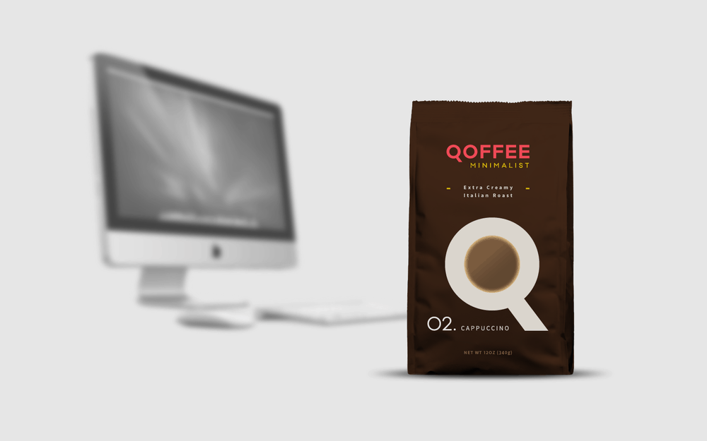
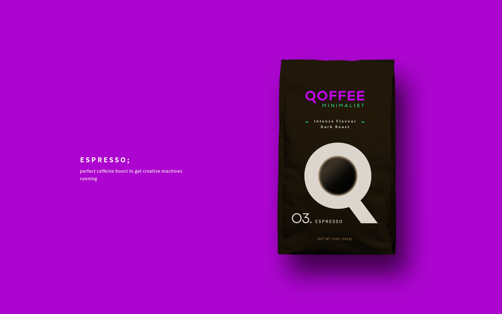
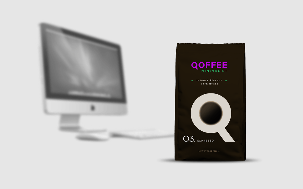
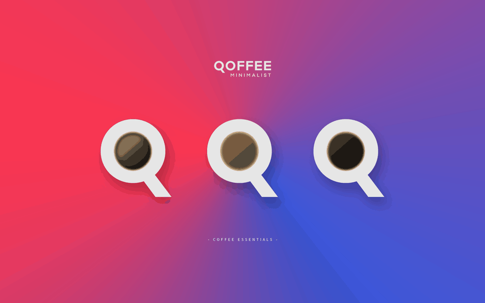
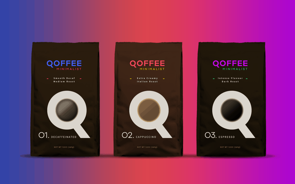
“Coffee is an elixir to many creatives. Today, the coffee maker is as integral to the work environment of creative studios as any tools of the craft. With this in mind, Qoffee Minimalist aims to appeal to designers and provide the essentials for the office: 1) a smooth decaf, for those who want to reduce their caffeine intake while still getting to enjoy the taste of a good coffee; 2) an extra creamy cappuccino, the perfect companion for chilling with colleagues during coffee breaks; 3) an intense flavoured espresso, for when in need of a delicious caffeine boost. Each flavour is easily identifiable by their own code: a number, different accent colors on the logo and a visual representation of the coffee. The packs’ minimalist aesthetic serves to making them a nice fit for any type of work space and emphasizes the brand’s symbol – a typographic play that turns the letter Q into a sleek cup of coffee. The Q also looks like a magnifying glass, an icon universally recognized by graphic and web designers.”
CREDIT
- Agency/Creative: Rebeca Gliosci
- Article Title: Rebeca Gliosci – Qoffee Minimalist (concept)
- Project Type: Packaging


