


EG, an established provider of data-driven intelligence for the UK real estate sector, has revealed a refreshed corporate brand identity that unites people and property through data.
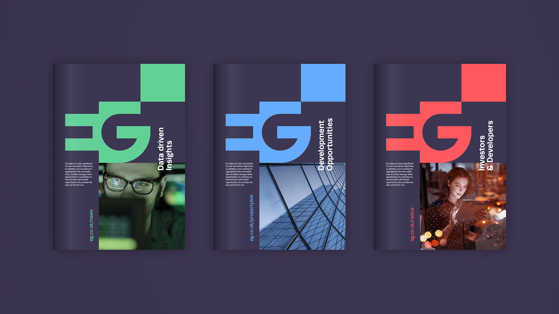
Created by brand agency Designhouse, the re-designed master logo employs the theory of negative space, combining the two letterforms into a single mark, making it more assertive and recognisable. The use of negative space in the logo reflects the importance of internal floor space in the commercial property world. The structure of the G creates the negative space that is the E, mirroring a building and its internal space.
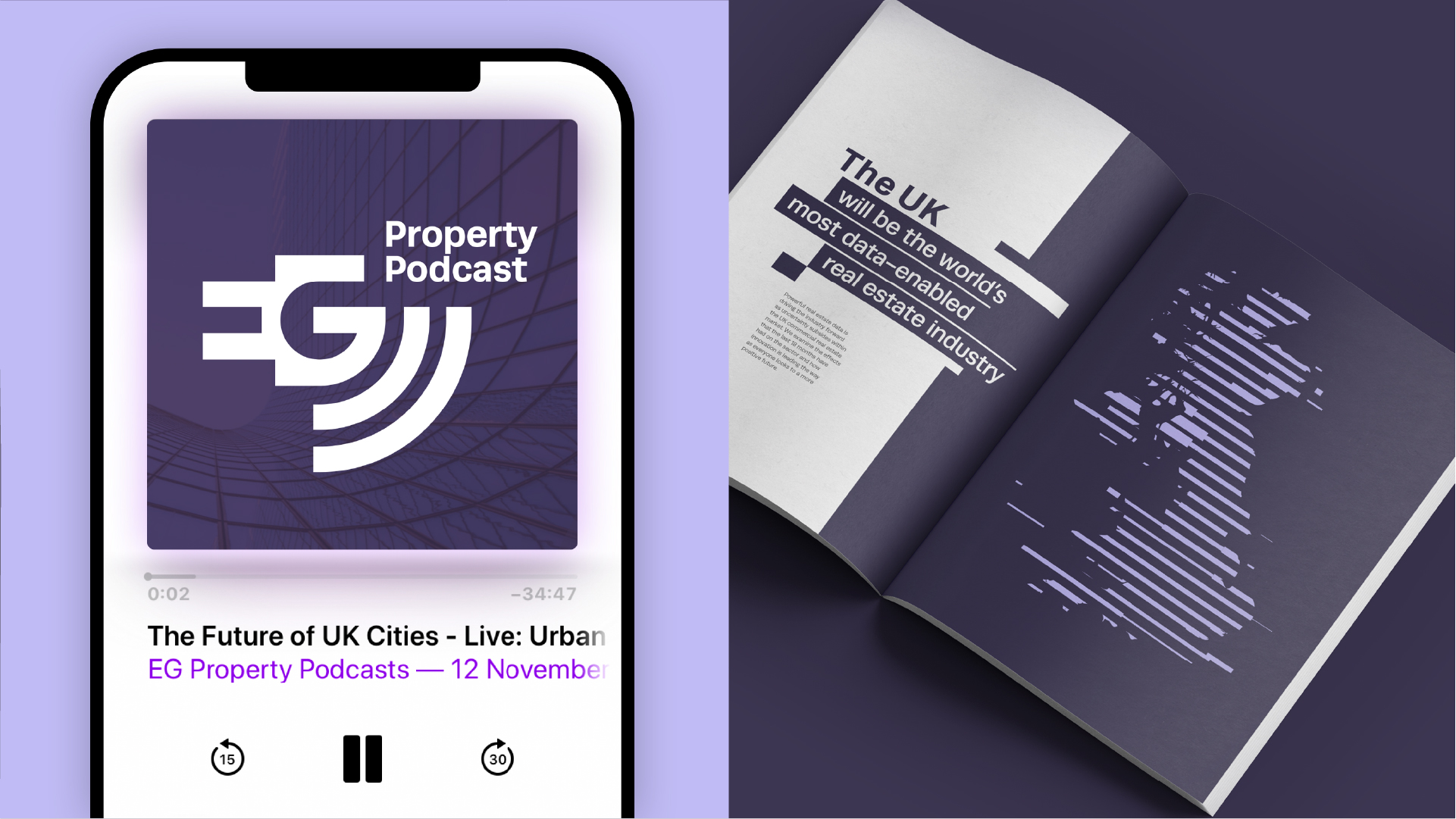
Technology and innovation are visualised through lateral data movement, powering the organisation, its individuals and the UK commercial property sector. This theme is a thread that runs through the rest of the brand, influencing illustration, iconography, infographics and video content.
Imagery has been updated, moving away from abstract stock photography representing data to focus on the people using the technology, both within EG and the clients who use it to inform their decision-making.
First published in Fleet Street more than 160 years ago as Estates Gazette, EG has a rich heritage of delivering real estate news and legal comment. Owned by the Wilson family for more than 100 years, the magazine was then sold to Reed Business Press in 1990, and since then it has expanded its portfolio to include a number of associated real estate publishing and intelligence services, data platforms, networks, events and awards. It is part of LexisNexis Risk Solutions Group, owned by RELX, a global provider of information-based analytics and decision tools for professional and business customers.
The brief centred on delivering a flexible, strong brand identity that would work equally well on an award trophy, signage or in digital format. The rebrand was commissioned to help rationalise and clarify the portfolio, unifying employees across a single organisation while refining the existing brand architecture with a new simplified product hierarchy that would be easier for customers to access.
Three sub-brands, EG Radius, EG Propertylink and EG News+Insight, have been given a refresh, with the EG master brand taking centre stage and dominating the product services.
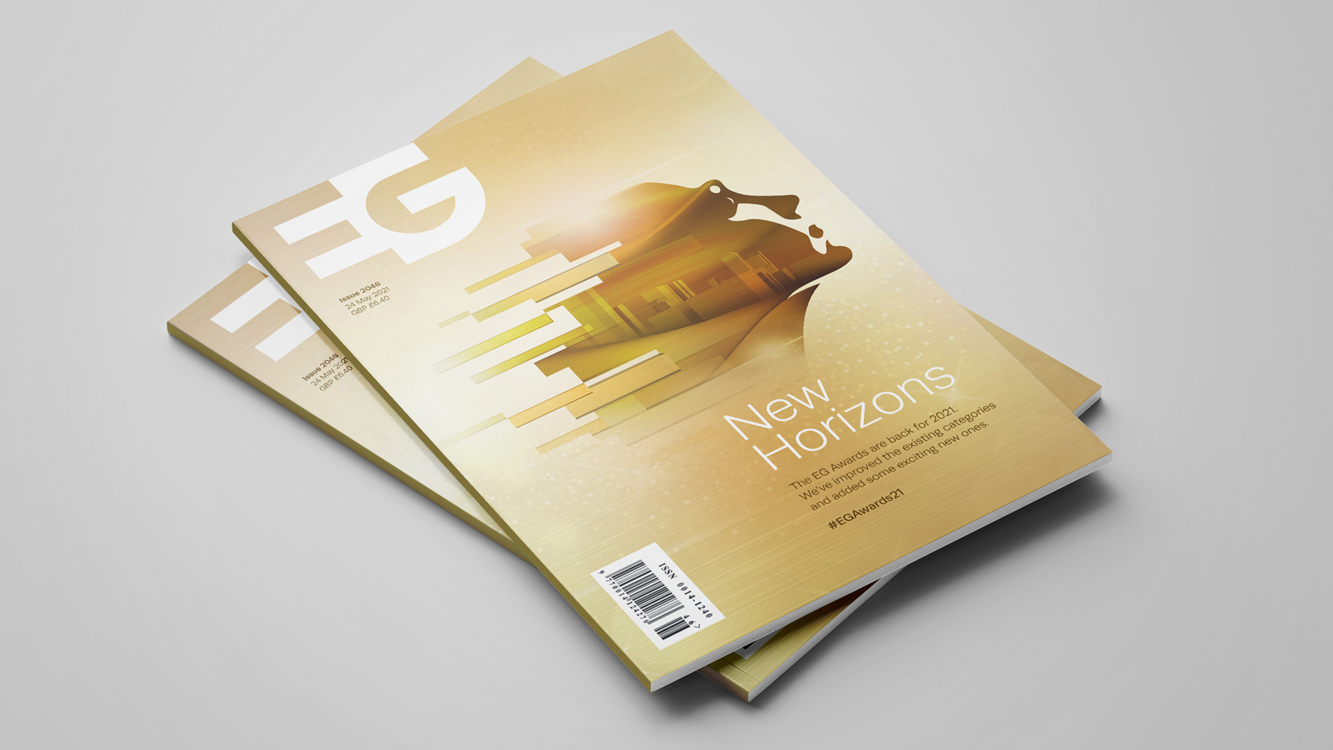
The old primary palette of dark grey and tomato red has been replaced with a single new master colour, a professional deep purple, but the flexible system allows for the logo to adopt the colours of its immediate environment. Purple works in harmony with a secondary palette of colours inspired by indoor and outdoor space.
Michelle McCann of EG said:
“It was time to refresh the EG brand to clarify the expanding portfolio to customers and also to deliver a bolder, cleaner and more engaging style for our marketing collateral. We have had a great partner in Designhouse over the past year, and the team have consistently delivered intelligent strategic advice and creative work. We are all delighted with the results.”
Richard Debenham, Design Director at Designhouse, said:
“Simplicity of construction is at the heart of the new logo, a singular mark that represents the unison of people and property. The data and intelligence behind EG’s technology is reflected throughout the visual language, acting as a thread, running through the entire brand.”
The new brand identity will be applied across the EG portfolio, including a new website, social platforms, marketing and a new look and feel for the EG awards. A launch video and support collateral were produced for sharing the new brand identity internally.

CREDIT
- Agency/Creative: Designhouse
- Article Title: Real Estate Leader EG Launches Refreshed Identity that Unites People and Property
- Organisation/Entity: Agency
- Project Type: Identity
- Project Status: Published
- Agency/Creative Country: United Kingdom
- Agency/Creative City: Designhouse/London
- Market Region: Europe
- Project Deliverables: Brand Architecture, Brand Identity, Brand Redesign, Brand Strategy, Graphic Design, Infographic, Logo Design, Rebranding
- Industry: Real Estate
- Keywords: Rebrand, EG, Designhouse, brand identity, logo, website, graphic system, infographics
-
Credits:
Designer: Design house


