


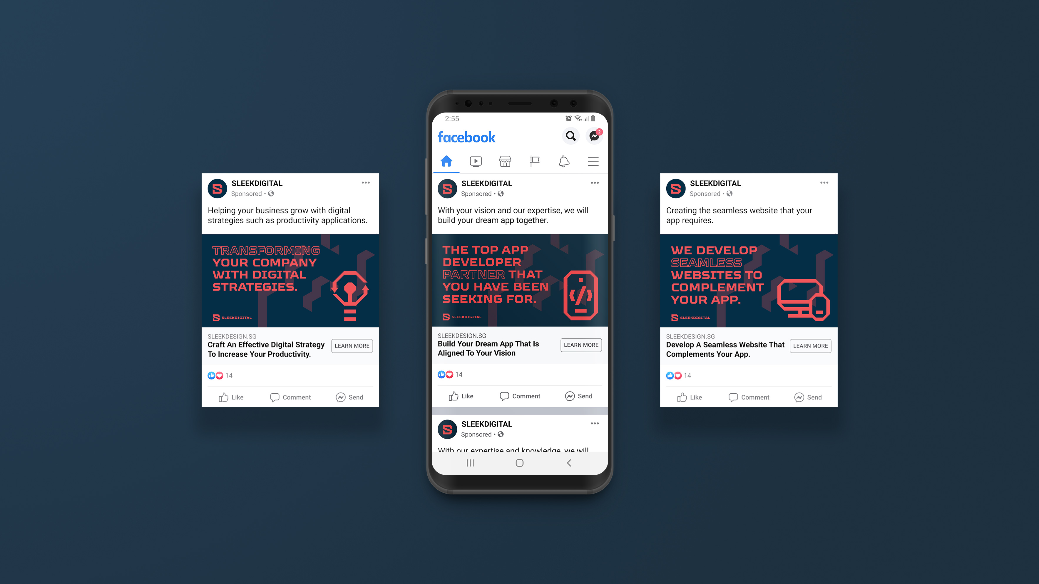
Since 2017, SleekDigital, a Singapore app developer company has been providing bespoke app development services, mobile app design, innovative enterprise app development, M-commerce app development, mobile app maintenance, mobile application consultation, iPad and tablet software development.
The challenge: SleekDigital need more than just a consistent brand identity that represents their values. Our challenge was to help them boost sales by resonating with their target audiences and also, demonstrating their bold ambition in becoming the top app developer in Singapore.
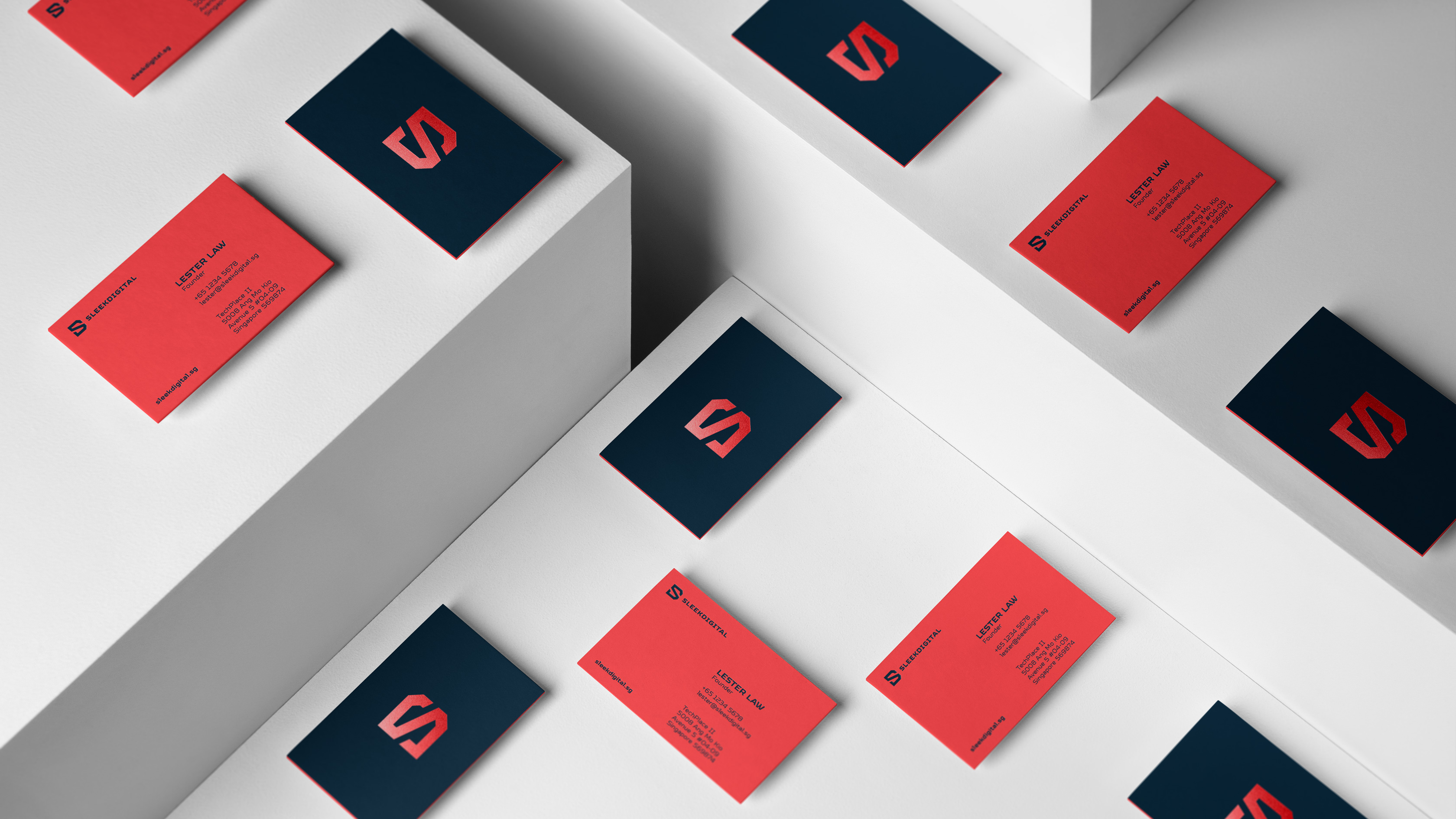
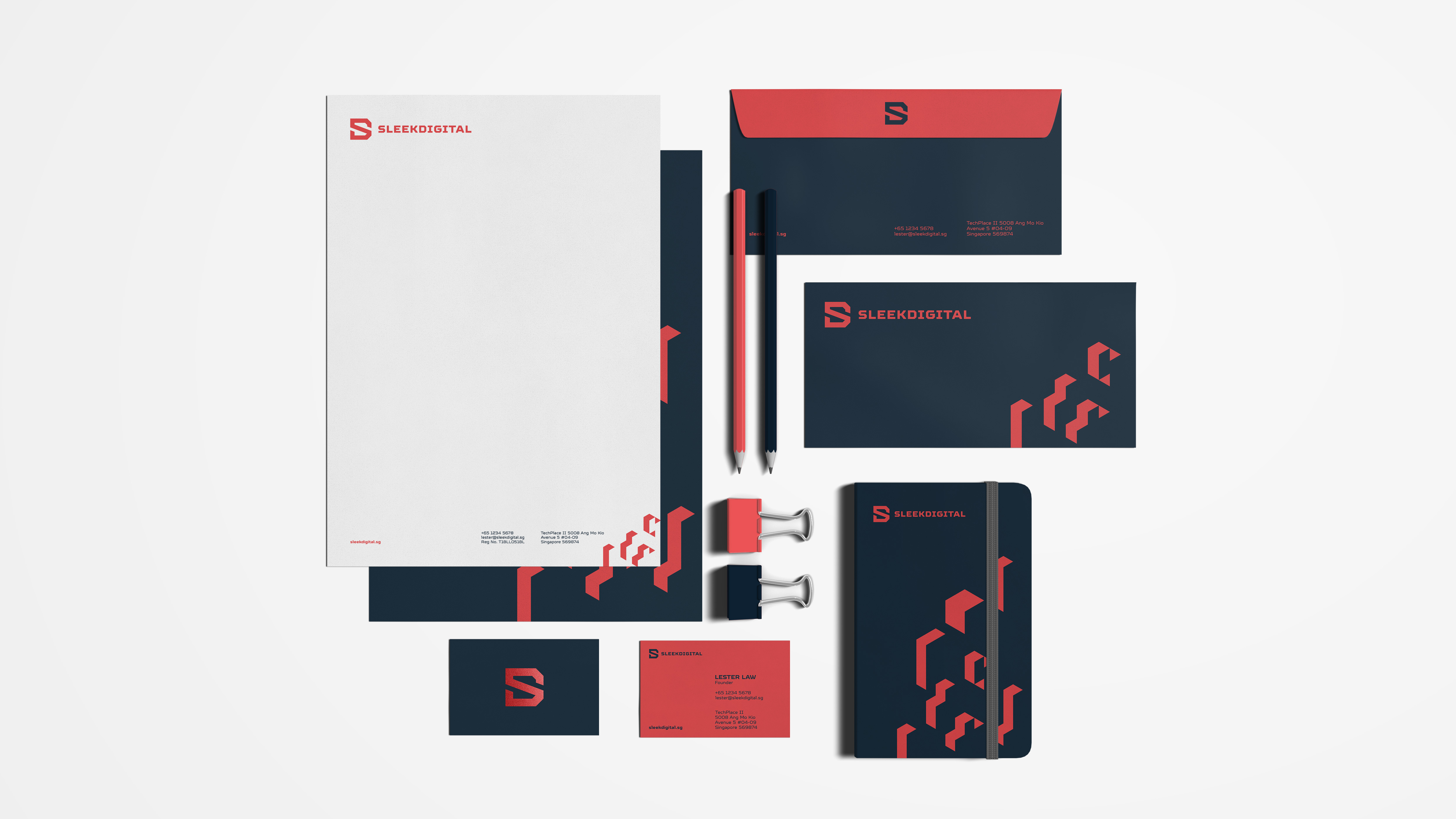
Outcome: We completely re-designed SleekDigital visual identity, integrating and enhancing their iconic red colour in the process. The outcome captured their values, target audiences and bold ambition in the app development industry in its logo, key graphics and iconography.
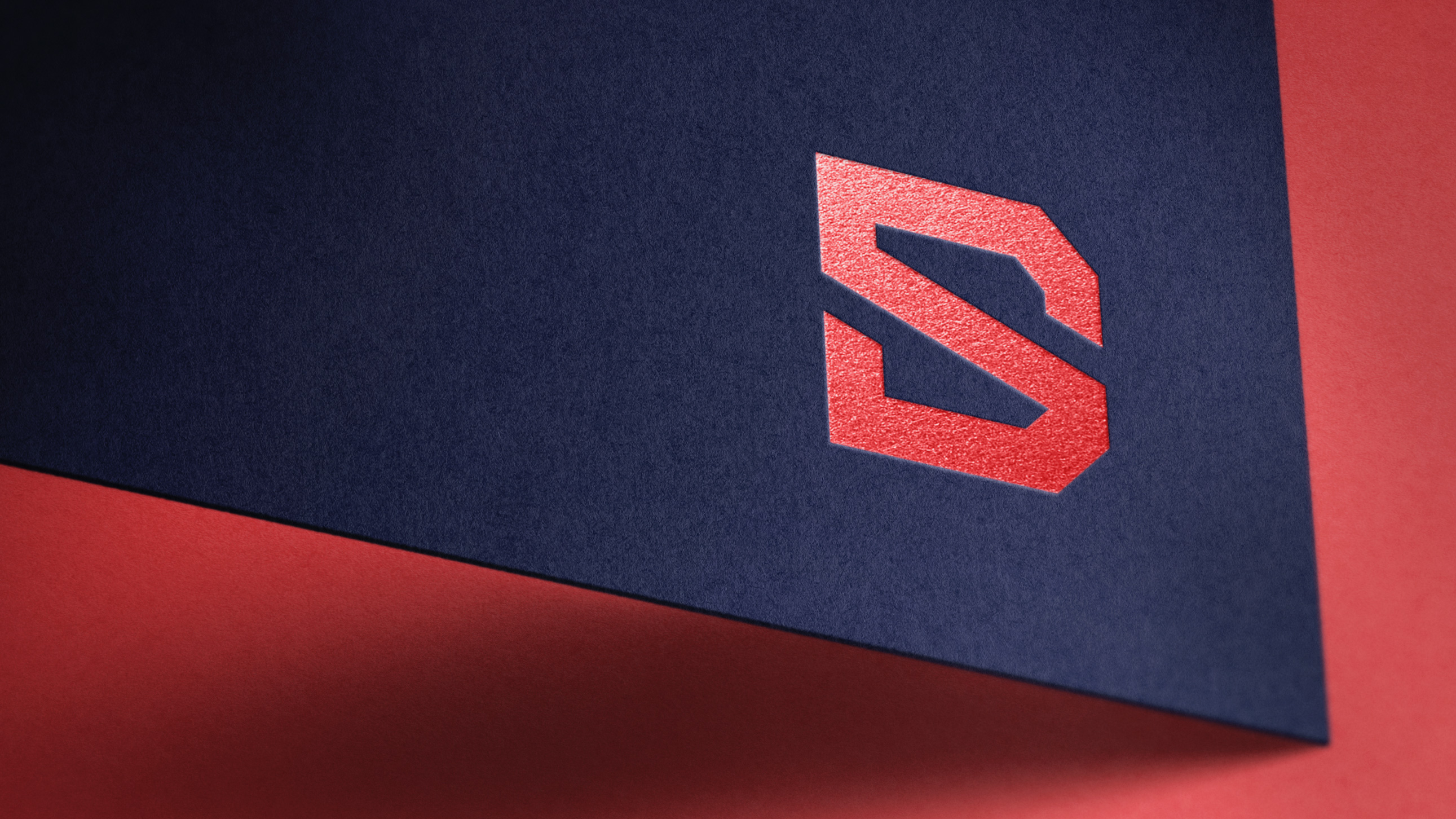
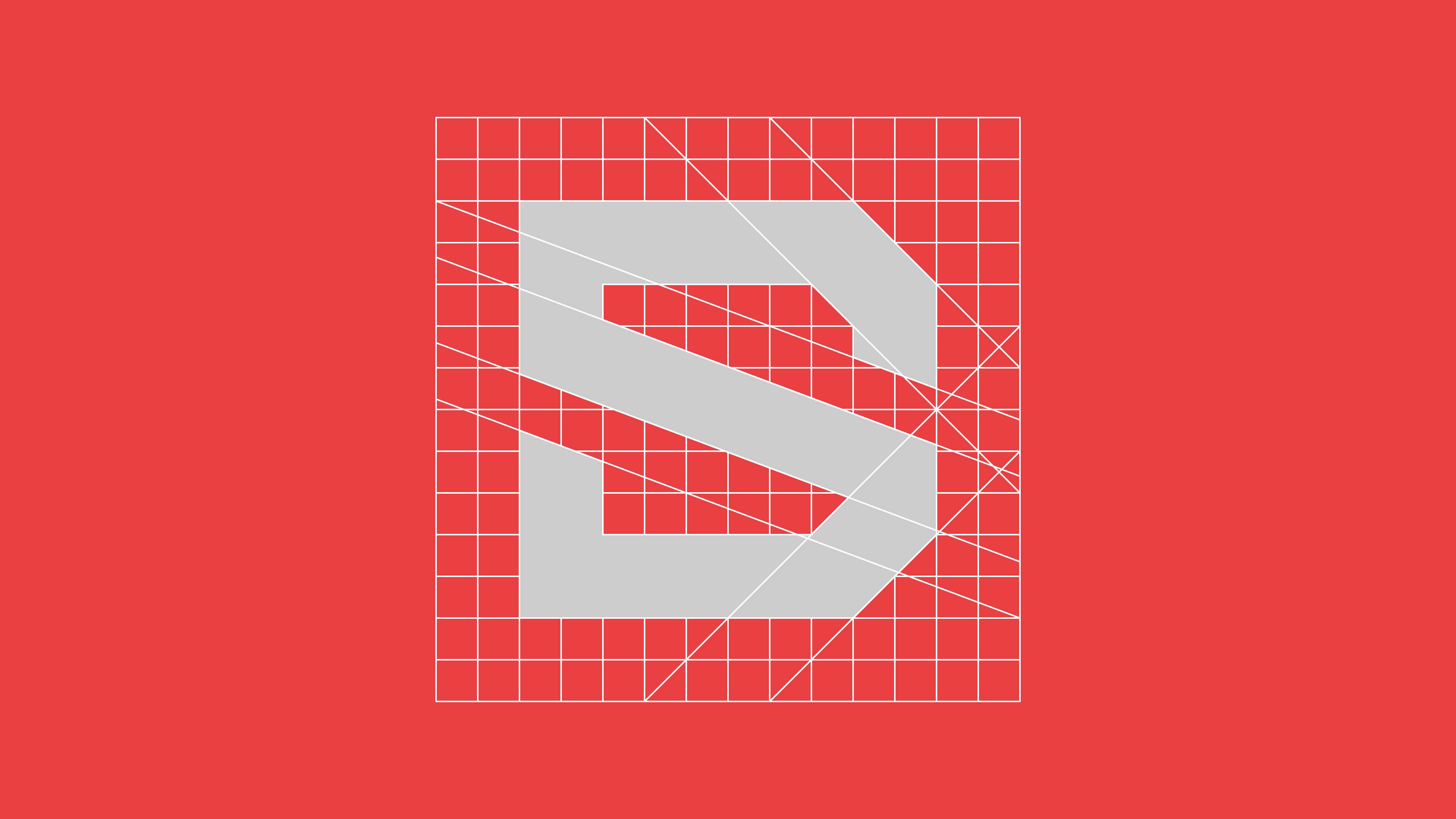
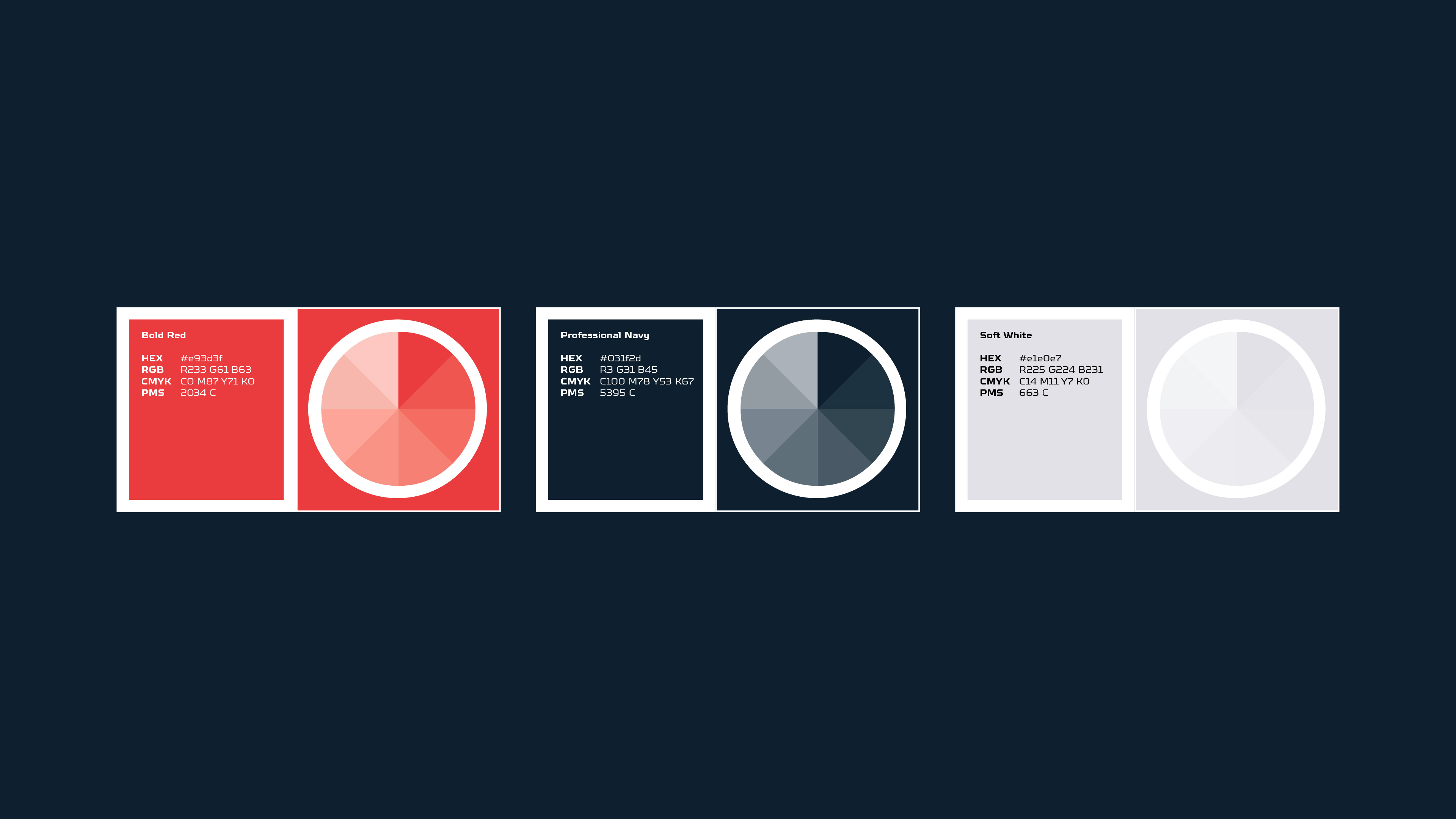
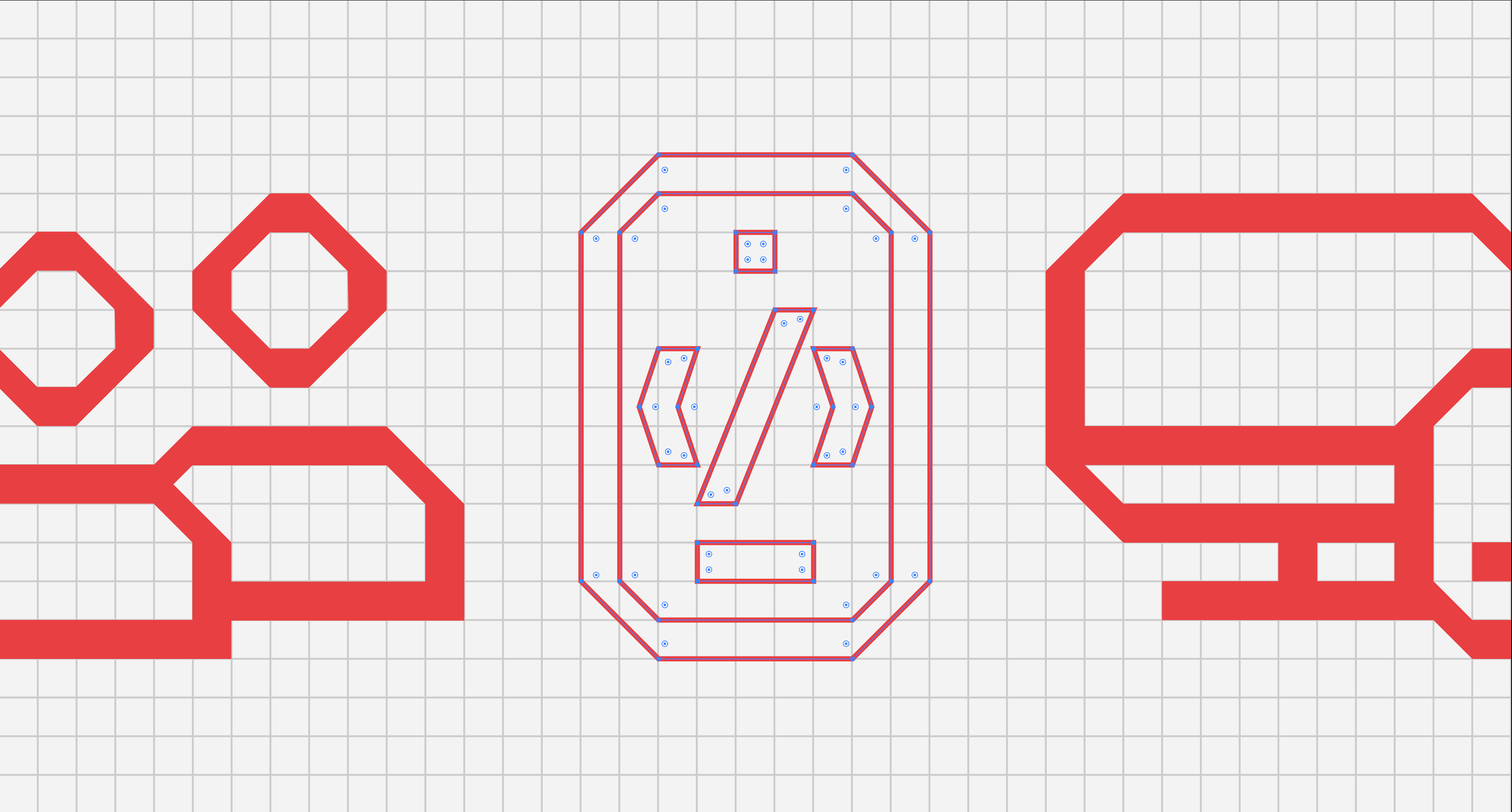
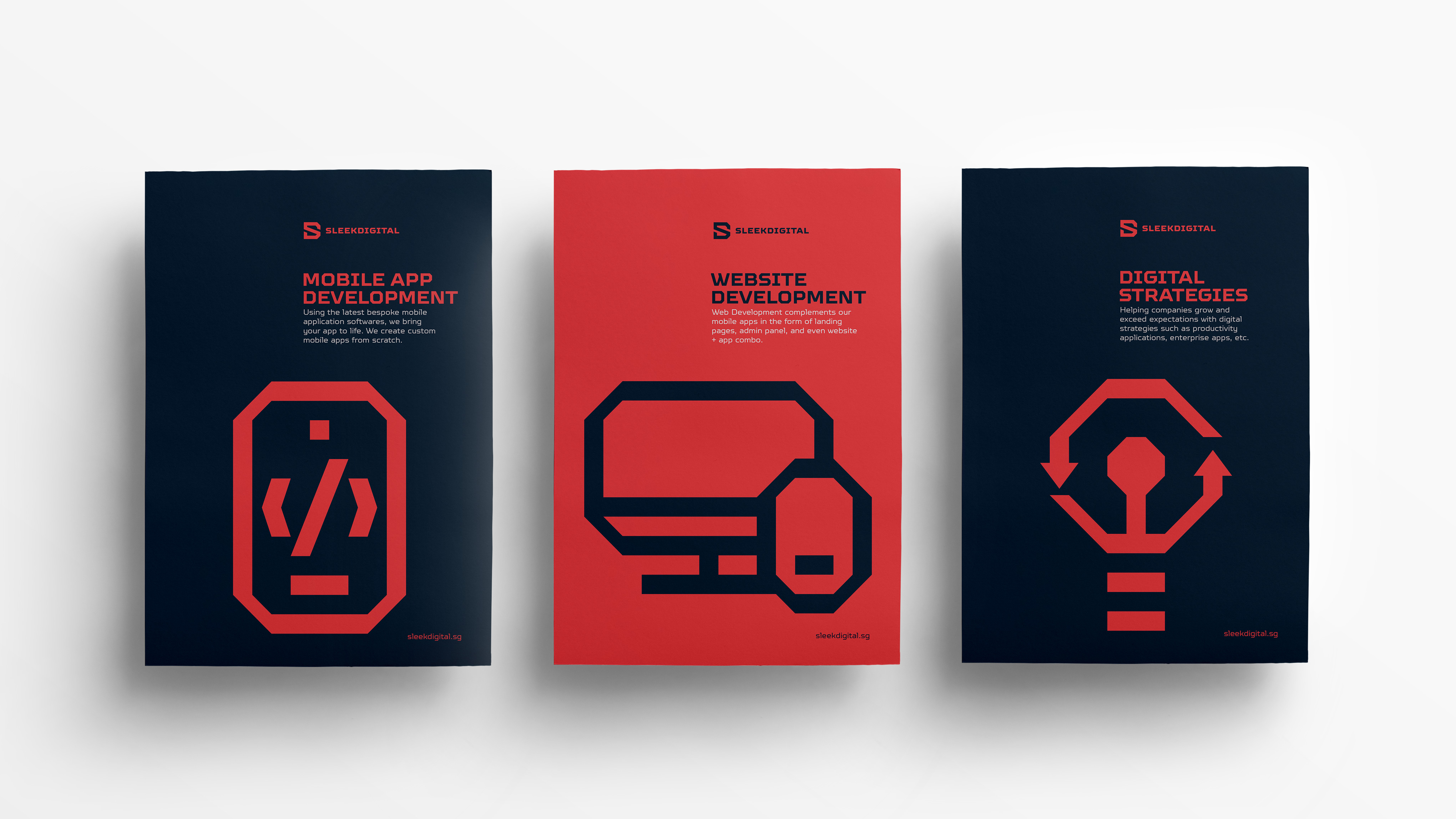
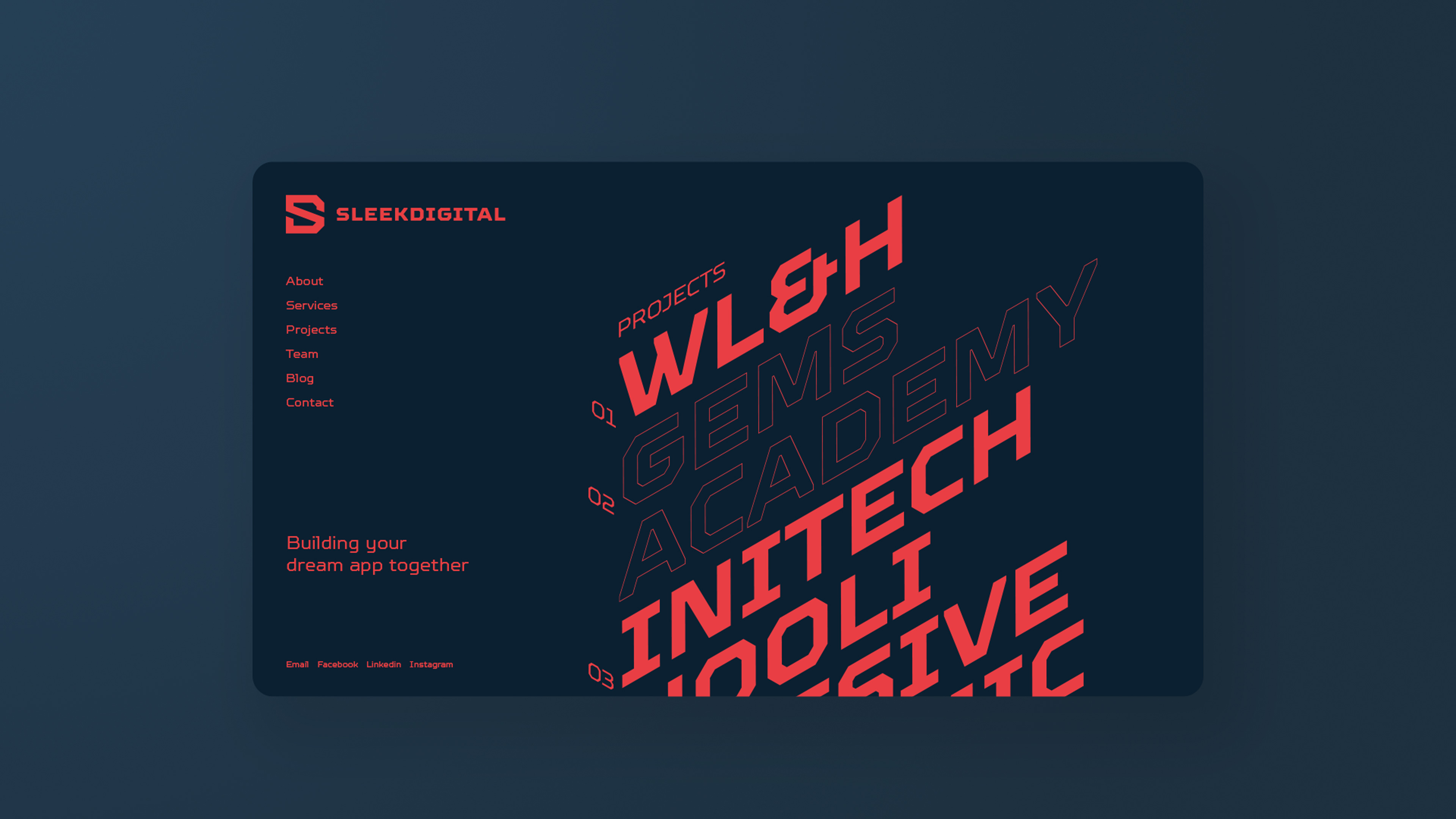
SleekDigital’s key message, “Let’s Build Something Together” inspired a concept of building blocks in a digital space. We visually expressed the concept by using squares as the core design element with extensions of isometric designs. Its primary red colour remained untouched but we enhanced it by contrasting it against a navy colour, giving it a professional look with a bold touch.
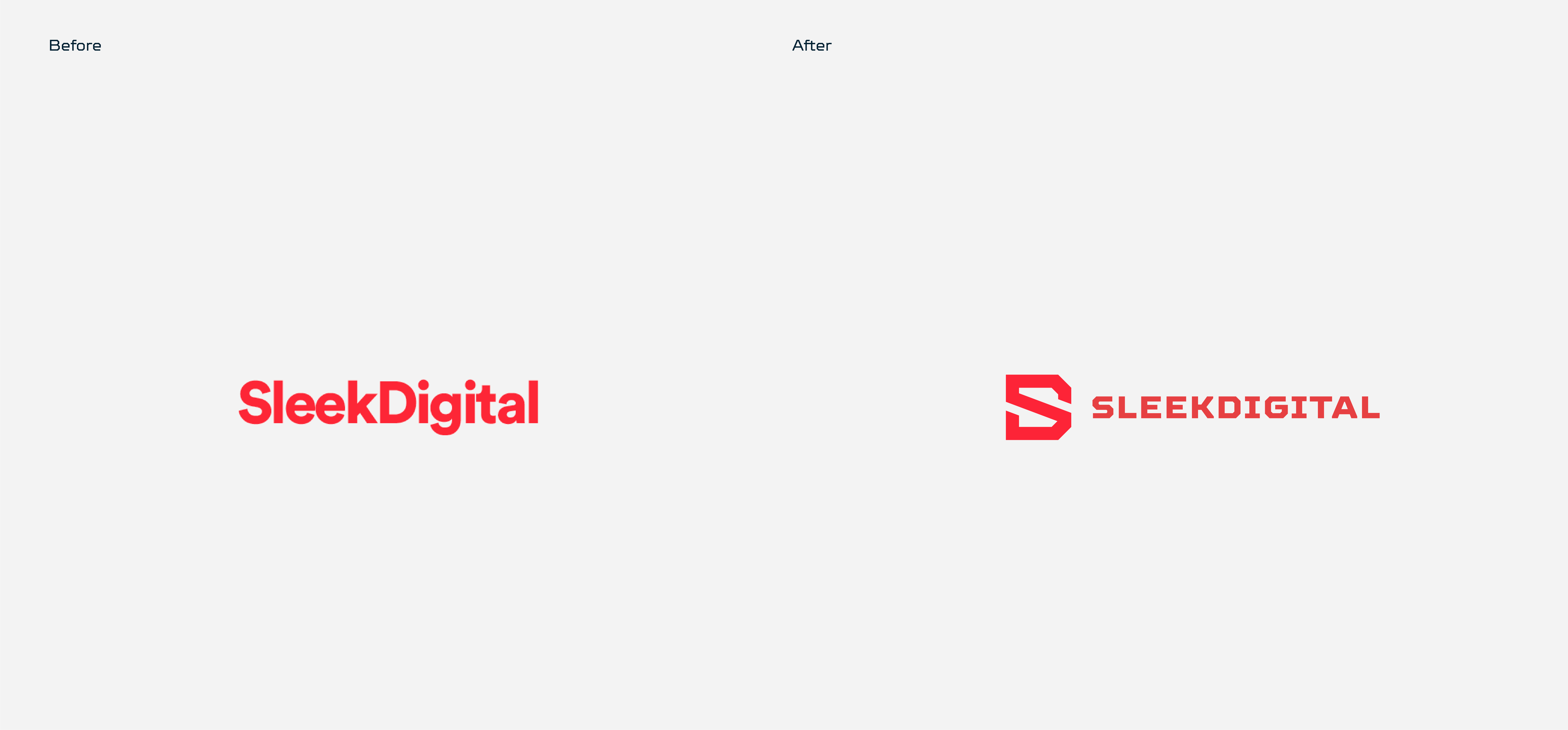
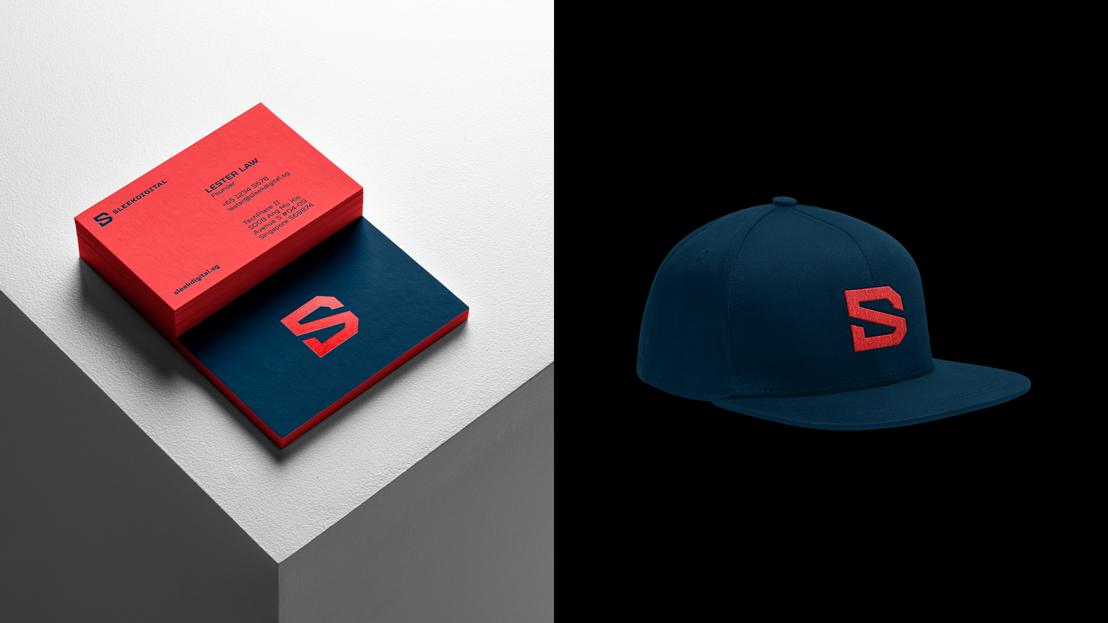
The Logo: The before logo was a logotype and because it has a long name, it was lengthy which makes it difficult for people to remember. In addition, it does not function well as a logo when scaled down. This aspect is especially important in the current digital day and age where logos are required to be seen in small and constraint spaces in our mobile screens.
Thus, we decided to design a monogram consisting of the initials “S” and “D”. Together with the core design element of the square as a building block in a digital space, the outcome is a distinct logomark which is appropriate for an app developer and functions well as a simple visual shorthand, especially in small spaces.
*This is a mock rebrand concept for SleekDigital, a Singapore app developer company.
![]()

CREDIT
- Agency/Creative: Notion Branding
- Article Title: Re-envisioning Brand Identity Design For SleekDigital
- Organisation/Entity: Agency, Published Self Promotional Design
- Project Type: Identity
- Agency/Creative Country: Singapore
- Market Region: Asia
- Project Deliverables: Brand Design, Brand Identity, Brand Redesign, Branding, Graphic Design, Identity System, Rebranding, Research
- Industry: Technology
- Keywords: App Developer, Technology, Rebranding, Branding, Brand Identity, Visual Identity, Logo, Monogram, Business Cards, Name Cards, Letterhead, Envelope, Stationery, Icons, Iconography, Website Design Concept, Landing Page Design Concept


