


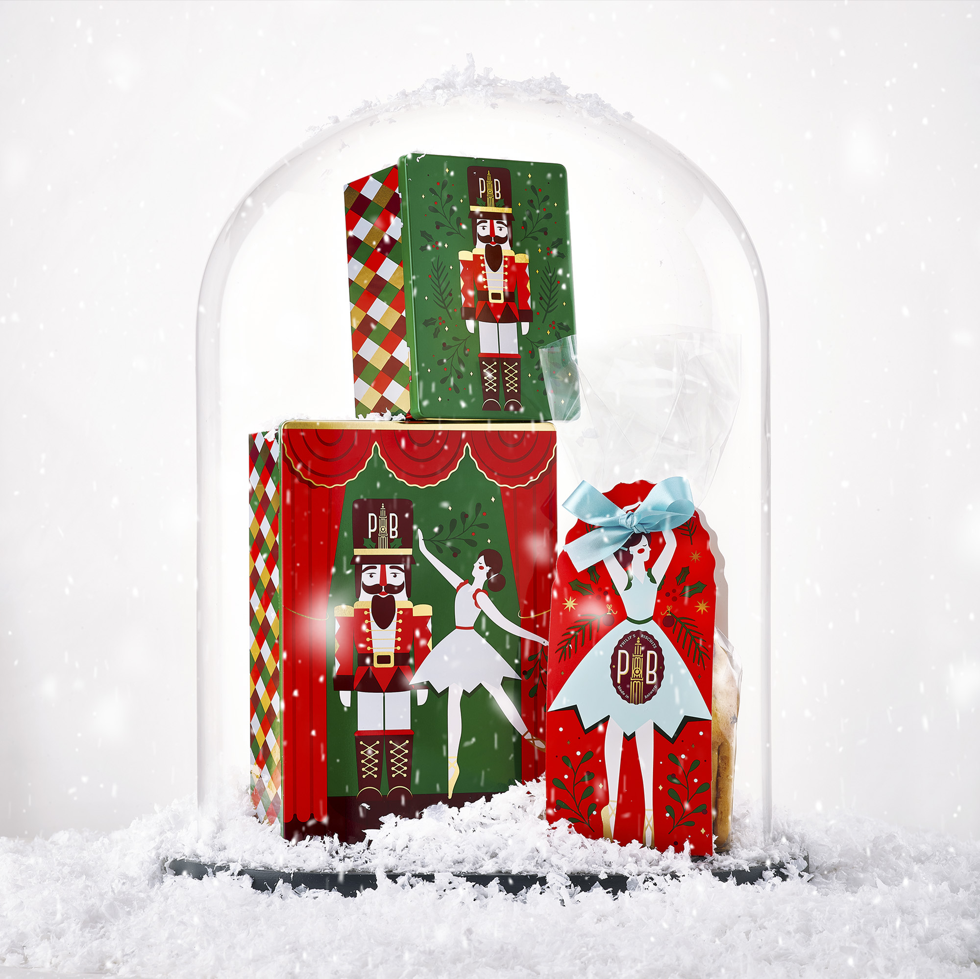
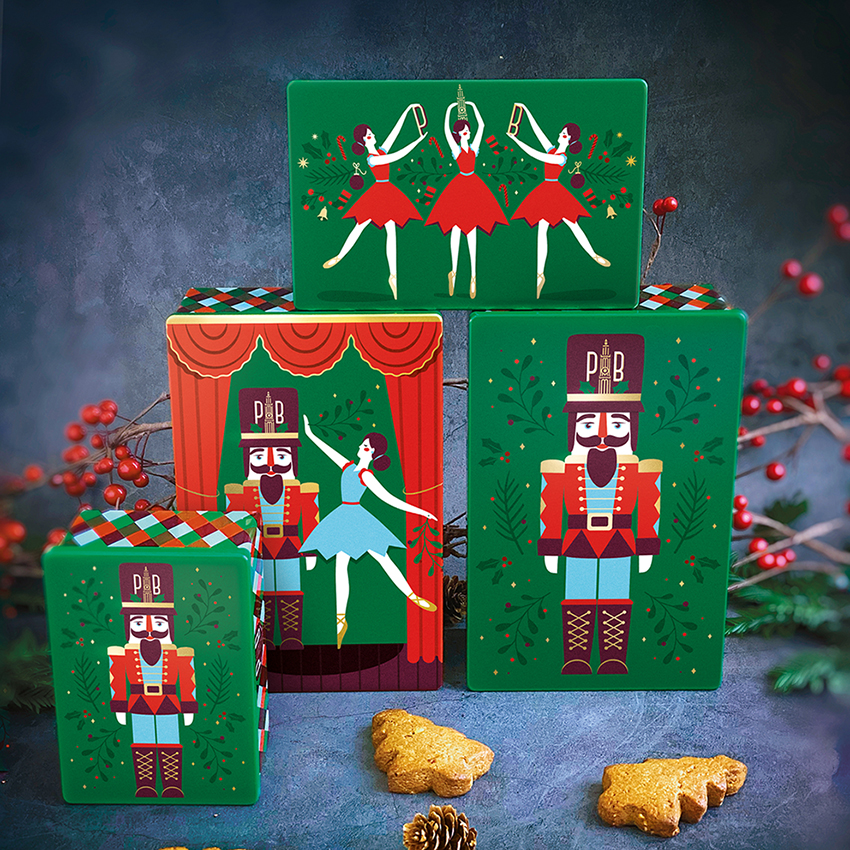
True to tradition, our client Philip’s Biscuits was keen to light up their packaging for the holiday season with a one-off limited edition design identity. True also to Quatre Mains, we dove deep into developing an unexpected theme to help surprise this period of the year with something refreshingly new. Enter the Nutcracker, the delightful Russian ballet that has been wowing audiences for generations and proved to be the perfect creative platform for us to tell a special kind of biscuit story.
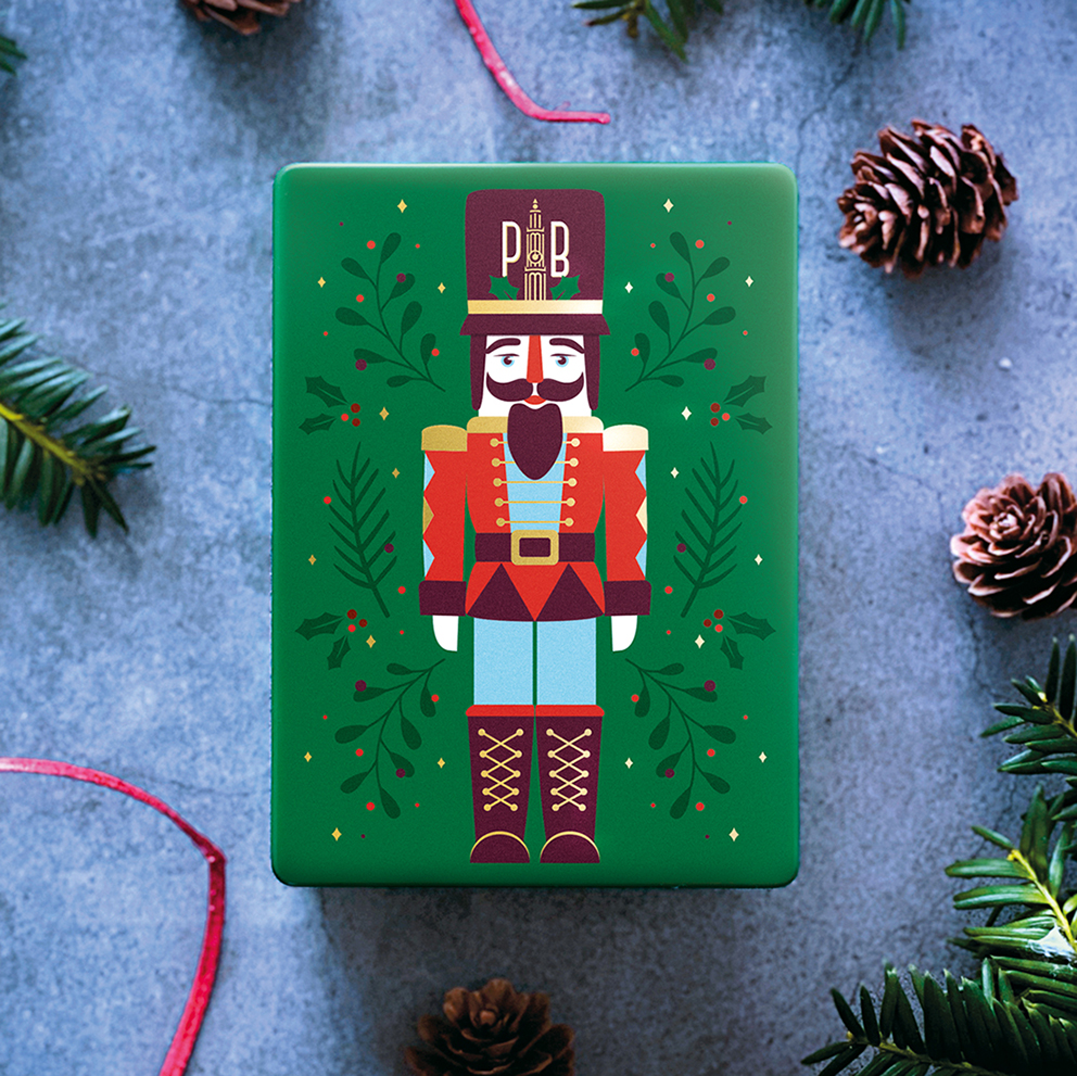
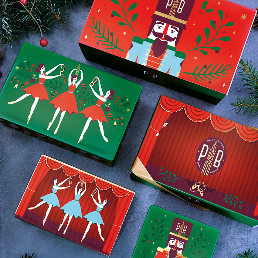
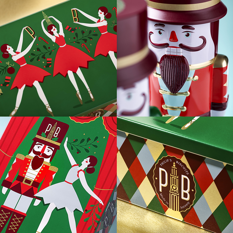
The Nutcracker Prince standing proud with his ballerina sweetheart, forms the charming focus of this illustrative and decorative world. All-important integration of the Philip’s Biscuits branding is seen throughout the dynamic identity that treats each pack in a playfully different fashion.
Arguably stealing the show is our Nutcracker Prince tin, whose loveable figure is simply a must-have gift to treat that special someone. Taking a bow after yet another wonderful performance, we hope this packaging design entertains you as much as we enjoyed its creation?
About Philip’s Biscuits / The Best Biscuits in Town: Philip’s Biscuits is a premium artisan biscuit bakery located in the heart of the Belgian ‘Koekenstad’ of Antwerp. Their dream began many years ago by creating an honest yet inspirational, artisanal biscuit. Their creative spirit displayed how experimenting with all kinds of flavours and traditional methods could give birth to an honestly delicious biscuit – no frills, no fuss, just really, really good. Our client was ready to revamp their out-dated biscuit identity by introducing a modern but timeless branding and packaging design. Important was to create a design that not only put the brand on the map but was translatable from regular daily packaging solutions to seasonally inspired special gifts. With a desire to export their biscuits outside Europe, the importance of their ‘Antwerp’ or ‘Belgium’ heritage, was something to pay attention to.
Made in Antwerp: For the new branding, our source of inspiration was the city of Antwerp, as the original flagship store is located at the foot of Antwerp’s well known cathedral, Onze-Lieve-Vrouwekathedraal. We created a quality seal emblem with strong initials and a contemporary colour combination that glues the identity into a coherent family. The iconic cathedral tower and its linear illustration style provided a unique design language that was extended throughout the entire identity. Adding decorative patterns to this clean design added both modernity and a true classical elegance. As our client is looking to open additional stores across the country, we hope to spot those classy Philip’s Biscuits shopping bags in the streets of Belgium.
CREDIT
- Agency/Creative: Quatre Mains
- Article Title: Quatre Mains Creates Brand Identity and Packaging Design for Philips Biscuits Nutcracker Suite
- Organisation/Entity: Agency, Published Commercial Design
- Project Type: Packaging
- Agency/Creative Country: Belgium
- Market Region: Multiple Regions
- Project Deliverables: Brand Creation, Brand Identity, Brand Strategy, Brand World, Branding, Packaging Design, Tone of Voice
- Format: Tin
- Substrate: Metal


