


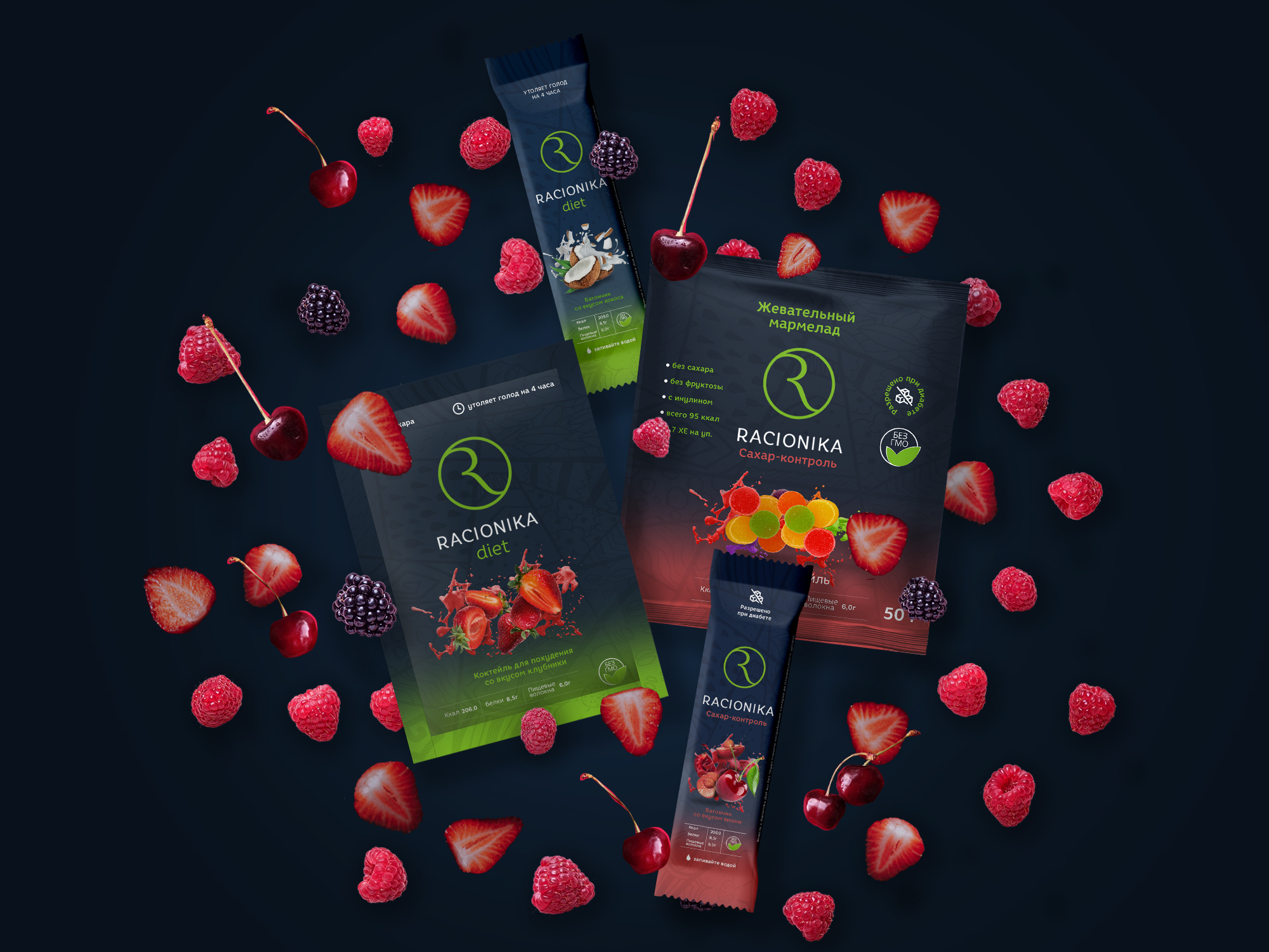
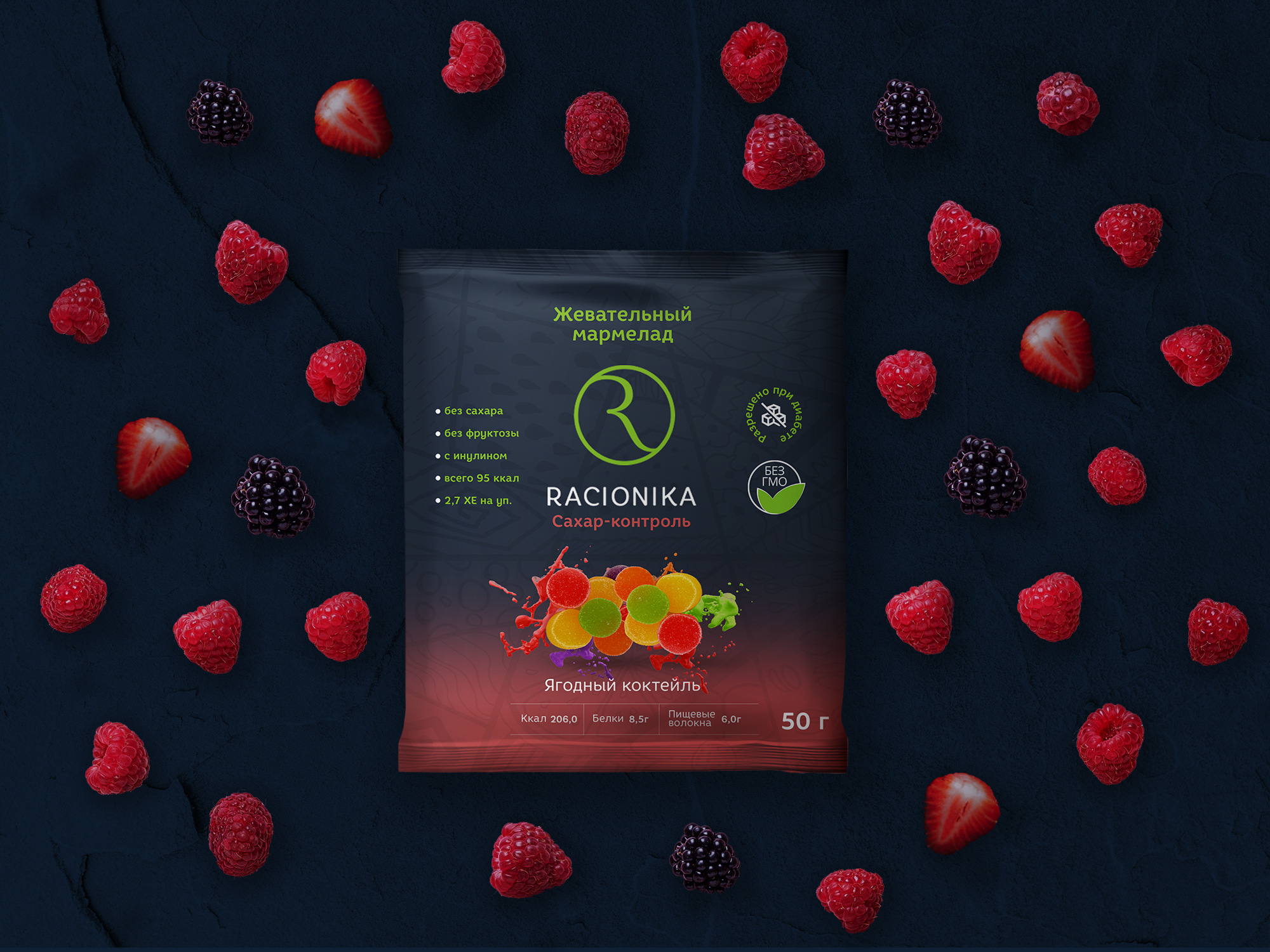
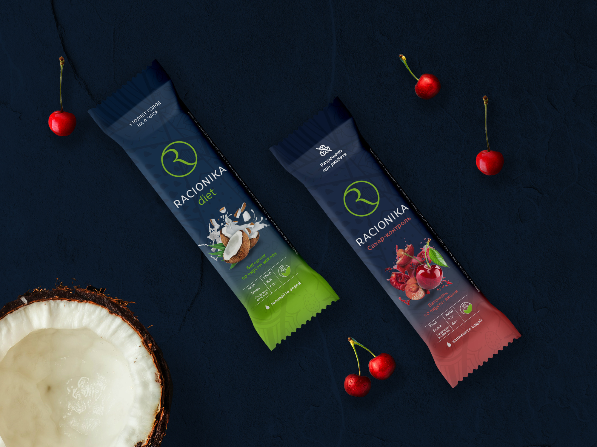
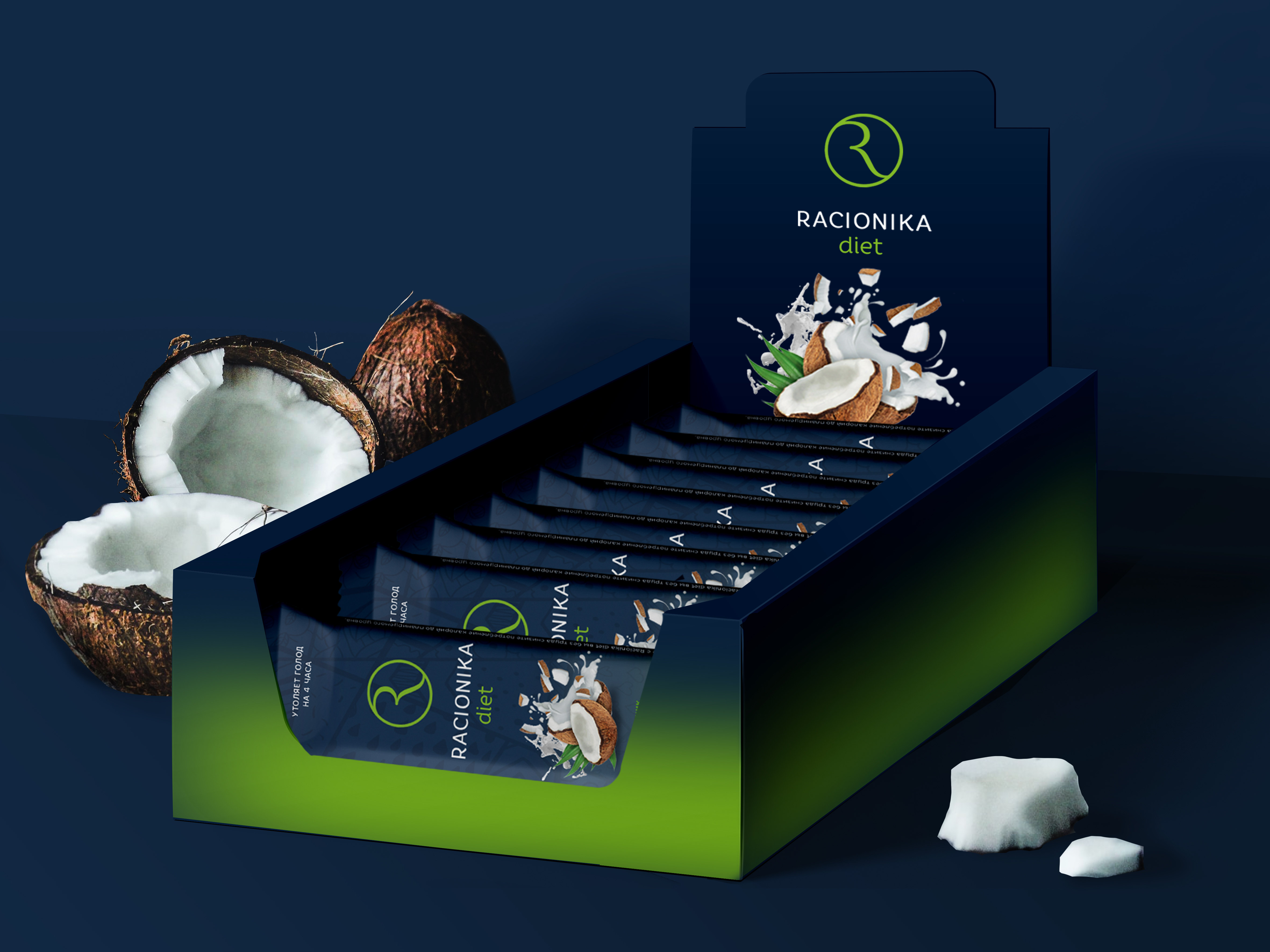
Racionika is a brand of dietary products for proper nutrition and weight loss. In Russia, the products of the healthy food segment are often associated with medicinal products, pharmaceuticals and dietary supplements of questionable composition. The agency needed to steer the brand away from this claim by reaffirming the brand’s positioning as a quality premium product for a health-conscious audience. In order to confirm their products to a high price segment, to attract a new target audience of “advanced” consumers, to increase brand awareness, as well as to visually distance themselves from competitors, the packaging of Racionika products was restyled. The agency’s team conducted an express audit of the competitive field and developed a creative packaging concept, adapting it to media. The core of the target audience (women from 28 to 40 years old) is characterized by two main drivers of purchasing health bars. The first motive is the need for freedom – “I consume Racionika in order to feel light, full of energy, capable of taking up a challenge, in order to eventually become the best version of myself”. The second is status – “I consume Racionika because it is correct and looks like a status, everyone understands that I am the chosen one”. At the same time, a visual analysis of the competitive field showed that the brand environment differs in different sales channels, moving from bright attractive graphics in the premium retail segment to an emphasized strict functional design of “pharmacy” products. The existing design of Racionika was relevant only for the “pharmacy” format, which was at odds with the characteristics of the product and its positioning. The study of market trends and the competitive field showed that the consumer perceives the value of niche products more highly, paying special attention to their benefits. Based on this statement, the “green premium” strategy was chosen for implementation. Caring for your health is not necessarily boredom and self-limitation. The modern lifestyle allows you to combine excellent taste, aesthetic appearance and healthy content. Style, brightness and elegance are your new energy. Choosing healthy foods is a manifestation of love and care for your body, which will give strength for new achievements. The visual style combines maximum contrast, an easy-to-read trademark, sophistication and personality. Functional directions – diet, “immuno”, “sugar control” – are differentiated by color.
CREDIT
- Agency/Creative: Brandson Branding Agency
- Article Title: Protein Bar Packaging Design by Brandson Branding Agency
- Organisation/Entity: Agency, Published Commercial Design
- Project Type: Packaging
- Agency/Creative Country: Russia
- Market Region: Europe
- Project Deliverables: Brand Architecture, Brand Identity, Brand Strategy, Packaging Design, Research, Retail Brand Design, Tone of Voice
- Format: Flow-Pack
- Substrate: Plastic


