


M&A Creative Agency – Curvos
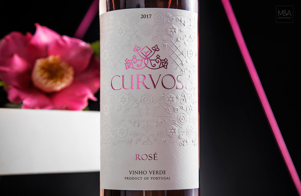
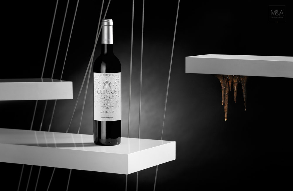
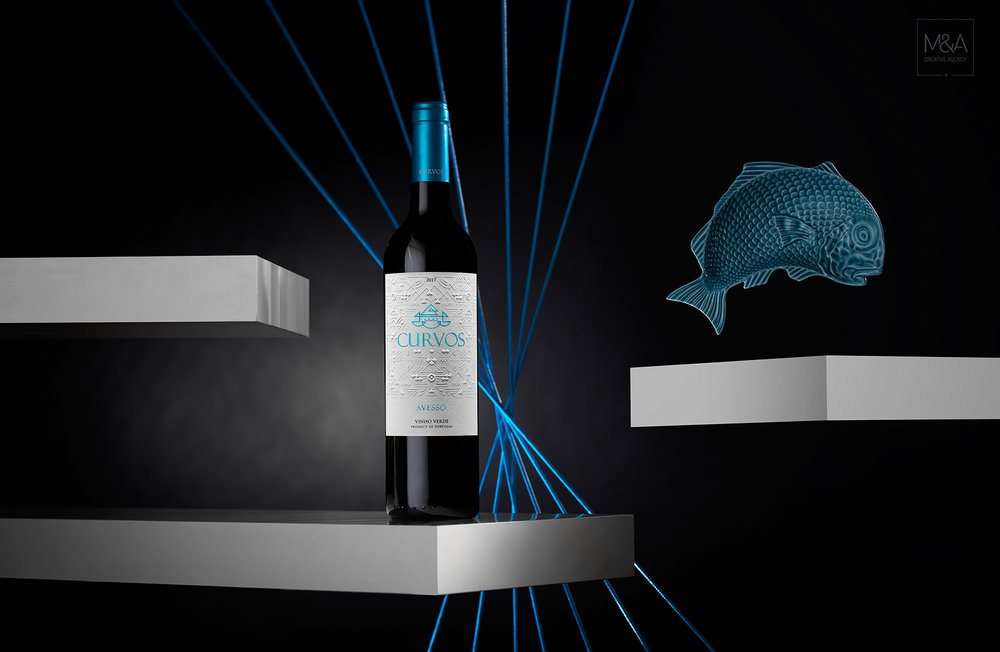
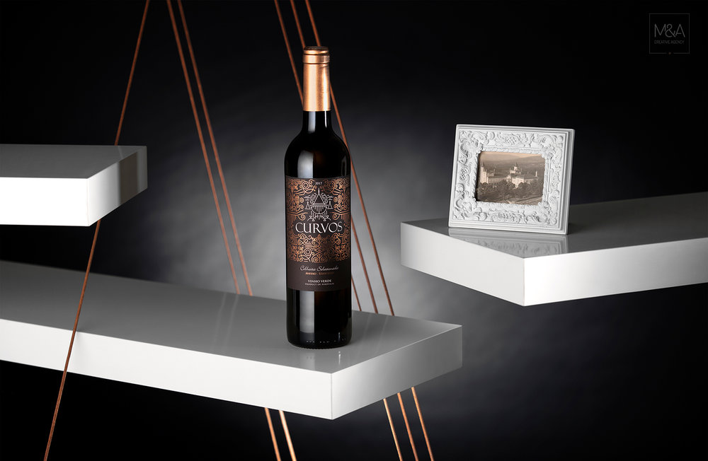
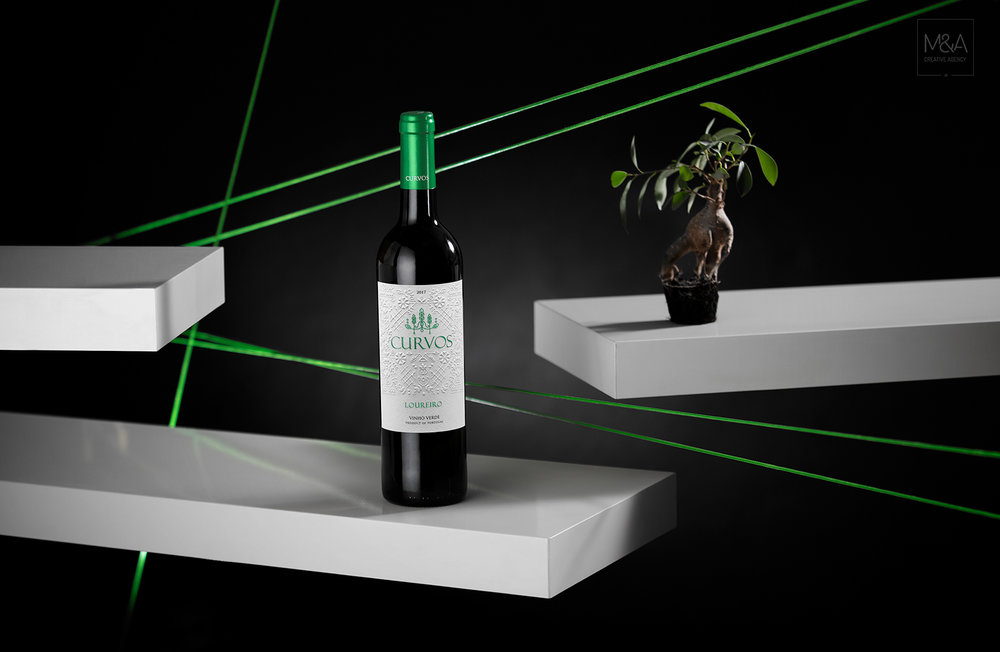
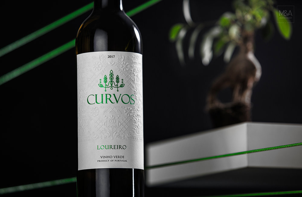
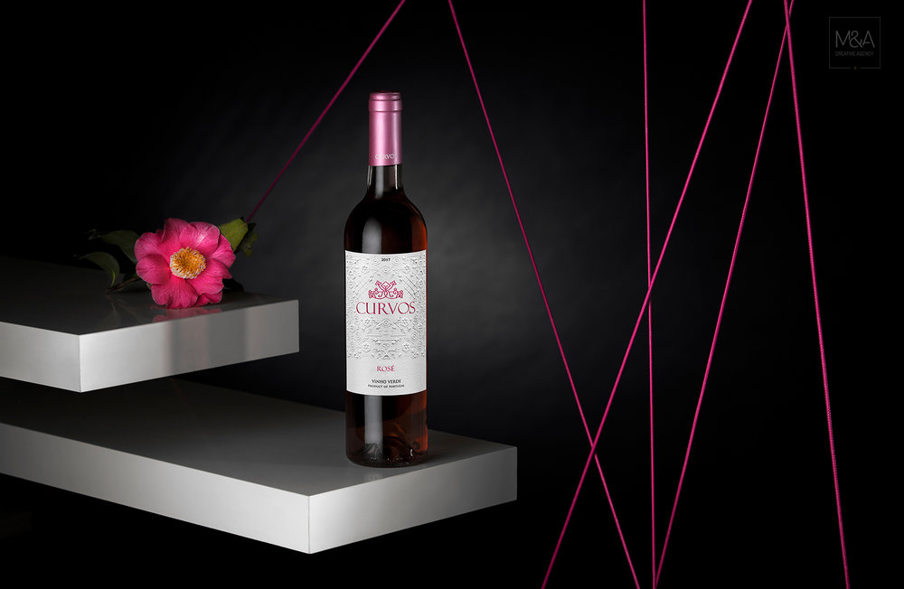
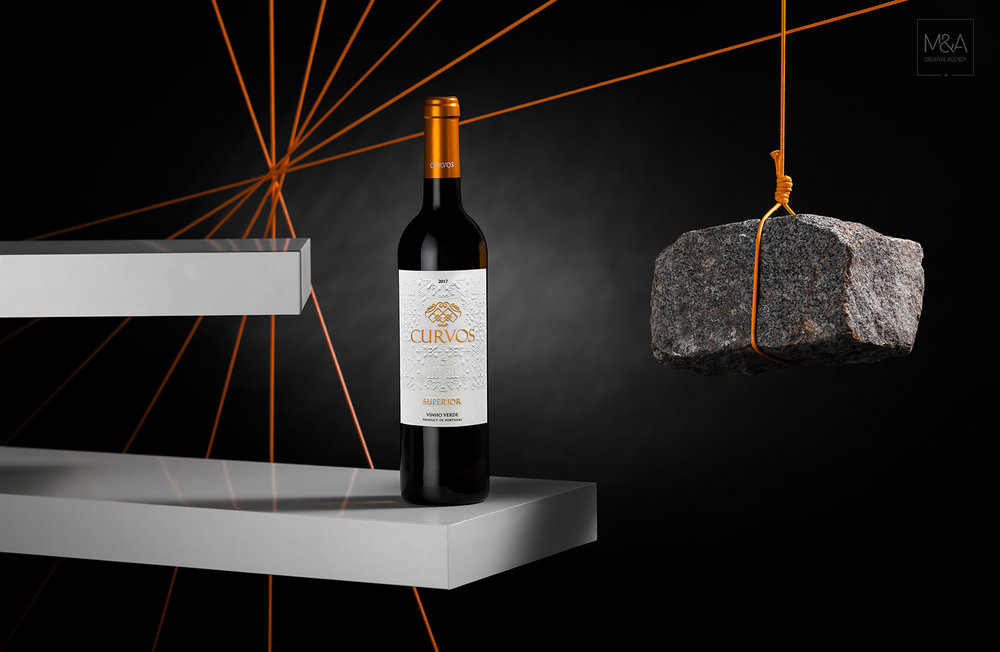
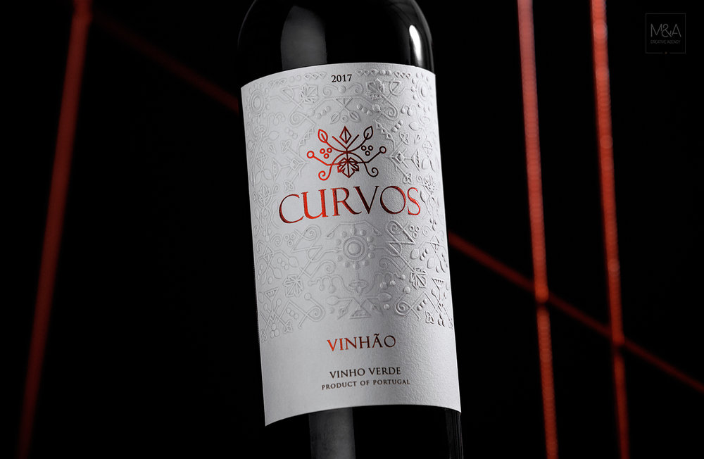
“We chose different elements from Quinta de Curvos to be represented on each label created for Curvos wines to tell the story of this enchanted estate. By joining this concept, is the portuguese traditional embroidery representation, through unique patterns with finishes that enhance them. Quinta de Curvos is surrounded by unique garden with several species of camellias and has more than four centuries with legends and “estórias” (stories), allowing us to get involve on this mystic place to tell the story!Loureiro, because of its characteristics represents the gardens and Rosé wine the flowers presented. Avesso donors the lake which exits in property and Alvarinho the cave that makes seem to belong to fairy tale. Vinhão is the grape variety that symbolizes the vineyards. The old manor house is represented on Colheita Selecionada which still remains alive in the history of Quinta de Curvos. Finally representing the current building which was born from the ruins of the old one is Curvos Superior wine.”
CREDIT
- Agency/Creative: M&A Creative Agency
- Article Title: Portuguese Traditional Embroidery Represented on Packaging Design Rosé Wine Label
- Organisation/Entity: Agency Commercial / Published
- Project Type: Packaging
- Agency/Creative Country: Portugal
- Market Region: Multiple Regions
- Format: Bottle
- Substrate: Pulp Paper


