


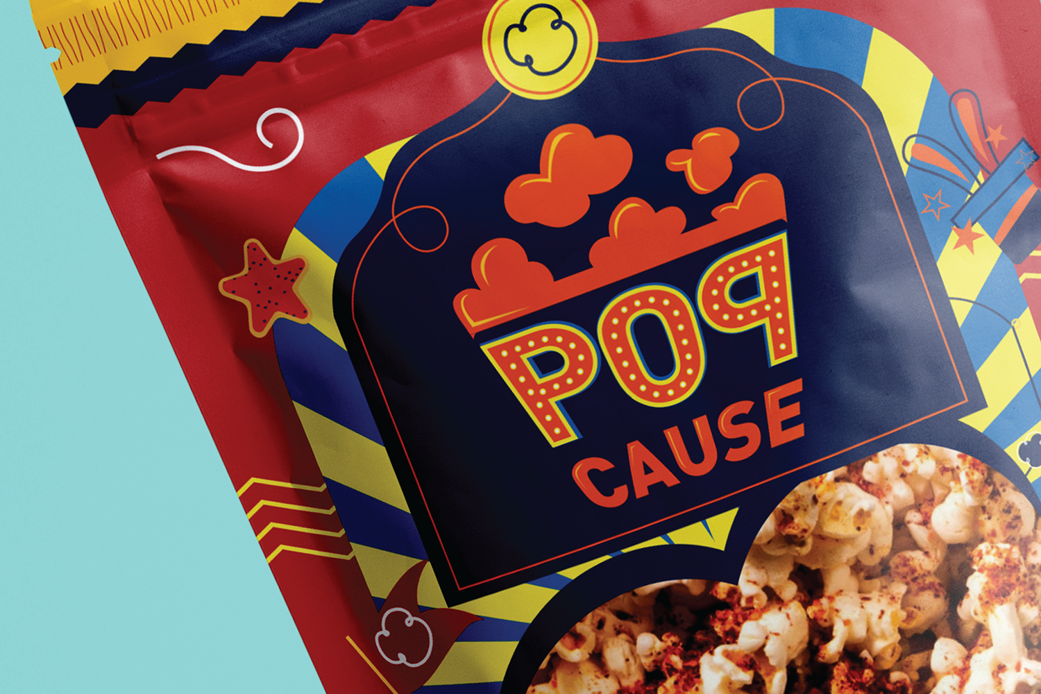
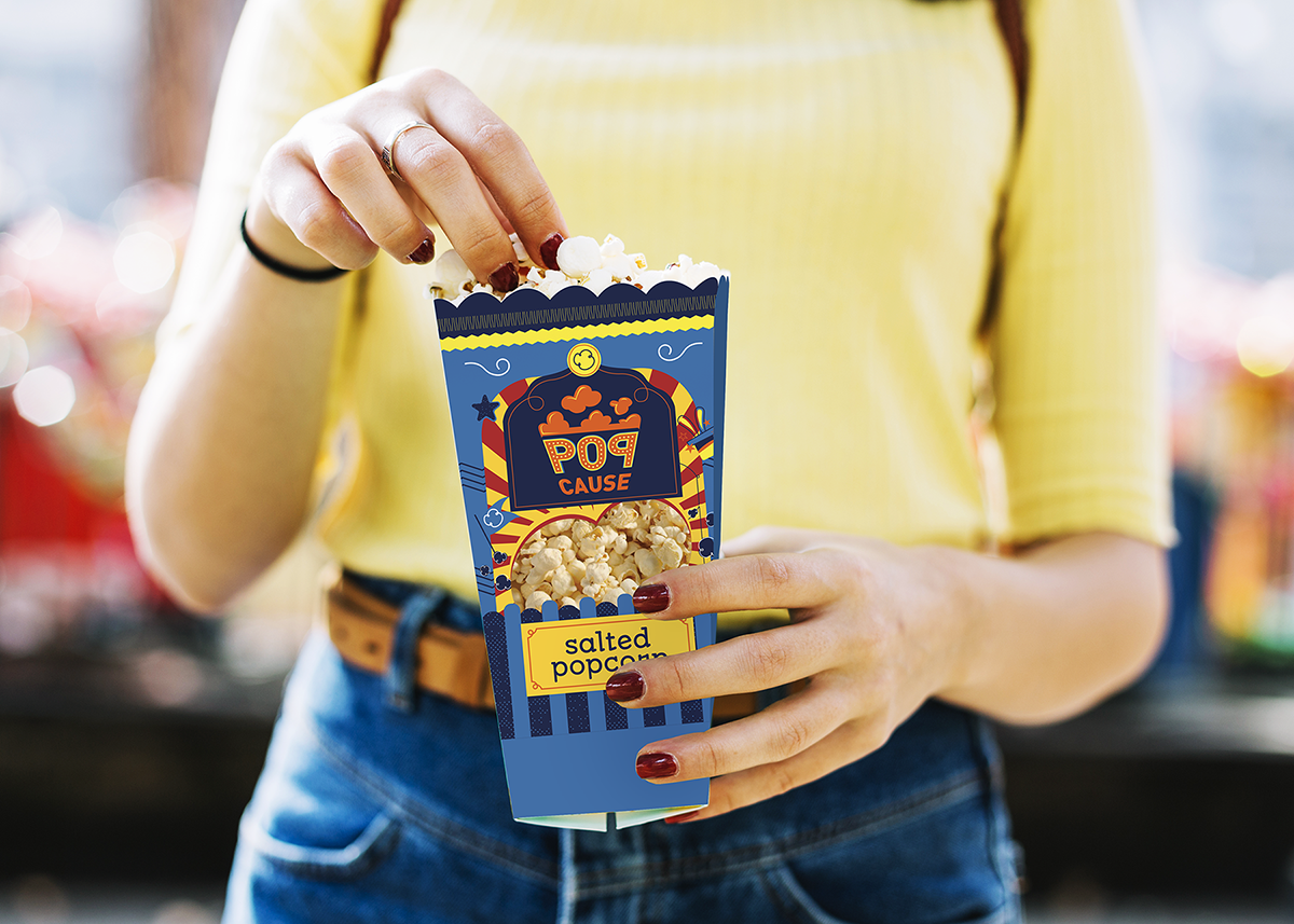
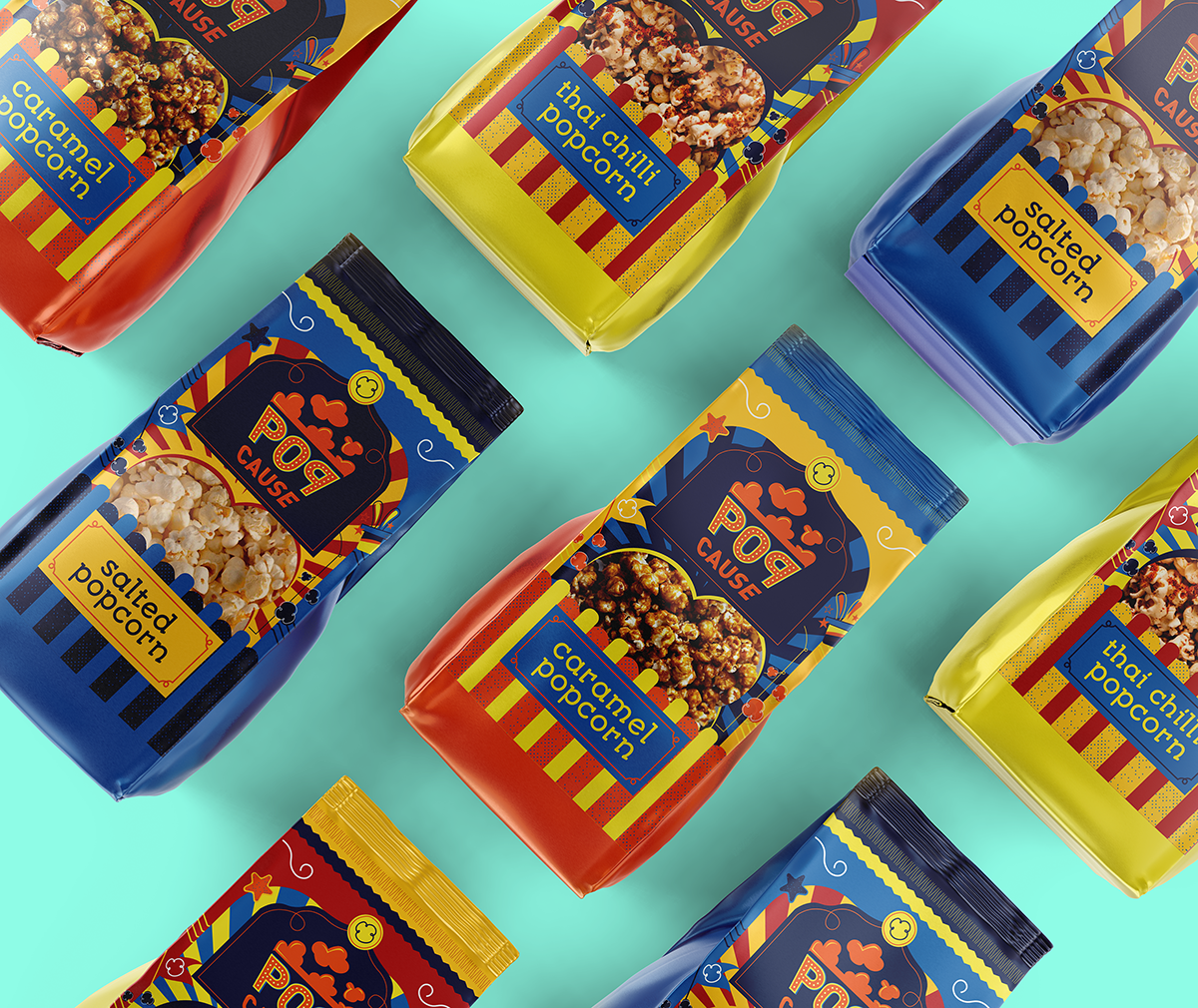
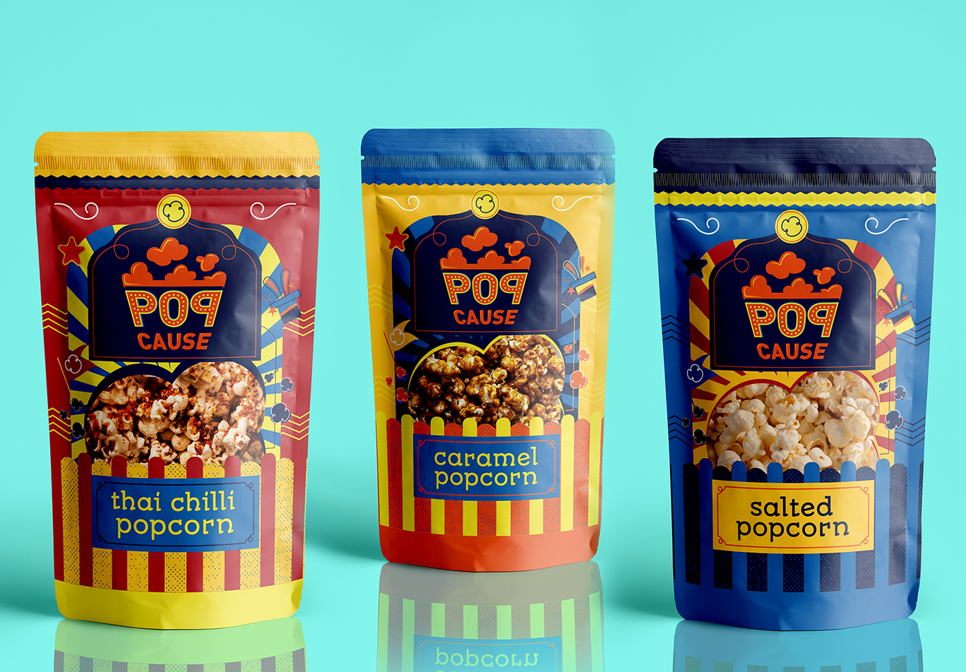
The objective of this project was to create a brand identity for a caramel popcorn brand. The product is made by differently abled children and the proceeds from the sales of the product go to charity. The story of this brand had to be brought out through the brand identity.
Through our storyboard sessions, we concluded that the product needed to tell a story of how each child is special and how their personalities are fun, bouyant and jouyful. Being around children is like being in a garden, surrounded by a wealth of happiness. When some children have different needs, their personalities multifold the joy that we feel by their presence. It is like being in a carnival, surrounded by nothing but exuberance. The brand identity of PopCause was designed to replicate a carnival. Fun, joyful colours, lightbulbs, and popcorn – all of it that makes you happy.
CREDIT
- Agency/Creative: 78 Design
- Article Title: PopCause Brand Packaging Design
- Organisation/Entity: Agency, Published Commercial Design
- Project Type: Identity
- Agency/Creative Country: India
- Market Region: Asia
- Project Deliverables: Brand Naming, Branding, Packaging Design, Product Architecture, Research
- Industry: Food/Beverage
- Keywords: Popcorn, For a cause


