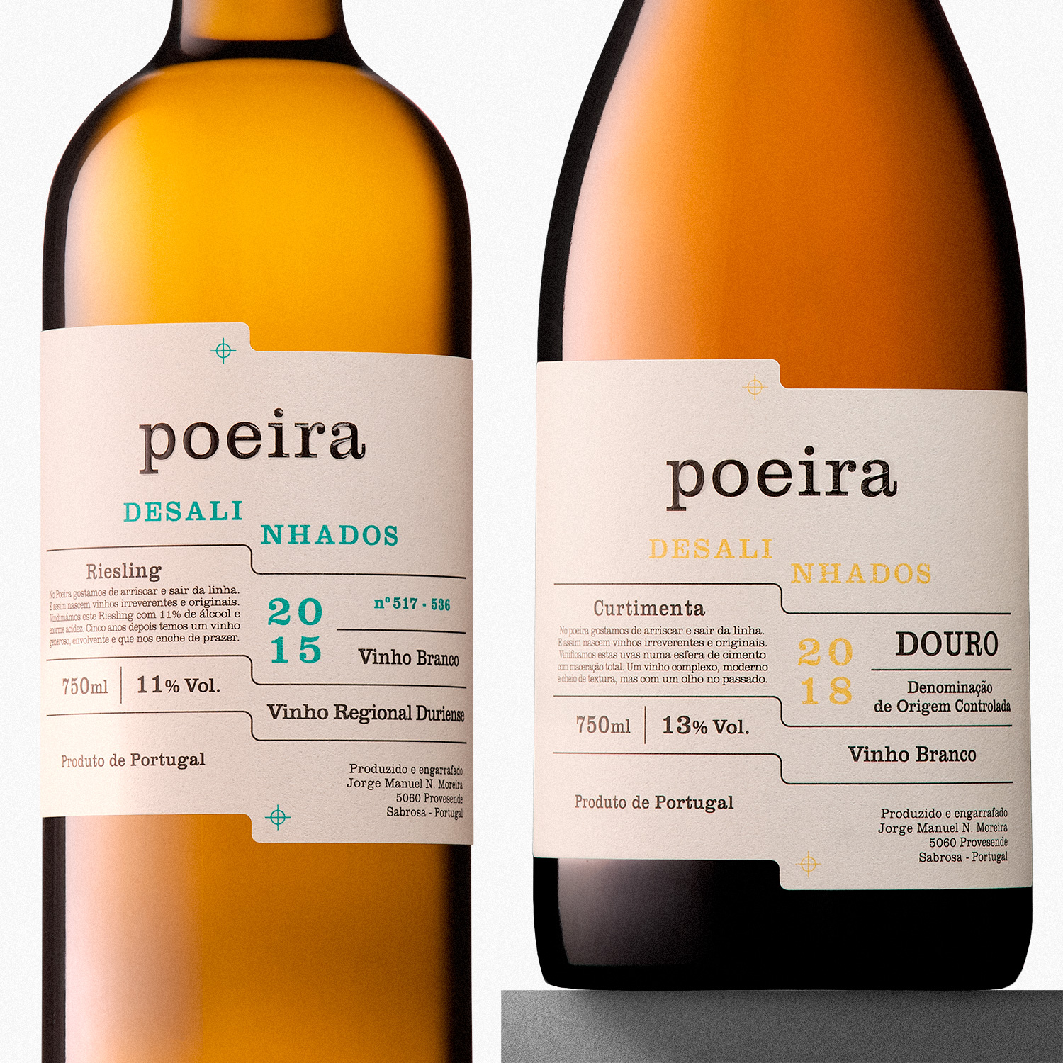
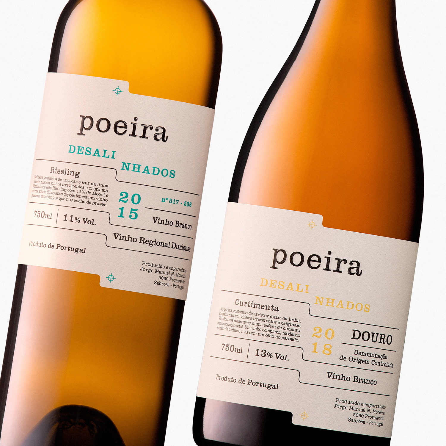
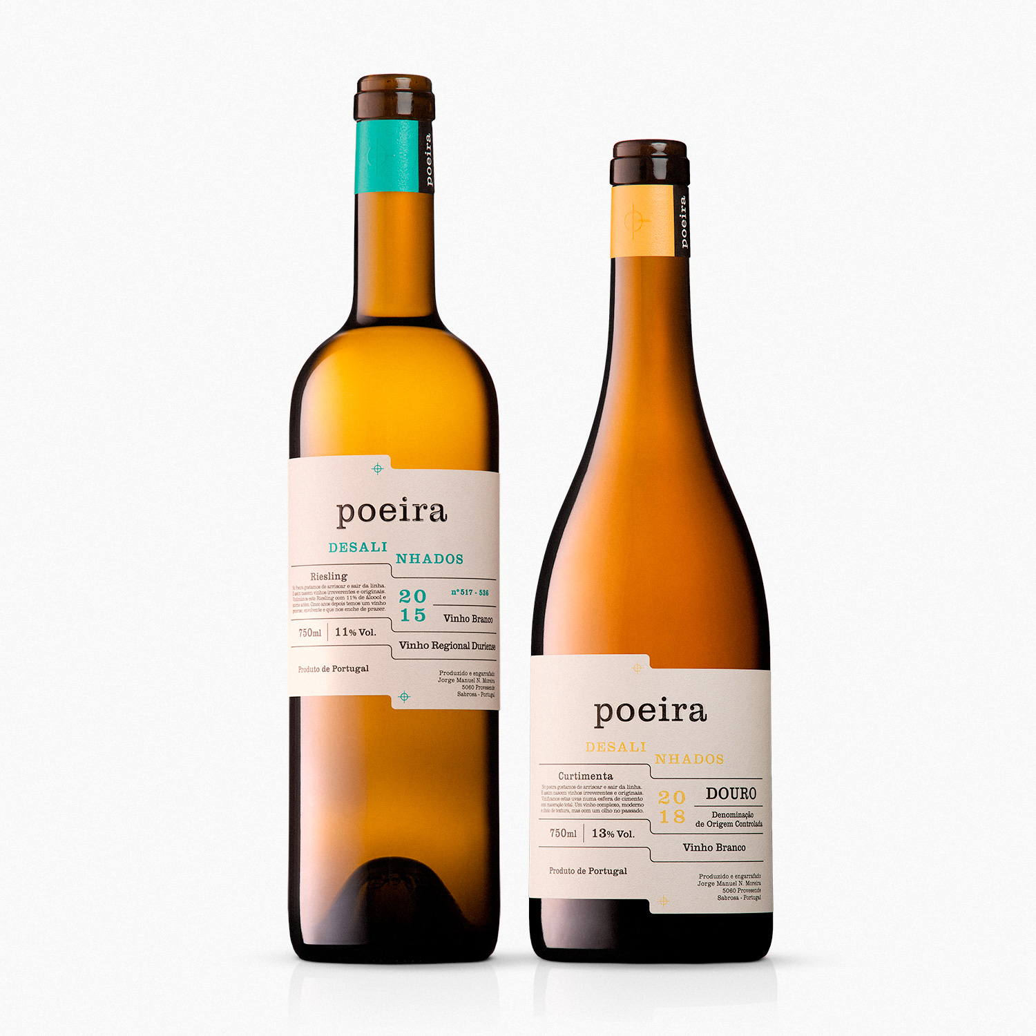
Poeira Desalinhados (Poeira Misaligned) is an irreverent wine that wants to break the line of tradition in the Douro region. It experiments with new balances and new ways of doing, and from those differences — *one says something, another says something else* — a generous and different wine is born.
Quinta do Poeira, founded in 2001, is located in Provesende, Sabrosa, in the Douro region, and has been presenting great quality wines, repeatedly high-scored and prize winners. That made Poeira a recognizable brand and synonym of excellent wines — not only in the Douro region and in Portugal but internationally as well. These Riesling and Curtimenta are wines that differ from what Quinta do Poeira has been producing in Douro and are a branch of the brand that induces experimentation and innovation.
The labels suggest exactly that — the break with tradition and convention, by keeping all the important characteristics. For these labels we chose a classic language that recollects old cataloguing sheets and tables, and followed the typographic choices already established by the brand Poeira, highly recognized among producers and consumers.
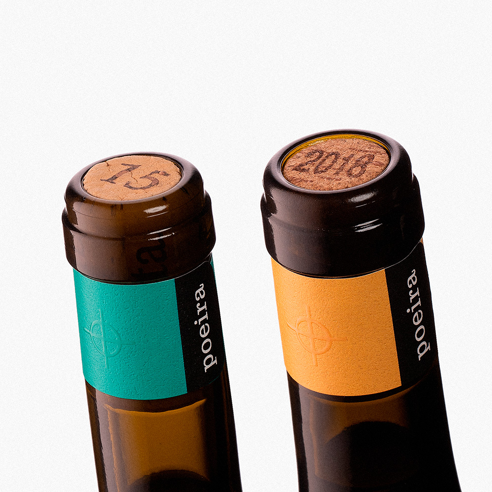
To disrupt those traditional choices, we misaligned the shape and added bright colors — yellow for the Curtimenta and green for the Riesling. These small deviations from the conventional perfectly represent the caracter of the wine they cover, and that apparent “mistake” in the label production catches the consumer’s eye, because it looks odd but not eccentric or strange: “Something is off with that label!”, he thinks, but when he approaches the wine he quickly understands, after reading its name, that the misalignment is on purpose and this is not a Poeira wine like the others. Something different is coming.
This label summons that: a familiar language with something out of place. More that mixing tradition and modernity, it is the simplicity of creating a surprise with a slight shape change. As we know more about this wine, it makes even more sense that this is its label.


CREDIT
- Agency/Creative: Bisarro Studio
- Article Title: Poeira Desalinhados Label Design by Bisarro Studio
- Organisation/Entity: Agency, Published Commercial Design
- Project Type: Packaging
- Agency/Creative Country: Portugal
- Market Region: Europe
- Project Deliverables: Brand Identity, Brand Naming, Brand Strategy, Brand World, Graphic Design, Packaging Design
- Format: Bottle
- Substrate: Glass Bottle


