


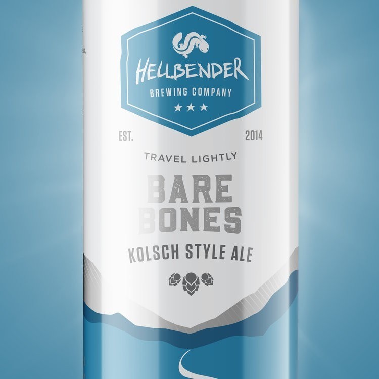

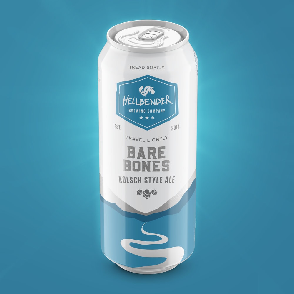
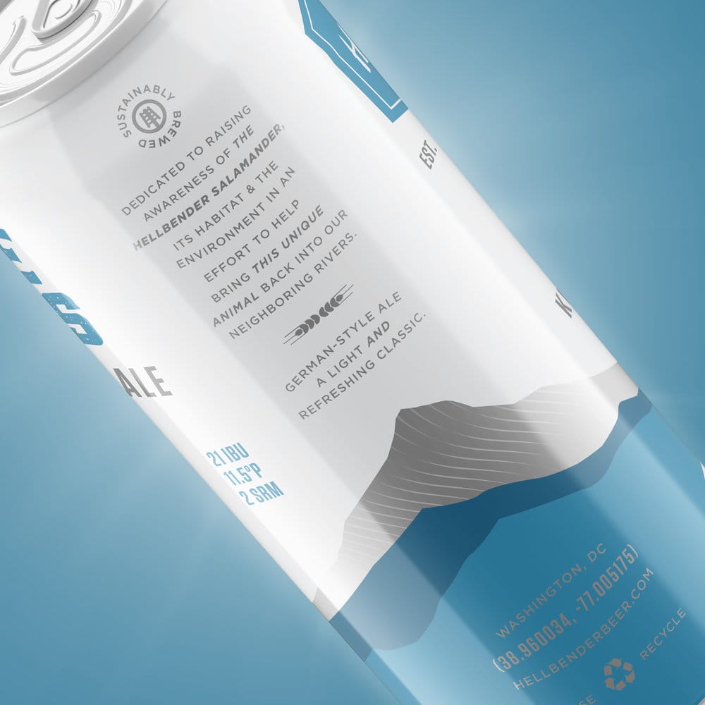
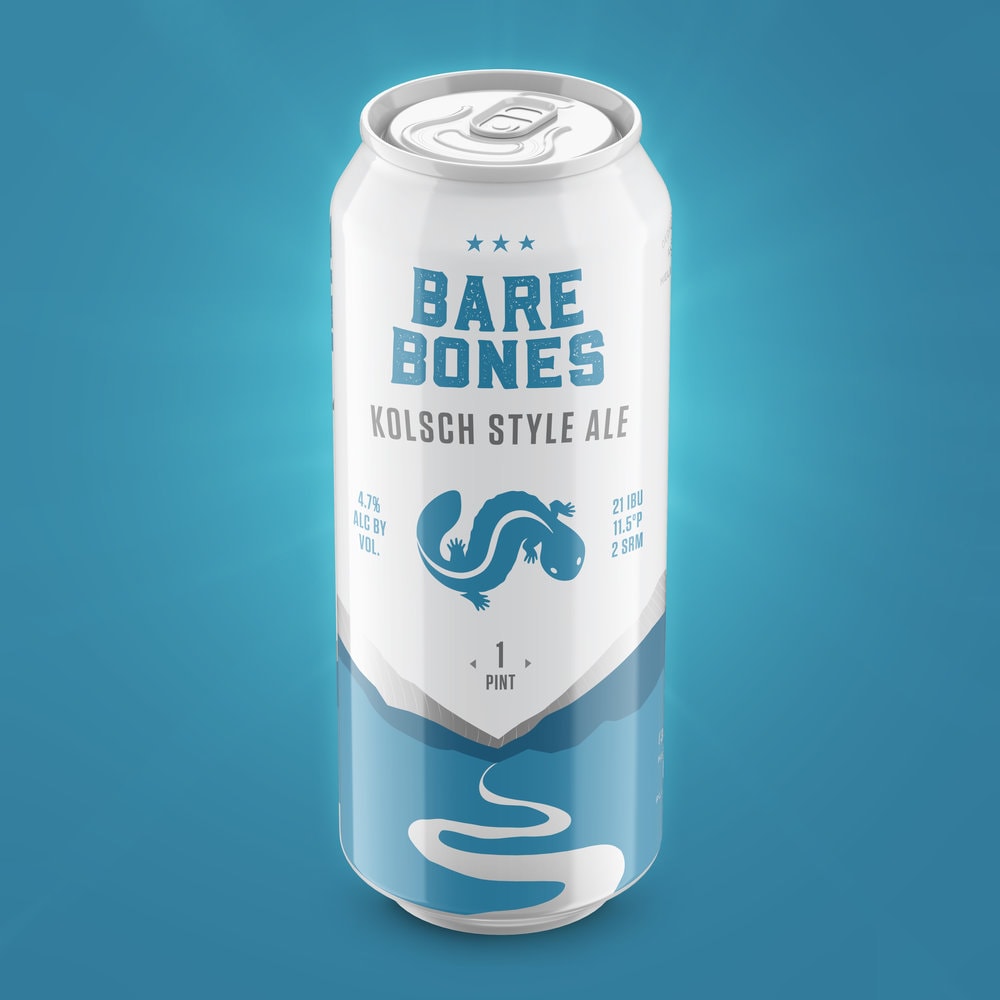
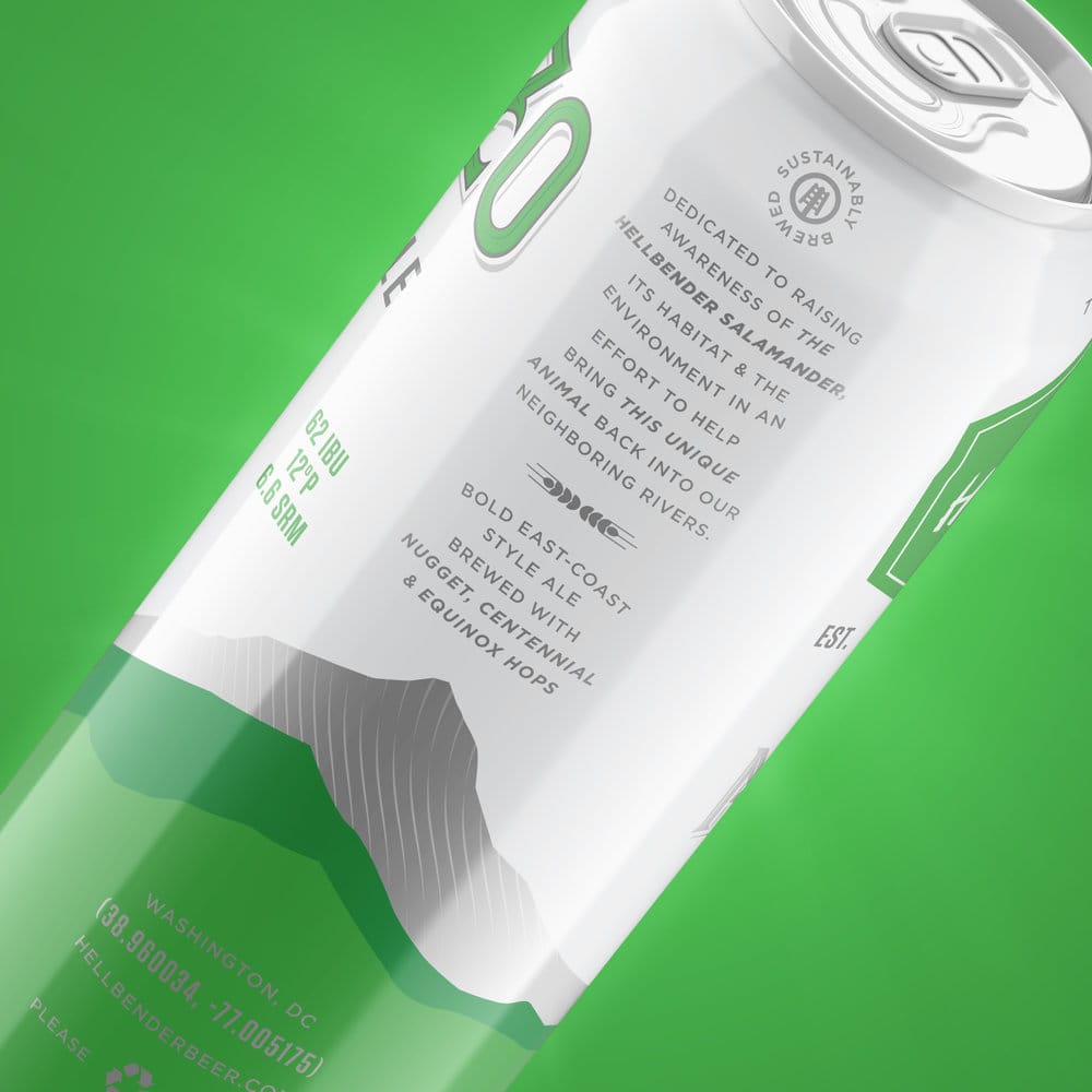
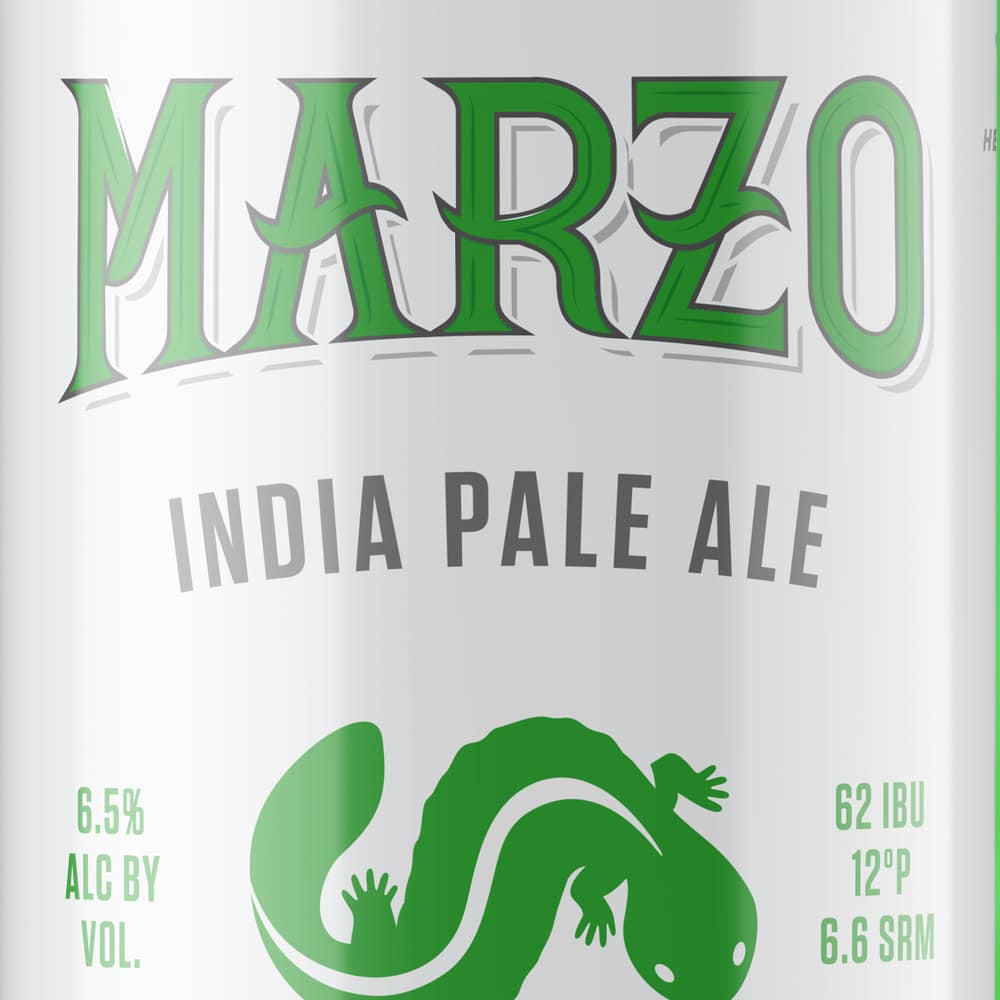
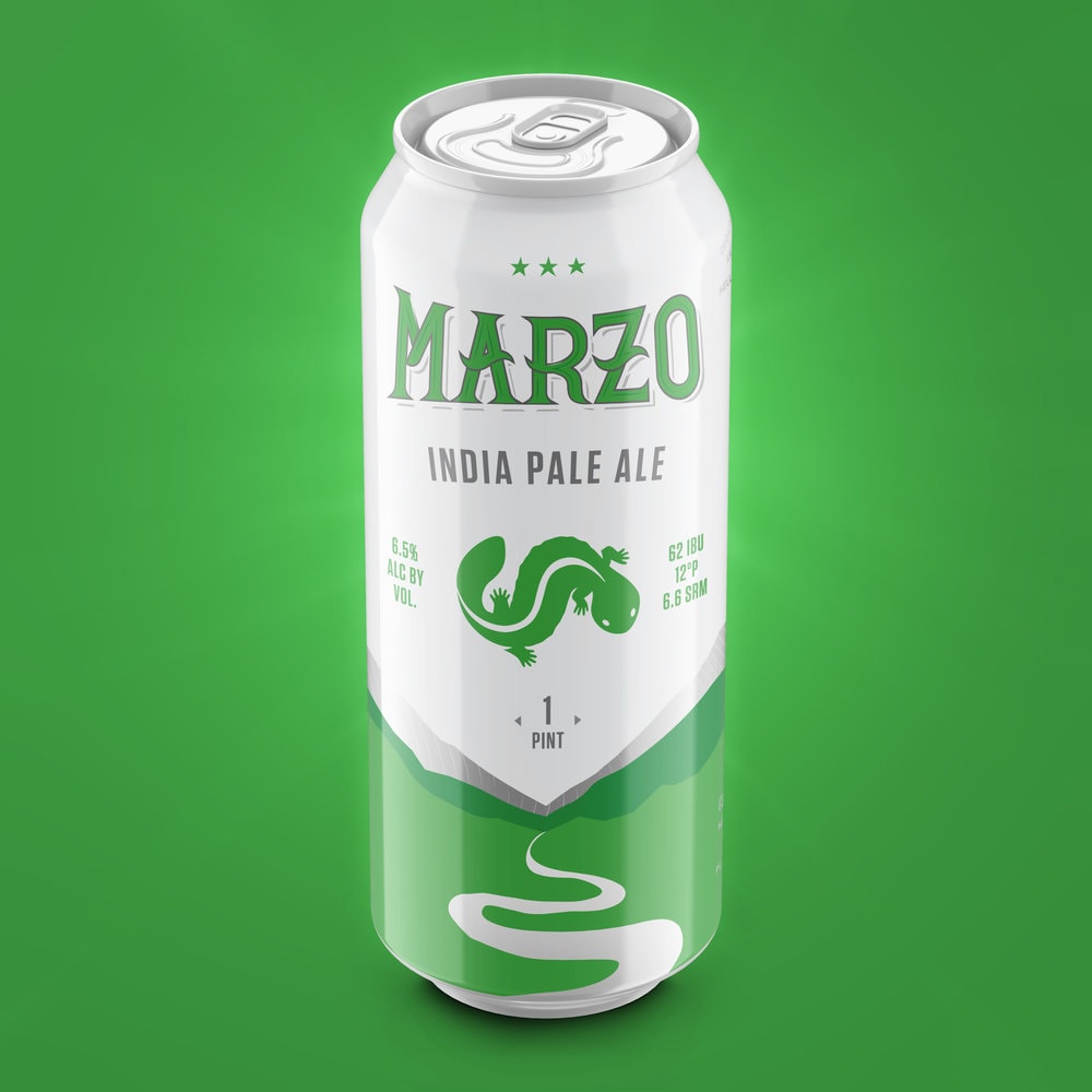
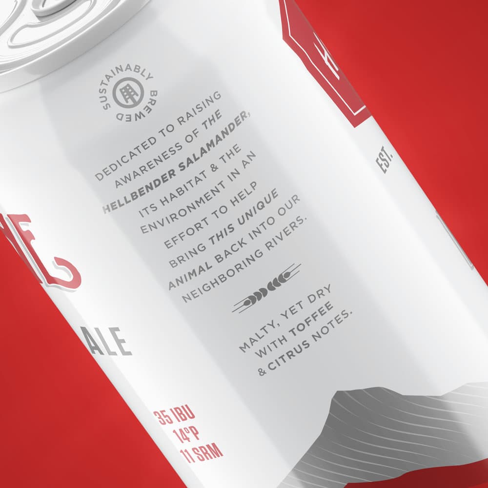
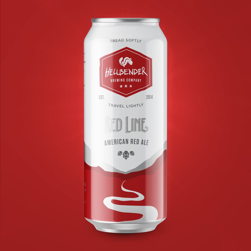
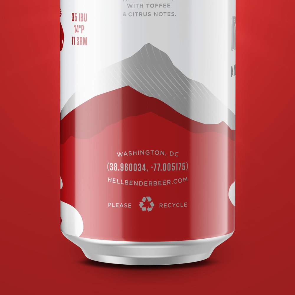
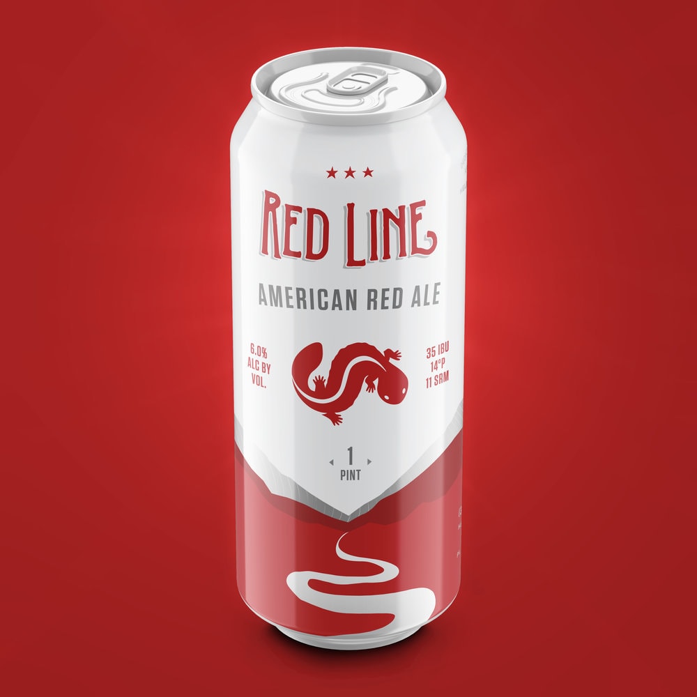
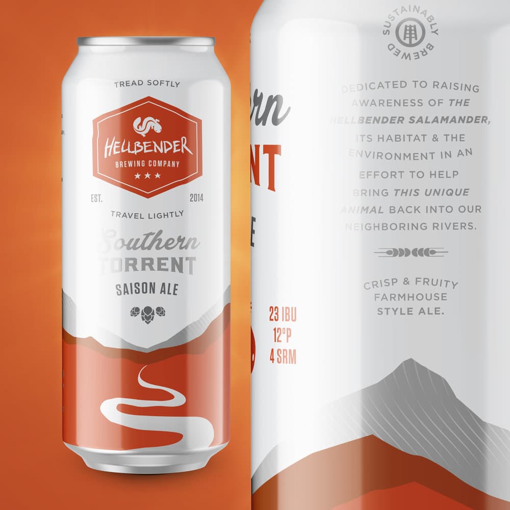
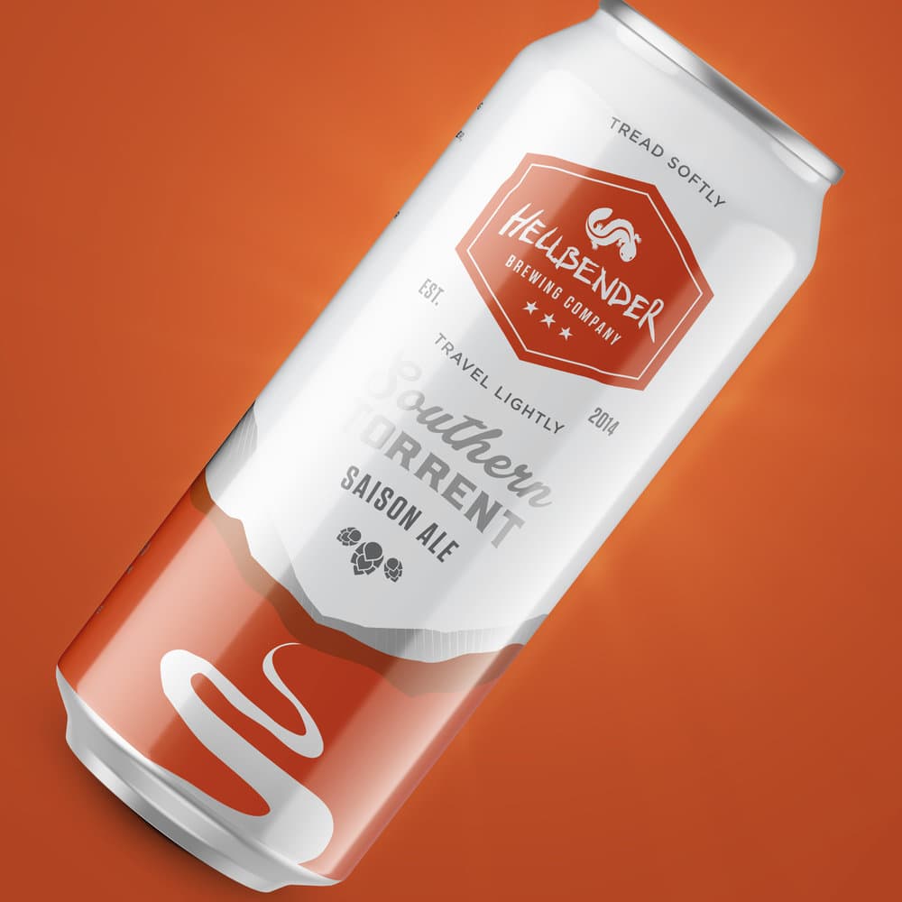
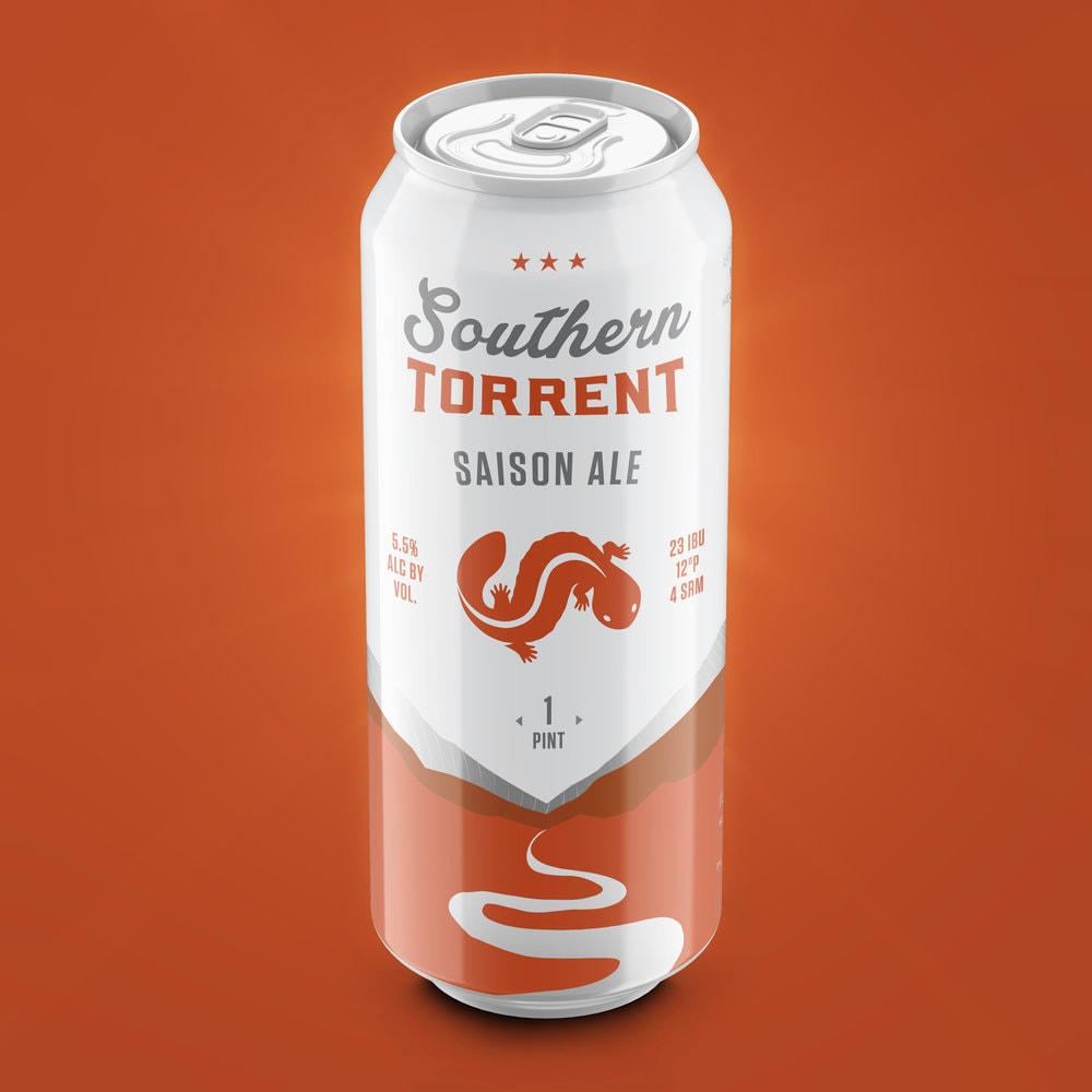
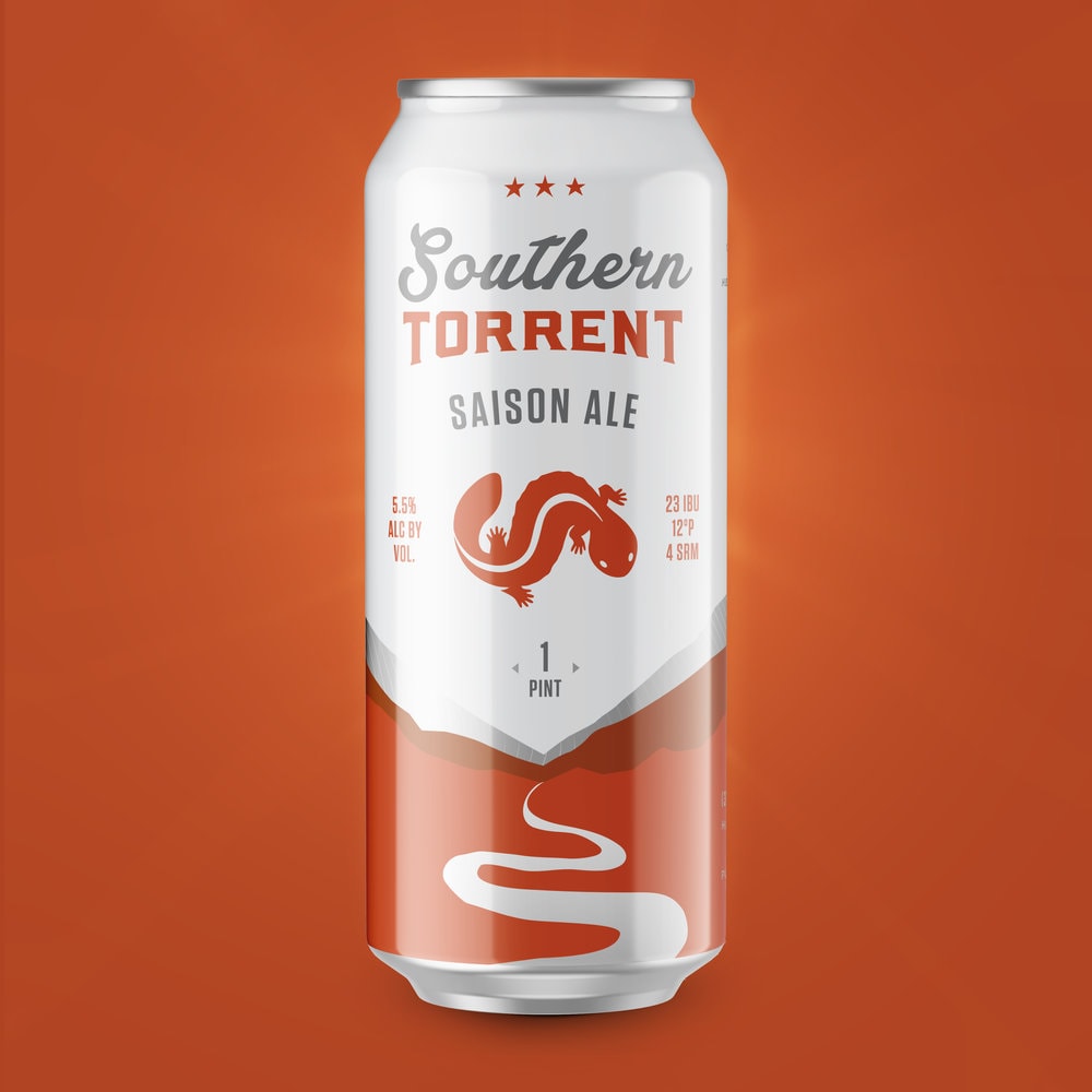
“Hellbender Brewing Co. approached Pig Iron with the task of creating packaging for their 16oz canned beer. They requested the design be simple and easy to recognize as a family of products while each maintaining their own individuality.The team at Pig Iron first started with a refreshing of their existing Hellbender Salamander logo. The design of the packaging subtly calls attention to the habitat of the Hellbender Salamander with the meandering creek and small mountain range that frames each of the different text lock ups. Hellbender Brewing Co’s mission statement is predominately featured as to call attention to the need to preserve these endangered animals.”

CREDIT
FEEDBACK
Relevance: Solution/idea in relation to brand, product or service
Implementation: Attention, detailing and finishing of final solution
Presentation: Text, visualisation and quality of the presentation


