


Task: to develop a brand for a large chain of convenience stores in the Uzbek market. Initial data: The retail market of Uzbekistan is unique: there are not many large players on it, but the competition between modern retail and traditional “bazaars” is strong: their wide choice and the opportunity to “bargain” and buy from a trusted seller who personally vouches for his goods. While modern retail is experiencing logistical difficulties and cannot always fill outlets with a sufficient assortment variety.
Strategy: The strategic decision in the project was to combine European technology and modernity with oriental soulfulness, sincerity and deep cultural code in brand positioning. Therefore, Baraka market is high-quality and selected products at a fair price, open people and modern service within walking distance from home.
The character of the brand combines reliability (stability of quality and guarantees of availability of everything you need in the most beloved and convenient Baraka market store), involvement – the store always meets its customer needs, and modernity, which guarantees constant development.
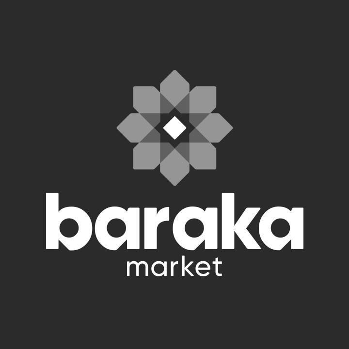
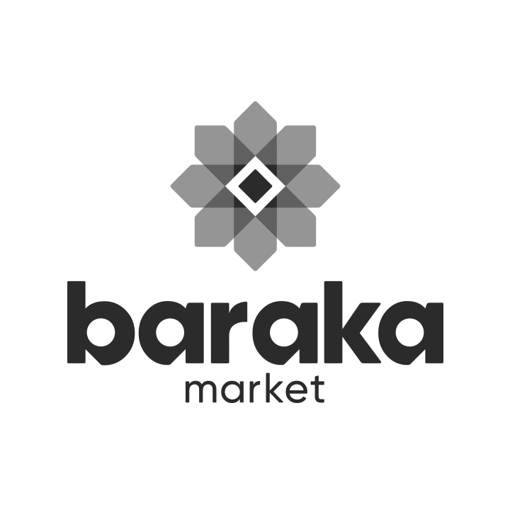
Creative: The name of the network has a rather deep meaning for the local consumer, because “Baraka” does not have a literal translation from Uzbek, but the closest is the concept of “abundance”, this word is used as a good wish and even a greeting.
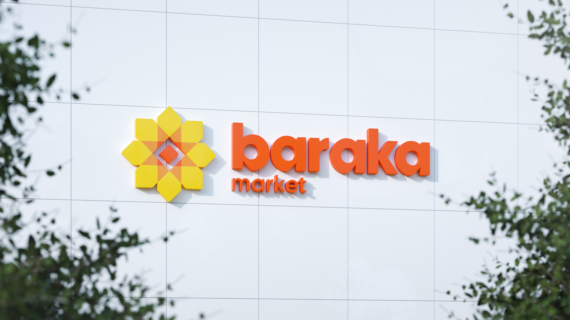
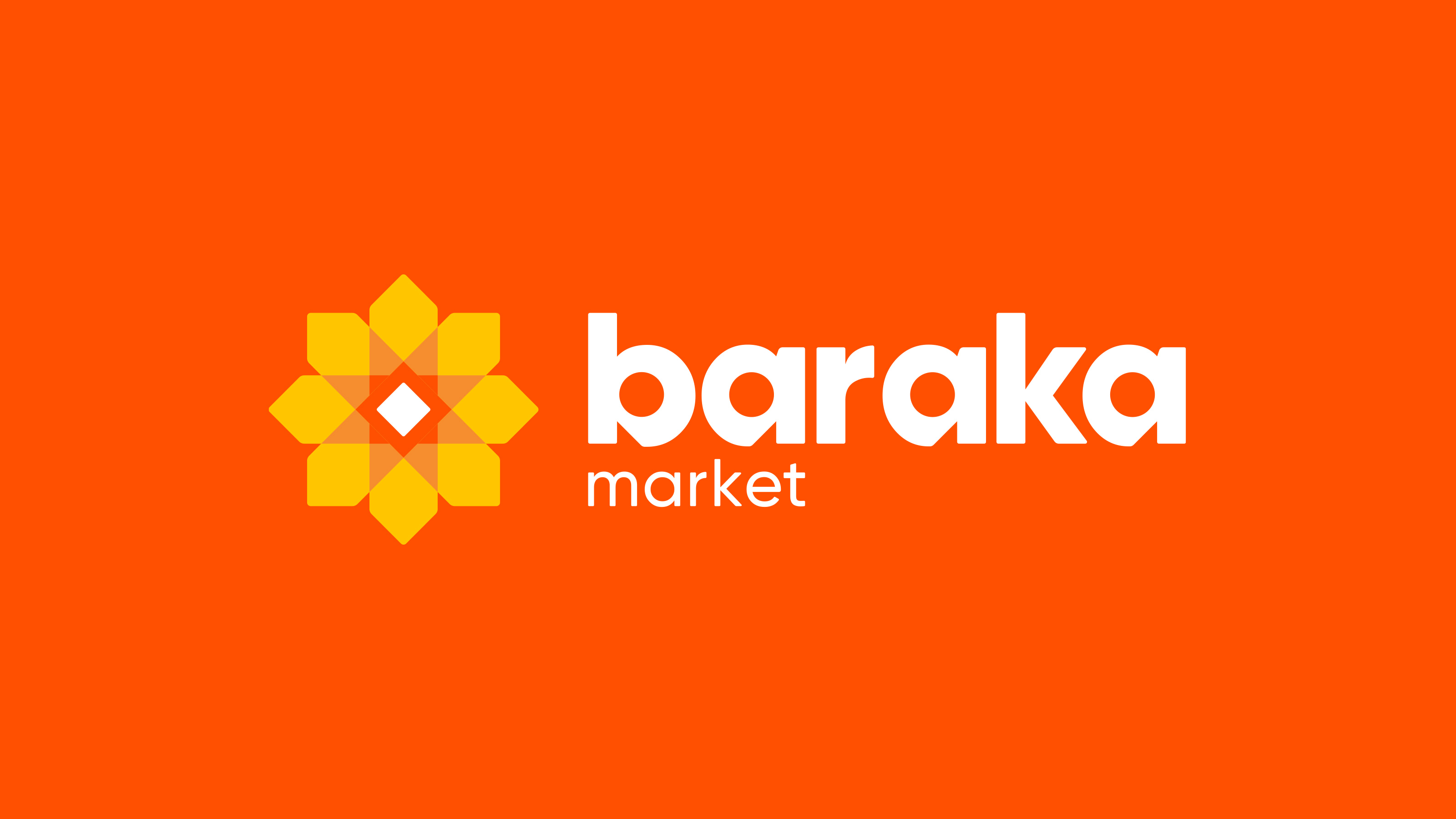
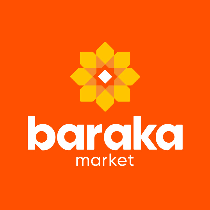
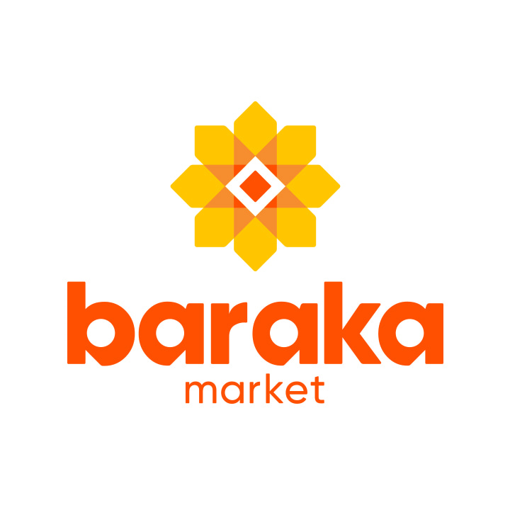
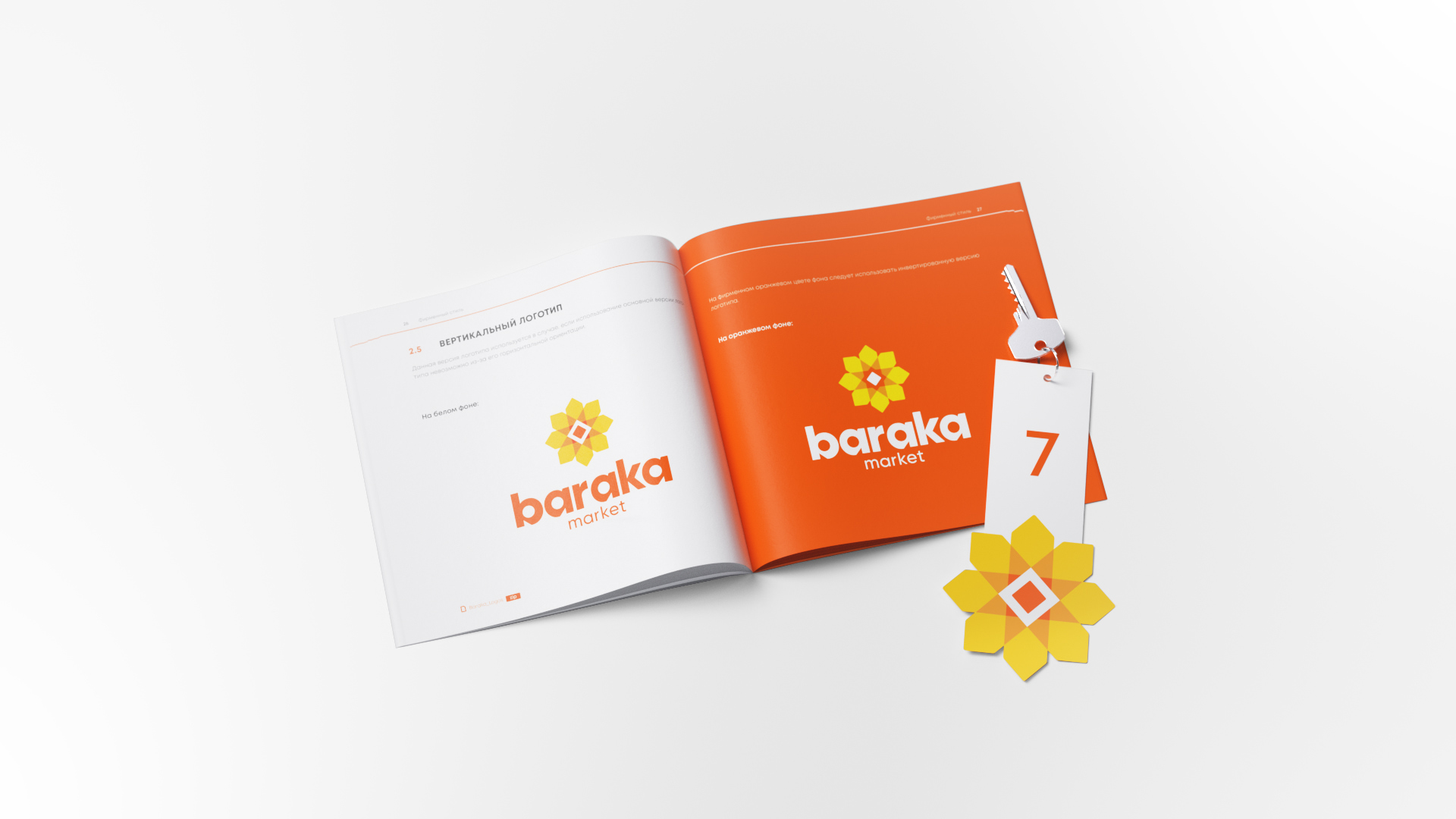
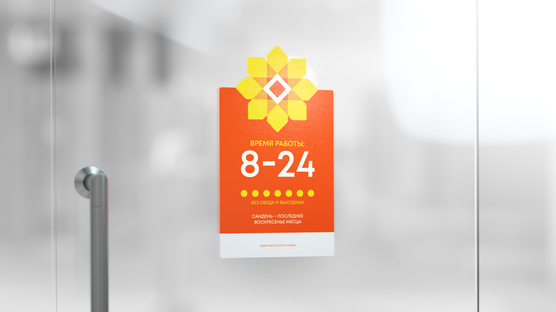
Based on the positioning and the name of the brand, a corporate sign was developed in which two symbols are combined: the sun and a sunflower in the form of elements of traditional ornament – as symbols of the fertile east, permeating the visual code of Uzbek culture (the sun is an element of the emblems of Uzbekistan and Tashkent). The typeface is rounded because it reflects the friendliness and flexibility of the brand, while the triangular die cuts emphasize the connection with the brand name.
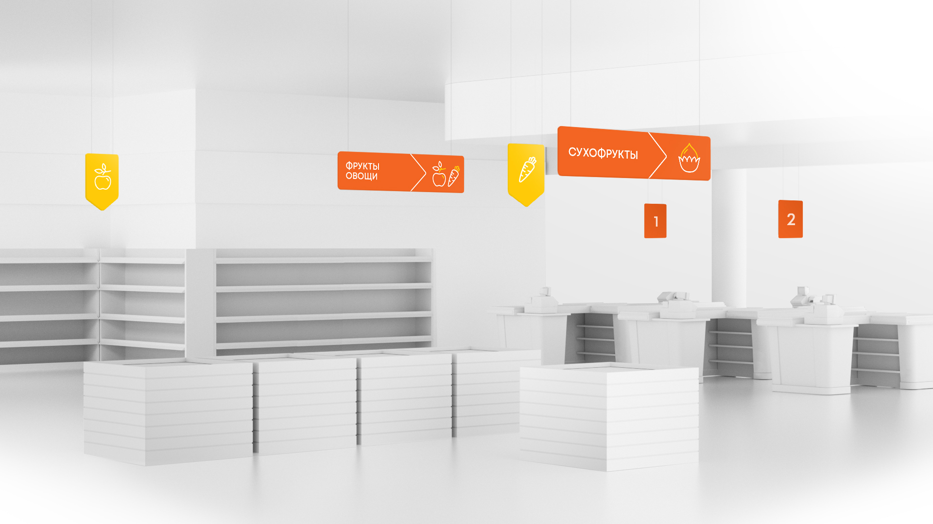
The basis of the corporate identity is orange color associated with vitality, warmth and positiveness.
Communication: Within the framework of the project, a brand communication strategy was developed for the first 2 years from the date of launch. The territory of the brand is “To be closer than just a store”, the message “Baraka market is a store that has everything you need to become “your own”.” Thus, Baraka Market is a caring, “own” store where everyone can find everything they need. In the tonality of brand communication, the emphasis is placed on its brightness, activity and emotionality, which influenced the brand’s design.

CREDIT
- Agency/Creative: PG Brand Reforming Company
- Article Title: PG Brand Reforming Has Developed a Brand for a Retail Chain in Uzbekistan
- Organisation/Entity: Agency
- Project Type: Identity
- Project Status: Published
- Agency/Creative Country: Poland
- Agency/Creative City: PG Brand Reforming Company Warsaw
- Market Region: Asia
- Project Deliverables: Brand Creation, Brand Design, Brand Guidelines, Brand Strategy, Brand Tone of Voice, Branding, Logo Design
- Industry: Retail
- Keywords: retail shop retaildesign Uzbekistan bright logo
-
Credits:
creative director: Vitaly Yatskevich


