


Naming: Company Balloon Bilingue contacted us to realize a refresh of both their branding and naming. Although the bilingual methodology is their primary service at the moment, they were searching for a brand that would better represent them as a company that develops creative solutions for Brazil’s education.
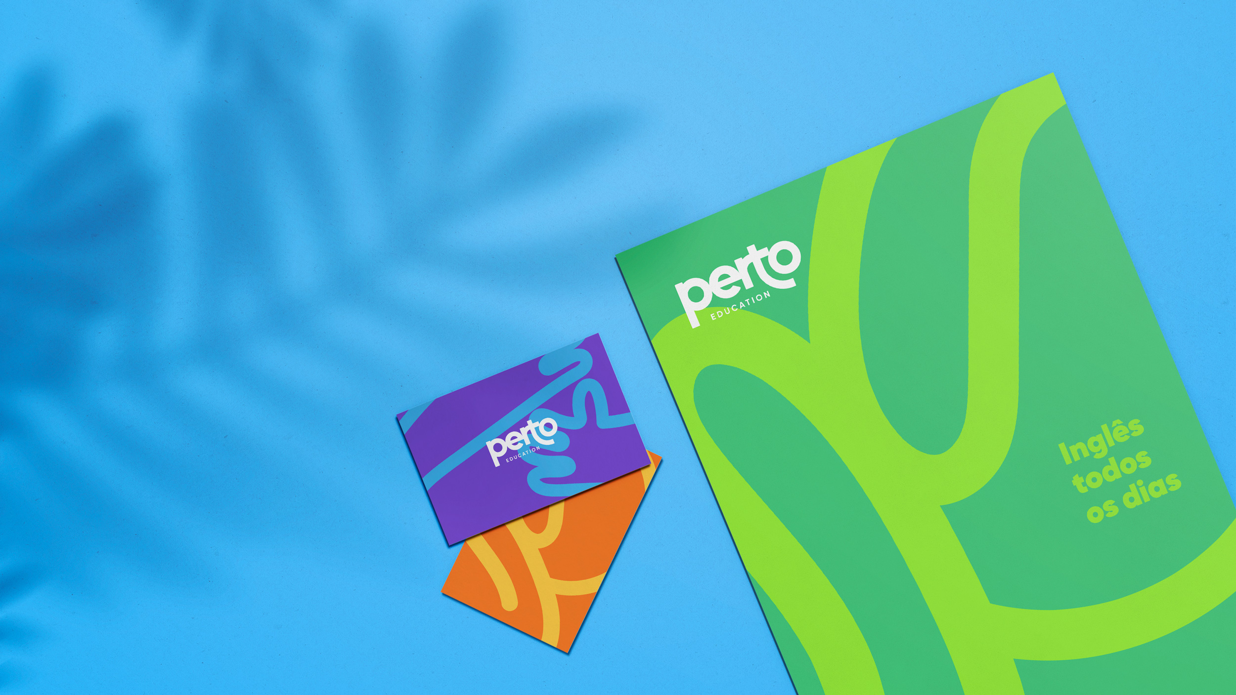
After several rounds of brainstorming and hundreds of domain searches, we conceived the name Perto Education. In Portuguese, this mild word means “near.” A perfect solution to represent the intimacy & proximity that were always core values of the company. Just as in English, the word also means next, which combines perfectly with their inspiration to impact the next generation.
Branding
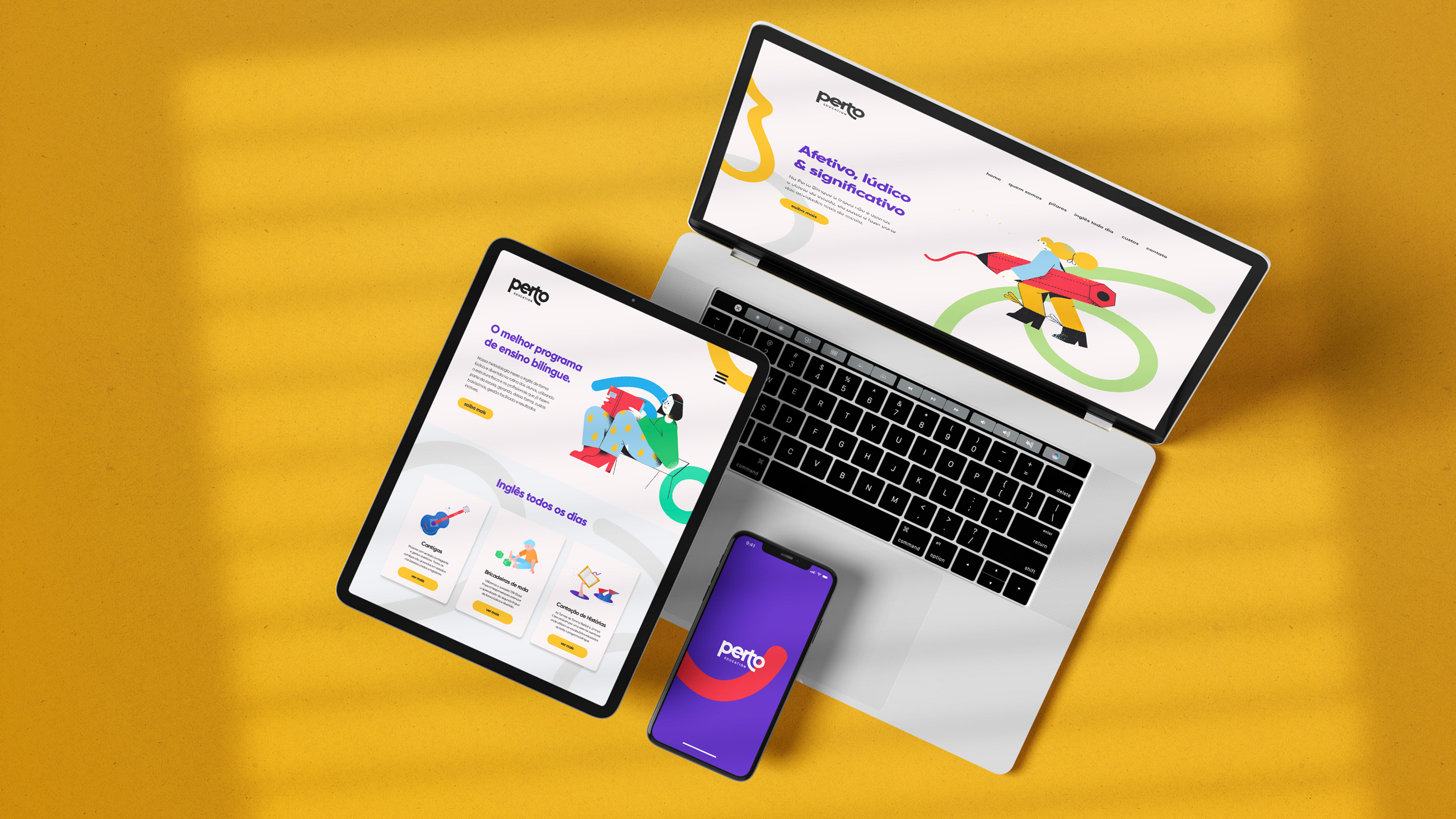
Perto Education is a bilingual methodology company that introduces English in a playful and fun way in students’ daily routine, using the physical structure and the professionals that are already part of the schools, in this way, accessible costs, easy management, and incredible results.
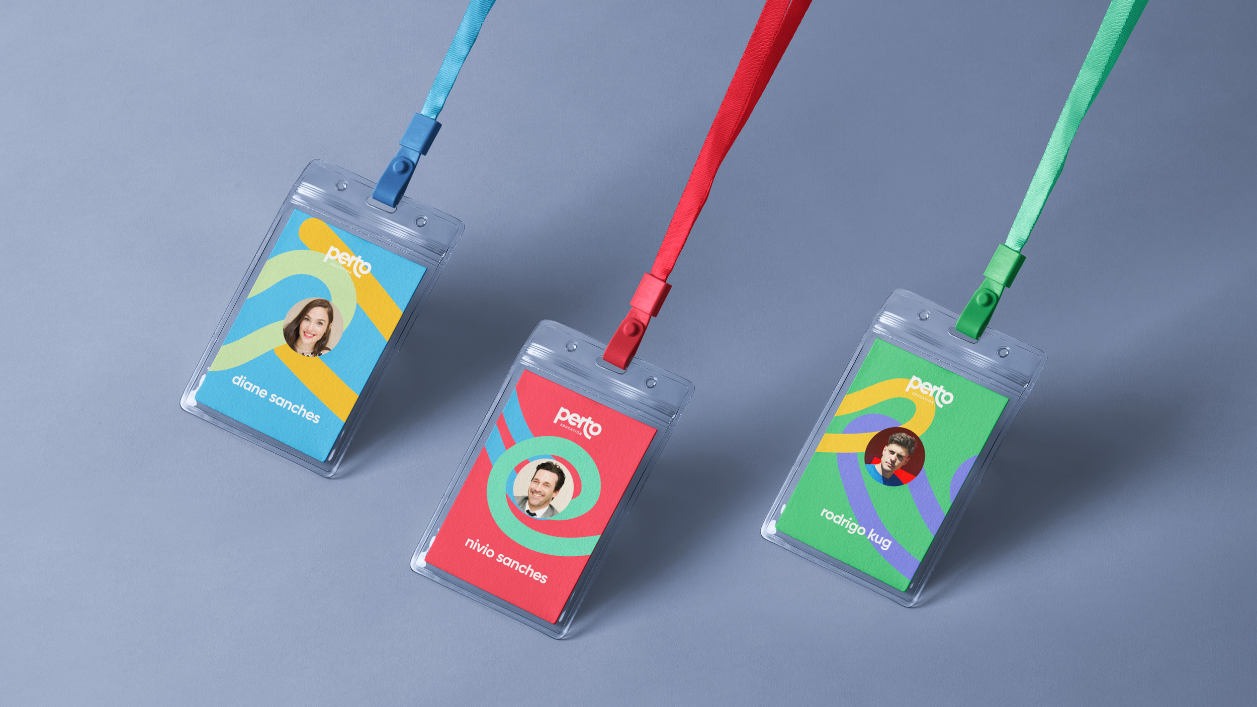
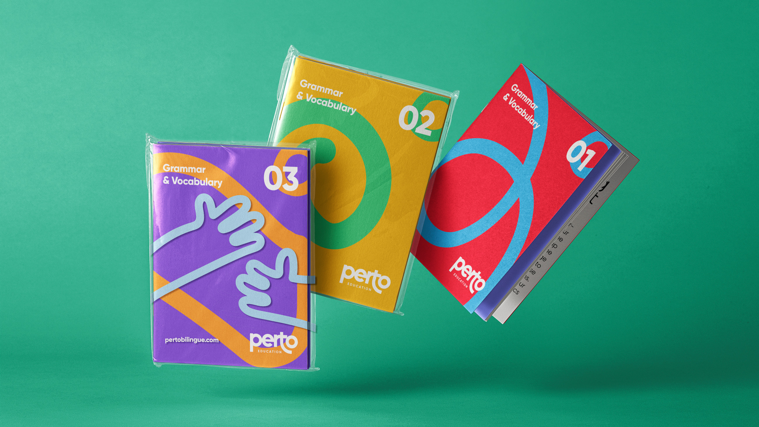
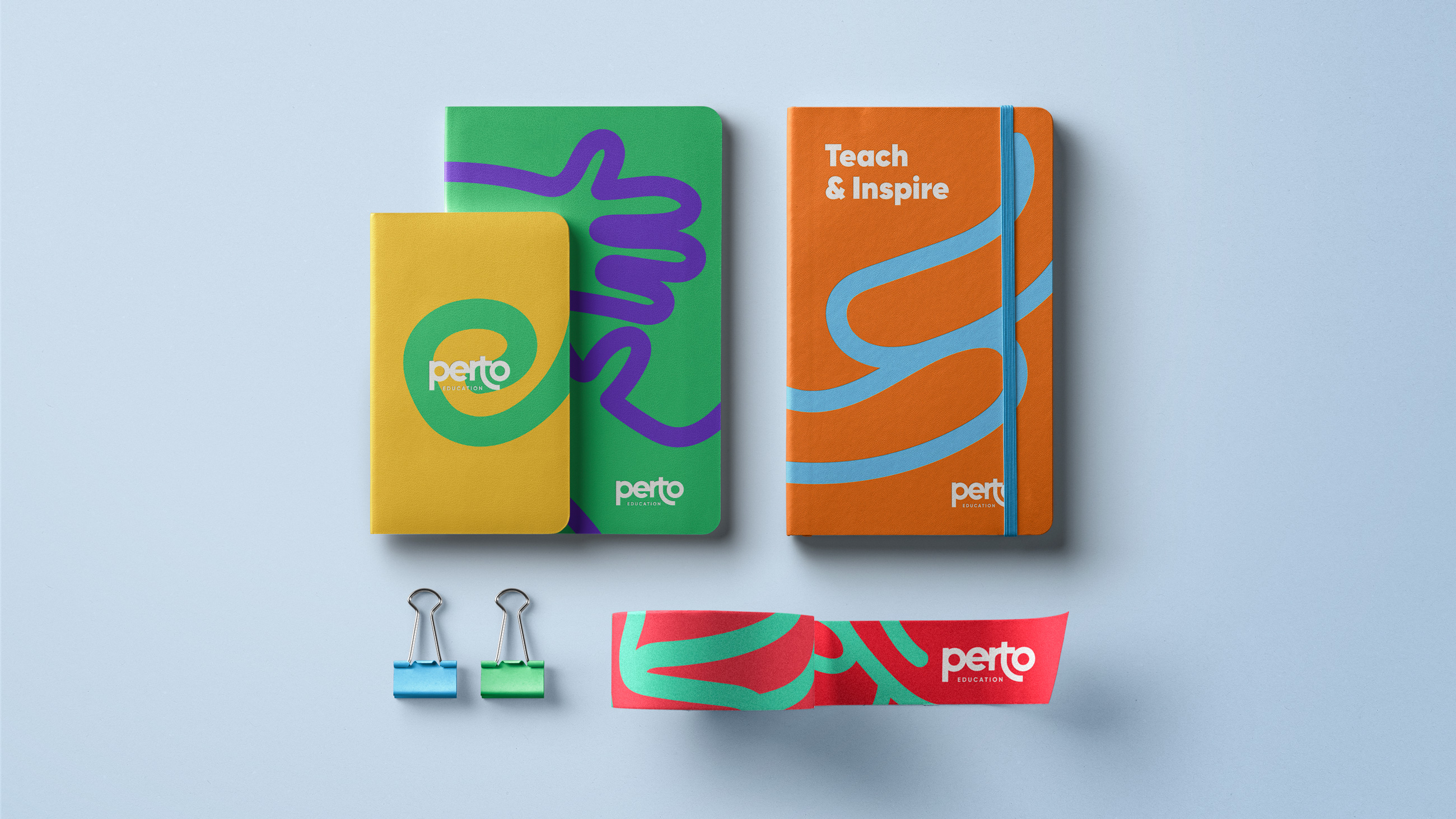
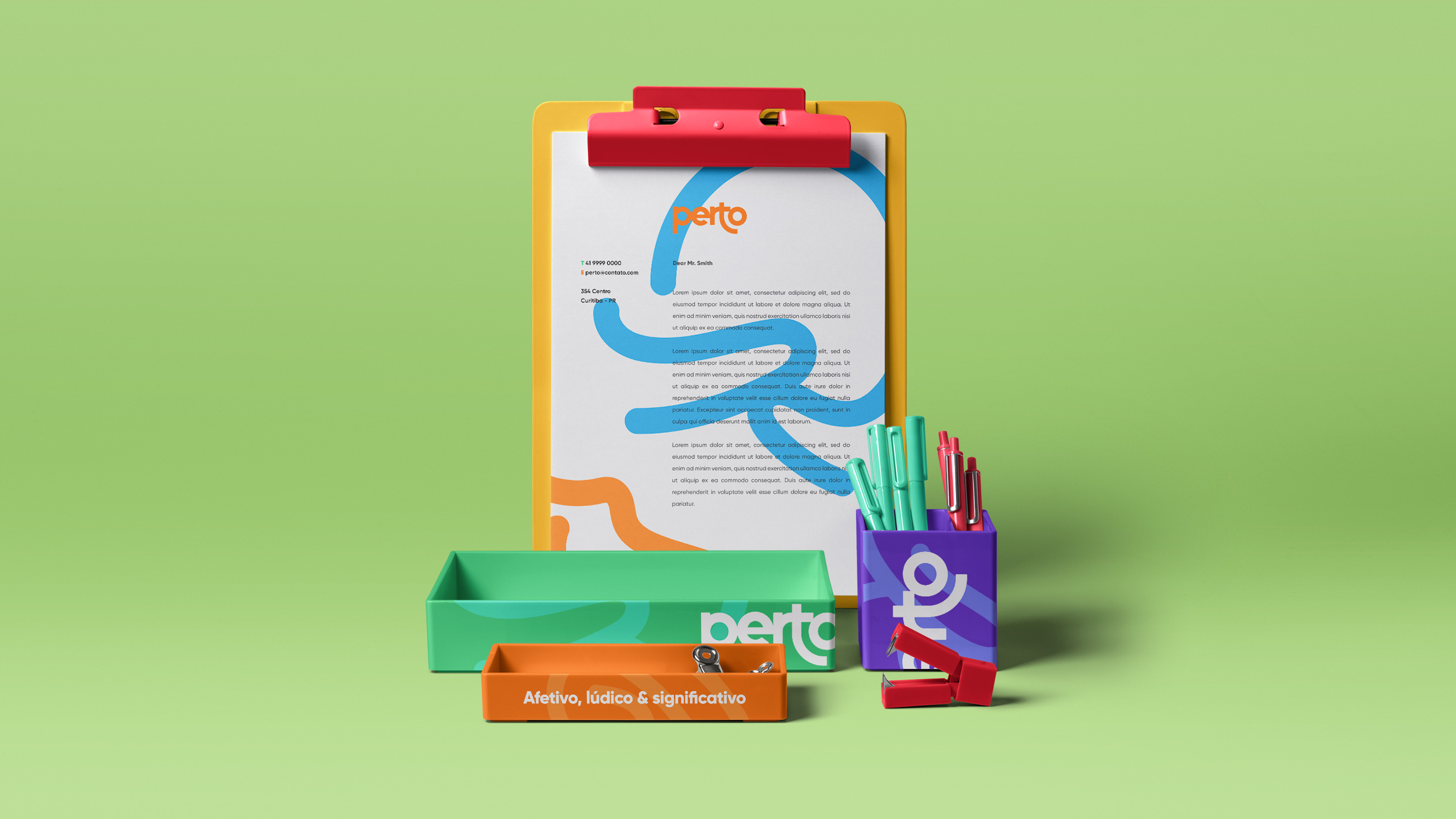
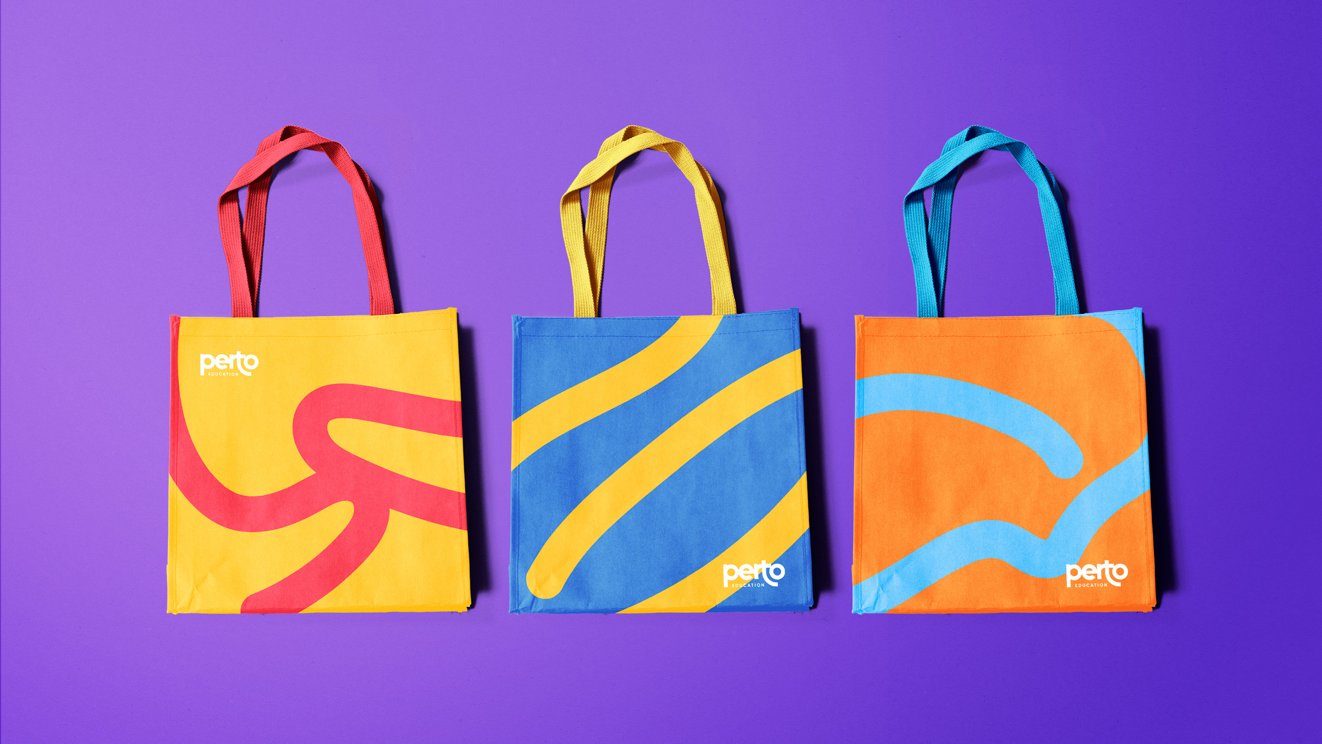
Designs explore affection and closeness in learning a new language. The identity is anchored with visual references of affection and warmth. This resulted in a geometric logotype, close letters and the letter T “embracing” the letter O. The goal with the design was to create an innovative, friendly and reliable expression with an identity rich in elements and playful forms and an overall differentiated identity in its field of practice.
CREDIT
- Agency/Creative: Kugnharski Studio
- Article Title: Perto Education Redesign
- Organisation/Entity: Agency, Published Commercial Design
- Project Type: Identity
- Agency/Creative Country: Spain
- Market Region: South America
- Project Deliverables: Brand Architecture, Brand Design, Brand Guidelines, Brand Identity, Brand Naming, Brand Redesign, Brand Refinement, Brand World, Branding, Graphic Design, Identity System, Illustration, Packaging Design, Rebranding, Tone of Voice
- Industry: Education
- Keywords: EDUCATION, BRANDING, ILLUSTRATION, STATIONERY, KIDS, SCHOOL, BILINGUAL, ABSTRACT, LOGO IDENTITY, BRANDING, REBRANDING


