


To the Dutch, Honig is like a member of the family. It’s the everyday culinary hero that helps consumers make something complicated, easy. The brand is inherently associated with helping Dutch families create quick and tasty meals with ‘the real Dutch taste’ through their ‘ready to cook’ meal ingredients such as pasta, soups, sauces and meal kits.
Renowned for its orange identity and 150 year Dutch heritage, Honig is the most trusted and best loved food brand in The Netherlands with 98% consumer awareness and presence in two thirds of all Dutch homes. However, younger consumers have more nostalgic associations with Honig and to them, it’s a brand that Mum buys that reminds them of the typical family dinner around the table. With consumer behaviour changing and more in-home meals being made from scratch, the category is evolving with fresh, new and exciting brands. Honig needed to refresh its perception in the category to align more closely with the latest consumer trends.
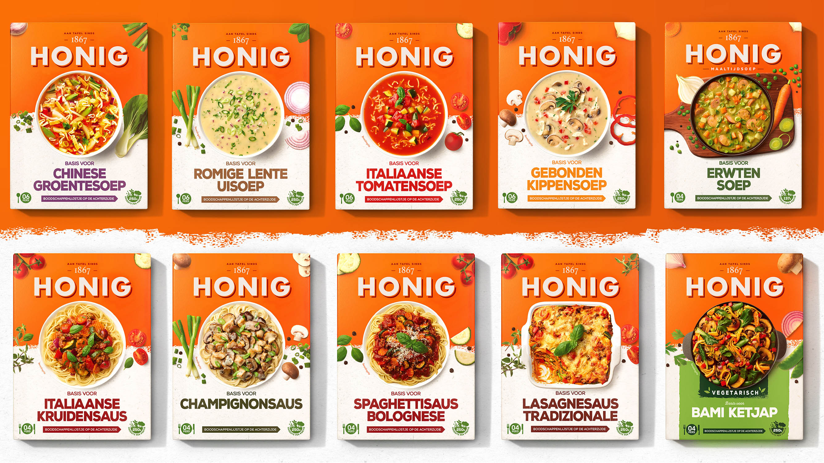
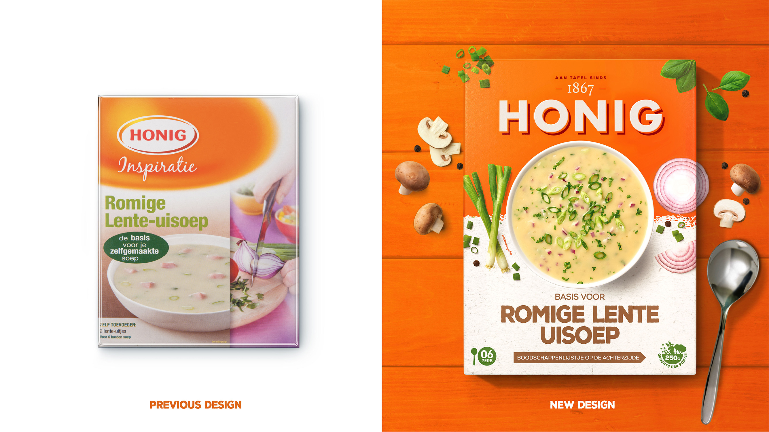
Kraft Heinz has partnered with London based PB Creative to redesign the Honig master brand visual identity, together with its extensive packaging range. With a diverse portfolio and several design changes over the past years, it had been difficult for consumers to navigate through the different product ranges. The brandmark itself lacked standout and modernity which compromised brand blocking and recognition at shelf. The agency saw a huge opportunity to breathe new life into this much loved brand by creating a distinctive and contemporary identity for Honig that drove strong reappraisal and new consumer appeal.
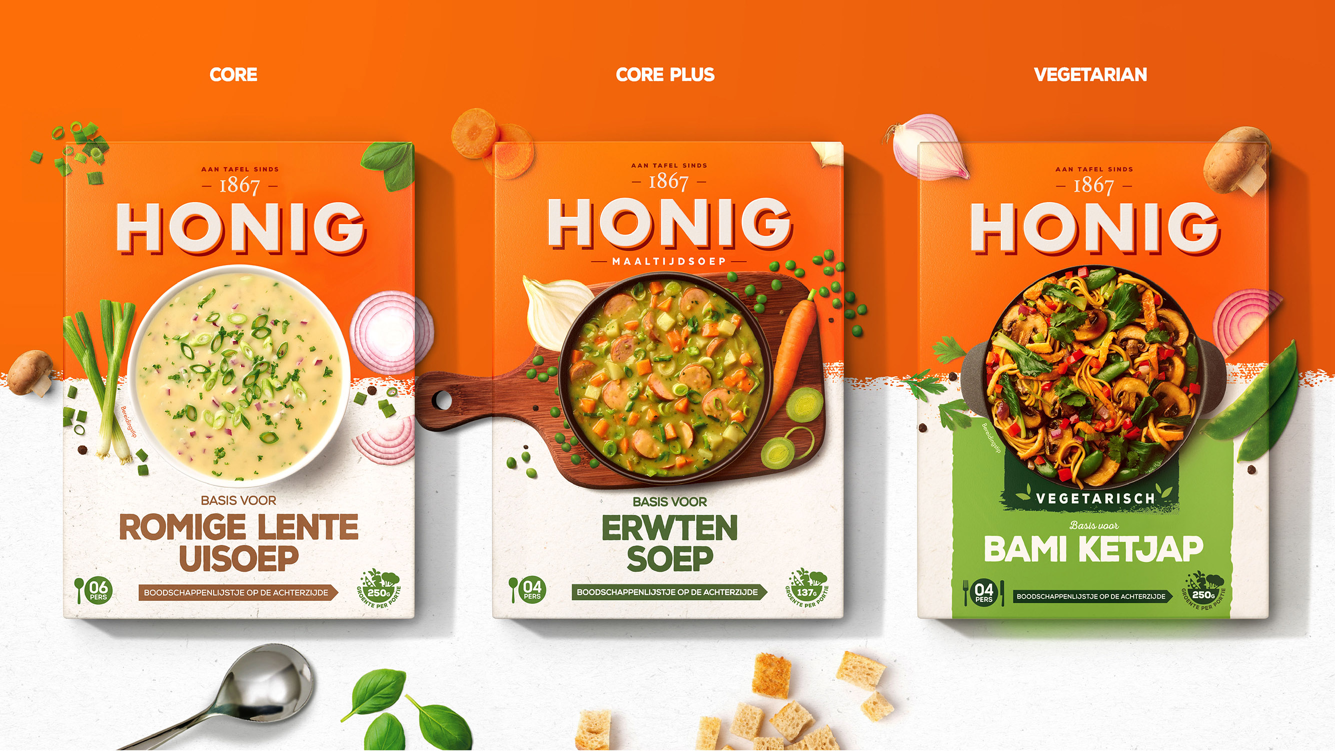
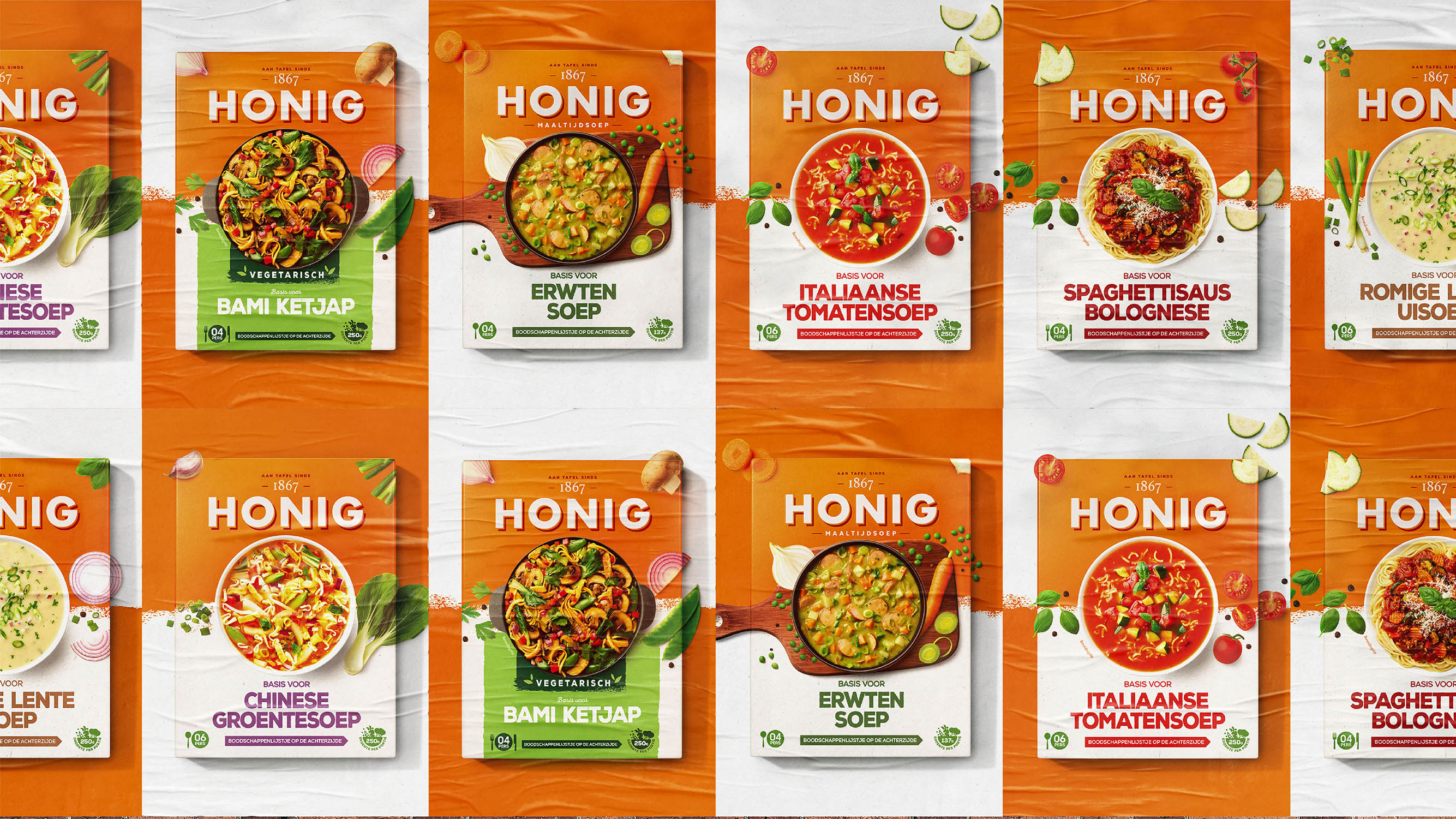
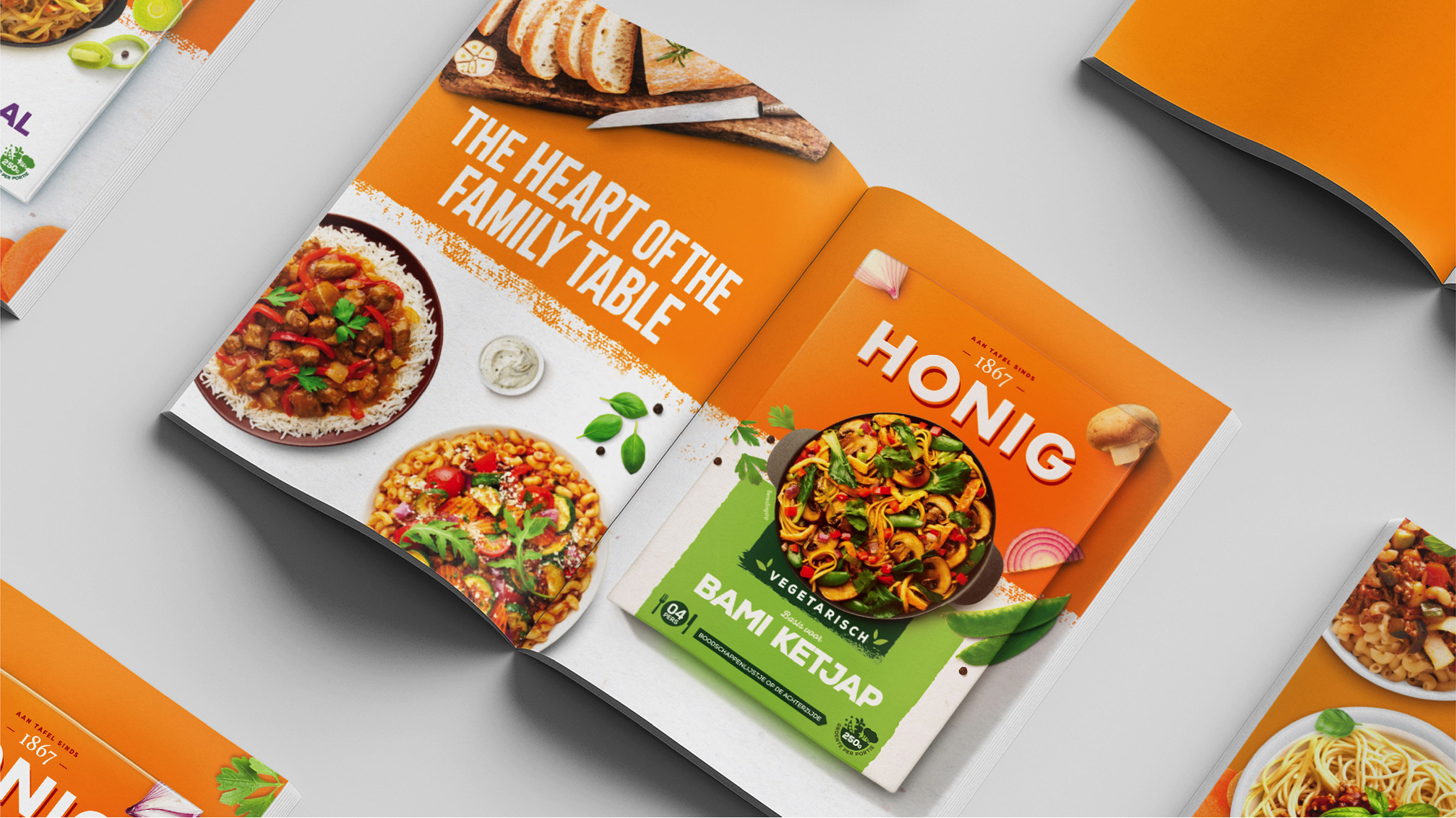
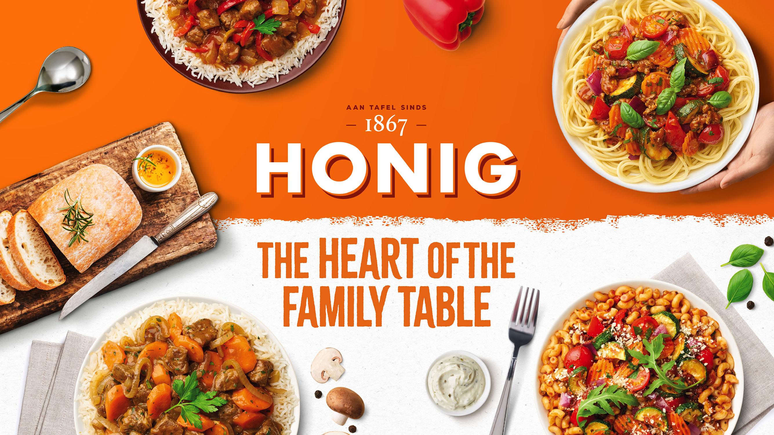
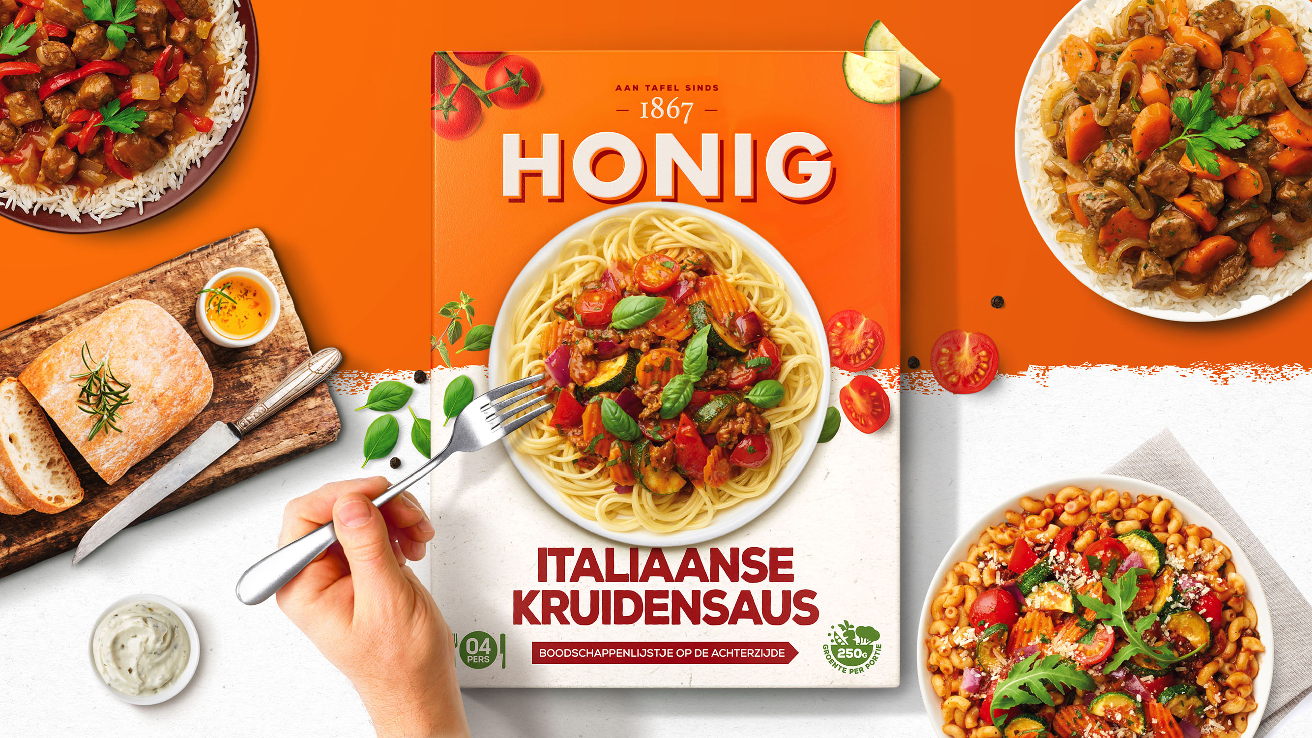
Delivering taste appeal is fundamental to the new visual identity with every mouth watering dish featured at the very heart of each pack and depicted through delicious food photography. Where the previous design was dated, PB Creative has developed a clear, contemporary and flexible communication hierarchy to appeal to a new generation of consumers and allow the brand to grow into new and exciting product ranges in the future.
“It was clear that we needed to create a relevant and compelling brand proposition that re-connected Honig’s past with the consumer trends of today”: says Lloyd Moffatt, Creative Director at PB Creative.
“We’ve progressed the brand from looking a bit dated and apologetic to an exciting and delicious new space. To deliver unified and distinctive brand blocking on shelf, we’ve accentuated the brand’s unique and recognisable colours of orange and white. The Honig brand mark has now broken free from its previous oval constraints allowing it sit proudly on the famous Honig orange whilst interacting with the brand elements around it. Honig now own’s orange as opposed to simply ‘wearing’ it!”
Tanja Kempen, Marketing Manager at Kraft Heinz added: “PB’s redesign of Honig has allowed us adapt to the changing needs and desires of our evolving audiences and constantly changing food trends without alienating existing consumers and while staying accessible to everyone. We now have a distinctive and ownable master brand visual identity which has injected personality back into the Honig range and enabled us to become relevant to today’s consumers once again.”
CREDIT
- Agency/Creative: PB Creative Ltd
- Article Title: PB Creative Contemporises a Dutch Classic
- Organisation/Entity: Agency
- Project Type: Packaging
- Project Status: Published
- Agency/Creative Country: United Kingdom
- Agency/Creative City: Londoon
- Market Region: Europe
- Project Deliverables: 2D Design, Brand Identity, Packaging Design
- Format: Box, Pouch, Sachet
- Substrate: Pulp Carton
- Industry: Food/Beverage
- Keywords: WBDS Agency Design Awards 2022/23
-
Credits:
Marketing Manager: Tanja Kempen


