


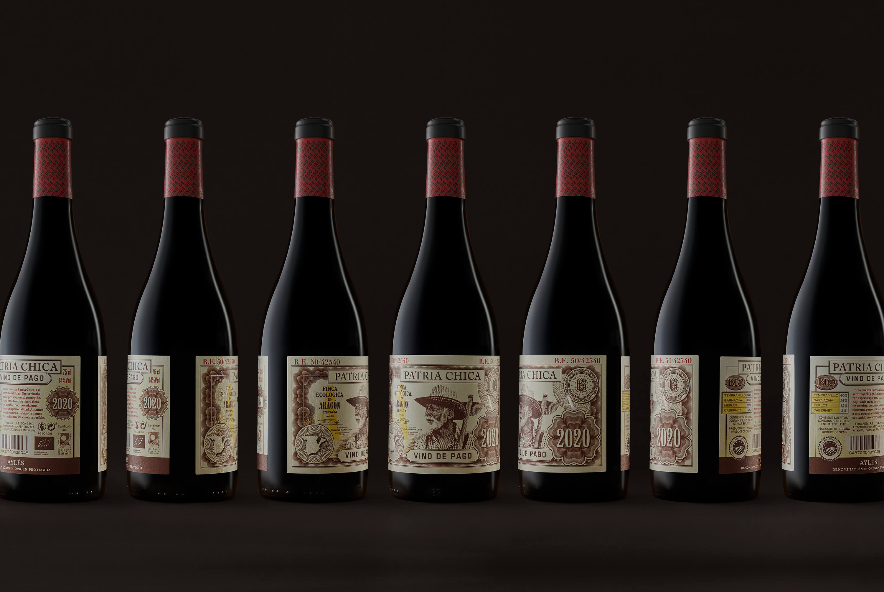
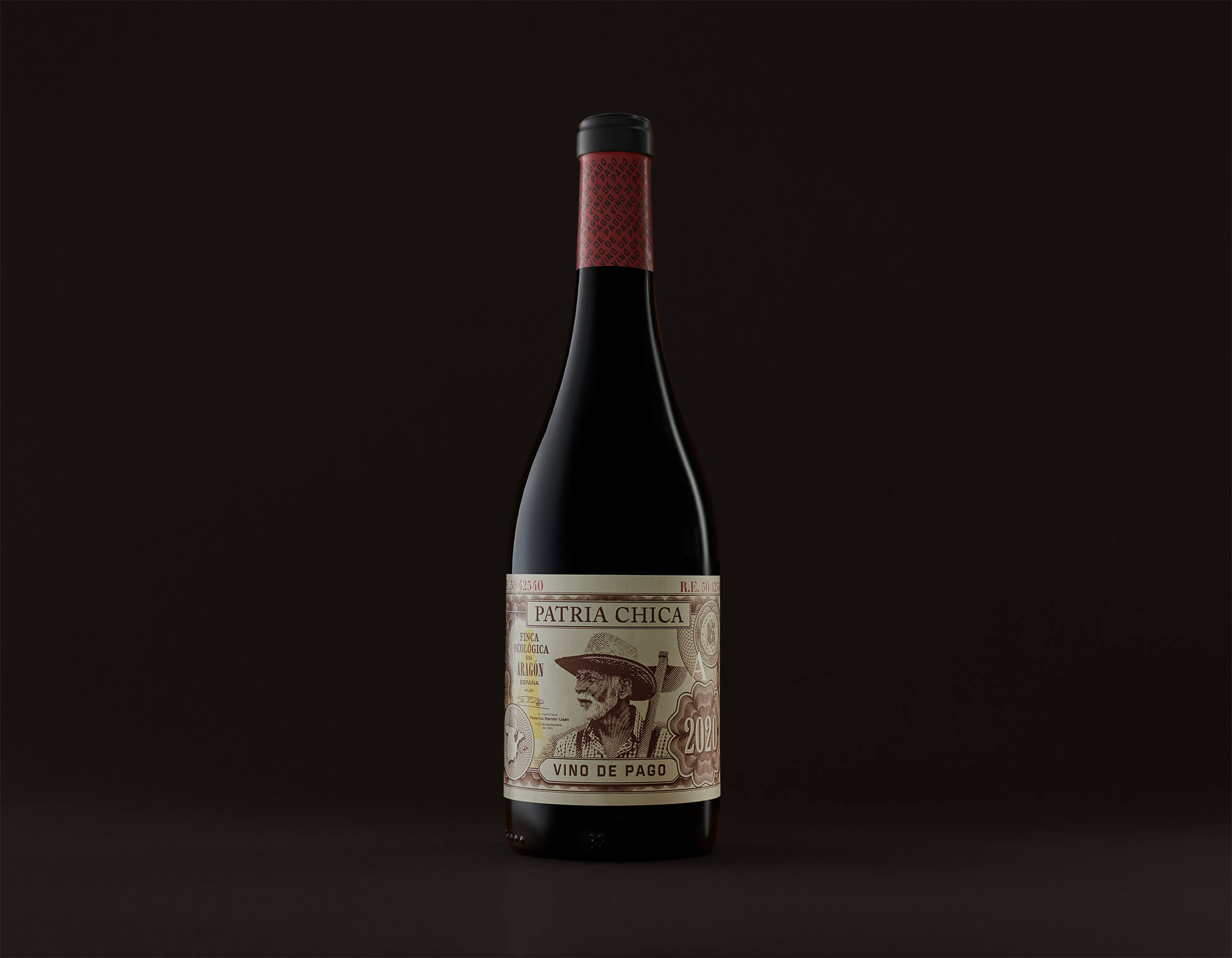
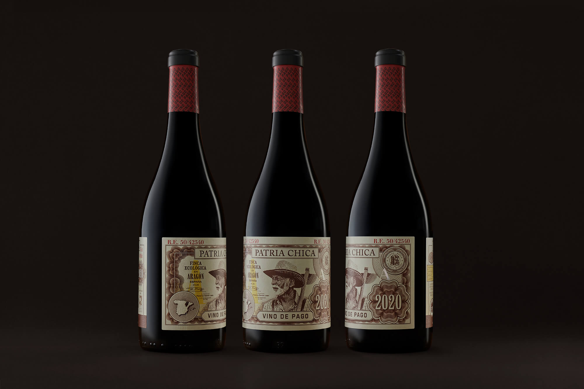
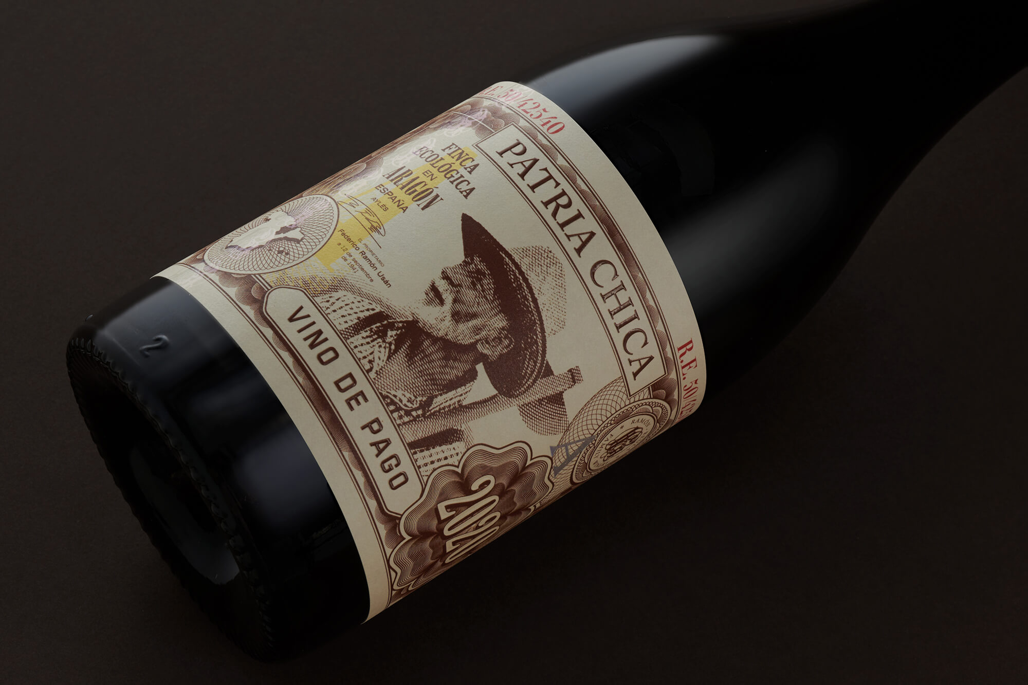
This new wine project of MABA, Patria Chica symbolises a rural area, whose value is epitomised in the Vino de Pago, a homage to farming traditions and the value of tradition as a banknote.
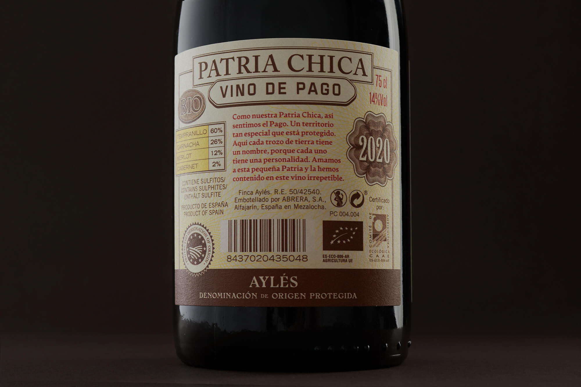
Pago wine is one that is produced in a very specific area of terroir, with very specific characteristics of soil, climate and varieties that make these wines unique and differentiated, for which it is awarded the Denomination of Pago for protect both its name and ways of making, and to maintain and improve the qualities of the wines produced on them over time. There are currently 20 Pagos in Spain, whose small territories and the wine resulting from them are protected.
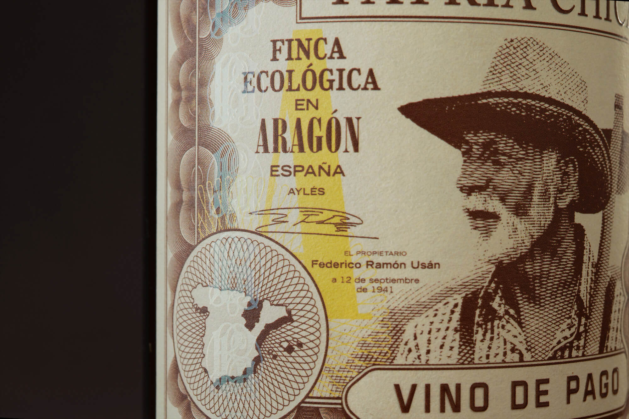
Just as countries have symbols with which their inhabitants live and organise their lives, the Pagos have their own characteristic features, in small territories with defined borders. Patria Chica, the name chosen by MABA team for this wine branding project, being a rural term loaded with symbolism and meaning. The wine narrative is a way of appreciating the value of old traditions, whose contribution is essential to the wine-making tradition. The proposal is a label but also an unmistakeable symbol of prosperity, the banknote, whose protagonist is the farmer, the man toiling land and allowing its treasure to emerge.
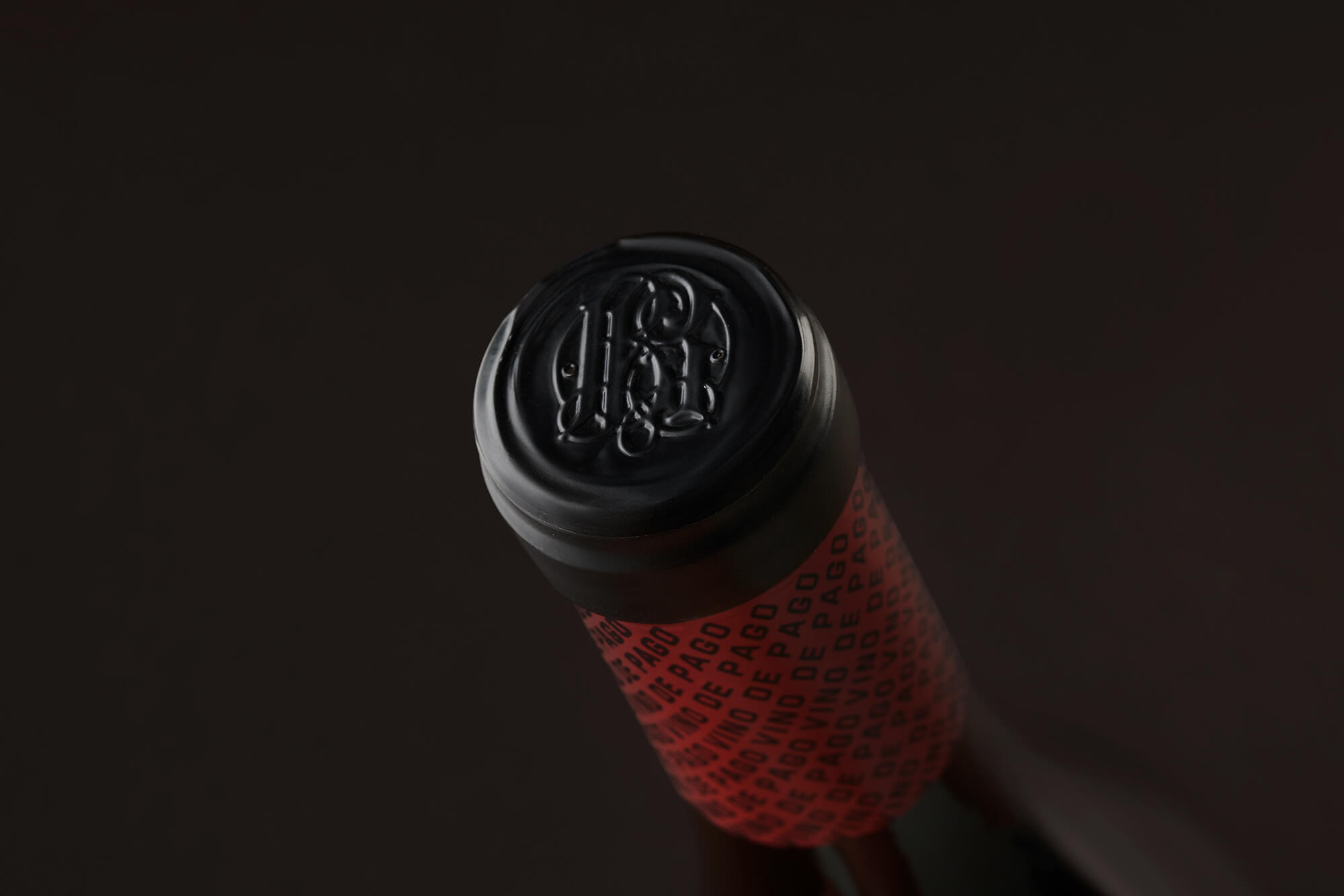
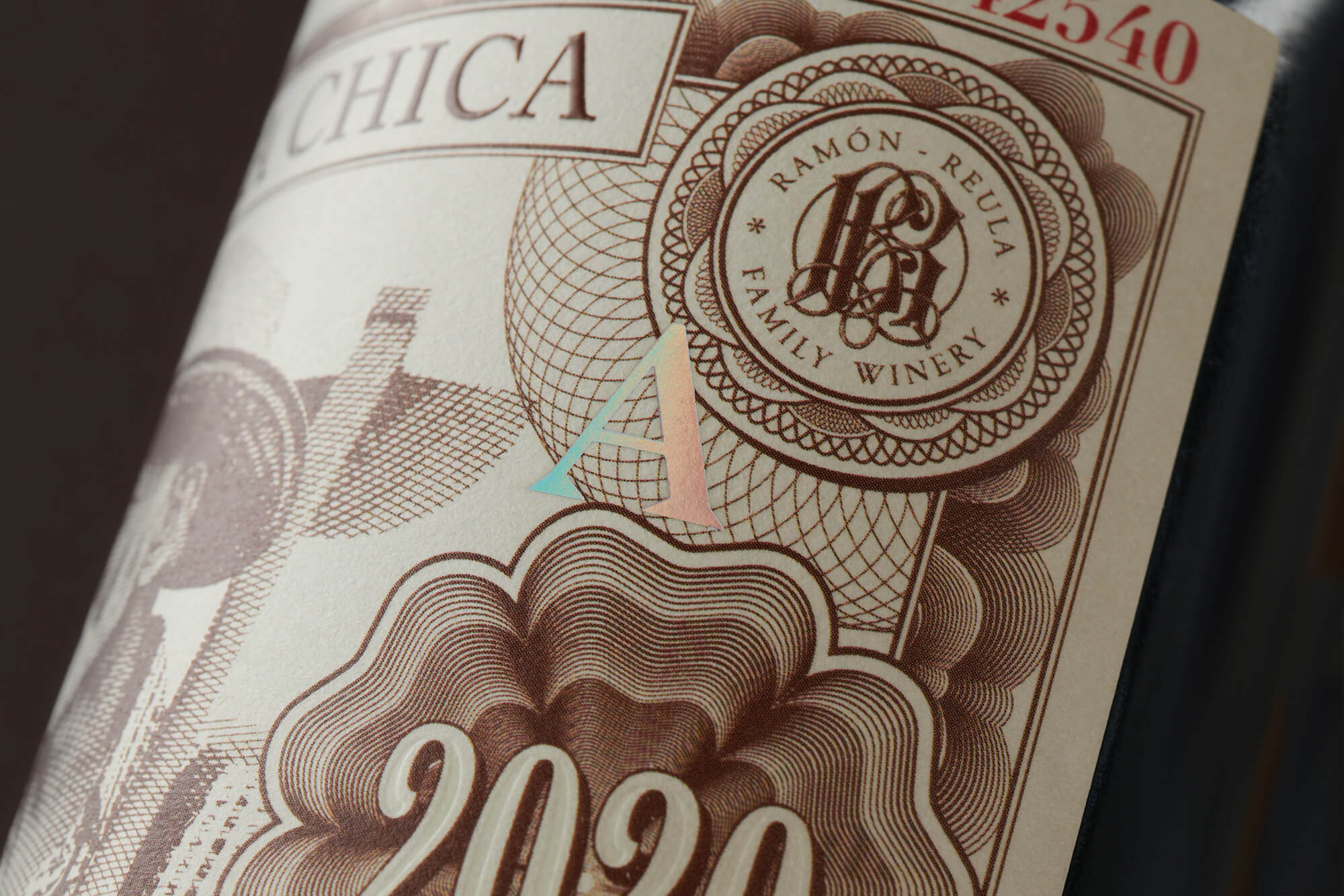
Materials treatment and printing for the label production, are textured Materica Limestone paper whose appearance adds value and holographic effects and the watermark to give a sensory and real feeling to the graphic.
CREDIT
- Agency/Creative: MABA
- Article Title: Patria Chica Traditional Wine Label Turned into a Banknote
- Organisation/Entity: Agency
- Project Type: Packaging
- Project Status: Published
- Agency/Creative Country: Spain
- Agency/Creative City: Murcia
- Market Region: Europe
- Project Deliverables: Branding, Label Design, Logo Design, Packaging Design
- Format: Bottle
- Substrate: Glass Bottle
- Industry: Food/Beverage
- Keywords: wine, graphic, label, packaging, spirits, illustration,
-
Credits:
Strategy Director: Beatriz Suarez
Creative Director & Designer: Manel Quílez
Photography: La Industrial


