The Client: Founded in 2012, Partner Education started as an online English education school that offered native English speaking classes. As one of the fastest-growing online English school in Asia, backed by a world-class team of academic and technical experts. From there, Partner Education partnered up with British Council, IELTS, expanded their programs: IELTS Speaking, IELTS Writing, English for Kids& Aboard Study Consultation. In 2019, Partner Education helped more than 1 million students, 1 out of 10 IELTS students learned with Partner Education.
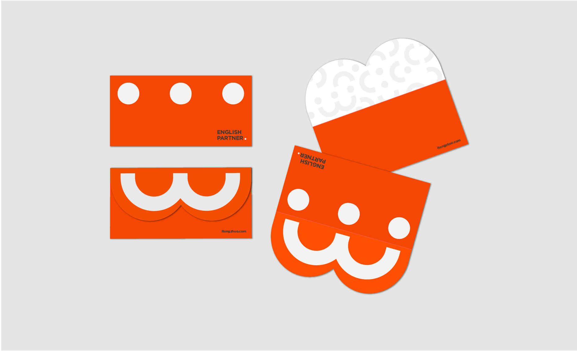
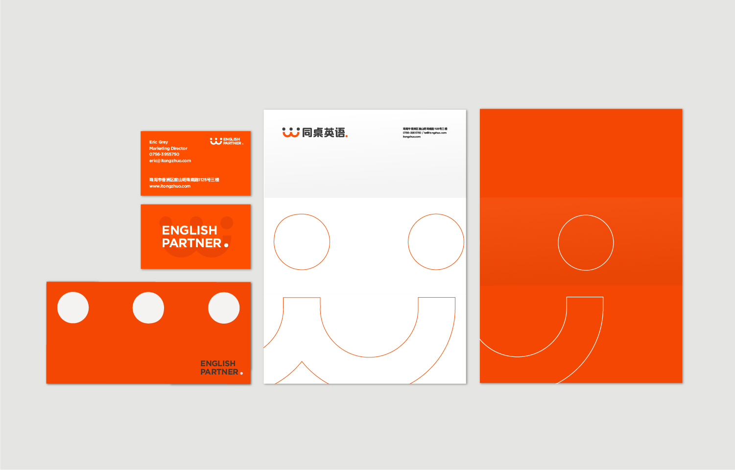
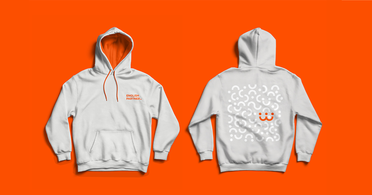
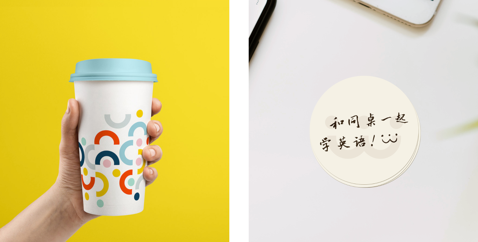
How did I help?: Partner Education’s existing brand was selling them short. I was under the mission of helping Partner Education build a new brand identity system to communicate their’s personality and story better. After conduct interview and research of the company, I create a new visual system: brand mark, color palette, typography systems, and supporting graphic elements such as patterns, shapes, brand applications, and brand guideline booklet.
A brand that symbolises the partner like connection between teachers and students.
Traditional asian school is famous for the teacher-led approach where students are silent, obedient and teachers are strict, serious and tough with minimum communication in between. Apart from that, Partner Education is a representation of the new age, they are known for warmth, approachable, and provides friends/partner like connection between students and teachers.
I decide to keep the characteristic of the brand and communicate better with an appropriate visual language system, and a more cohesive experience across their consumer touch-points.
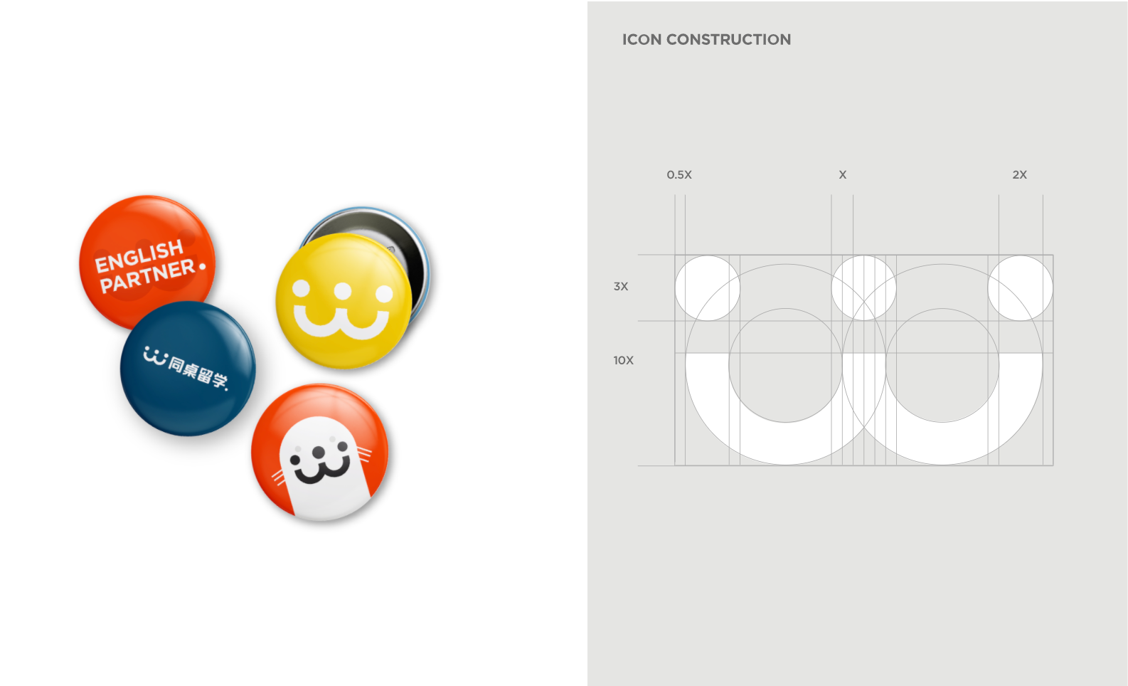
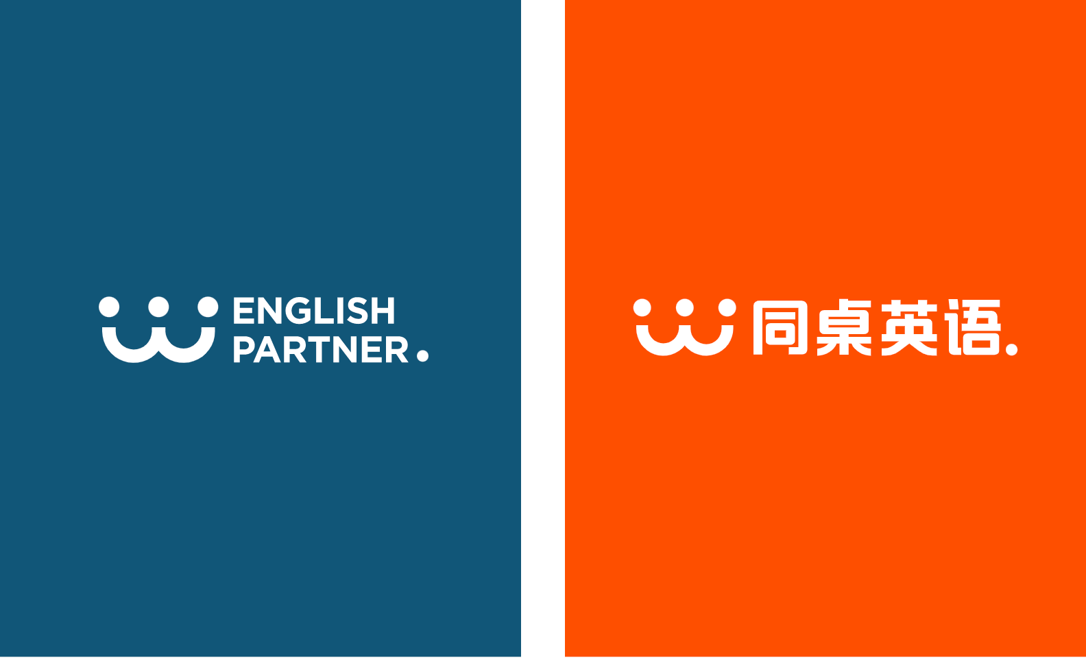
Design choice are intentional beyond aesthetics. The brand mark as the symble of Partner Education is the combination of 2 smiley face which represent the optimistic and happy relationship between teacher and students. I choose to kept the original brand colour- orange, as it was one of the most memorable and likeable visual element based on the interview research with Partner Education’s students. A group of colour was added to palette to create a more flexible support when apply to different media and applications.


CREDIT
- Agency/Creative: Bing N Design
- Article Title: Partner Education Brand Identity Design Created by Bing N Design
- Organisation/Entity: Freelance, Published Commercial Design
- Project Type: Identity
- Agency/Creative Country: Canada
- Market Region: Asia
- Project Deliverables: Brand Advertising, Brand Guidelines, Brand Identity, Brand Redesign, Branding, Graphic Design, Rebranding, Research
- Industry: Education
- Keywords: Brand Identity Design, Orange, Smile, Education, School, Online Study, Academy, English Education, English School


