


After 15 successful years in the market, Victorinox brand best known for their popular Swiss army knives, decided to relaunch their whole fragrance collection. After passing the first contest phase, we were finally selected to develop and inaugurate this new era with them thanks to our narrative approach and storytelling. With our proposal we intended to capture their brand essence, portray their Swiss roots, and reinforce their fresh, modern and adventurous identity.
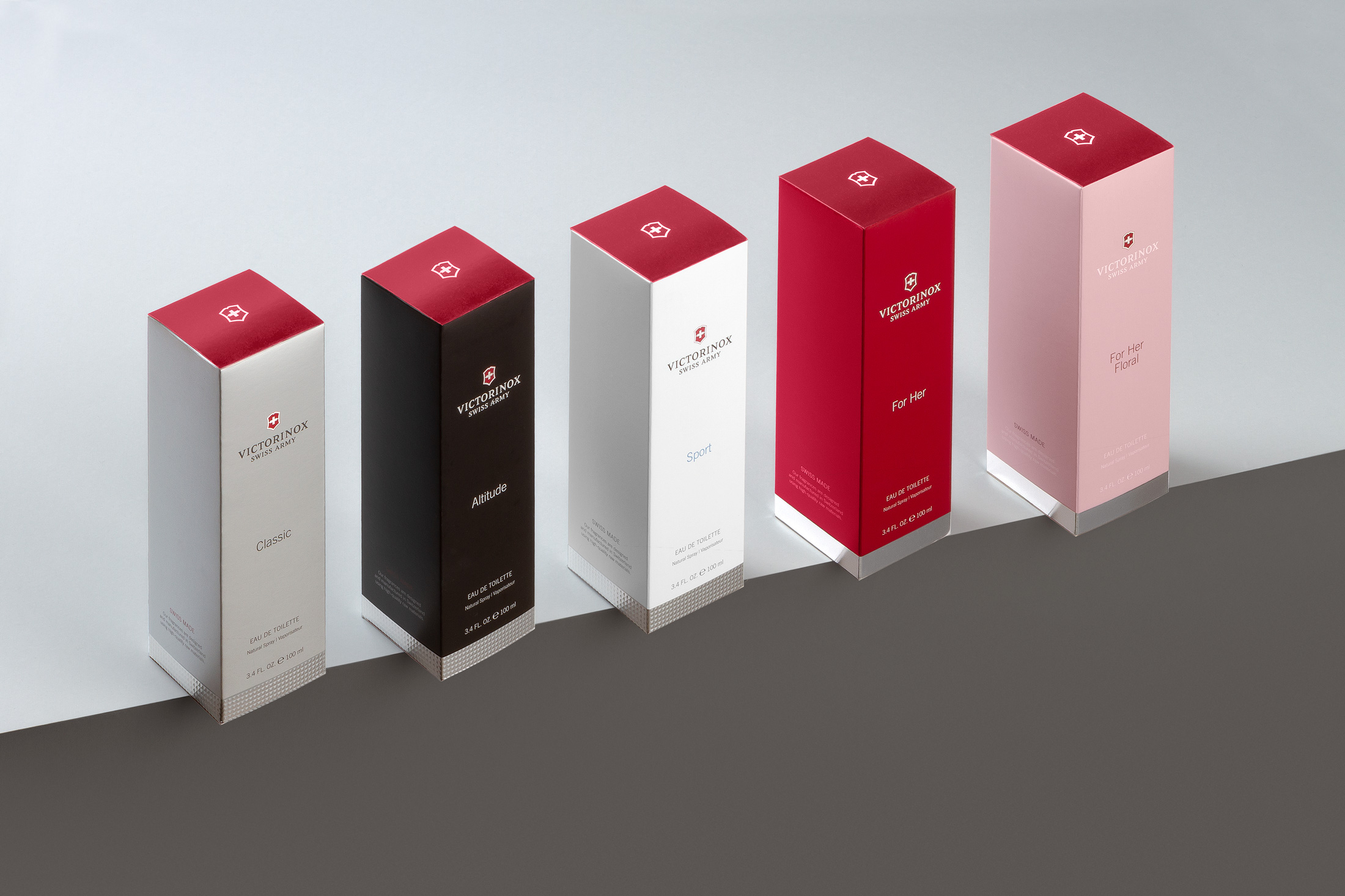
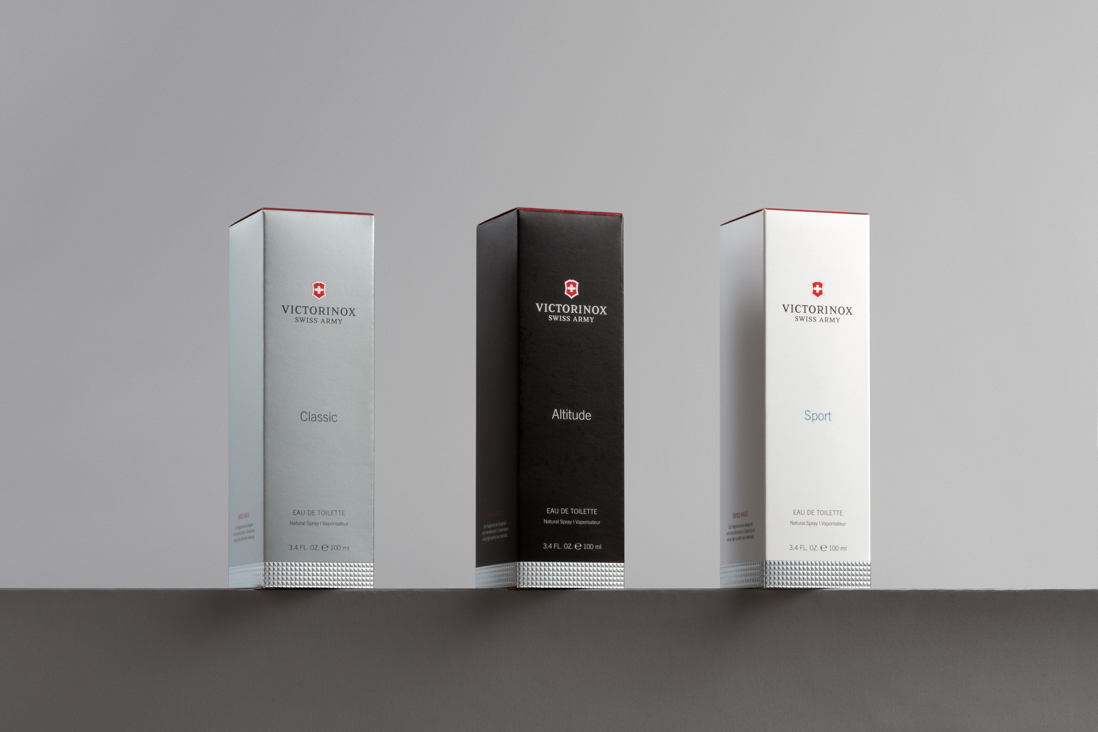
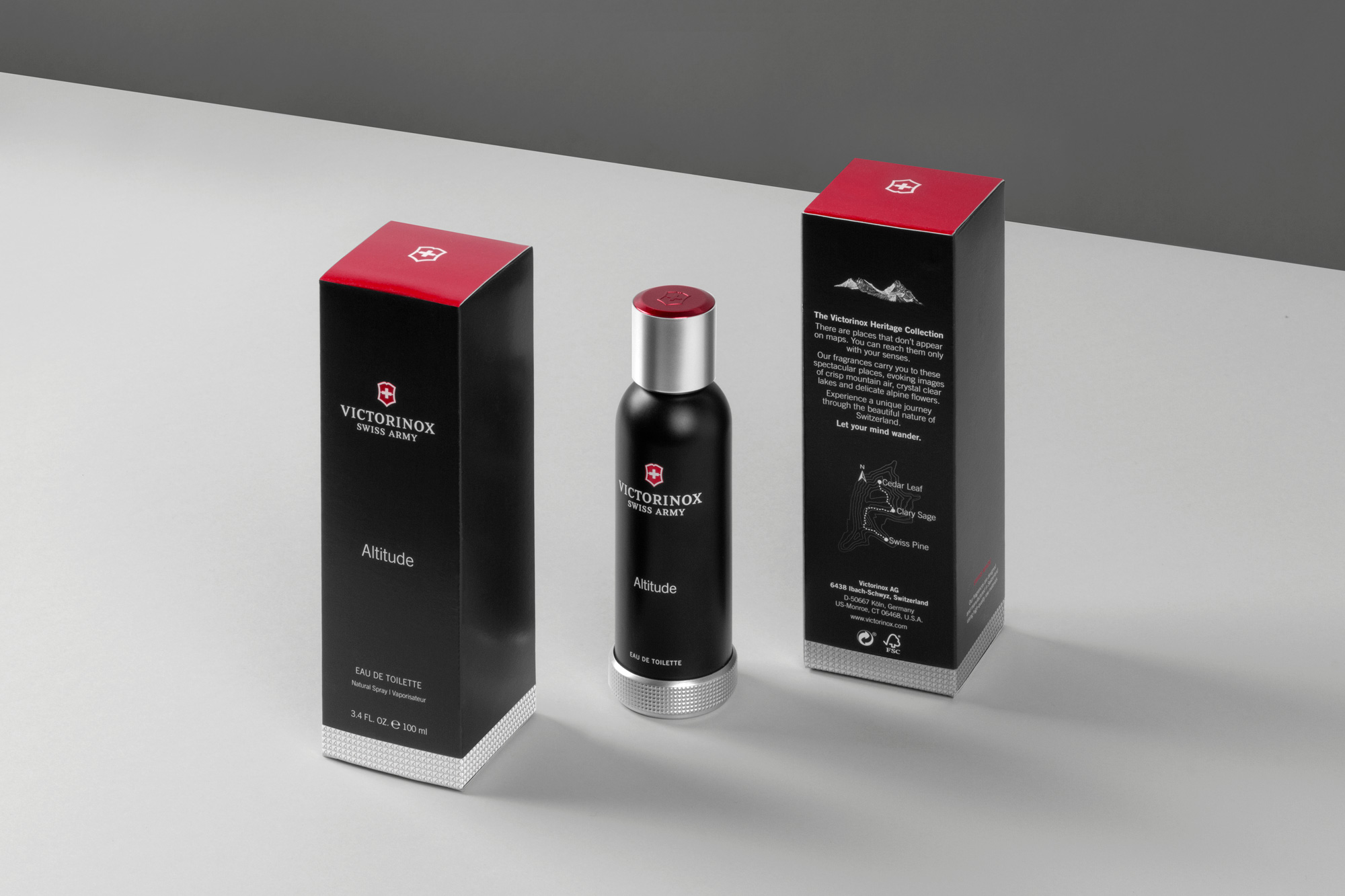
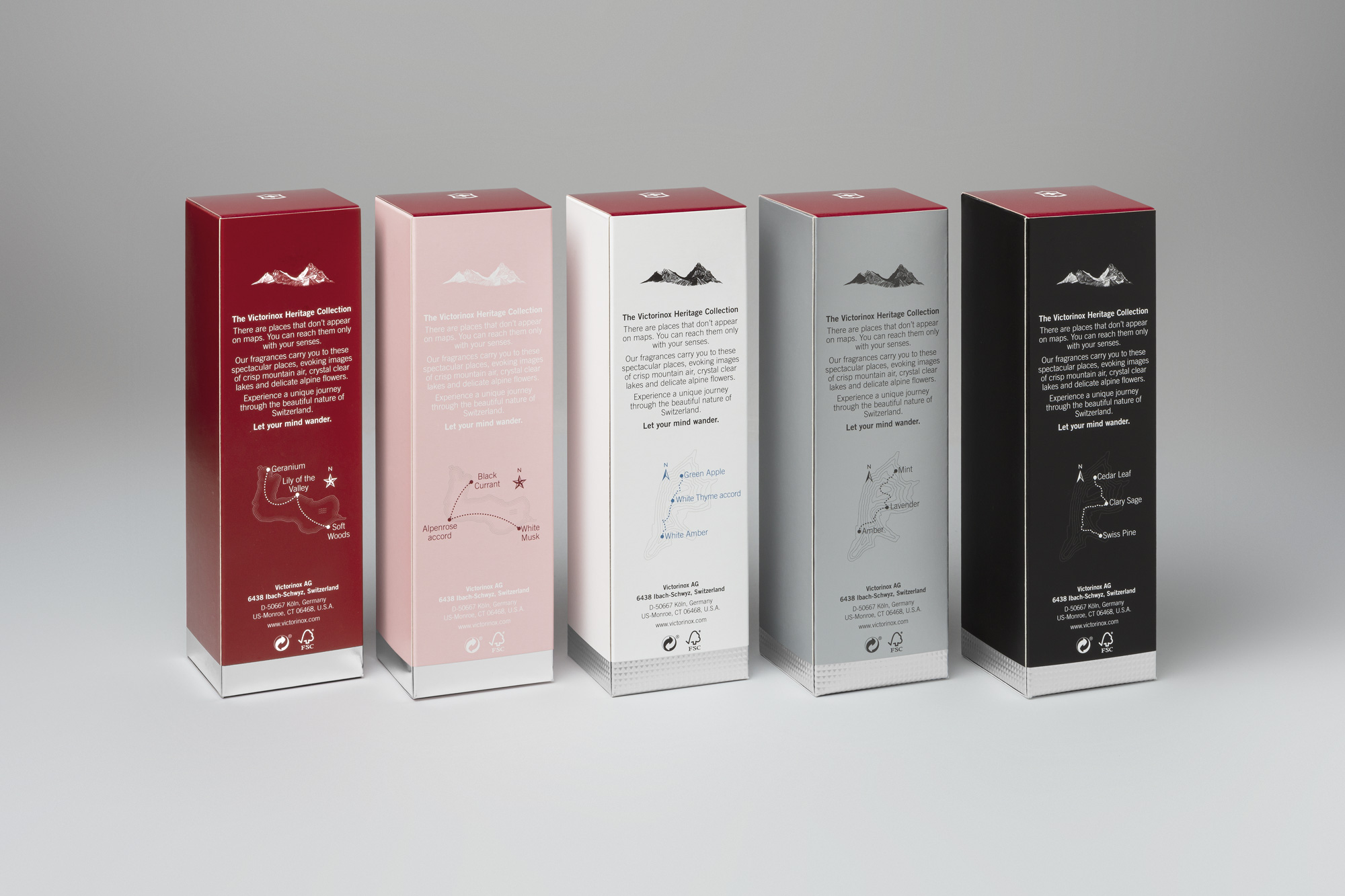
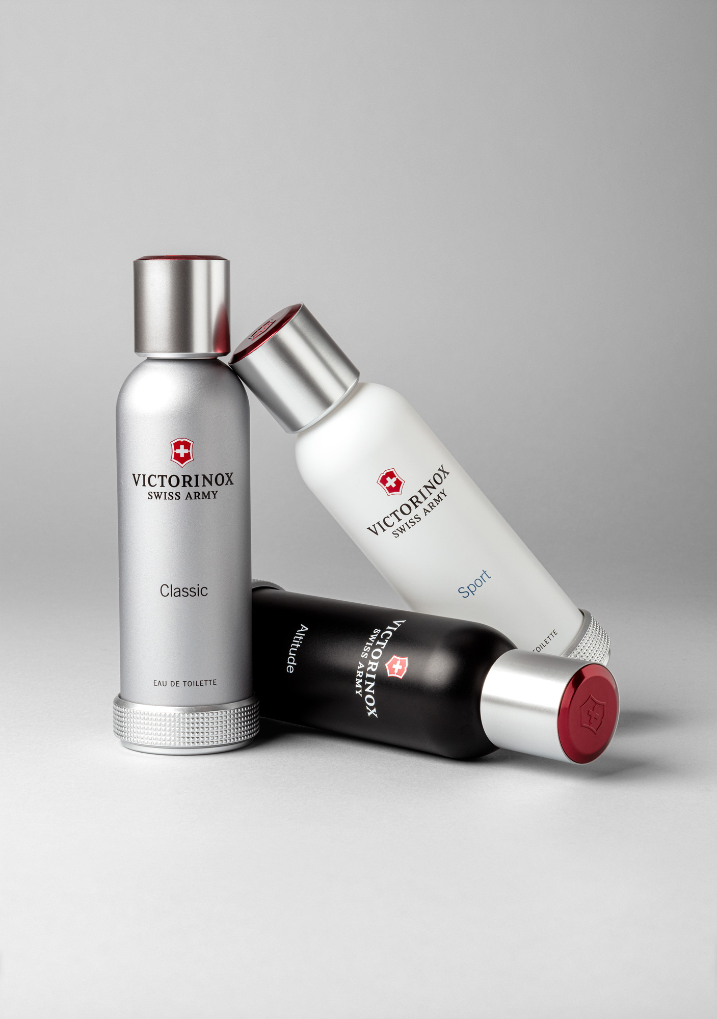
An important transformation has been carried out redesigning this legendary brand where we wished to incorporate “Swissness” to all of its elements. We began by matching dimensions for both feminine and masculine packaging to unify the fragrance collection, thus creating a feeling of a broader product range. Beyond their popular branding, Victorinox has an emotional connection with its consumers through the stories linked to their famous knives; therefore we decided to use their powerful identity by placing the logo over their red background on all of the top covers and their signature aluminum texture on the inferior sections.
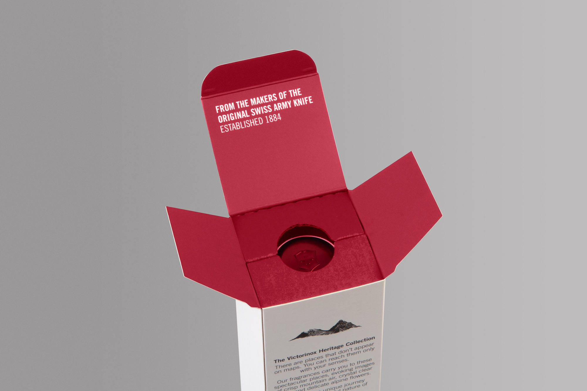
Storytelling has gained prominence throughout the range, being present both in the rear parts and inside the packaging. The original bottle was inspired by the oxygen tanks used in alpinism, so we decided to guide the customer on an olfactive adventure on the swiss mountains through a series of topographic elements where we compare the base notes to a base camp, and the top notes to a summit; as well as using the brands color and history inside of the pack for a subtle surprise when opened.
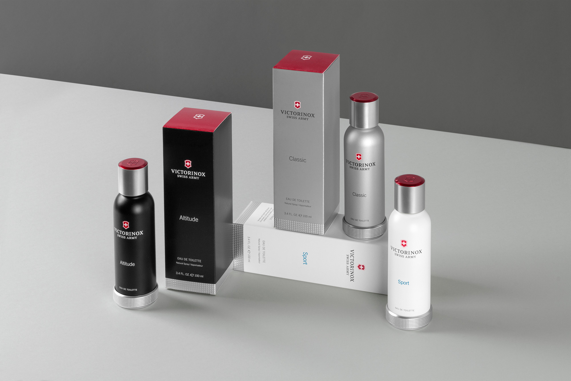
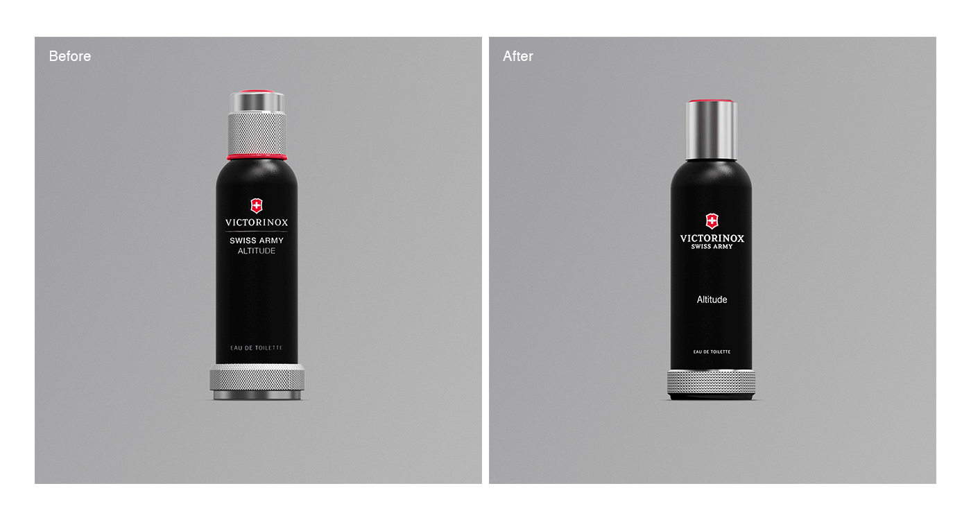
As for the glass bottle redesign, we have maintained their original conceptual idea of the bottles being alpine oxygen tanks, keeping the storytelling and the swissness of the brand. As for the cap redesign, the lines have been cleaned and the size has been reduced to achieve a more elegant and modern look. In order to resemble the famous Victorinox knives aluminium texture, we have integrated it in the bottles. By applying their signature red and famous shield on all of the classical fragrance caps, we wanted to create a direct link with the packaging, with the branding and with the knives, which already have an existing emotional connection with the consumers.
CREDIT
- Agency/Creative: Noreste
- Article Title: Packaging Redesign of Victorinox Fragrance Collection by Noreste
- Organisation/Entity: Agency, Published Commercial Design
- Project Type: Packaging
- Project Status: Published
- Agency/Creative Country: Spain
- Market Region: Global
- Project Deliverables: Brand Redesign, Brand World, Graphic Design, Industrial Design, Packaging Design, Photography, Research
- Format: Bottle, Box
- Substrate: Glass Bottle, Plastic, Pulp Carton


