


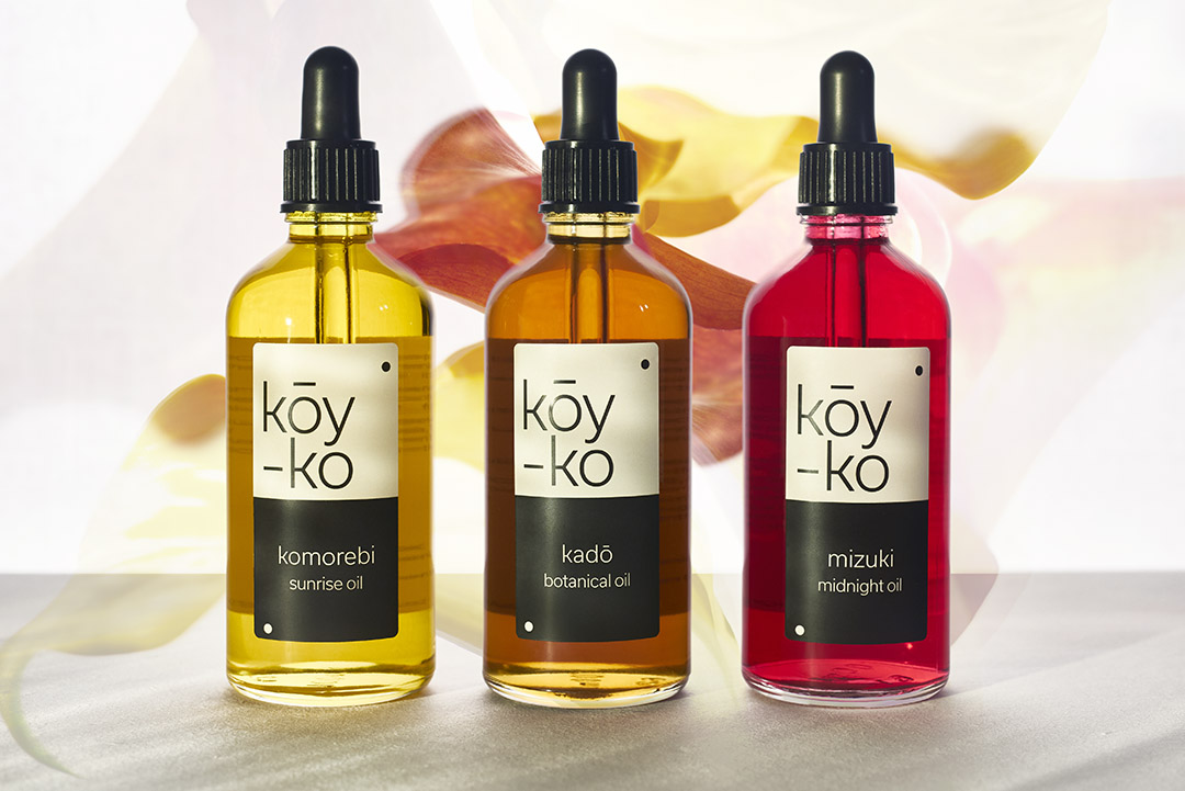
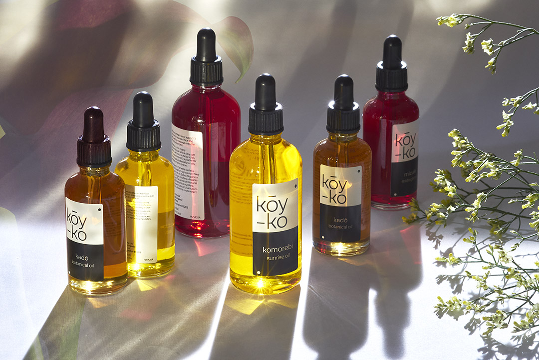
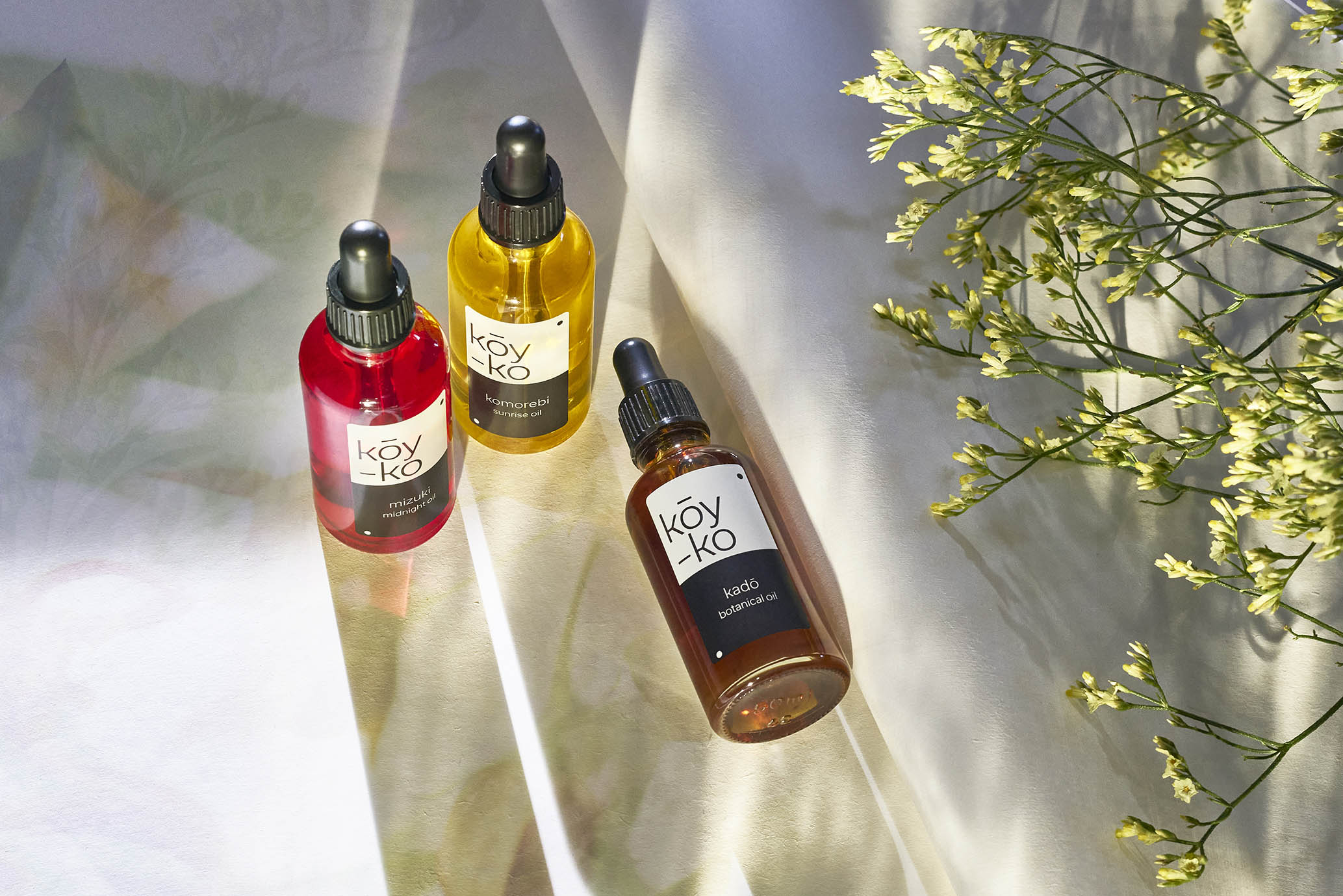
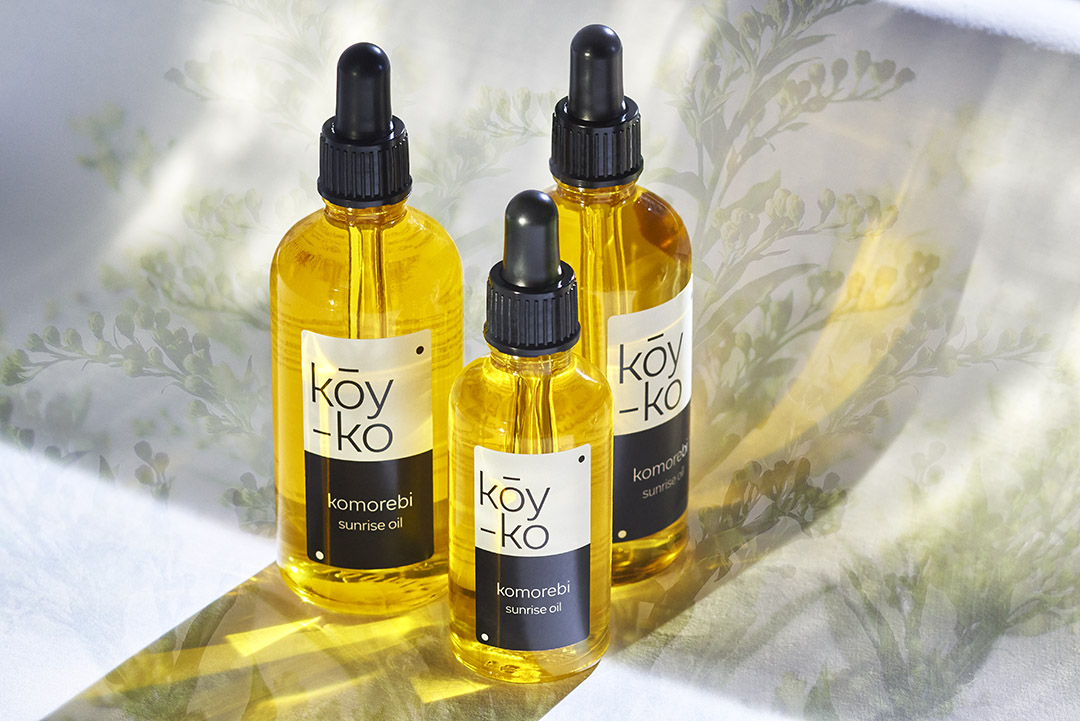
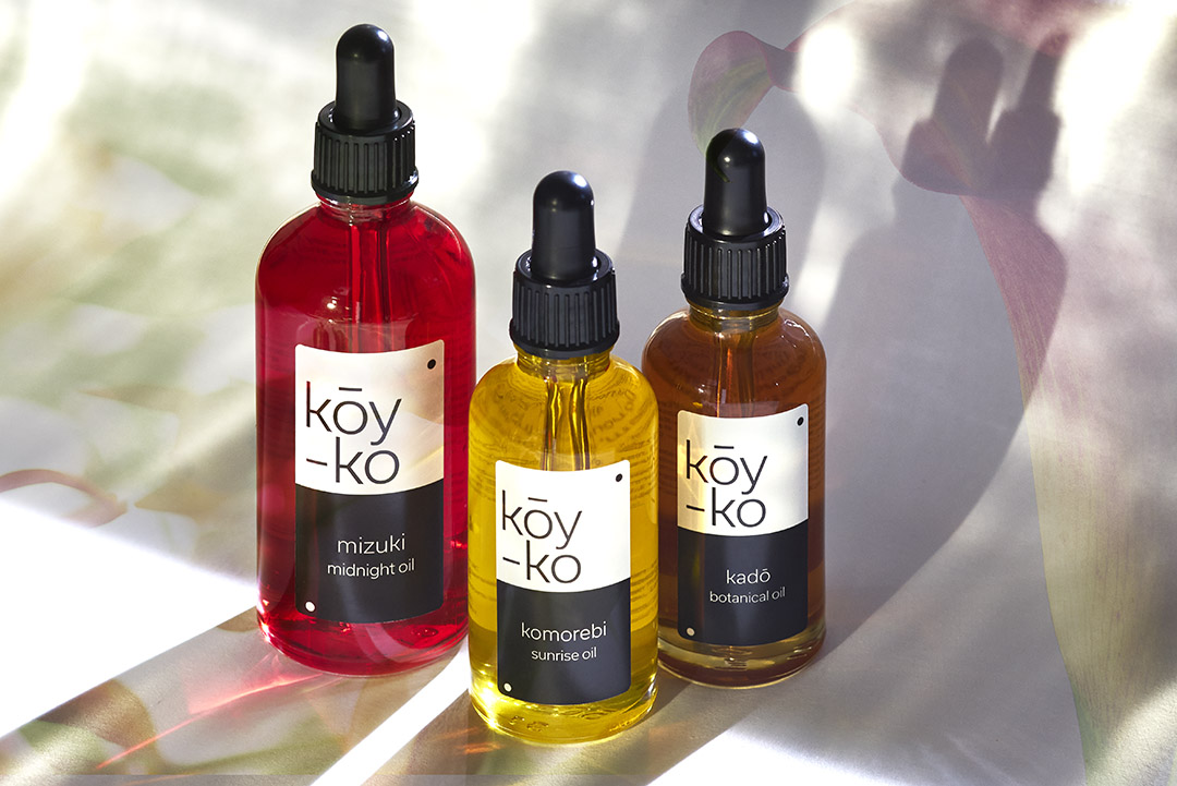
Kōy–ko encapsulates nature’s secrets into a collection of organic beauty oils. The oils regenerate the skin from sunrise to sunset. Komorebi, a Japanese expression describing the sunlight filtered through the trees, brings light to the morning skin. The ritual is completed with Kadō “way of flowers” and Mizuki, “beautiful moon”.
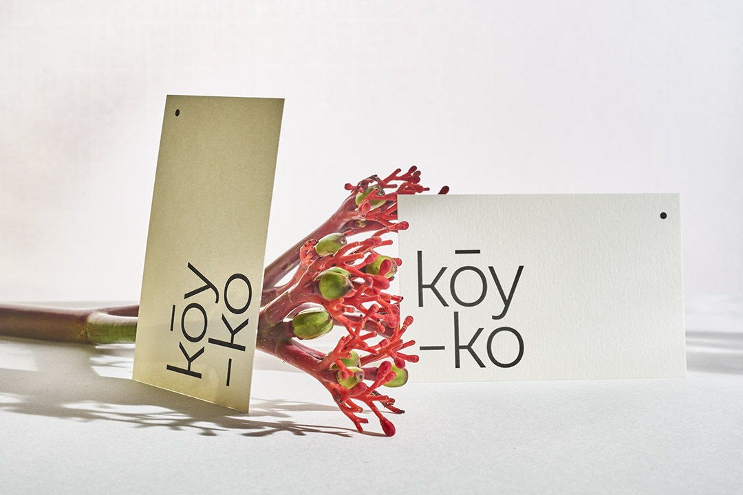
The design is an invitation to wander into Japan and honour the sophistication of their beauty rituals. We re-interpreted the codes of Onmyōdō, a Japanese philosophy based on the Yin and Yang where forces are interdependent. We played on this idea of contrasts that together bring balance to the world.
We embraced a minimalist design aesthetic with black and white labels enhancing the natural and rich colours of the oils. The design celebrates the beauty found in the natural ingredients and the simplicity of enjoying nature’s treasures.
When embarking on a new design project, we take a holistic view to ensure the project is as sustainable as it can be. We look not only at the materials we use but also the credentials of our contractors. As a London based studio, we want to support local and ethical businesses, prioritising local printers instead of online print shops keeps money in our local economy. It also ensures a lower greenhouse gas footprint, as the product does not have to be transported as far.
To create the brand’s identity visual, we experimented with colours and the beauty of the ingredients. We created a series of moving images overlaid with flowers that form the composition of the oil in their colourful bottles. These slow-paced pieces are a statement against the constant noise of a busy lifestyle. We invited Kōy–ko’s users to pause and reflect on the pleasure of enjoying simple pleasures re-connecting with oneself, a reminder to respect our body and the planet.
CREDIT
- Agency/Creative: lombaert studio
- Article Title: Packaging Design for Kōy–ko, Japanese Collection of Organic Beauty Oils
- Organisation/Entity: Agency
- Project Type: Graphic
- Project Status: Published
- Agency/Creative Country: United Kingdom
- Agency/Creative City: London
- Market Region: Europe
- Project Deliverables: 2D Design, Art Direction, Brand Design, Brand Identity, Brand Naming, Branding, Creative Direction, Design, Film, Graphic Design, Label Design, Logo Design, Packaging Design, Product Photography, Typography
- Industry: Retail
- Keywords: branding, visual identity, logo design, graphic design, branding for beauty, label design
-
Credits:
Art Direction: lombaert studio


