


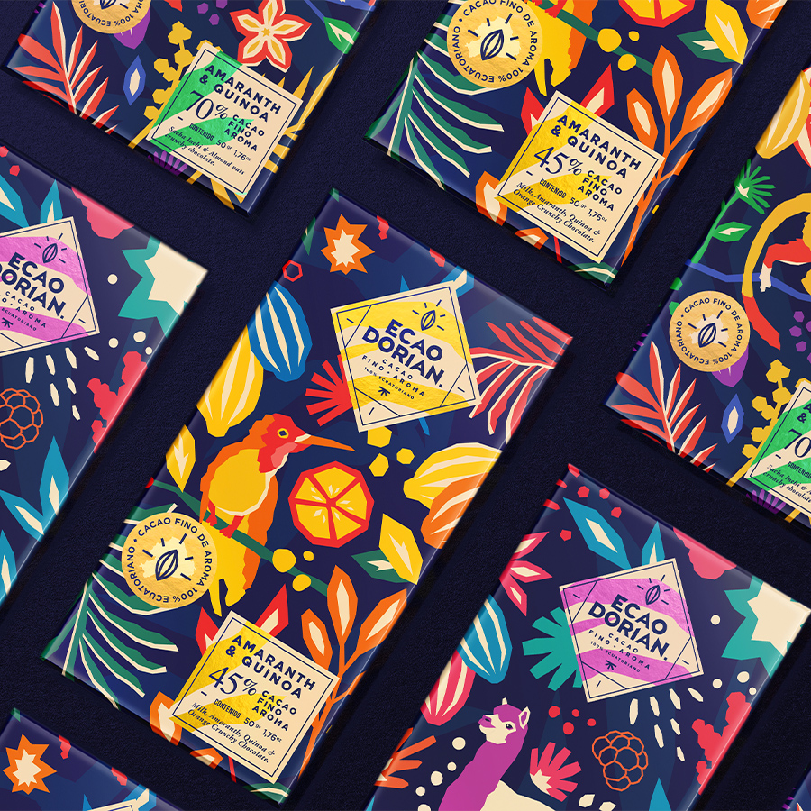
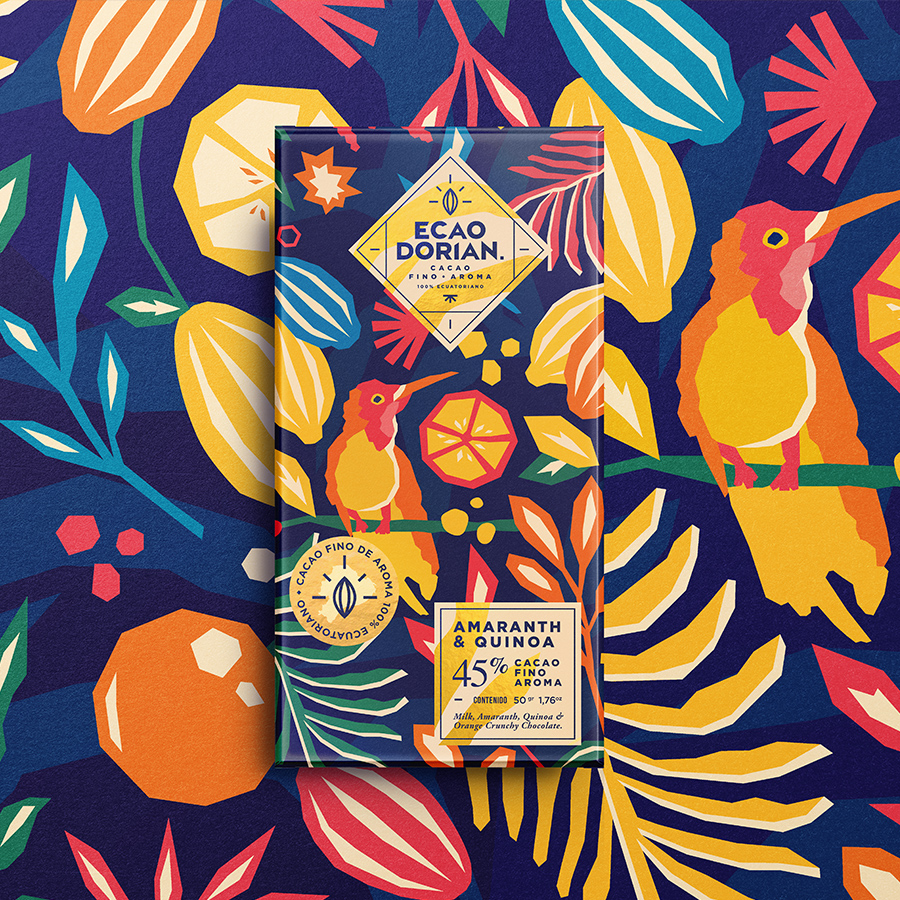
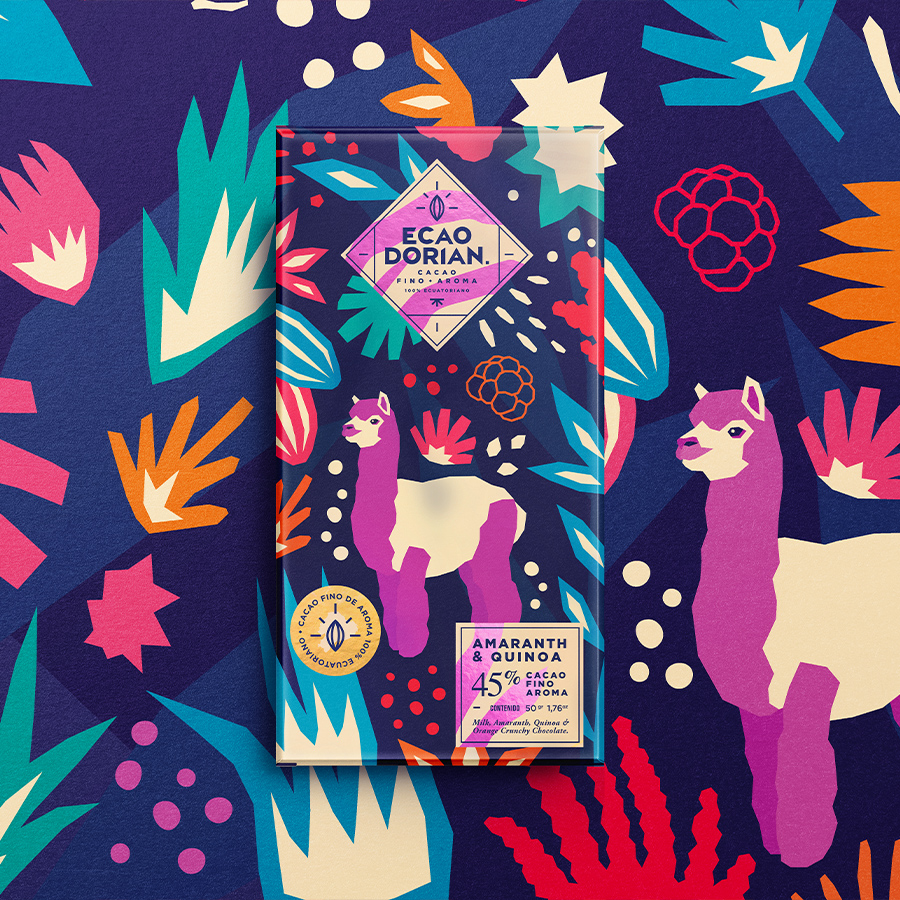
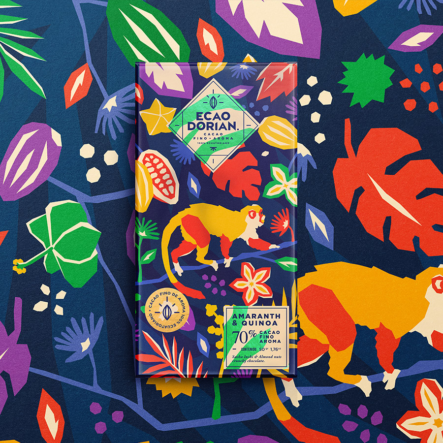
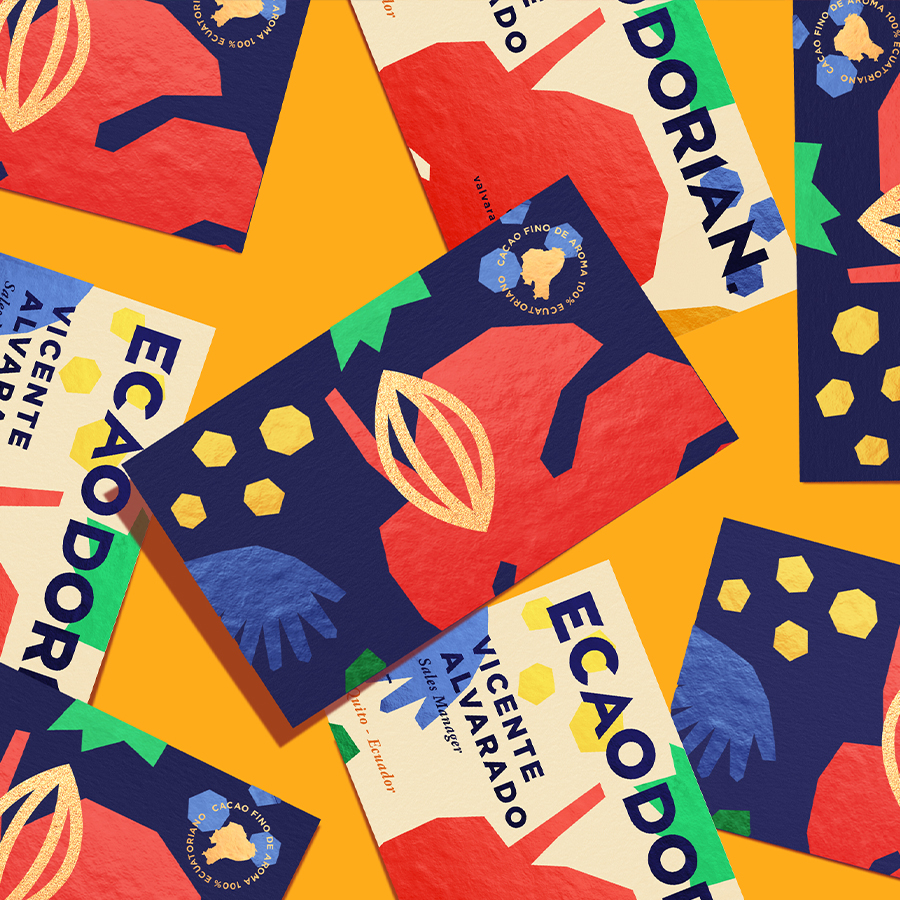
Ecaodorian is a chocolate brand with its headquarters in the city of Quito – Ecuador which commissioned me through David Peralbo, its manager and founding partner for the development of its new line of packaging which is called Ecaodorian Chocolate Ecuatoriano Fino de Aroma. The main characteristic and something that they emphasized a lot in the brainstorming meetings in addition to knowing more about them and their tastes as well as brand values was that their new brand had to be very striking and relevant for the young public that seeks to take care of themselves but without restricting itself from the pleasures of life such as chocolate from Ecuador, trying to show that the brand is 100% Ecuadorian and this highlight it as something very important that should be seen with the naked eye in the new packaging. We decided through the meetings and others to choose a path in which illustration was the main axis of communication and which allows the consumer to be delighted at first sight with our new Ecaodorian packaging, which makes them feel encouraged, excited so much for The product is a fine cocoa with a 100% Ecuadorian aroma that is also harvested in various rural areas of Ecuador, thus helping rural populations that live in each of the cocoa harvest and production areas in Ecuador, in addition to having infusions of intelligent foods such as amaranth, quinoa and sacha inchi that are recognized for their various nutrients that contribute to the health and well-being of our body as well as a concept that allows you to know more about the regions where cocoa comes from in Ecuador.
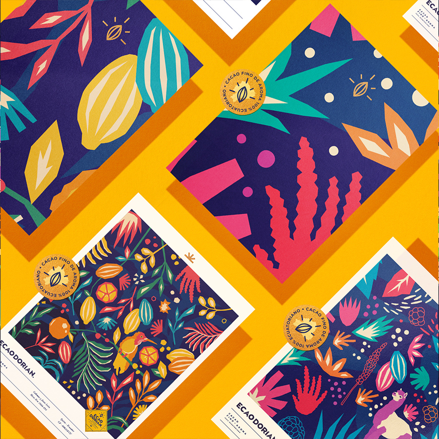
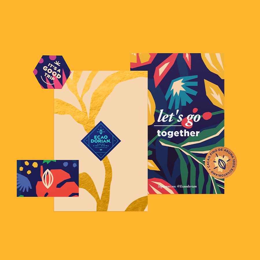
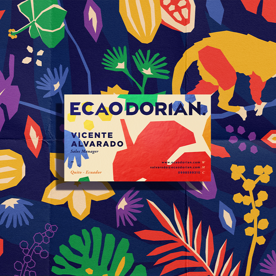
We created a series of illustrations and graphic elements that strikingly tells where each element that was used in each of the flavors of the new brand comes from. Subsequently, these illustrations and other visual elements such as plants, textures, fruits and animals were used as brand elements for the complete development of the company’s visual language and other visual products that help to highlight the new concept and culture of Ecuador.
CREDIT
- Agency/Creative: Jorge Campozano
- Article Title: Packaging and Brand Design for Ecaodorian Chocolate Ecuatoriano Fino de Aroma
- Organisation/Entity: Freelance
- Project Type: Packaging
- Project Status: Published
- Agency/Creative Country: Ecuador
- Agency/Creative City: guayaquil
- Market Region: South America
- Project Deliverables: Art, Brand Design, Brand Identity, Graphic Design, Illustration, Packaging Design
- Format: Box
- Substrate: Pulp Carton
- Industry: Food/Beverage
- Keywords: logo, design, brand, branding, pack, packaging, chocolate, colors, animal, food, nature, illustration
-
Credits:
Designer: Jorge Luis Campozano Alarcon


