


Our Design Agency – Brighton Gin’s Pride Limited Edition
“ Creative branding and communications agency Our Design Agency (ODA) reveals a bold design and strategy for Brighton Gin’s latest Pride Limited Edition, inspired by this year’s Brighton Pride theme – Colour My World.
The design features the eight colours from the original Pride flag commissioned by politician and activist Harvey Milk and devised by artist Gilbert Baker in San Francisco in 1978 as the festival returns to the historic flag this year.
ODA illustrates Brighton Gin’s hand-crafted credentials with hand-painted lettering and celebrates Pride in an authentic way. A portion of the profits from the limited edition go to The Rainbow Fund, a Brighton and Hove-based grant giving fund which supports local LGBTQ+ and HIV/AIDS organisations. The original iconic Seafront Blue Brighton Gin was also designed by ODA.
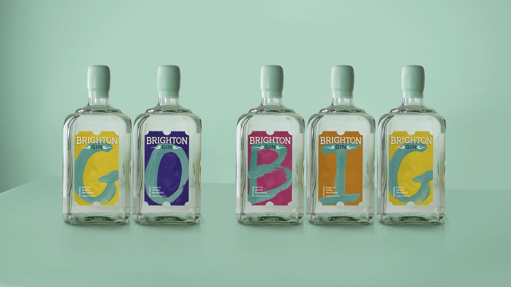
Panna Rose, Managing Director, ODA, says: “We wanted to create a range where people could have fun by rearranging the letters or create their own gin collection. It reflects the spirit of Brighton and Brighton Gin. It’s a true celebration of diversity and the individual.”
Sarah Westwood, Creative Strategist, ODA, adds: “The design oozes confidence. We wanted to go big on Pride as part of Brighton Gin’s brand personality and therefore we celebrated the rainbow in a way that would create real excitement in Brighton, particularly as a display as the city’s residents and retailers decorate their windows for Pride and gear up for one the biggest celebrations of the year.”
‘Brighton Your Life’
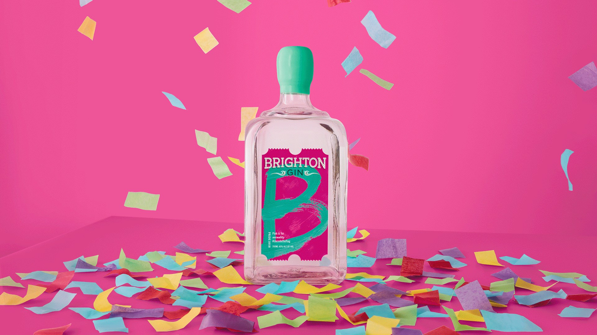
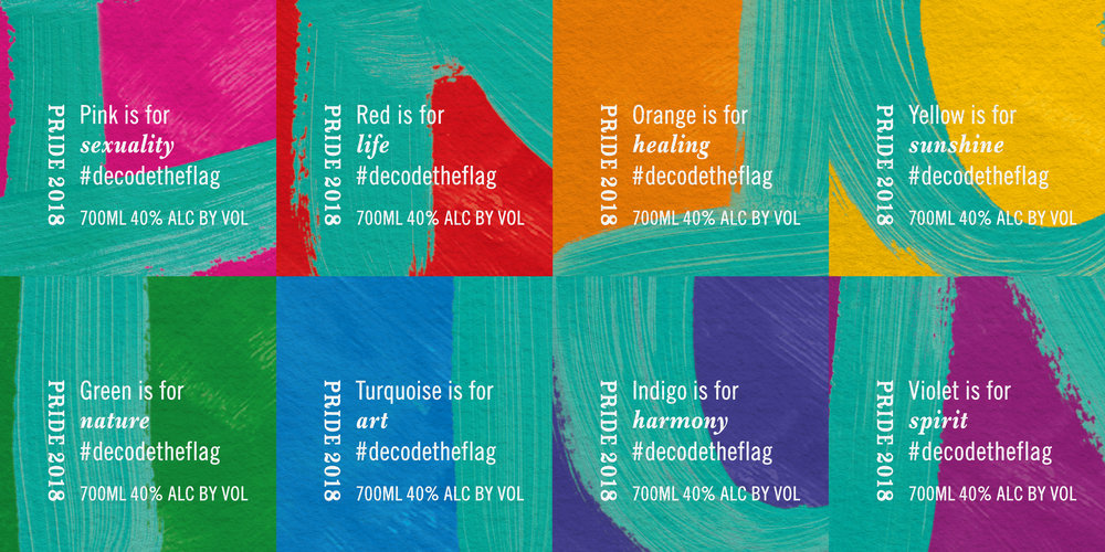
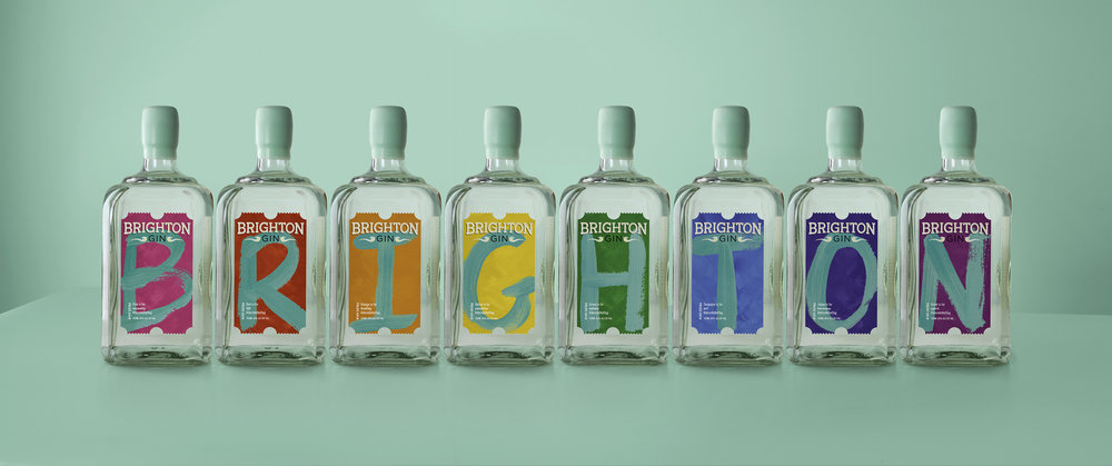
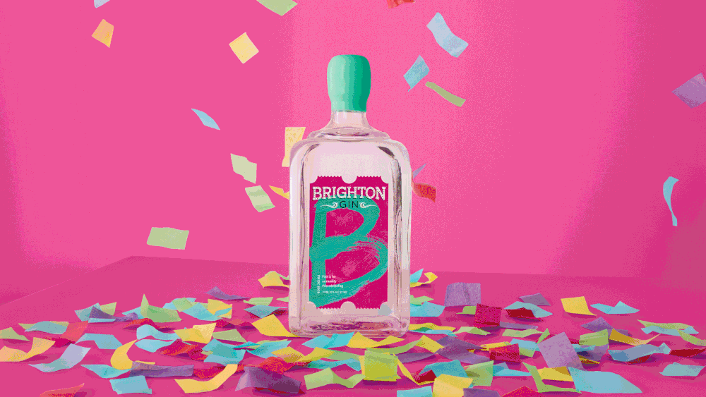
Collectively the labels spell out Brighton (or other words depending on how they are arranged) and with eight letters in Brighton and eight colours in the flag, it was the perfect fit. The range of eight unique bottles bear the individual flag colours which stand for sexuality, life, healing, sunlight, nature, art/magic, harmony and spirit.
A storytelling link to each colour features on the label and illustrates how these qualities link to life in Brighton in a way which works across social media channels.
Each label bears a letter from the word Brighton, hand-painted in the famous Brighton Seafront Blue on top of the flag colour. The design reflects the brand proposition ‘Brighton Your Life,’ a call to action to be more Brighton and enjoy a laid-back craft gin which helps people escape the humdrum, open their minds and let their hair down. ODA removed all the brand graphics apart from the logo.
Celebrating diversity
Westwood adds: “The challenge was to avoid a rainbow flag cliché. In recent years many of the big brands have entered Pride and taken on the rainbow as an easy symbol to associate with their brand, but Brighton Gin is different.
“It’s a small company based in Brighton with diversity at its core, so we wanted to create a limited edition that felt authentic. Our creative concept was to celebrate Pride, dedicate a bottle to every colour and tell the story of the meaning of the flag. Together the bottles make up a whole, just like the flag itself.”
The brand is releasing 1,400 bottles in the colours of the Pride flag priced at £45 each (700ml), available from fine local, independent retailers from June 29th and from Brightongin.com
Brighton Gin will donate £2 from every bottle sold to The Rainbow Fund. Since Brighton Gin began limited editions in 2014, the annual Pride release has achieved cult status in Brighton and has become a collectors’ item. In previous years the brand adopted a label colour change, first to pink and then to rainbow for its Pride Limited Editions.
Kathy Caton, Founder, Brighton Gin, says: Kathy said: “Set to be bolder, more beautiful and brilliant than ever, we’re so proud that we host the UK’s biggest Pride Festival in our free-thinking, campaigning Iand and hedonistic home city. We want to celebrate that ultimate spirit of Brighton and contribute again to the essential work of the Rainbow Fund in supporting the city’s LGBTQ+ community and voluntary sector.””
CREDIT
- Agency/Creative: Our Design Agency
- Article Title: ‘Colour My World’ with Brighton Gin’s Pride Limited Edition
- Organisation/Entity: Agency Commercial / Published
- Project Type: Packaging
- Agency/Creative Country: United Kingdom
- Market Region: Europe
- Format: Bottle
- Substrate: Glass


