


Armoder Arte & Diseño – Orovelo
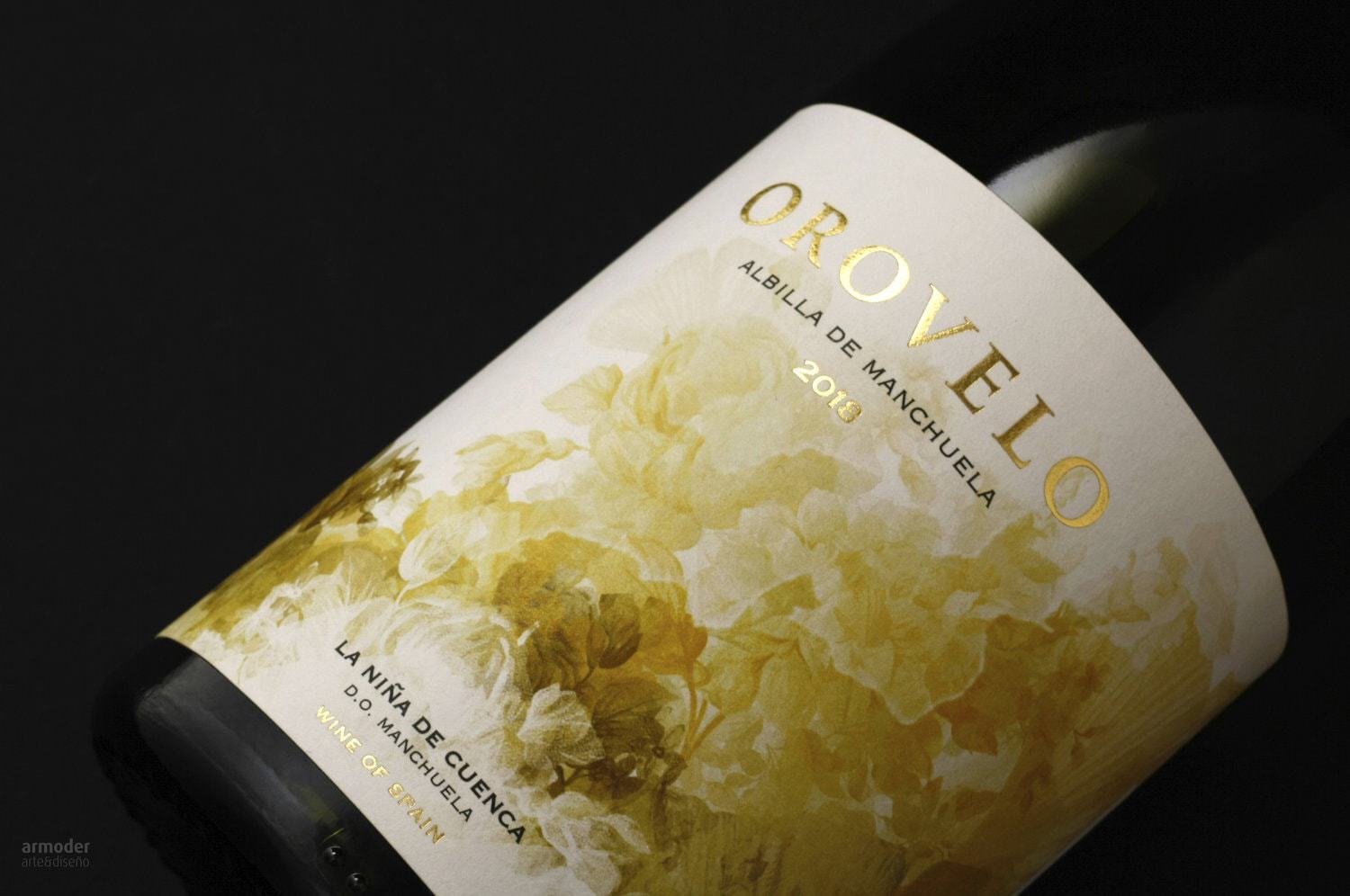
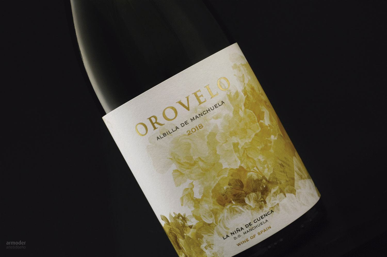
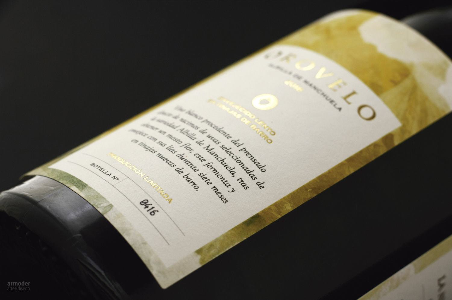
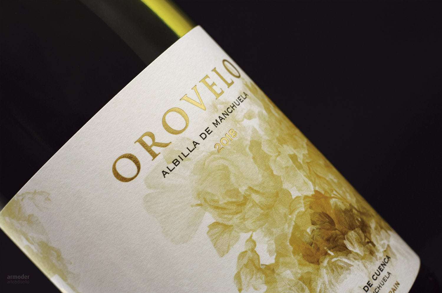
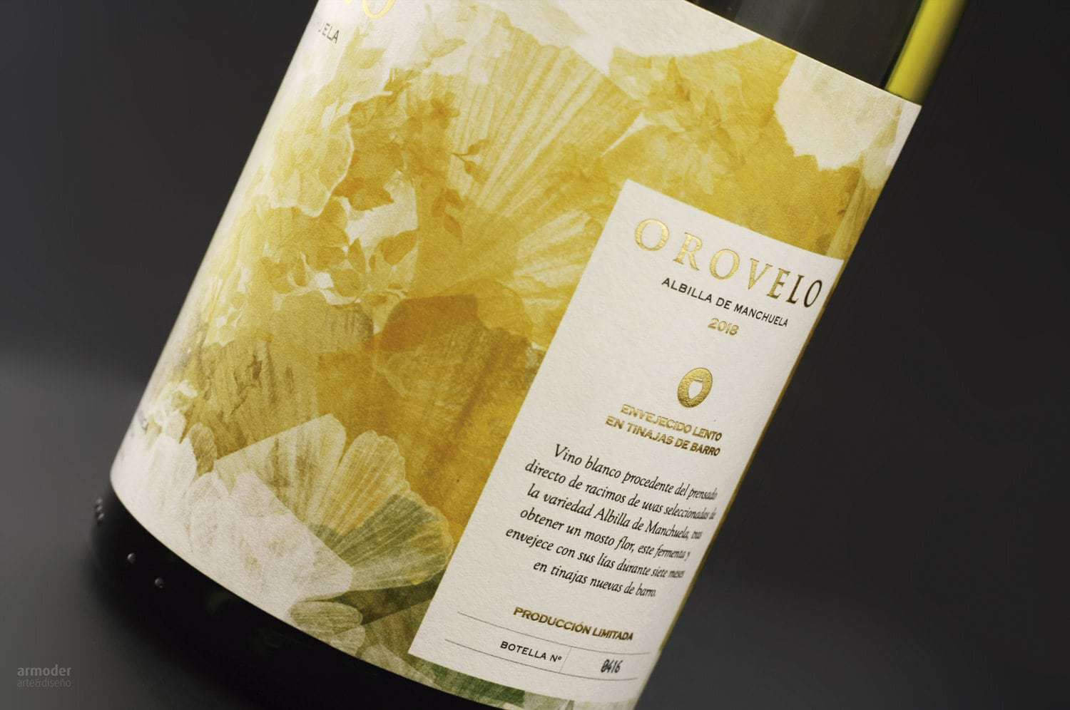
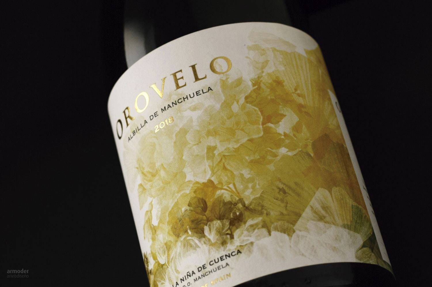
Orovelo wine label designBodega La Niña de Cuenca entrusts us with the creation and design of the label of its new Orovelo wine. A wine that comes from Albilla de Manchuela grapes planted in 1940, on the geographical border between Cuenca and Albacete.The objective was to create an enveloping image referring to the pale yellow tones of the wine, through an illustration with delicate baroque style where its different color tones express the essence of the product, a white wine with a multitude of nuances.
CREDIT
- Agency/Creative: Armoder Arte & Diseño
- Article Title: Orovelo Wine Label Design
- Organisation/Entity: Agency, Published Commercial Design
- Project Type: Packaging
- Agency/Creative Country: Spain
- Market Region: Europe
- Format: Bottle
- Substrate: Pulp Paper
FEEDBACK
Relevance: Solution/idea in relation to brand, product or service
Implementation: Attention, detailing and finishing of final solution
Presentation: Text, visualisation and quality of the presentation


